1. transition-property
transition-property 属性用来设置元素中参与过渡的属性名称,语法格式如下:
transition-property: none | all | property;
参数说明如下:
- none:表示没有属性参与过渡效果;
- all:表示所有属性都参与过渡效果;
- property:定义应用过渡效果的 CSS 属性名称列表,多个属性名称之间使用逗号
,进行分隔。
例如:
<!DOCTYPE html>
<html>
<head><style>div {width: 100px;height: 100px;border: 3px solid black;margin: 10px 0px 0px 10px;transition-property: width, background;}div:hover {width: 200px;background-color: blue;}</style>
</head>
<body><div></div>
</body>
</html>
2. transition-duration
transition-duration 属性用来设置过渡需要花费的时间(单位为秒或者毫秒),语法格式如下:
transition-duration: time;
其中,time 为完成过渡效果需要花费的时间(单位为秒或毫秒),默认值为 0,意味着不会有效果。
如果有多个参与过渡的属性,也可以依次为这些属性设置过渡需要的时间,多个属性之间使用逗号进行分隔,例如transition-duration: 1s, 2s, 3s;。除此之外,也可以使用一个时间来为所有参与过渡的属性设置过渡所需的时间。示例代码如下:
<!DOCTYPE html>
<html>
<head><style>div {width: 100px;height: 100px;border: 3px solid black;margin: 10px 0px 0px 10px;transition-property: width, background;transition-duration: .25s, 1s;}div:hover {width: 200px;background-color: blue;}</style>
</head>
<body><div></div>
</body>
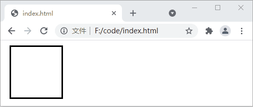
</html>运行效果如下:
3. transition-timing-function
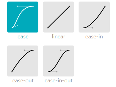
transition-timing-function 属性用来设置过渡动画的类型,属性的可选值如下:
| 值 | 描述 |
|---|---|
| linear | 以始终相同的速度完成整个过渡过程,等同于 cubic-bezier(0,0,1,1) |
| ease | 以慢速开始,然后变快,然后慢速结束的顺序来完成过渡过程,等同于 cubic-bezier(0.25,0.1,0.25,1) |
| ease-in | 以慢速开始过渡的过程,等同于 cubic-bezier(0.42,0,1,1) |
| ease-out | 以慢速结束过渡的过程,等同于 cubic-bezier(0,0,0.58,1) |
| ease-in-out | 以慢速开始,并以慢速结束的过渡效果,等同于 cubic-bezier(0.42,0,0.58,1) |
| cubic-bezier(n, n, n, n) | 使用 cubic-bezier() 函数来定义自己的值,每个参数的取值范围在 0 到 1 之间 |
示例代码如下:
<!DOCTYPE html>
<html>
<head><style>div {width: 100px;height: 100px;border: 3px solid black;margin: 10px 0px 0px 10px;transition-property: width, background;transition-duration: .25s, 1s;transition-timing-function: ease;}div:hover {width: 200px;background-color: blue;}</style>
</head>
<body><div></div>
</body>
</html>
4. transition-delay
transition-delay 属性用来设置过渡效果何时开始,属性的语法格式如下:
transition-delay: time;
其中,参数 time 用来设置在过渡效果开始之前需要等待的时间,单位为秒或毫秒。
示例代码如下:
<!DOCTYPE html>
<html>
<head><style>div {width: 100px;height: 100px;border: 3px solid black;margin: 10px 0px 0px 10px;transition-property: width, background;transition-duration: .25s, 1s;transition-delay: 3s;}div:hover {width: 200px;background-color: blue;}</style>
</head>
<body><div></div>
</body>
</html>
运行效果如下:

5. transition
transition 属性是上面四个属性的简写形式,通过该属性可以同时设置上面的四个属性,属性的语法格式如下:
transition: transition-property transition-duration transition-timing-function transition-delay;
transition 属性中,transition-property 和 transition-duration 为必填参数,transition-timing-function 和 transition-delay 为选填参数,如非必要可以省略不写。另外,通过 transition 属性也可以设置多组过渡效果,每组之间使用逗号进行分隔,示例代码如下:
<!DOCTYPE html>
<html>
<head><style>div {width: 100px;height: 100px;border: 3px solid black;margin: 10px 0px 0px 10px;transition: width .25s linear 1.9s, background 1s 2s, transform 2s;}div:hover {width: 200px;background-color: blue;transform: rotate(180deg);}</style>
</head>
<body><div></div>
</body>
</html>
运行效果如下:

上面的代码也可以写成如下所示的样子:
<!DOCTYPE html>
<html>
<head><style>div {width: 100px;height: 100px;border: 3px solid black;margin: 10px 0px 0px 10px;transition-property: width, background, transform;transition-duration: .25s, 1s, 2s;transition-timing-function: linear, ease, ease;transition-delay: 1.9s, 2s, 0s;}div:hover {width: 200px;background-color: blue;transform: rotate(180deg);}</style>
</head>
<body><div></div>
</body>
</html>