css中实现动画有两种方式:transition过渡动画、 animation自定义动画。
transition 是 css3 新增的⼀个功能,可以实现元素不同状态间的平滑过渡(当元素从⼀个状态进⼊到另⼀个状态时),经常⽤来制作⼀些动画效果。
之前:元素 -> 元素:hover 状态直接切换,从开始状态到结束状态,瞬间完成,中间过程⼏乎不可⻅。
过渡:从开始状态到结束状态的中间过程可以查看
格式:
transition:过渡的属性 完成时间(s) 运动曲线 延迟时间
transition:all 3s(1s=1000ms) linear 0s;
transition 包含以下四个属性:
transition-property 过渡属性。如果希望所有的属性都发⽣过渡,就使⽤all
transition-duration 过渡的持续时间,单位是s或者ms
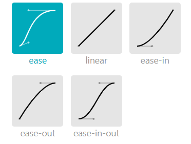
transition-timing-function 运动曲线。属性值取值:
ease 慢速开始,然后变快,然后慢速结束的过渡效果(默认 cubic-bezier(0.25,0.1,0.25,1))
linear 线性,以相同速度开始至结束的过渡效果(cubic-bezier(0,0,1,1))
ease-in 以慢速开始的过渡效果(cubic-bezier(0.42,0,1,1))
ease-out 慢速结束的过渡效果(cubic-bezier(0,0,0.58,1))
ease-in-out 以慢速开始和结束的过渡效果(cubic-bezier(0.42,0,0.58,1))
cubic-bezier(n,n,n,n) 在 cubic-bezier 函数中定义自己的值,https://cubic-bezier.com/
transition-delay 默认是0,单位为s,过渡延迟。多⻓时间后再执⾏这个过渡动画。
transition-duration 这个属性需要首先设置,否则时长为 0,就不会产生过渡效果。
1.圆过渡
<style>.div-1{width: 200px;height: 200px;border-radius: 50%;background-color: aqua;transition: all 3s;transition-timing-function: steps(3000,start);}.div-1:hover{background-color: rgb(21, 255, 0);width: 400px;height: 400px;border-radius: 0%;}</style> 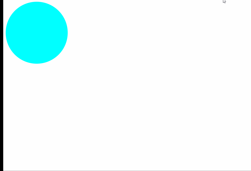
2.钟表秒针
<style>.clock{background: url(img/clock.png);border-radius: 50%;width: 284px;height: 284px;position: relative;}.clock::before{content: "";width: 20px;height: 20px;background-color: black;transform: translate(-50%,-50%);top: 50%;left: 49.5%;position: absolute;border-radius: 50%;}.clock::after{content: "";width: 3px;height: 110px;background-color: black;position: absolute;left: 49.8%;top: 50%;transform: translate(-50%,-100%);border-radius: 70%;transform-origin: bottom;animation: rotate360 60s steps(60) infinite;}@keyframes rotate360 {to {transform: translate(-50%, -100%) rotate(360deg);}}/* .clock:hover::after{transform: translateX(-50%) rotate(360deg);} */</style>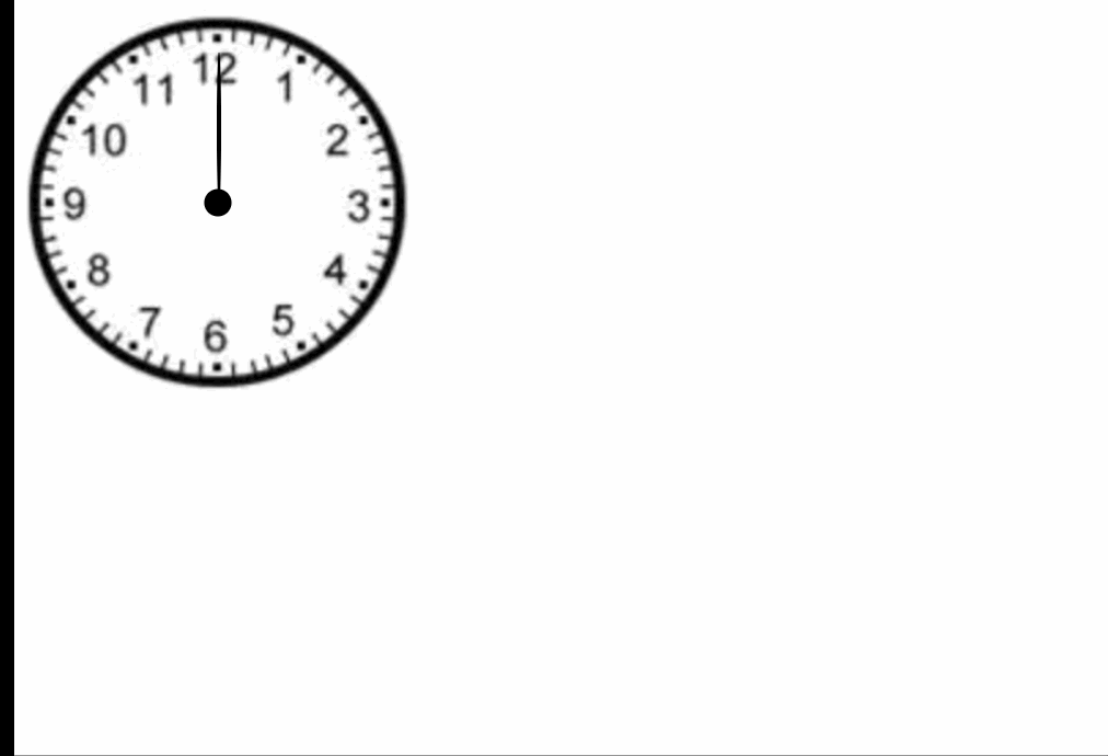
3.圆过渡动画
<style>.div-1{width: 300px;height: 300px;background-color: royalblue;border-radius: 50%;/* 应用动画 */animation-name: div_animate; /*制定动画名称*/animation-duration: 2s; /*动画持续时间*/animation-fill-mode: forwards; /*动画填充模式,forwards作用是将动画的样式停留在最后一个 */animation-delay: 2s; /*动画延迟的时间,当值为负数时表示动画已经执行了多长时间*/animation-direction: alternate; /*规定是否应该轮流反向播放动画。*/animation-iteration-count: infinite; /*规定动画的速度曲线。*/animation-timing-function: cubic-bezier(.97,.08,.35,.72);/*速度*/}/* 定义动画规则 */@keyframes div_animate{from{background-color:royalblue;margin-left: 0px;}to{background-color: brown;margin-left: 500px;}}</style>