作者:熊的猫
原文:https://juejin.cn/post/7063010855167721486
前言
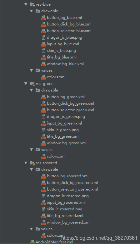
现在越来越多的网站都提供了拥有换肤(切换主题)功能,如 ElementUI,既是为了迎合用户需求,或是为了凸显自己特点,因此提供了个性化定制的功能.
其实之前就想了解和实现 “一键换肤” 功能,但是由于种种原因一直拖到了现在.
CSS 样式覆盖实现
核心
通过切换 css 选择器的方式实现主题样式的切换.
在组件中保留不变的样式,将需要变化的样式进行抽离
提供多种样式,给不同的主题定义一个对应的 CSS 选择器
根据不同主题设置不同的样式
实现
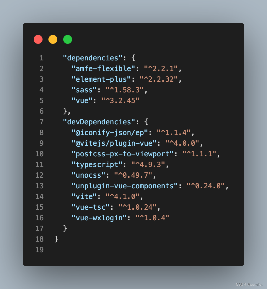
下面通过 vuex 存储和控制全局的主题色,其代码如下:
import { createStore } from 'vuex'// 创建一个新的 store 实例
const store = createStore({state () {return {theme: 'light'}},mutations: {setTheme (state, payload) {state.theme = payloaddocument.querySelector('body').className = payload}}
})export default store
复制代码
在 template 模板中通过 vuex 中的主题设置对应类名,如头部代码如下:
<template><div :class="['header', store.state.theme]"><span>{{title}}</span><input v-model="checked" type="checkbox" class="switch" @change="changeTheme" /></div>
</template>
复制代码
下面 theme.css 中通过 .light 和 .dark 两个类选择器来区分明亮主题和暗黑主题,并且事先准备了它们对应的样式,如下:
/* light 默认主题*/
body.light {background-color: #fff;
}.header.light {background-color: #fff;border-bottom: 1px solid #d6d6d6;color: rgb(51, 50, 50);
}.list.light .title {color: rgb(51, 50, 50);
}
.list.light .describe{color: rgb(158, 158, 158);
}.list.light .left{border: 1px solid rgb(51, 50, 50);
}/* dark 暗黑主题 */
body.dark {background-color: rgb(51, 50, 50);
}.header.dark {background-color: rgb(51, 50, 50);border-bottom: 1px solid #fff;color: #fff;
}.list.dark .title {color: #fff;
}
.list.dark .describe{color: rgb(201, 201, 201);
}
.list.dark .left{border: 1px solid #fff;background-color: #fff;
}
复制代码
缺点
多种主题样式都要引入,导致代码量增大
样式不易管理
查找样式复杂
开发效率低
拓展性差
...
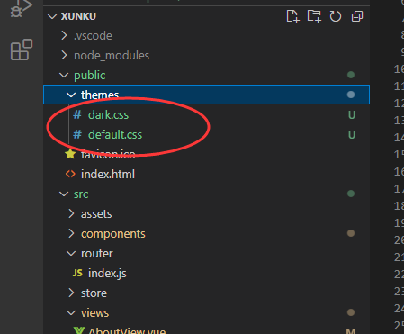
实现多套 CSS 主题样式
核心
实现多套 CSS 主题样式,根据用户切换操作,通过 link 标签动态加载不同的主题样式,主要解决了多个主题色被编译到一个文件中导致单个文件过大.
实现
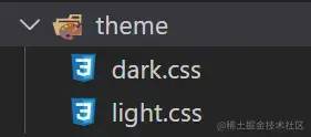
css 部分直接拆分成 ligth.css 和 dark.css 两个文件:
设置主题部分的 setTheme.js 代码如下:
export default function setTheme(theme = 'ligth') {let link = document.querySelector('#theme-link')let href = "/theme/" + theme + ".css"if (!link) {let head = document.querySelector('head')link = document.createElement('link')link.id = '#theme-link'link.rel = "stylesheet"link.href = hrefhead.appendChild(link)} else {link.href = href}
}
复制代码
缺点
需要重复 CV 多份样式文件进行单独修改
没有单独提取出可变的样式部分
需要提前知道打包后的文件路径,否则可能导致主题样式引入错误
...
CSS 变量实现
核心
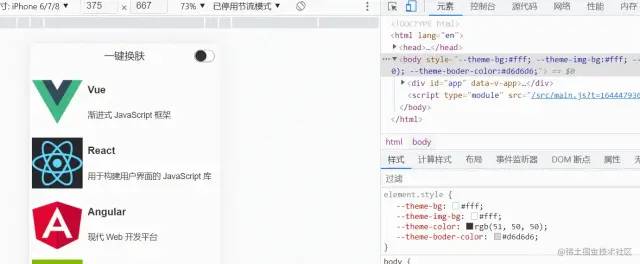
通过 body.style.setProperty(key, value) 动态修改 body 上的 CSS 变量,使得页面上的其他部分可以应用最新的 CSS 变量对应的样式.
实现
theme.css 中负责定义全局的 CSS 变量,代码如下:
/* 实现方式一 */
:root {--theme-bg: initial; // 背景色--theme-color: initial; // 字体色--theme-boder-color: initial; // 边框色
}====================================================/* 实现方式二 */
/* 默认值:light */
:root {--theme-bg: #fff;--theme-color: rgb(51, 50, 50);--theme-img-bg: #fff;--theme-boder-color: #d6d6d6;
}/* 暗黑:dark */
[data-theme='dark'] {--theme-bg: rgb(51, 50, 50);--theme-color: #fff;--theme-boder-color: #fff;
}
复制代码
themeUtil.js 中负责获取当前对应样式值,以及设置 body 上的 CSS 变量值,如下:
const darkTheme = 'rgb(51, 50, 50)'
const lightTheme = '#fff'
const lightBorderTheme = '#d6d6d6'// 获取对应的主题色值
export const getThemeMap = (isLight) => {return {'theme-bg': isLight ? lightTheme : darkTheme,'theme-color': isLight ? darkTheme : lightTheme,'theme-boder-color': isLight ? lightBorderTheme : lightTheme,}
}// 设置主题色值
export const setTheme = (isLight = true) => {const themeMap = getThemeMap(isLight)const body = document.body/* 实现方式一 */Object.keys(themeMap).forEach(key => {body.style.setProperty(`--${key}`, themeMap[key])})/* 实现方式二 */// body.style.setProperty('data-theme', isLight ? 'light' : 'dark')
}复制代码
通过 var() 在组件中应用对应 CSS 变量,比如在头部中的使用:
<style scoped>
.header {...省略color: var(--theme-color);border-bottom: 1px solid var(--theme-boder-color);background-color: var(--theme-bg);
}
...省略
</style>
复制代码
缺点
缺点就是兼容性不好
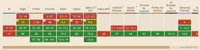
兼容
通过 css-vars-ponyfill 对 CSS 变量进行兼容处理,themeUtil.js 中代码改变如下:
import cssVars from "css-vars-ponyfill";const darkTheme = 'rgb(51, 50, 50)'
const lightTheme = '#fff'
const lightBorderTheme = '#d6d6d6'// 这里定义的 键/值 对,是为了给 cssVars 传参
export const getThemeMap = (isLight) => {return {'--theme-bg': isLight ? lightTheme : darkTheme,'--theme-img-bg': lightTheme,'--theme-color': isLight ? darkTheme : lightTheme,'--theme-boder-color': isLight ? lightBorderTheme : lightTheme,}
}export const setTheme = (isLight = true) => {const themeMap = getThemeMap(isLight)const body = document.body/* 实现方式一 */Object.keys(themeMap).forEach(key => {body.style.setProperty(key, themeMap[key])})/* 实现方式二 */// body.style.setProperty('data-theme', isLight ? 'light' : 'dark')// 实现兼容方案cssVars({watch: true, // 添加、删除、修改 <link> 或 <style> 元素的禁用或 href 属性时,ponyfill 将自行调用    variables: themeMap, // variables 自定义属性名/值对的集合onlyLegacy: false, // false  默认将 css 变量编译为浏览器识别的 css 样式 ;true 当浏览器不支持css变量的时候将css变量编译为识别的css  });
}
复制代码
主题图片切换


实现了前面的内容之后,现在给分别给 light 和 dark 主题添加一个 logo,这一部分其实很简单了,下面的示例代码是基于 Vue3 进行实现的
// Header.vue
<script setup>
import { ref } from 'vue'
import { setTheme } from '../style/themeUtil'defineProps({title: String
})const checked = ref(false)const logoUrl = ref('')const loadImg = async () => {let name = !checked.value ? 'light' : 'dark'let ext = !checked.value ? 'png' : 'jpg'let res = await import(`../assets/logo-${name}.${ext}`)logoUrl.value = res.default
}loadImg()const changeTheme = (event) => {setTheme(!checked.value)loadImg()
}</script><template><div class="header"><img class="logo" :src="logoUrl" /><span>{{ title }}</span><input v-model="checked" type="checkbox" class="switch" @change="changeTheme" /></div>
</template>
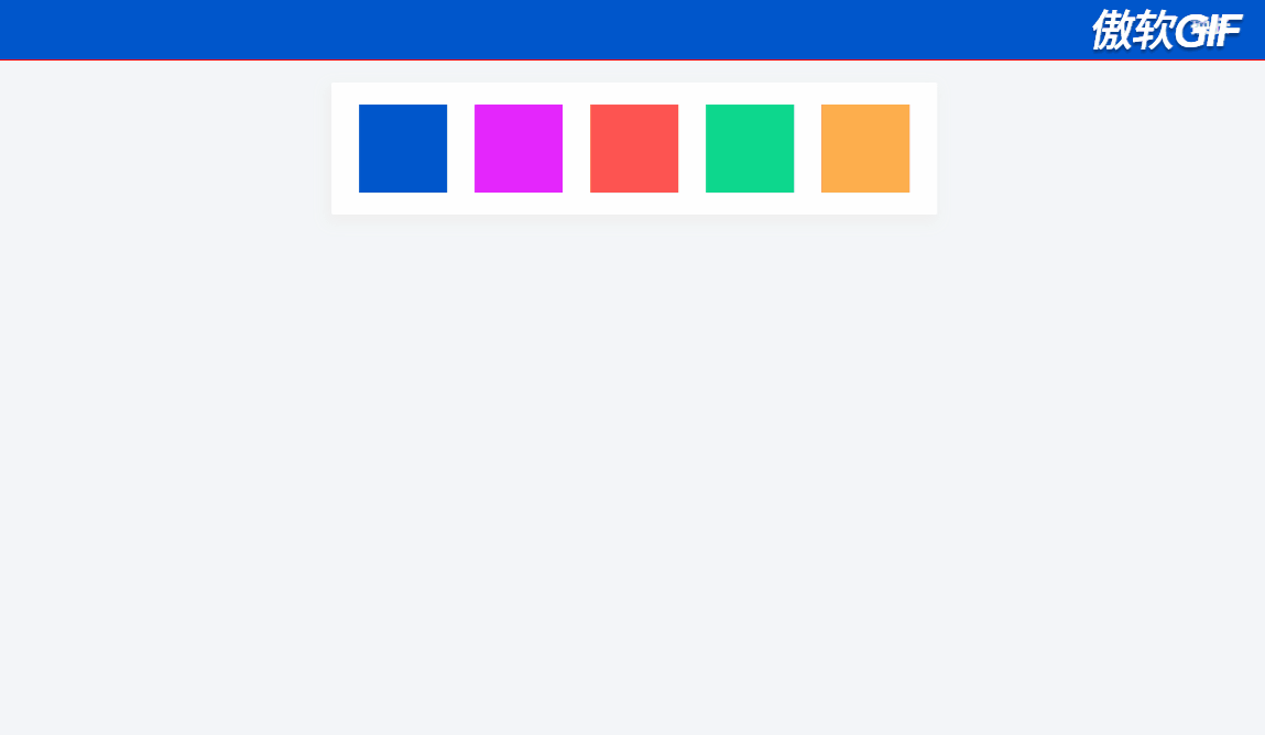
复制代码效果如下
最后
以上就是目前了解到一些的换肤方案,以上全部基于 css 去实现的,不过知道了原理就可以结合 less 和 sass 进行更好的实现。如果有更好的方案,欢迎贴在评论区进行分享!!!
最后
感谢阅读,欢迎分享给身边的朋友,
记得关注噢,黑叔带你飞!
亲,点这涨工资