文章目录
- 一、居中
- 二、水平居中
- 1. 行内元素水平居中
- 2. 块级元素水平居中
- 2.1 使用margin: 0 auto
- 2.2 使用position
- 2.3 使用flex
- 三、垂直居中
- 1. 行内元素
- 1.1 单行行内元素垂直居中
- 1.2 多行行内元素垂直居中
- 2. 块级元素
- 2.1 使用position
- 2.2 使用flex
一、居中
行内元素:
- 水平居中:text-align:center
- 垂直居中:单行——行高等于盒子高度
- 垂直居中:多行——display:table-cell、vertical-align: middle
块级元素:
- 水平居中:margin:0 auto、absolute+left50%+margin-left/translateX(-50%)、
flex+ justify-content: center- 垂直居中:absolute+top50%+margin-top/translateY(-50%)、
flex+ align-items: center
水平垂直居中:同时使用水平居中和垂直居中
二、水平居中
1. 行内元素水平居中
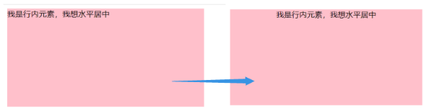
行内元素水平居中:text-align:center
<style>.father {width: 400px;height: 200px;background-color: pink;/* 主要代码:text-align: center; */text-align: center;}.son {}
</style><body><div class="father"><span class="son">我是行内元素,我想水平居中</span></div>
</body>
2. 块级元素水平居中
2.1 使用margin: 0 auto
<head><style>.father {width: 400px;height: 200px;background-color: pink;}.son {width: 200px;height: 100px;background-color: skyblue;margin: 0 auto;}</style>
</head>
<body><div class="father"><div class="son">我是块级元素,我想水平居中。</div></div>
</body>

2.2 使用position
<head><style>.father {width: 400px;height: 200px;background-color: pink;position: relative;}.son {width: 200px;height: 100px;background-color: skyblue;position: absolute;left: 50%;/* 如果元素没有设置宽度,不能使用margin-left,可以使用transform: translateX(-50%); 效果相同*/margin-left: -100px;}</style>
</head>
<body><div class="father"><div class="son">我是块级元素,我想水平居中。</div></div>
</body>
</html>

2.3 使用flex
<head><style>.father {width: 400px;height: 200px;background-color: pink;display: flex;justify-content: center;}.son {width: 200px;height: 100px;background-color: skyblue;}</style>
</head>
<body><div class="father"><div class="son">我是块级元素,我想水平居中。</div></div>
</body>
</html>
三、垂直居中
1. 行内元素
1.1 单行行内元素垂直居中
单行行内元素垂直居中:行高等于盒子高度
<head><style>.father {width: 400px;height: 200px;/* 行高等于盒子高度:line-height: 200px; */line-height: 200px;background-color: pink;}.son {}</style>
</head>
<body><div class="father"><span class="son">我是行内元素,我想垂直居中</span></div>
</body>

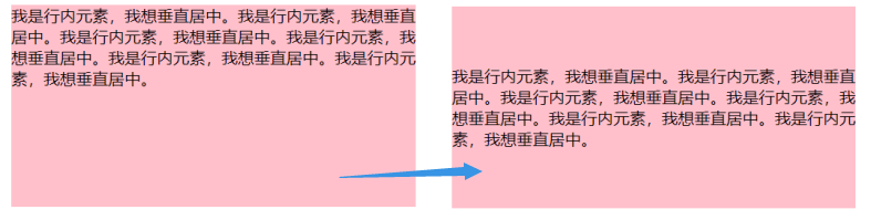
1.2 多行行内元素垂直居中
多行行内元素垂直居中:display:table-cell、vertical-align: middle
单行行内元素垂直居中方式不适合多行文本,会变成下图:
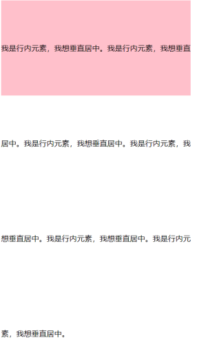
<head><style>.father {width: 400px;height: 200px;/* 主要代码:display: table-cell; vertical-align: middle;*/display: table-cell;background-color: pink;vertical-align: middle;}.son {}</style>
</head>
<body><div class="father"><span class="son">我是行内元素,我想垂直居中。我是行内元素,我想垂直居中。我是行内元素,我想垂直居中。我是行内元素,我想垂直居中。我是行内元素,我想垂直居中。我是行内元素,我想垂直居中。</span></div>
</body>
2. 块级元素
2.1 使用position
<head><style>.father {width: 400px;height: 200px;background-color: pink;position: relative;}.son {width: 200px;height: 100px;background-color: skyblue;position: absolute;top: 50%;/* 如果元素没有设置高度,不能使用margin-top,可以使用transform: translateY(-50%); 效果相同*/margin-top: -50px;}</style>
</head>
<body><div class="father"><div class="son">我是块级元素,我想垂直居中。</div></div>
</body>
</html>

2.2 使用flex
<head><style>.father {width: 400px;height: 200px;background-color: pink;display: flex;align-items: center;}.son {width: 200px;height: 100px;background-color: skyblue;}</style>
</head>
<body><div class="father"><div class="son">我是块级元素,我想垂直居中。</div></div>
</body>
</html>