本文主要是讲述照片(img)的水平居中和垂直居中,但是其他元素的水平居中和垂直居中也可借鉴此文。
水平居中:
1.将img元素设置成块级元素
img {display: block;margin: 0 auto;}2.flex布局
.box1 {width: 100px;height: 100px;background-color: aquamarine;display: flex;justify-content: center;}3.父元素设置text-align:center
.box1 {width: 100px;height: 100px;background-color: aquamarine;text-align: center;}4.定位
img {width: 50px;height: 50px;position: relative;left: 50%;transform: translateX(-50%);}垂直居中:
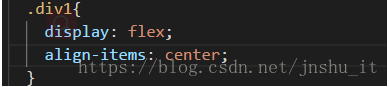
1.flex布局
.box1 {width: 100px;height: 100px;background-color: aquamarine;display: flex;align-items: center; /* 对单行弹性盒子模型使用可以使用 *//* align-content: center; 通常使用该属性设置垂直居中,但是该属性对单行弹性盒子模型无效。(即:带有 flex-wrap: nowrap ,或者盒子中本来就只有一个元素)。*/}tip:CSS align-items属性将所有直接子节点上的align-self值设置为一个组。align-self属性设置项目在其包含块中在交叉轴方向上的对齐方式。
2.display:table-cell
.box1 {width: 100px;height: 100px;background-color: aquamarine;display: table-cell;vertical-align: middle;}3.定位
img {width: 50px;height: 50px;position: relative;top: 50%;transform: translateY(-50%);}tip:通过设置line-height等于父元素高度可以使单行文字实现垂直居中。
代码样例(example):
CSS:
.container {width: 400px;height: 800px;background-color: aliceblue;display: flex;justify-content: center;align-items: center;margin: 0 auto;}.box1 {width: 200px;height: 200px;background-color: aquamarine;/* display: flex;align-items: center; *//* 对单行弹性盒子模型使用可以使用 *//* align-content: center; 通常使用该属性设置垂直居中,但是该属性对单行弹性盒子模型无效。(即:带有 flex-wrap: nowrap)。*/}.box1 img {width: 100px;height: 100px;position: relative;top: 50%;left: 50%;transform: translate(-50%, -50%);/* display: block;margin: 0,auto; */}