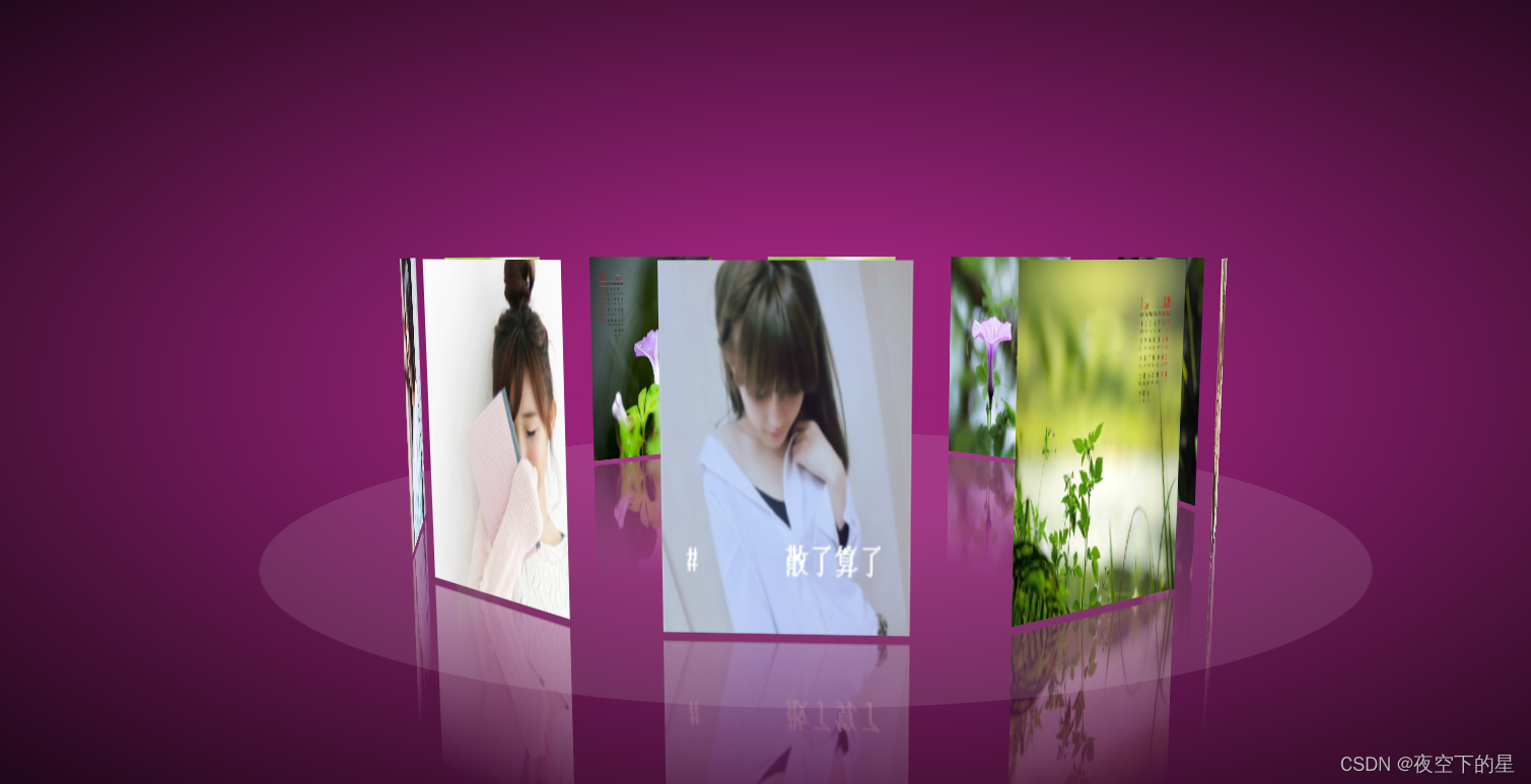
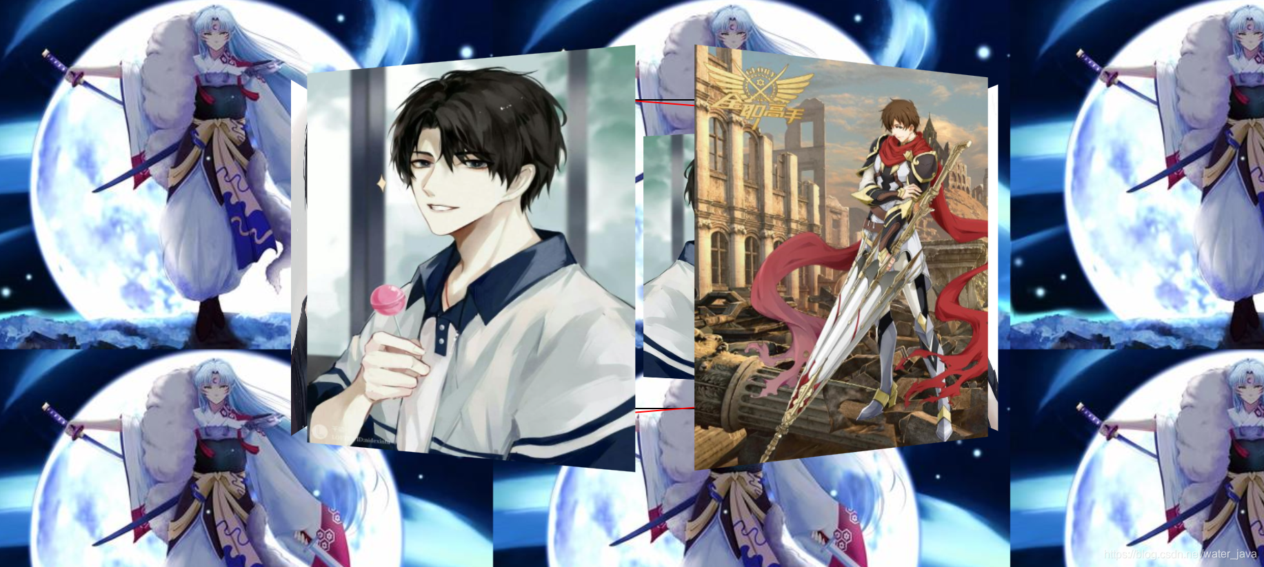
前端CSS3实现3D相册小案例
HTML代码部分:
<!DOCTYPE html>
<html lang="en">
<head>
<meta charset="UTF-8">
<title>3D相册</title>
<link type="text/css" href="css/style.css" rel="stylesheet" />
<link href="css/index.css" rel="stylesheet" type="text/css">
</head> <body>
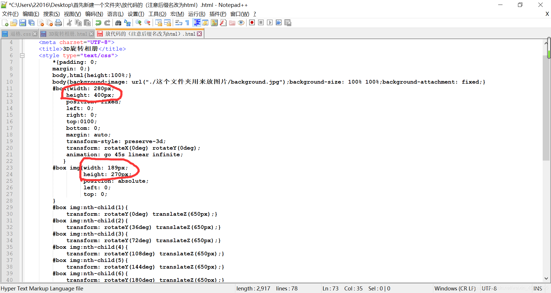
<div class="box">
<ul class="minbox">
<li><img src="3D相册图片/01.jpg" width="100" height="100"></li>
<li><img src="3D相册图片/02.jpg" width="100" height="100"></li>
<li><img src="3D相册图片/03.jpg" width="100" height="100"></li>
<li><img src="3D相册图片/04.jpg" width="100" height="100"></li>
<li><img src="3D相册图片/05.jpg" width="100" height="100"></li>
<li><img src="3D相册图片/06.jpg" width="100" height="100"></li>
</ul>
<ol class="maxbox">
<li><img src="3D相册图片/1.jpg" width="400" height="400"></li>
<li><img src="3D相册图片/2.jpg" width="400" height="400"></li>
<li><img src="3D相册图片/3.jpg" width="400" height="400"></li>
<li><img src="3D相册图片/4.jpg" width="400" height="400"></li>
<li><img src="3D相册图片/5.jpg" width="400" height="400"></li>
<li><img src="3D相册图片/6.jpg" width="400" height="400"></li>
</ol>
</div>
</body>
</html> CSS部分代码:
@charset "utf-8";
*{margin:0;padding:0;
}
body{max-width: 100%;min-width: 100%;height: 100%;background-size: cover;background-repeat: no-repeat;background-attachment: fixed;background-size:100% 100%;position: absolute;margin-left: auto;margin-right: auto;
}
li{list-style: none;
}
.box{width:200px;height:200px;background-size: cover;background-repeat: no-repeat;background-attachment: fixed;background-size:100% 100%;position: absolute;margin-left: 42%;margin-top: 22%;-webkit-transform-style:preserve-3d;-webkit-transform:rotateX(13deg);-webkit-animation:move 5s linear infinite;
}
.minbox{width:100px;height:100px;position: absolute;left:50px;top:30px;-webkit-transform-style:preserve-3d;
}
.minbox li{width:100px;height:100px;position: absolute;left:0;top:0;
}
.minbox li:nth-child(1){background: url(../img/01.png) no-repeat 0 0;-webkit-transform:translateZ(50px);
}
.minbox li:nth-child(2){background: url(../img/02.png) no-repeat 0 0;-webkit-transform:rotateX(180deg) translateZ(50px);
}
.minbox li:nth-child(3){background: url(../img/03.png) no-repeat 0 0;-webkit-transform:rotateX(-90deg) translateZ(50px);
}
.minbox li:nth-child(4){background: url(../img/04.png) no-repeat 0 0;-webkit-transform:rotateX(90deg) translateZ(50px);
}
.minbox li:nth-child(5){background: url(../img/05.png) no-repeat 0 0;-webkit-transform:rotateY(-90deg) translateZ(50px);
}
.minbox li:nth-child(6){background: url(../img/06.png) no-repeat 0 0;-webkit-transform:rotateY(90deg) translateZ(50px);
}
.maxbox li:nth-child(1){background: url(../img/1.png) no-repeat 0 0;-webkit-transform:translateZ(50px);
}
.maxbox li:nth-child(2){background: url(../img/2.png) no-repeat 0 0;-webkit-transform:translateZ(50px);
}
.maxbox li:nth-child(3){background: url(../img/3.png) no-repeat 0 0;-webkit-transform:rotateX(-90deg) translateZ(50px);
}
.maxbox li:nth-child(4){background: url(../img/4.png) no-repeat 0 0;-webkit-transform:rotateX(90deg) translateZ(50px);
}
.maxbox li:nth-child(5){background: url(../img/5.png) no-repeat 0 0;-webkit-transform:rotateY(-90deg) translateZ(50px);
}
.maxbox li:nth-child(6){background: url(../img/6.png) no-repeat 0 0;-webkit-transform:rotateY(90deg) translateZ(50px);
}
.maxbox{width: 800px;height: 400px;position: absolute;left: 0;top: -20px;-webkit-transform-style: preserve-3d;}
.maxbox li{width: 200px;height: 200px;background: #fff;border:1px solid #ccc;position: absolute;left: 0;top: 0;opacity: 0.2;-webkit-transition:all 1s ease;
}
.maxbox li:nth-child(1){-webkit-transform:translateZ(100px);
}
.maxbox li:nth-child(2){-webkit-transform:rotateX(180deg) translateZ(100px);
}
.maxbox li:nth-child(3){-webkit-transform:rotateX(-90deg) translateZ(100px);
}
.maxbox li:nth-child(4){-webkit-transform:rotateX(90deg) translateZ(100px);
}
.maxbox li:nth-child(5){-webkit-transform:rotateY(-90deg) translateZ(100px);
}
.maxbox li:nth-child(6){-webkit-transform:rotateY(90deg) translateZ(100px);
}
.box:hover ol li:nth-child(1){-webkit-transform:translateZ(300px);width: 400px;height: 400px;opacity: 0.8;left: -100px;top: -100px;
}
.box:hover ol li:nth-child(2){-webkit-transform:rotateX(180deg) translateZ(300px);width: 400px;height: 400px;opacity: 0.8;left: -100px;top: -100px;
}
.box:hover ol li:nth-child(3){-webkit-transform:rotateX(-90deg) translateZ(300px);width: 400px;height: 400px;opacity: 0.8;left: -100px;top: -100px;
}
.box:hover ol li:nth-child(4){-webkit-transform:rotateX(90deg) translateZ(300px);width: 400px;height: 400px;opacity: 0.8;left: -100px;top: -100px;
}
.box:hover ol li:nth-child(5){-webkit-transform:rotateY(-90deg) translateZ(300px);width: 400px;height: 400px;opacity: 0.8;left: -100px;top: -100px;
}
.box:hover ol li:nth-child(6){-webkit-transform:rotateY(90deg) translateZ(300px);width: 400px;height: 400px;opacity: 0.8;left: -100px;top: -100px;
}
@keyframes move{0%{-webkit-transform: rotateX(13deg) rotateY(0deg);}100%{-webkit-transform:rotateX(13deg) rotateY(360deg);}
}