今天,我给大家分享一个3D相册的代码
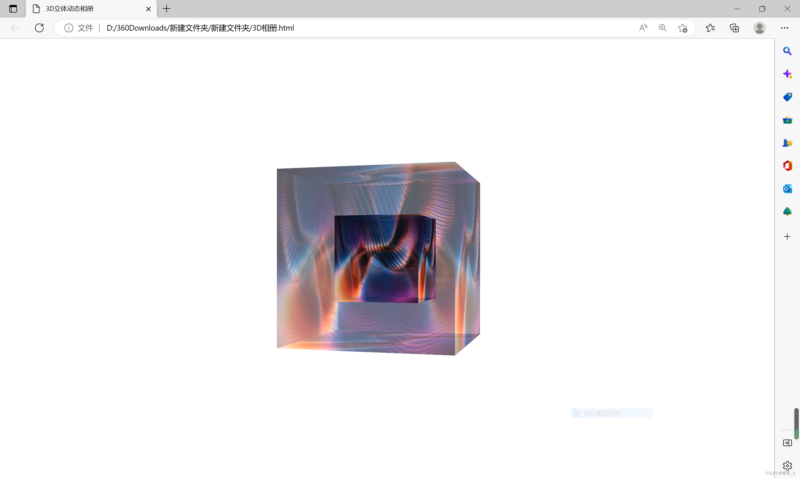
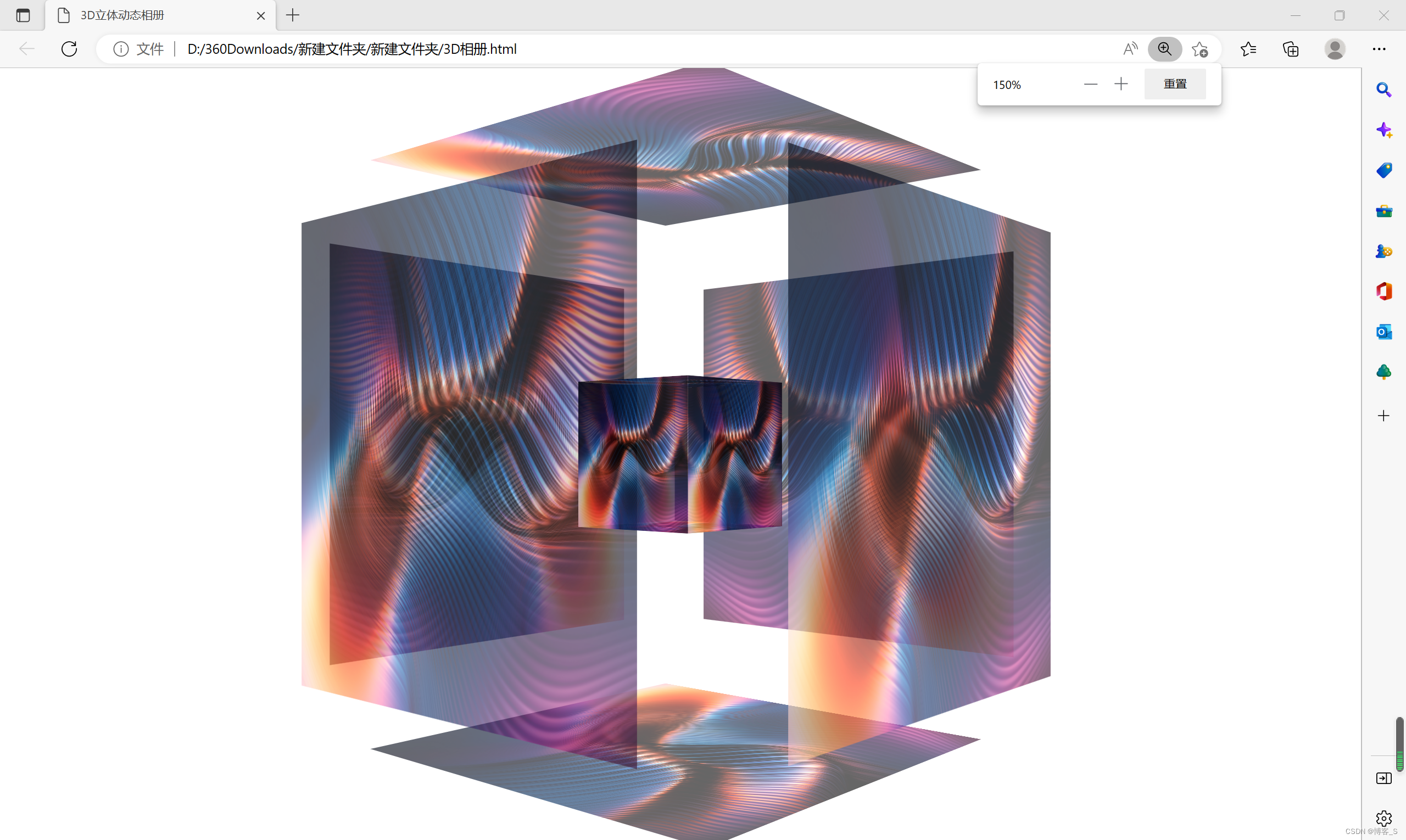
废话不说先上效果图:
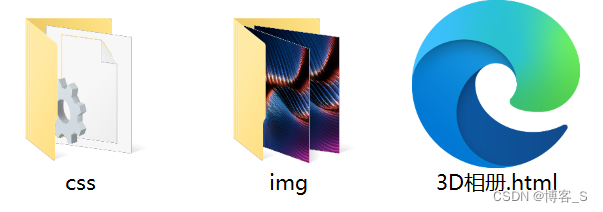
先新建两个文件夹,一个叫css,另一个叫img,如下图:
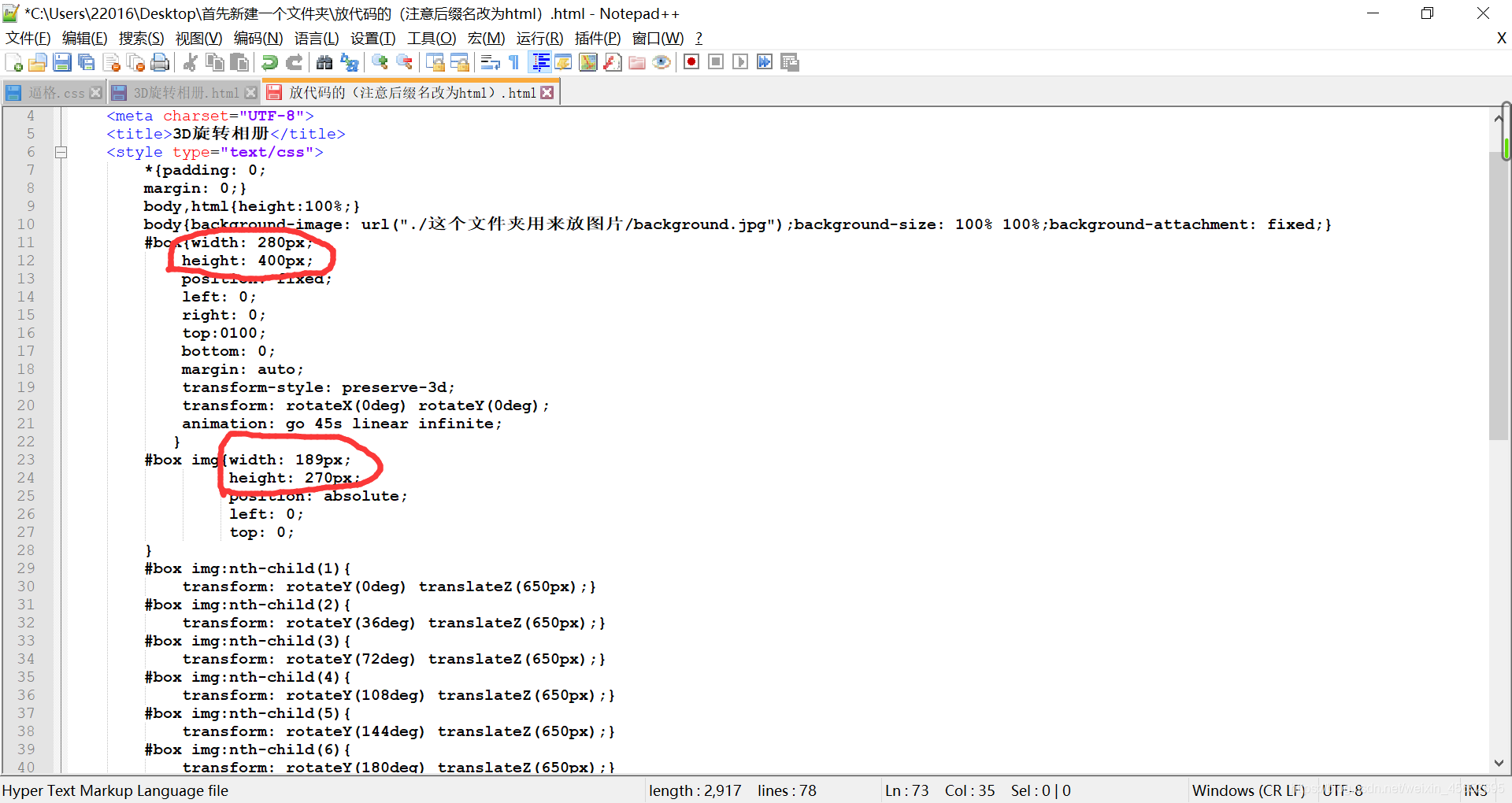
先新建一个文本文档,输入下面的代码:
<!DOCTYPE html>
<html><head><meta charset="utf-8"><title>3D立体动态相册</title><link rel="stylesheet" type="text/css" href="css/css.css"/></head><body><div id="cube"><!--外层盒子--><ul><li><img src="img/1.jpg" ></li><li><img src="img/2.jpg" ></li><li><img src="img/3.jpg" ></li><li><img src="img/4.jpg" ></li><li><img src="img/5.jpg" ></li><li><img src="img/6.jpg" ></li></ul><!--内层盒子--><ol><li><img src="img/7.jpg" ></li><li><img src="img/8.jpg" ></li><li><img src="img/9.jpg" ></li><li><img src="img/10.jpg" ></li><li><img src="img/11.jpg" ></li><li><img src="img/12.jpg" ></li></ol></div></body>
</html>
然后保存关闭,将后缀名更改为HTML
再打开css文件夹,新建一个文本文档,输入以下代码:
/*默认样式*/
*{margin: 0;padding: 0;
}
ol,ul{list-style: none;}/*外层盒子*/
#cube{height: 200px;width: 200px;/* 将整个盒子至于中间 */position: absolute;left: 0;top: 0;bottom: 0;right: 0;margin: auto;/* 这是旋转基点 */transform-origin: -550px 550px 100;/* 设置景深 */perspective:800px; }#cube ul{width: 200px;height: 200px;transform-style: preserve-3d;animation: rotate1 5s linear infinite;
}
#cube ul img{width: 200px;height: 200px;
}
#cube ul li{width: 200px;height: 200px;position: absolute;/* 设置过渡时间 */transition: 2s;
}
#cube ul li:nth-child(1){left: 0;top: 0;opacity: .4;transform: translateZ(100px);}
#cube ul li:nth-child(2){left: 100px;top: 0;transform: rotateY(90deg);opacity: .4;}
#cube ul li:nth-child(3){left: -100px;top: 0;transform: rotateY(-90deg);opacity: .4;}
#cube ul li:nth-child(4){left: 0;top: 100px;transform: rotateX(-90deg);opacity:.4;}
#cube ul li:nth-child(5){left: 0;top: -100px;transform: rotateX(90deg);opacity: .4;}
#cube ul li:nth-child(6){left: 0;top: 0;transform: translateZ(-100px) rotateY(180deg);opacity: .4;} /* 内层盒子*/
#cube ol{width: 100px;height: 100px;position: absolute;left: 50px;top: 50px;/* 给内层盒子设置3d空间 */transform-style: preserve-3d;/* 设置动画 */animation: rotate1 5s linear infinite;
}
#cube ol img{width: 100px;height: 100px;
}
#cube ol li{width: 100px;height: 100px;position: absolute;
}
#cube ol li:nth-child(1){left: 0;top: 0;opacity: .7;transform: translateZ(50px);}
#cube ol li:nth-child(2){left: 100px;top: 0px;transform-origin: left;transform:translateZ(50px) rotateY(90deg);opacity: .7;}
#cube ol li:nth-child(3){left: -100px;top: 0px;transform-origin: right;transform:translateZ(50px) rotateY(-90deg);opacity: .7;}
#cube ol li:nth-child(4){left:0px;top: 100px;transform-origin: top;transform:translateZ(50px) rotateX(-90deg);opacity: .7;}
#cube ol li:nth-child(5){left:0px;top: -100px;transform-origin: bottom;transform:translateZ(50px) rotateX(90deg);opacity: .7;}
#cube ol li:nth-child(6){left:0px;top: 0px;transform: translateZ(-50px) rotateY(180deg);opacity: .7;}/*外层盒子鼠标移入效果*/
#cube:hover ul li:nth-child(1){transform: translateZ(200px) scale(1.5);opacity: .6;}
#cube:hover ul li:nth-child(2){transform:rotateY(90deg) translateZ(100px) scale(1.5);opacity: .6;}
#cube:hover ul li:nth-child(3){transform:rotateY(-90deg) translateZ(100px) scale(1.5);opacity: .6;}
#cube:hover ul li:nth-child(4){transform:rotateX(-90deg) translateZ(100px) scale(1.5);opacity: .6;}
#cube:hover ul li:nth-child(5){transform:rotateX(90deg) translateZ(100px) scale(1.5);opacity: .6;}
#cube:hover ul li:nth-child(6){transform:rotateY(180deg) translateZ(200px) scale(1.5);opacity: .6;}
/*旋转动画效果*/
@keyframes rotate1{0%{transform: rotateY(0);}100%{transform: rotateY(360deg);}
}
然后保存关闭,将后缀名更改为css
再打开img文件夹,将图片发在里面,重命名(名字必须与下图一样,否则无法显示图片),如下图:

最后运行那个后缀名为HTML的文件就可以了
我会不定期更新,喜欢的话就关注