情景一:单行文字垂直居中
1、line-height
原理是在于将单行文字的行高设定后,文字会位于行高的垂直中间位置

<div class="text-con">单行文字垂直居中</div><style>.text-con {width: 200px;height: 60px;line-height: 60px;color: #fff;background: #000;text-align: center;}</style>
情景二:多行文字垂直居中
1、absolute + margin负值
定位设置top:50%来抓取空间高度的50%,然后将居中元素的margin-top设置为负一半的高度

<h3>absolute + margin负值</h3><div class="box"><div class="content">absolute + margin负值多行文本垂直居中<a>absolute + margin负值多行文本垂直居中</a>absolute + margin负值多行文本垂直居中</div></div><style>.box {width: 500px;height: 200px;border: 1px #000 solid;position: relative;}.content {width: 400px;background: #ccc;height: 70px;position: absolute;top: 50%;left: 50%;margin-left: -200px;margin-top: -35px;}</style>
2、absolute + margin auto
当元素设置为绝对定位后,假设它是抓取不到整体可运用的空间范围,所以margin:auto会失效,但是当你设置了top:0;bottom:0;时,绝对定位元素就抓到了可运用的空间了,这是你的margin:auto;就生效了。此方法的缺点是定位元素必须有固定的宽高(百分比也可)才能正常居中

<h3>absolute + margin auto</h3><div class="box"><div class="content">absolute + margin auto 多行文本垂直居中<a>absolute + margin auto 多行文本垂直居中</a>absolute + margin auto 多行文本垂直居中</div></div><style>.box {width: 500px;height: 200px;border: 1px #000 solid;position: relative;}.content {width: 400px;height: 70px;background: #ccc;position: absolute;top: 0;right: 0;bottom: 0;left: 0;margin: auto;}</style>
3、absolute + translate
此居中的定位元素不需要固定的宽高,我们利用绝对定位的top和left设置元素跟上方和左方各为50%,再利用translate(-50%, -50%)位移居中元素自身的宽和高的50%来达到居中;不设置宽高时会自动充满
<h3>absolute + translate</h3><div class="box"><div class="content">absolute + translate 多行文本垂直居中<a>absolute + translate 多行文本垂直居中</a>absolute + translate 多行文本垂直居中</div></div><style>.box {width: 500px;height: 200px;border: 1px #000 solid;position: relative;}.content {background: #ccc;position: absolute;top: 50%;left: 50%;transform: translate(-50%, -50%);}</style>
4、flex + align-items
只要设定父层display:flex以及设定次轴属性align-items:center就好了,有点事不需要设置高度就可以自动居中,代码简单

<h3>flex + align-items</h3><div class="box"><div class="content">flex + align-items 多行文本垂直居中<a>flex + align-items 多行文本垂直居中</a>flex + align-items 多行文本垂直居中</div></div><style>.box {width: 500px;height: 200px;border: 1px #000 solid;display: flex;justify-content: center;align-items: center;}.content {width: 400px;background: #ccc;}</style>
5、flex + auto
父层元素设置display:flex,里层元素设置margin:auto就可实现垂直居中

<h3>flex + margin:auto</h3><div class="box"><div class="content">flex + margin:auto 多行文本垂直居中<a>flex + margin:auto 多行文本垂直居中</a>flex + margin:auto 多行文本垂直居中</div></div><style>.box {width: 500px;height: 200px;border: 1px #000 solid;display: flex;}.content {width: 400px;background: #ccc;margin: auto;}</style>
6、grid + template
把模板设置成三列,就能搞定垂直居中了

<h3>grid + template</h3><div class="box"><div class="content">grid + template 多行文本垂直居中<a>grid + template 多行文本垂直居中</a>grid + template 多行文本垂直居中</div></div><style>.box {width: 500px;height: 200px;border: 1px #000 solid;display: grid;grid-template-rows: 1fr auto 1fr;grid-template-columns: 1fr auto 1fr;grid-template-areas:'. . .''. amos .''. . .';}.content {width: 400px;background: #ccc;grid-area: amos;}</style>
7、grid + align-items
在flex中align-items是针对次轴cross axis作对齐,而grid中是针对Y轴作对齐,可以把它想象成表格中存储单元的vertical-align属性来看

<h3>grid + align-items</h3><div class="box"><div class="content">grid + align-items 多行文本垂直居中<a>grid + align-items 多行文本垂直居中</a>grid + align-items 多行文本垂直居中</div></div><style>.box {width: 500px;height: 200px;border: 1px #000 solid;display: grid;justify-content: center;align-items: center;}.content {width: 400px;background: #ccc;}</style>
8、grid + align-content
grid中的align-content与flex中的有些差异,在flex中仅能针对多行元素起作用,但在grid中没有这个问题,可以用作对子元素做垂直居中

<h3>grid + align-content</h3><div class="box"><div class="content">grid + align-content 多行文本垂直居中<a>grid + align-content 多行文本垂直居中</a>grid + align-content 多行文本垂直居中</div></div><style>.box {width: 500px;height: 200px;border: 1px #000 solid;display: grid;justify-content: center;align-content: center;}.content {width: 400px;background: #ccc;}</style>
9、grid + align-self
align-self是对grid Y轴的个别对齐方式,只要对单一子元素设置为align-self: center就能达到垂直居中

<h3>grid + align-self</h3><div class="box"><div class="content">grid + align-self 多行文本垂直居中<a>grid + align-self 多行文本垂直居中</a>grid + align-self 多行文本垂直居中</div></div><style>.box {width: 500px;height: 200px;border: 1px #000 solid;display: grid;justify-content: center;}.content {width: 400px;background: #ccc;align-self: center;}</style>
10、grid + place-items
place-items是align-items与justify-items的缩写,简单说就是水平和居中的对齐方式

<h3>grid + place-items</h3><div class="box"><div class="content">grid + place-items 多行文本垂直居中<a>grid + place-items 多行文本垂直居中</a>grid + place-items 多行文本垂直居中</div></div><style>.box {width: 500px;height: 200px;border: 1px #000 solid;display: grid;place-items: center;}.content {width: 400px;background: #ccc;align-self: center;}</style>
11、grid + place-content
place-content是align-content与juestify-content的缩写

<h3>grid + place-content</h3><div class="box"><div class="content">grid + place-content 多行文本垂直居中<a>grid + place-content 多行文本垂直居中</a>grid + place-content 多行文本垂直居中</div></div><style>.box {width: 500px;height: 200px;border: 1px #000 solid;display: grid;place-content: center;}.content {width: 400px;background: #ccc;align-self: center;}</style>
12、grid + margin
由于grid元素对空间解读的特殊性,只要在父层元素设定display: grid,在需要垂直居中的元素上设置margin: auto即可自动居中,这点与flex+margin类似

<h3>grid + margin</h3><div class="box"><div class="content">grid + margin 多行文本垂直居中<a>grid + margin 多行文本垂直居中</a>grid + margin 多行文本垂直居中</div></div><style>.box {width: 500px;height: 200px;border: 1px #000 solid;display: grid;}.content {width: 400px;background: #ccc;margin: auto;}</style>13、display: table-cell
原理在于使用css的display属性将div设置成表格的单元格,这样就能利用支持存储单元格对齐的vertical-align属性来实现垂直居中。(不建议使用,自认为table是个不好控制的东东,看效果图就知道这种方式并不适合多行文本,emmm)

<h3>display: table-cell</h3><div class="box"><div class="content">display: table-cell 多行文本垂直居中<a>display: table-cell 多行文本垂直居中</a>display: table-cell 多行文本垂直居中</div></div><style>.box {width: 500px;height: 200px;border: 1px #000 solid;display: table-cell;text-align: center;vertical-align: middle;}.content {width: 400px;background: #ccc;margin: auto;}</style>
14、calc
calc是计算机英文单词calculator的缩写,利用calc()方法可以将百分比及时且动态的计算出实际需要什么高度,但是大量使用会影响网页性能

<h3>calc</h3><div class="box"><div class="content">calc 多行文本垂直居中<a>calc 多行文本垂直居中</a>calc 多行文本垂直居中</div></div><style>.box {width: 500px;height: 200px;border: 1px #000 solid;}.content {width: 400px;background: #ccc;position: relative;top: calc((100% - 70px) / 2);margin: auto;}</style>
15、relative + translateY
这个方法是利用了top: 50%,让元素上放产生固定百分比的距离,接着让要居中的元素本身使用translateY的百分比来达成垂直居中的需求,犹豫translate的百分比单位是利用元素自身的尺寸作为100%,这样让我们要利用元素自身宽高做事变得很方便

<h3>relative + translateY</h3><div class="box"><div class="content">relative + translateY 多行文本垂直居中<a>relative + translateY 多行文本垂直居中</a>relative + translateY 多行文本垂直居中</div></div><style>.box {width: 500px;height: 200px;border: 1px #000 solid;}.content {width: 400px;background: #ccc;position: relative;top: 50%;transform: translateY(-50%);margin: auto;}</style>
情景三:多对象的垂直居中
1、line-height + inline-block
将多个元素或多行元素当成一个来看待,所以要讲这些数据多包一层,并将其设定为inline-block,并在该inline-block对象的外层对象使用line-height来代替height的设置,

<h3>line-height + inline-block</h3><div class="box"><div class="content"><div>这是第一个元素</div><p>这是第二个元素</p><a>这是第三个元素</a></div></div><style>.box {width: 500px;border: 1px #000 solid;line-height: 200px;text-align: center;}.content {width: 400px;background: #ccc;display: inline-block;height: auto;line-height: 1;}</style>
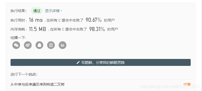


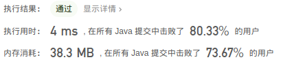
![验证二叉树的前序序列化[抽象前序遍历]](https://img-blog.csdnimg.cn/60781e71a8f34d8f86aefa8e2b77671d.png)