前言
前端开发中元素居中是最常见和最经常使用到的css技巧,不仅开发中经常会用到,面试官出题考核基础时有时候也会问道这类问题。本文主要介绍10种垂直居中的方法。希望对你我都有帮组。
1、line-height+height实现
如果子元素是行内文本元素的话,只要设置父元素的height和line-height高度一样就可以垂直居中。
HTML
<div class="parent"><span class="child">我是行内元素</span>
</div>
CSS
.parent {height: 200px;width: 200px;line-height: 200px;background:  #fcc;
}
.child {background: #f66;
}
效果图:
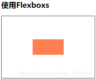
2、flex+align-items实现
flex布局可以实现一行或多行元素垂直居中,使用align-items:center就可以。
HTML
<div class="parent"><div class="child">flex实现居中</div>
</div>
CSS
.parent {height: 200px;width: 200px;display: flex;align-items: center;background:  #fcc;
}
.child {background: #f66;width: 180px;
}
效果图:
3、table-cell+vertical-align实现
利用表布局的vertical-align: middle属性可以实现子元素的垂直居中。
HTML
<div class="parent"><div class="child">使用表格垂直居中</div>
</div>
CSS
.parent {height: 200px;width: 200px;display: table;
}
.child {background: #f66;vertical-align: middle;display: table-cell;
}
效果图:
4、absolute+负margin(已知高度宽度)
通过绝对定位元素距离顶部50%,并设置margin-top向上偏移元素高度的一半,就可以实现居中。
HTML
<div class="parent"><div class="child">absolute+负margin</div>
</div>
CSS
.parent {height: 200px;width: 200px;position: relative;background: #fcc;
}
.child {background: #f66;height: 50px;position: absolute;top: 50%;margin-top: -25px;width: 180px;
}
效果图:
5、absolute+transform(已知高度宽度)
当垂直居中的元素的高度和宽度未知时,可以借助CSS3中的transform属性向Y轴反向偏移50%的方法实现垂直居中。但存在兼容性问题。
HTML
<div class="parent"><div class="child">absolute+transform</div>
</div>
CSS
.parent {height: 200px;width: 200px;position: relative;background: #fcc;
}
.child {background: #f66;position: absolute;top: 50%;transform: translateY(-50%);width: 180px;
}
效果图:
6、absolute + calc实现
这种方式也要求居中元素的宽高必须固定,使用css3的ca’lc计算属性,top的百分比是基于元素的左上角,那么用top百分比在减去宽度的一半就可以垂直居中。
HTML
<div class="parent"><div class="child">absolute + calc</div>
</div>
CSS
.parent {height: 200px;width: 200px;position: relative;background: #fcc;
}
.child {background: #f66;height: 50px;width: 180px;position: absolute;top: calc(50% - 25px);width: 180px;
}
效果图:
7、absolute+margin: auto实现
通过绝对定位,然后设置top:0、bottom:0、margin:auto实现居中。
HTML
<div class="parent"><div class="child">absolute + margin: auto</div>
</div>
CSS
.parent {height: 200px;width: 200px;position: relative;background: #fcc;
}
.child {background: #f66;height: 50px;width: 180px;position: absolute;top: 0;margin: auto;bottom: 0;
}
效果图:
8、padding实现
通过设置父元素padding来实现。
HTML
<div class="parent"><div class="child">padding实现</div>
</div>
CSS
.parent {width: 200px;padding: 80px 0;background: #fcc;
}
.child {background: #f66;height: 80px;width: 180px;line-height: 80px;
}
效果图:
9、flex+flex-direction实现
这种方式也是首先给父元素设置 display:flex ,然后改变主轴的方向 flex-direction: column,最后通过justify-content:center实现垂直居中。
HTML
<div class="parent"><div class="child">flex+flex-direction实现</div>
</div>
CSS
.parent {width: 200px;height: 200px;display: flex;flex-direction: column;justify-content: center;background: #fcc;
}
.child {background: #f66;height: 80px;width: 180px;line-height: 80px;
}
效果图:
10、Grid实现
HTML
<div class="parent"><div class="child1"></div><div class="child">Grid实现</div><div class="child1"></div>
</div>
CSS
.parent {width: 200px;height: 200px;display: grid;background: #fcc;
}
.child {background: #f66;
}
.child1 {background: #fcc;
}
效果图:
最后
如果喜欢的话,欢迎收藏关注。
更多优质文章可以访问GitHub博客,欢迎帅哥美女前来Star!!!
参考文章
- 如何居中一个元素(终结版)
- CSS垂直居中的12种实现方式


![验证二叉树的前序序列化[抽象前序遍历]](https://img-blog.csdnimg.cn/60781e71a8f34d8f86aefa8e2b77671d.png)