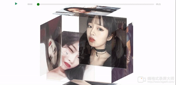
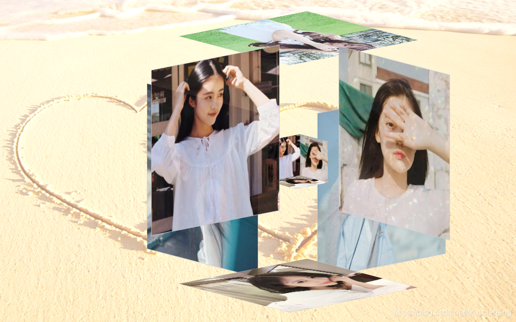
这几天无聊,看到有博主弄的电子相册有点意思,就照葫芦画瓢也实现了一个,一个半透明的正方体包含着一个小正方体,相册自动旋转,当获得焦点时变化效果,截图如下:

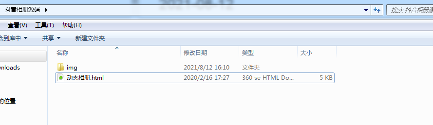
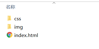
一,代码目录结构
二,html代码
<!DOCTYPE html>
<html lang="en">
<head>
<meta charset="UTF-8">
<title>3D立体相册</title>
<link type="text/css" href="css/style.css" rel="stylesheet" />
</head>
<body>
<div class="box"><ul class="minbox"><!-- 内层 --><li></li><li></li><li></li><li></li><li></li><li></li></ul><ol class="maxbox"><!-- 外层 --><li></li><li></li><li></li><li></li><li></li><li></li></ol>
</div>
</body>
</html>
三,css代码,图片自适应,无需调整图片大小
@charset "utf-8";
*{margin:0;padding:0;
}
body{max-width: 100%;min-width: 100%;height: 100%;background-size: cover;background-repeat: no-repeat;background-attachment: fixed;background-size:100% 100%;position: absolute;margin-left: auto;margin-right: auto;background: url(../img/bj1.png) no-repeat 0 0;
}
li{list-style: none;
}
.box{width:200px;height:200px;background-size: cover;background-repeat: no-repeat;background-attachment: fixed;background-size:100% 100%;position: absolute;margin-left: 42%;margin-top: 22%;-webkit-transform-style:preserve-3d;-webkit-transform:rotateX(13deg);-webkit-animation:move 10s linear infinite;/* 旋转速度,时间越短速度越快 */
}
.minbox{width:100px;height:100px;position: absolute;left:50px;top:30px;-webkit-transform-style:preserve-3d;
}
.minbox li{width:100px;height:100px;position: absolute;left:0;top:0;
}
.minbox li:nth-child(1){background: url(../img/01.jpg) no-repeat 0 0;background-size:100px 100px;-webkit-transform:translateZ(50px);
}
.minbox li:nth-child(2){background: url(../img/02.jpg) no-repeat 0 0;background-size:100px 100px;-webkit-transform:rotateX(180deg) translateZ(50px);
}
.minbox li:nth-child(3){background: url(../img/03.jpg) no-repeat 0 0;background-size:100px 100px;-webkit-transform:rotateX(-90deg) translateZ(50px);
}
.minbox li:nth-child(4){background: url(../img/04.jpg) no-repeat 0 0;background-size:100px 100px; -webkit-transform:rotateX(90deg) translateZ(50px);
}
.minbox li:nth-child(5){background: url(../img/05.jpg) no-repeat 0 0;background-size:100px 100px; -webkit-transform:rotateY(-90deg) translateZ(50px);
}
.minbox li:nth-child(6){background: url(../img/06.jpg) no-repeat 0 0;background-size:100px 100px; -webkit-transform:rotateY(90deg) translateZ(50px);
}
.maxbox li:nth-child(1){background: url(../img/01.jpg) no-repeat 0 0;background-size:400px 400px; -webkit-transform:translateZ(50px);
}
.maxbox li:nth-child(2){background: url(../img/02.jpg) no-repeat 0 0;background-size:400px 400px; -webkit-transform:rotateX(180deg) translateZ(50px);
}
.maxbox li:nth-child(3){background: url(../img/03.jpg) no-repeat 0 0;background-size:400px 400px; -webkit-transform:rotateX(-90deg) translateZ(50px);
}
.maxbox li:nth-child(4){background: url(../img/04.jpg) no-repeat 0 0;background-size:400px 400px; -webkit-transform:rotateX(90deg) translateZ(50px);
}
.maxbox li:nth-child(5){background: url(../img/05.jpg) no-repeat 0 0;background-size:400px 400px; -webkit-transform:rotateY(-90deg) translateZ(50px);
}
.maxbox li:nth-child(6){background: url(../img/06.jpg) no-repeat 0 0;background-size:400px 400px; -webkit-transform:rotateY(90deg) translateZ(50px);
}
.maxbox{width: 800px;height: 400px;position: absolute;left: 0;top: -20px;-webkit-transform-style: preserve-3d;}
.maxbox li{width: 200px;height: 200px;background: #fff;border:1px solid #ccc;position: absolute;left: 0;top: 0;opacity: 0.2;-webkit-transition:all 1s ease;
}
.maxbox li:nth-child(1){-webkit-transform:translateZ(100px);
}
.maxbox li:nth-child(2){-webkit-transform:rotateX(180deg) translateZ(100px);
}
.maxbox li:nth-child(3){-webkit-transform:rotateX(-90deg) translateZ(100px);
}
.maxbox li:nth-child(4){-webkit-transform:rotateX(90deg) translateZ(100px);
}
.maxbox li:nth-child(5){-webkit-transform:rotateY(-90deg) translateZ(100px);
}
.maxbox li:nth-child(6){-webkit-transform:rotateY(90deg) translateZ(100px);
}
.box:hover ol li:nth-child(1){-webkit-transform:translateZ(300px);width: 400px;height: 400px;opacity: 0.9;left: -100px;top: -100px;
}
.box:hover ol li:nth-child(2){-webkit-transform:rotateX(180deg) translateZ(300px);width: 400px;height: 400px;opacity: 0.9;left: -100px;top: -100px;
}
.box:hover ol li:nth-child(3){-webkit-transform:rotateX(-90deg) translateZ(300px);width: 400px;height: 400px;opacity: 0.9;left: -100px;top: -100px;
}
.box:hover ol li:nth-child(4){-webkit-transform:rotateX(90deg) translateZ(300px);width: 400px;height: 400px;opacity: 0.9;left: -100px;top: -100px;
}
.box:hover ol li:nth-child(5){-webkit-transform:rotateY(-90deg) translateZ(300px);width: 400px;height: 400px;opacity: 0.9;left: -100px;top: -100px;
}
.box:hover ol li:nth-child(6){-webkit-transform:rotateY(90deg) translateZ(300px);width: 400px;height: 400px;opacity: 0.9;left: -100px;top: -100px;
}
@keyframes move{0%{-webkit-transform: rotateX(13deg) rotateY(0deg);}100%{-webkit-transform:rotateX(13deg) rotateY(360deg);}
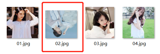
}页面上可能出现图片倒置的情况,我文件夹里面把图片旋转即可;
代码下载路径:https://gitee.com/zhaoHengCodes/html