带背景音乐网站效果:
http://www.fengzhao.icu/photos/html/%E6%8A%96%E9%9F%B3%E4%B8%8A%E5%BE%88%E7%81%AB%E7%9A%843D%E7%AB%8B%E4%BD%93%E5%8A%A8%E6%80%81%E7%9B%B8%E5%86%8C.html
如何创建网站:参考我的这篇文章
https://blog.csdn.net/allen_csdns/article/details/103487917
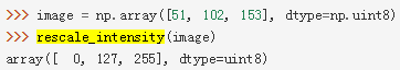
动态效果图
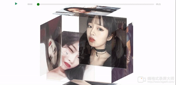
另外有需要带背景音乐的效果联系我
源码Demo:
一、新建一个index.html的文件,代码如下
<!DOCTYPE html>
<html lang="en">
<head>
<meta charset="utf-8">
<meta name="viewport" content="width=device-width, initial-scale=1.0, maximum-scale=1.0, user-scalable=0" />
<title>纯CSS实现鼠标经过3D立体动态展示图片特效代码</title>
<!-- <link type="text/css" href="../css/抖音上很火的3D立体动态相册.css" rel="stylesheet" /> -->
<style>
*{margin:0;padding:0;
}
body{max-width: 100%;min-width: 100%;height: 100%;background-size: cover;background-repeat: no-repeat;background-attachment: fixed;background-size:100% 100%;position: absolute;margin-left: auto;margin-right: auto;
}
li{list-style: none;
}
.box{width:200px;height:200px;background-size: cover;background-repeat: no-repeat;background-attachment: fixed;background-size:100% 100%;position: absolute;margin-left: 42%;margin-top: 22%;-webkit-transform-style:preserve-3d;-webkit-transform:rotateX(13deg);-webkit-animation:move 5s linear infinite;
}
.minbox{width:100px;height:100px;position: absolute;left:50px;top:30px;-webkit-transform-style:preserve-3d;
}
.minbox li{width:100px;height:100px;position: absolute;left:0;top:0;
}
.minbox li:nth-child(1){background: url(../img/01.png) no-repeat 0 0;-webkit-transform:translateZ(50px);
}
.minbox li:nth-child(2){background: url(../img/02.png) no-repeat 0 0;-webkit-transform:rotateX(180deg) translateZ(50px);
}
.minbox li:nth-child(3){background: ur