在工作中 经常会碰到让一个div框针对某个模块水平垂直居中 针对这种情况 有多种方法 现在一一实现一下
一. div绝对定位水平垂直居中 margin 负间距
代码:
.box {width: 200px;height: 200px;background: yellow;position: absolute;left: 50%;top: 50%;margin-left: -100px;margin-top: -100px;
}
效果如下:

二. div绝对定位水平垂直居中 transforms变形
代码:
.box {width: 200px;height: 200px;background: greenyellow;position: absolute;left: 50%;top: 50%;transform: translate(-50%,-50%);
}
效果如下:

三. 弹性盒模型 css不定宽高水平垂直居中
代码:
.par{display: flex;justify-content: center;align-items: center;height: 768px; // 去掉父元素高度时只能水平居中
}
.par .child{background: blueviolet;width: 200px;height: 200px;
}
效果如下:

四. table-cell 是不支持设置 width: 100%; 想让 .parent 和 其容器宽度一致最好设置一个 dispaly: table; 父容器
代码:
div.parent-box {display: table;width: 100%;
}div.parent {display: table-cell;height: 200px;width: 200px;background-color: orange;text-align: center;vertical-align: middle;
}div.child {display: inline-block;width: 100px;height: 100px;background-color: blue;
}
效果如下:

五. 绝对定位 calc()函数动态计算实现水平垂直居中
代码:
.par {position: relative;width: 500px;height: 500px;border: 1px solid saddlebrown;
}.child {position: absolute;width: 200px;height: 200px;left: -webkit-calc((500px - 200px)/2);top: -webkit-calc((500px - 200px)/2);left: -moz-calc((500px - 200px)/2);top: -moz-calc((500px - 200px)/2);left: calc((500px - 200px)/2);top: calc((500px - 200px)/2);background: gold;
}
需要注意父子元素
效果如下:

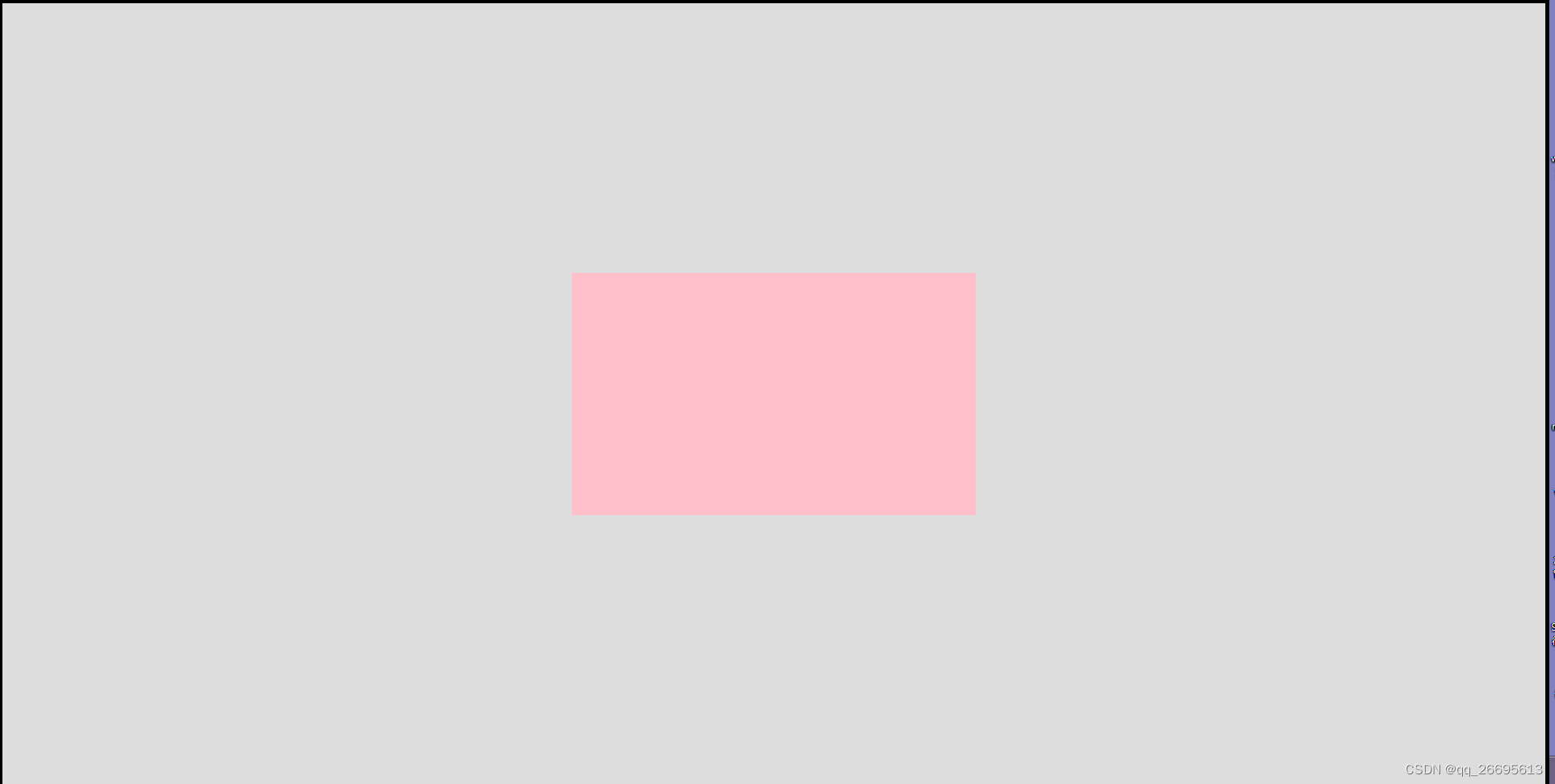
六. div绝对定位水平垂直居中 margin auto 实现绝对定位元素的居中
代码:
.box {width: 200px;height: 200px;background: lightcoral;position: absolute;left: 0;top: 0;bottom: 0;right: 0;margin: auto;
}
效果如下: