html5的文档结构
<!DOCTYPE html>
<html lang="zh">
<head><meta charset="UTF-8"><title></title></head>
<body></body>
</html>
效果图: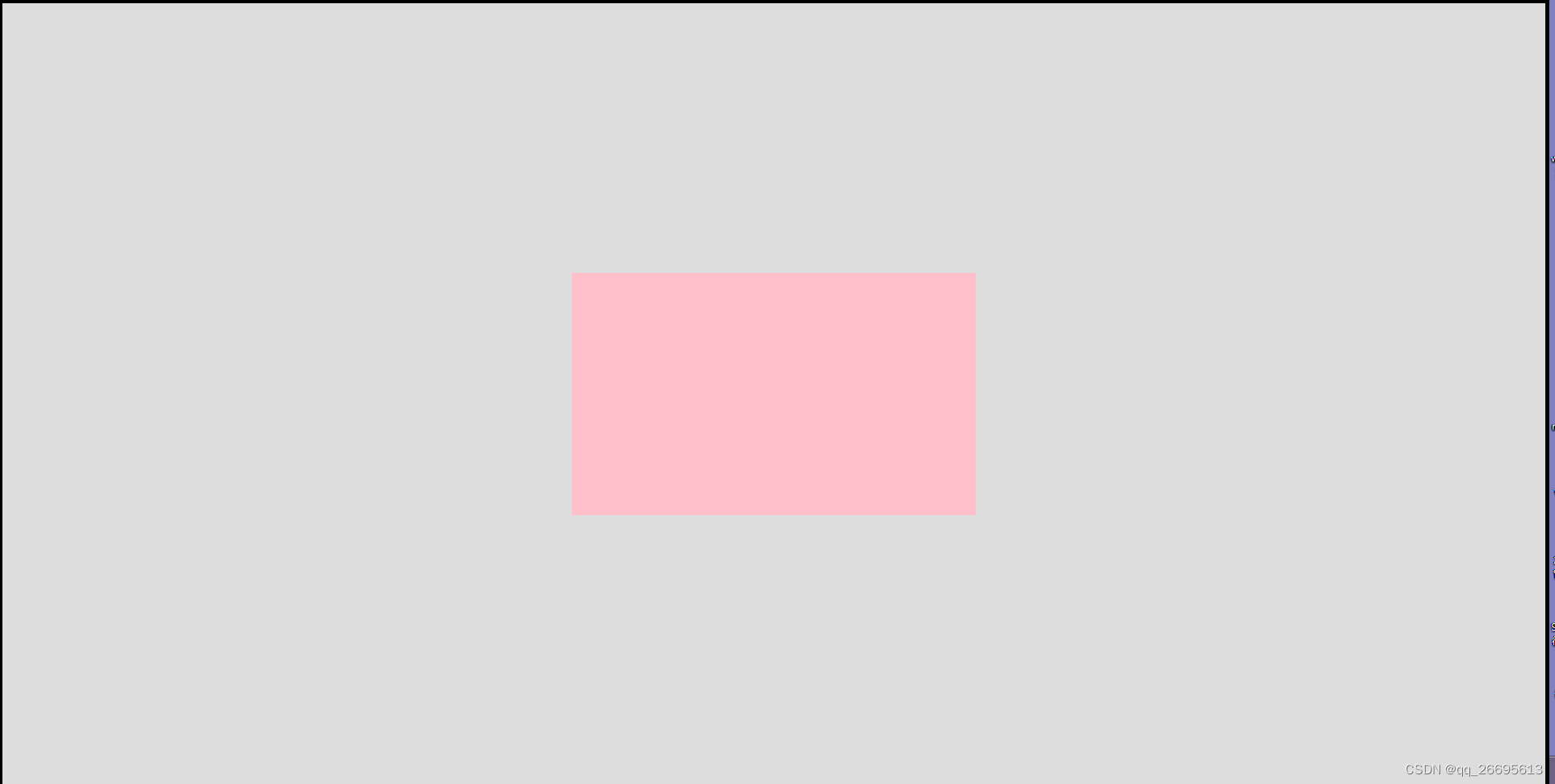
1.通过设置绝对定位和设置负边距实现:
思路:通过设置div绝对定位top:50%和left50%定位到距离上边框和左边框一半的位置,然后将div的边距设为负数分别向左和向上移动自身距离的50%,就可以实现水平垂直居中了。注意:需要实现知道div的宽高。
优点:实现方便,兼容性好
缺点:需要实现确定居中元素的宽和高
代码:
<style>html,body{width: 100%;height: 100%;text-align: center;box-sizing: border-box;margin: 0;}body div{box-sizing: border-box;}.parent{width: 100%;height:100%;position: relative;border: 5px solid #000000;background:#ddd;}.children{position: absolute;width:500px;height:300px;top: 50%;left: 50%; margin-left: -250px;margin-top: -150px;/* margin: auto; */background:green;}</style><div class="parent"><div class="children"></div></div>
2.通过绝对定位和translate实现
思路:原理和上面差不多,也是先通过绝对定位将div定位到上,左各一半的位置,然后通过translate,向上或者向左移动自身一半的位置。
优点:实现方便,不需要事先获取居中元素的宽高。
缺点:需要浏览器支持translate
代码:
<style>html,body{width: 100%;height: 100%;text-align: center;box-sizing: border-box;margin: 0;}body div{box-sizing: border-box;}.parent{width: 100%;height:100%;position: relative;border: 5px solid #000000;background:#ddd;}.children{position: absolute;width:500px;height:300px;top: 50%;left: 50%; transform: translate(-50%, -50%);background:green;}</style><div class="parent"><div class="children"></div></div>
3.通过设置绝对定位和margin:auto来实现。
原理:这个就比较神奇了,通过设置绝对定位上下左右各为0, 然后设置margin:auto便可以实现div水平垂直居中。这个解释起来比较复杂
首先,元素margin:auto后会自动计算元素的左右边距,但是上下边距还是默认0, auto。但是当元素设置为绝对定位后,元素就会脱离文档流,这是magin:auto就会自动计算上下边距了,这样就实现了水平垂直居中。
效果:同上
优点:兼容性良好,方便程度一般
代码:
<style>html,body{width: 100%;height: 100%;text-align: center;box-sizing: border-box;margin: 0;}body div{box-sizing: border-box;}.parent{width: 100%;height:100%;position: relative;border: 5px solid #000000;background:#ddd;}.children{position: absolute;width:500px;height:300px;top: 0;left: 0;right: 0;bottom: 0;margin: auto;/* transform: translate(-50%, -50%); */background:green;}</style><div class="parent"><div class="children"></div></div>
4. flex布局
原理:css3新增弹性盒子模型可以直接设置元素的水平垂直居中。
效果同上
优点:十分方便,可以直接定义元素布局的排列方式。
缺点:兼容性有待处理
代码:
<style>html,body{width: 100%;height: 100%;text-align: center;box-sizing: border-box;margin: 0;}body div{box-sizing: border-box;}.parent{display: flex;justify-content: center;align-items: center;width: 100%;height:100%;border: 5px solid #000000;background:#ddd;}.children{position: absolute;width:500px;height:300px;background:green;}</style><div class="parent"><div class="children"></div></div>
5.使用table-cell
原理:将父级元素设置为单元格display: table-cell,然后使用vertical-align:middle;来实现子div的垂直方向的居中,然后设置子级div 的margin:auto;实现水平方向上居中。
效果同上,不过单元格布局不是太常用。
代码:
<style>html,body{width: 100%;height: 100%;text-align: center;box-sizing: border-box;margin: 0;}body div{box-sizing: border-box;}.parent{display: table-cell;vertical-align: middle;width: 1080px;height:700px;border: 5px solid #000000;background:#ddd;}.children{/* position: absolute; */width:500px;height:300px;background:green;margin: auto;}</style><div class="parent"><div class="children"></div></div>