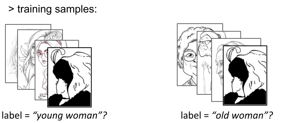
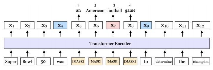
先看效果:

完整代码如下:
<!DOCTYPE html>
<html lang="en">
<head><meta charset="UTF-8"><meta http-equiv="X-UA-Compatible" content="IE=edge"><meta name="viewport" content="width=device-width, initial-scale=1.0"><title>css加载旋转动画</title><style>*{margin: 0;padding: 0;}.loading-screen{width: 100%;     height: 100vh;background: white;position: fixed;display: flex;align-items: center;justify-content: center;}.loading{width: 80px;display: flex;flex-wrap: wrap;animation: rotate 3s linear infinite;}@keyframes rotate{to{transform: rotate(360deg);}}.loading span{width: 32px;height: 32px;background: red;margin: 4px;animation: scale 1.5s linear infinite;}@keyframes scale{50%{transform: scale(1.2);}}.loading span:nth-child(1){border-radius: 50% 50% 0 50%;background: #e77f67;transform-origin: bottom right;}.loading span:nth-child(2){border-radius: 50% 50% 50% 0;background: #778beb;transform-origin: bottom left;animation-delay: 0.5s;}.loading span:nth-child(3){border-radius: 50% 0 50% 50%;background: #f8a5c2;transform-origin: top right;animation-delay: 1.5s;}.loading span:nth-child(4){border-radius:  0 50% 50% 50%;background: #f5cd79;transform-origin: top left;animation: 1s;}</style>
</head>
<body><div class="loading-screen"><div class="loading"><span></span><span></span><span></span><span></span></div></div>
</body>
</html>
其他小案例:
css实现颜色渐变小动画
css代码实现3D动画翻转 - 鱿鱼游戏卡片制作
css实现旋转的小流星动画
只用js代码实现电子时钟,精确到毫秒
简单的js代码实现主题色切换
点击主页看更多css小动画,js小案例…
我的主页

![[翻译]循环神经网络不可思议的有效性](https://img-blog.csdnimg.cn/20200516202213703.png?x-oss-process=image/watermark,type_ZmFuZ3poZW5naGVpdGk,shadow_10,text_aHR0cHM6Ly9ibG9nLmNzZG4ubmV0L3dlaXhpbl80NTE4MjAwMA==,size_16,color_FFFFFF,t_70)