Flex布局 (弹性盒布局)
1、flex弹性盒布局
一种当页面需要适应不同的屏幕大小以及设备类型时确保元素拥有恰当的行为的布局方式。引入弹性盒布局模型的目的是提供一种更加有效的方式来对一个容器中的子元素进行排列、对齐和分配空白空间
2、弹性盒子内容
弹性盒子由弹性容器(Flex container)和弹性子元素(Flex item)组成。
弹性容器通过设置 display 属性的值为 flex 或 inline-flex将其定义为弹性容器。
弹性容器内包含了一个或多个弹性子元素。
3、弹性盒基本概念
采用 Flex 布局的元素,称为 Flex 容器(flex container),简称"容器"。它的所有子元素自动成为容器成员,称为 Flex 项目(flex item),简称"项目"。

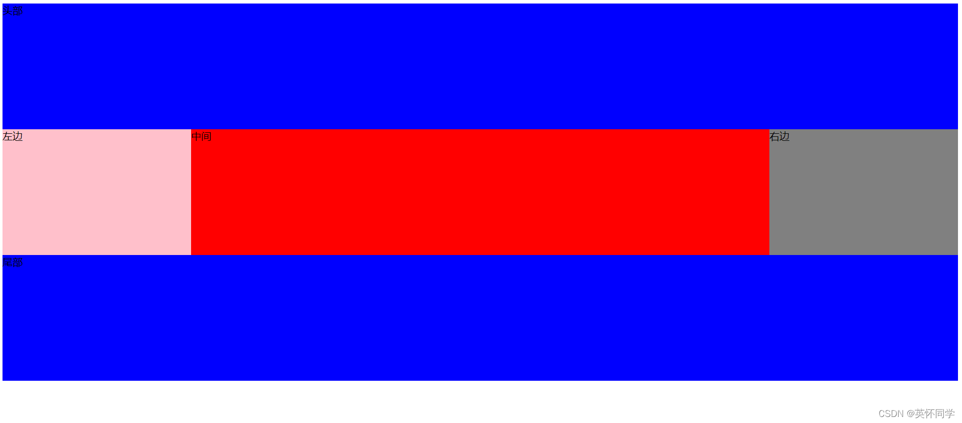
容器默认存在两根轴:水平的主轴(main axis)和垂直的交叉轴(cross axis)。主轴的开始位置(与边框的交叉点)叫做main start,结束位置叫做main end;交叉轴的开始位置叫做cross start,结束位置叫做cross end。
项目默认沿主轴排列。单个项目占据的主轴空间叫做main size,占据的交叉轴空间叫做cross size。
4、弹性盒的容器属性
- flex-direction
- flex-wrap
- flex-flow
- justify-content
- align-items
- align-content
- 注: 设为 Flex 布局以后,子元素的float、clear和vertical-align属性将失效。
1、flex-direction 属性指定了弹性子元素在父容器中的位置。
flex-direction的值有:row:横向从左到右排列(左对齐),默认的排列方式。row-reverse:反转横向排列(右对齐,从后往前排,最后一项排在最前面。column:纵向排列。column-reverse:反转纵向排列,从后往前排,最后一项排在最上面。
<!DOCTYPE html>
<html>
<head>
<meta charset="utf-8">
<title>菜鸟教程(runoob.com)</title>
<style>.flex-container {display: -webkit-flex;display: flex;width: 400px;height: 250px;background-color: lightgrey;flex-direction: row | row-reverse | column | column-reverse;
} // 下图为各种值的展示.flex-item {background-color: blue;width: 100px;height: 100px;margin: 10px;
}
</style>
</head>
<body><div class="flex-container"><div class="flex-item">1</div><div class="flex-item">2</div><div class="flex-item">3</div>
</div></body>
</html>


2、flex-wrap 属性用于指定弹性盒子的子元素换行方式。
flex-wrap: nowrap | wrap | wrap-reverse | initial | inherit;nowrap - 默认, 弹性容器为单行。该情况下弹性子项可能会溢出容器。wrap   - 弹性容器为多行。该情况下弹性子项溢出的部分会被放置到新行,子项内部会发生断行
wrap-reverse    -反转 wrap 排列。
// 只看style的代码
<style>
.flex-container {display: -webkit-flex;display: flex;-webkit-flex-wrap: nowrap;flex-wrap: nowrap;width: 300px;height: 250px;background-color: lightgrey;
}.flex-item {background-color: cornflowerblue;width: 100px;height: 100px;margin: 10px;
}
</style>


3、flex-flow 属性是 flex-direction 和 flex-wrap 的简写形式,默认值为row nowrap
// 上面二者属性的结合写法, 可对二者属性任意结合
flex-flow: row  nowrapcolumn wrap......
<style>
.flex-container {display: -webkit-flex;display: flex;flex-flow: row nowrap || column wrap;width: 300px;height: 250px;background-color: lightgrey;
}.flex-item {background-color: cornflowerblue;width: 100px;height: 100px;margin: 10px;
}


4、justify-content 内容对齐(justify-content)属性应用在弹性容器上,把弹性项沿着弹性容器的主轴线(main axis)对齐。
justify-content: flex-start | flex-end | center | space-between | space-aroundflex-start:弹性项目向行头紧挨着填充。这个是默认值。第一个弹性项的main-start外边距边线被放置在该行的main-start边线,而后续弹性项依次平齐摆放。flex-end:弹性项目向行尾紧挨着填充。第一个弹性项的main-end外边距边线被放置在该行的main-end边线,而后续弹性项依次平齐摆放。center:弹性项目居中紧挨着填充。(如果剩余的自由空间是负的,则弹性项目将在两个方向上同时溢出)。space-between:弹性项目平均分布在该行上。如果剩余空间为负或者只有一个弹性项,则该值等同于flex-start。否则,第1个弹性项的外边距和行的main-start边线对齐,而最后1个弹性项的外边距和行的main-end边线对齐,然后剩余的弹性项分布在该行上,相邻项目的间隔相等。space-around:弹性项目平均分布在该行上,两边留有一半的间隔空间。如果剩余空间为负或者只有一个弹性项,则该值等同于center。否则,弹性项目沿该行分布,且彼此间隔相等(比如是20px),同时首尾两边和弹性容器之间留有一半的间隔(1/2*20px=10px)。
<style>
.flex-container {display: -webkit-flex;display: flex;-webkit-justify-content: flex-start(...);justify-content: flex-start(...);width: 400px;height: 250px;background-color: lightgrey;
}.flex-item {background-color: cornflowerblue;width: 100px;height: 100px;margin: 10px;
}
</style>


5、align-items 设置或检索弹性盒子元素在侧轴(纵轴)方向上的对齐方式。
align-items: flex-start | flex-end | center | baseline | stretchflex-start:弹性盒子元素的侧轴(纵轴)起始位置的边界紧靠住该行的侧轴起始边界。flex-end:弹性盒子元素的侧轴(纵轴)起始位置的边界紧靠住该行的侧轴结束边界。center:弹性盒子元素在该行的侧轴(纵轴)上居中放置。(如果该行的尺寸小于弹性盒子元素的尺寸,则会向两个方向溢出相同的长度)。baseline:如弹性盒子元素的行内轴与侧轴为同一条,则该值与'flex-start'等效。其它情况下,该值将参与基线对齐。stretch:如果指定侧轴大小的属性值为'auto',则其值会使项目的边距盒的尺寸尽可能接近所在行的尺寸,但同时会遵照'min/max-width/height'属性的限制。
<style>
.flex-container {display: -webkit-flex;display: flex;-webkit-align-items: stretch;align-items: stretch;width: 400px;height: 250px;background-color: lightgrey;
}.flex-item {background-color: cornflowerblue;width: 100px;margin: 10px;
}
</style>


6、align-content 属性用于修改 flex-wrap 属性的行为。类似于 align-items, 但它不是设置弹性子元素的对齐,而是设置各个行的对齐。
align-content: flex-start | flex-end | center | space-between | space-around | stretchstretch - 默认。各行将会伸展以占用剩余的空间。flex-start - 各行向弹性盒容器的起始位置堆叠。flex-end - 各行向弹性盒容器的结束位置堆叠。center -各行向弹性盒容器的中间位置堆叠。space-between -各行在弹性盒容器中平均分布。space-around - 各行在弹性盒容器中平均分布,两端保留子元素与子元素之间间距大小的一半。
// 此处只做2例展示
<style>
.flex-container {display: -webkit-flex;display: flex;-webkit-flex-wrap: wrap;flex-wrap: wrap;-webkit-align-content: space-around;align-content: space-around;width: 300px;height: 300px;background-color: lightgrey;
}.flex-item {background-color: cornflowerblue;width: 100px;height: 100px;margin: 10px;
}
</style>


5、弹性盒的项目属性
- order
- flex-grow
- flex-shrink
- flex-basis
- flex
- align-self
1、order:用整数值来定义排列顺序,数值小的排在前面。可以为负值。
<style>
.flex-container {display: -webkit-flex;display: flex;width: 400px;height: 250px;background-color: lightgrey;
}.flex-item {background-color: cornflowerblue;width: 100px;height: 100px;margin: 10px;
}.first {-webkit-order: -1;order: -1;
}
</style>
</head>
<body><div class="flex-container"><div class="flex-item"> 1</div><div class="flex-item first">2</div><div class="flex-item"> 3</div>
</div>


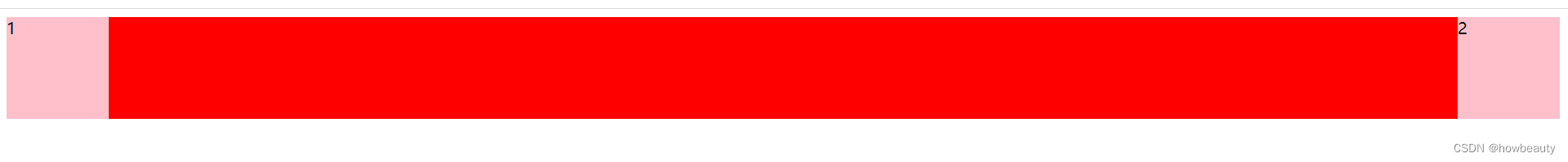
2、flex-grow 属性定义项目的放大比例,默认为0,即如果存在剩余空间,也不放大。
<style>
.flex-container {display: -webkit-flex;display: flex;width: 400px;height: 250px;background-color: lightgrey;
}.flex-item {background-color: cornflowerblue;width: 75px;height: 75px;margin: 10px;
}.flex-item:first-child {flex-grow: 3
}
</style>


3、flex-shrink属性定义了项目的缩小比例,默认为1,即如果空间不足,该项目将缩小。

4、flex-basis属性定义了在分配多余空间之前,项目占据的主轴空间(main size)。浏览器根据这个属性,计算主轴是否有多余空间。它的默认值为auto,即项目的本来大小。
它可以设为跟width或height属性一样的值(比如350px),则项目将占据固定空间。


5、flex属性是flex-grow, flex-shrink 和 flex-basis的简写,默认值为0 1 auto。后两个属性可选。
该属性有两个快捷值:auto (1 1 auto) 和 none (0 0 auto)。
flex: auto | initial | none | inherit | [ flex-grow ] || [ flex-shrink ] || [ flex-basis ]auto: 计算值为 1 1 autoinitial: 计算值为 0 1 autonone:计算值为 0 0 autoinherit:从父元素继承[ flex-grow ]:定义弹性盒子元素的扩展比率。[ flex-shrink ]:定义弹性盒子元素的收缩比率。[ flex-basis ]:定义弹性盒子元素的默认基准值。
<style>
.flex-container {display: -webkit-flex;display: flex;width: 400px;height: 250px;background-color: lightgrey;
}.flex-item {background-color: cornflowerblue;margin: 10px;
}.item1 {-webkit-flex: 2;flex: 2;
}.item2 {-webkit-flex: 1;flex: 1;
}.item3 {-webkit-flex: 1;flex: 1;
}
</style>
</head>
<body><div class="flex-container"><div class="flex-item item1">flex item 1</div><div class="flex-item item2">flex item 2</div><div class="flex-item item3">flex item 3</div>
</div>


6、align-self属性允许单个项目有与其他项目不一样的对齐方式,可覆盖align-items属性。默认值为auto,表示继承父元素的align-items属性,如果没有父元素,则等同于stretch。
align-self: auto | flex-start | flex-end | center | baseline | stretchauto:如果'align-self'的值为'auto',则其计算值为元素的父元素的'align-items'值,如果其没有父元素,则计算值为'stretch'。flex-start:弹性盒子元素的侧轴(纵轴)起始位置的边界紧靠住该行的侧轴起始边界。flex-end:弹性盒子元素的侧轴(纵轴)起始位置的边界紧靠住该行的侧轴结束边界。center:弹性盒子元素在该行的侧轴(纵轴)上居中放置。(如果该行的尺寸小于弹性盒子元素的尺寸,则会向两个方向溢出相同的长度)。baseline:如弹性盒子元素的行内轴与侧轴为同一条,则该值与'flex-start'等效。其它情况下,该值将参与基线对齐。stretch:如果指定侧轴大小的属性值为'auto',则其值会使项目的边距盒的尺寸尽可能接近所在行的尺寸,但同时会遵照'min/max-width/height'属性的限制。
<style>
.flex-container {display: -webkit-flex;display: flex;width: 400px;height: 250px;background-color: lightgrey;
}.flex-item {background-color: cornflowerblue;width: 60px;min-height: 100px;margin: 10px;
}.item1 {-webkit-align-self: flex-start;align-self: flex-start;
}
.item2 {-webkit-align-self: flex-end;align-self: flex-end;
}.item3 {-webkit-align-self: center;align-self: center;
}.item4 {-webkit-align-self: baseline;align-self: baseline;
}.item5 {-webkit-align-self: stretch;align-self: stretch;
}
</style>
</head>
<body><div class="flex-container"><div class="flex-item item1">flex-start</div><div class="flex-item item2">flex-end</div><div class="flex-item item3">center</div><div class="flex-item item4">baseline</div><div class="flex-item item5">stretch</div>
</div>

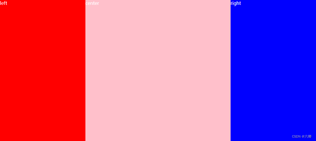
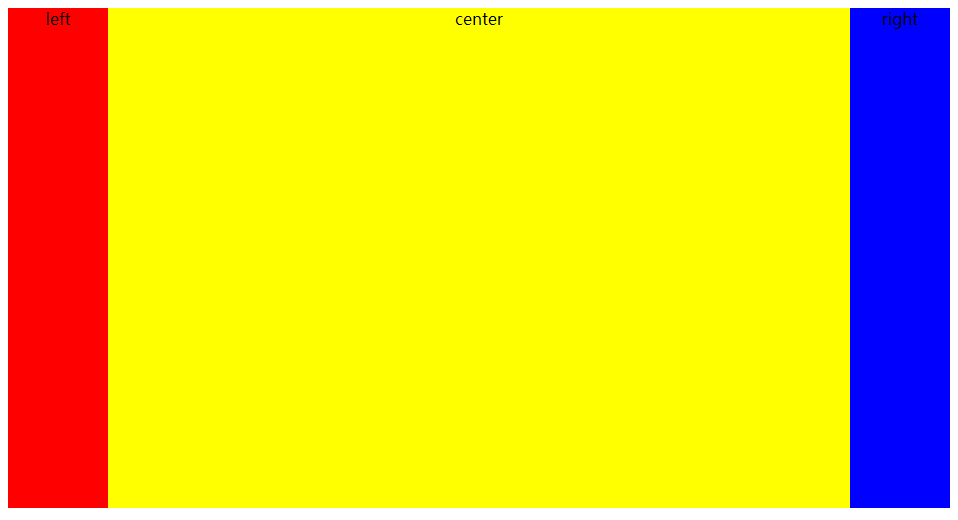
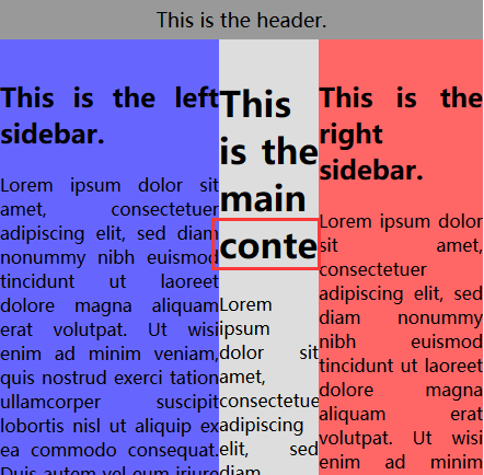
6、3栏布局,随屏幕宽度变化,左右两侧宽度不变,中间自适应宽度
1、圣杯布局: 两边顶宽,中间自适应的三栏布局,随着屏幕宽度的变化,中间一栏的屏幕宽度变化,左右两个元素的宽度不变
1、float
//html
<div className="left"></div>
<div className="right"></div>
<div className="center"></div>  // 位置重点
// style
.left{width: 100px;height: 100px;background-color: purple;float: left;
}
.center{height: 100px;background-color: greenyellow;
}
.right{width: 100px;height: 100px;background-color: pink;float: right;
}
2、position
// html
<div className="left"></div><div className="center"></div><div className="right"></div>// style.left{width: 100px;height: 100px;background-color: purple;position: absolute;left: 0;
}
.center{height: 100px;background-color: greenyellow;position: absolute; // 重点right: 100px;left: 100px;
}
.right{width: 100px;height: 100px;background-color: pink;position: absolute;right: 0;
}
3、flex
// html
<div className="test-box"><div className="left"></div><div className="center"></div><div className="right"></div></div>// style.test-box{height: 100px;border: 1px solid black;display: flex;
}
.left{width: 100px;height: 100px;background-color: purple;}
.center{height: 100px;background-color: greenyellow;flex: 1;   // 重点
}
.right{width: 100px;height: 100px;background-color: pink;
}
4、table
// html同上
// style
.test-box{height: 100px;border: 1px solid black;display: table;width: 100%;
}
.left{width: 100px;height: 100px;background-color: purple;display: table-cell;
}
.center{height: 100px;background-color: greenyellow;display: table-cell;
}
.right{width: 100px;height: 100px;background-color: pink;display: table-cell;
}
5、grid
// html同上
// style
.test-box{display: grid;grid-template-columns: 100px auto 100px;grid-template-rows: 100px;
}
.left{background-color: purple;
}
.center{background-color: greenyellow;
}
.right{background-color: pink;
}
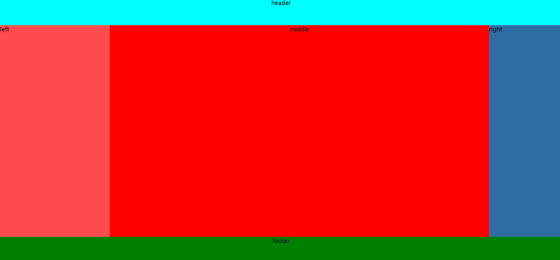
7、圣杯布局
1、优先加载中间栏,再左再右(中间栏要在放在文档流前面以优先渲染)
1、中间元素放在第一位置
2、先用float,使3元素保持一行
3、由于中间元素宽度为100%,左右2元素在设置margin-left值保持在一行
4、对最外层容器加上padding值,左右元素使用自身相对定位relation,修改位置在最外层容器的padding,漏出中间元素的全部内容
// html
<div className="test-box"><div className="center">center</div><div className="left">left</div><div className="right">right</div></div>
// style
.test-box{height: 100px;border: 1px solid black;padding: 0 100px;min-width: 300px;  // 放置屏幕宽度缩小到一定范围时,整体布局打乱
}
.left{width: 100px;height: 100px;background-color: purple;float: left;margin-left: -100%;position: relative;left: -100px;
}
.center{width: 100%;height: 100px;background-color: greenyellow;float: left;
}
.right{width: 100px;height: 100px;background-color: pink;float: left;margin-left: -100px;position: relative;right: -100px;
}
2、双飞翼布局, 在圣杯布局的基础上在改动
1、中间元素放在第一位置, 内部在加一个容器放置内容
2、先用float,使3元素保持一行
3、由于中间元素宽度为100%,左右2元素在设置margin-left值保持在一行
4、修改位置中间元素内层容器的margin值,是左右2元素位置合适,漏出中间元素的全部内容
// html
<div className="test-box"><div className="center"><div className="con">content-center</div></div><div className="left">left</div><div className="right">right</div></div>
// style
.test-box{height: 100px;border: 1px solid black;
}
.left{width: 100px;height: 100px;background-color: purple;float: left;margin-left: -100%;
}
.center{width: 100%;height: 100px;background-color: greenyellow;float: left;
}
.con{margin: 0 100px;
}
.right{width: 100px;height: 100px;background-color: pink;float: left;margin-left: -100px;
}