双飞翼布局
- 一、实现效果
- 二、使用弹性盒模型display:flex实现
- 三、使用calc属性实现
- 四、使用绝对定位实现
一、实现效果
为了实现一个两侧宽度固定,中间宽度自适应的三栏布局,效果如图所示: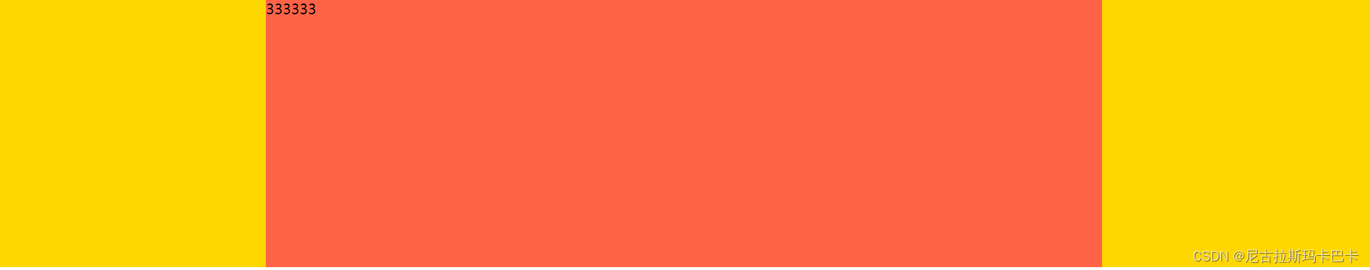
二、使用弹性盒模型display:flex实现
静态页面思路:设置一个大盒子,里面包含三个小盒子
// 静态页面搭建
<div class="box"><div class="left"></div><div class="content">333333</div><div class="right"></div>
</div>
原理:给最外面的盒子box添加弹性盒模型display:flex,让盒子在同一行显示;给左右盒子设置固定的宽高,则父元素的剩余宽度为中间盒子的宽度flex:1
// 样式实现
<style>* {margin: 0;padding: 0;}.box {display: flex;}.left,.right {width: 300px;height: 300px;background-color: gold;}.content {flex: 1;height: 300px;background-color: tomato;
}
</style>
三、使用calc属性实现
// 静态页面搭建
<div class="box"><div class="left"></div><div class="content">333333</div><div class="right"></div>
</div>
原理:给左中右三个盒子都添加左浮动,固定左右盒子的宽高,给中间盒子的宽设置calc属性,计算宽度为100%的宽度减去左右两边盒子的宽度
<style>* {margin: 0;padding: 0;}.left,.right {background-color: orange;float: left;width: 300px;height: 300px;}.content {background-color: green;float: left;height: 300px;width: calc(100% - 600px);}
</style>
四、使用绝对定位实现
// 静态页面搭建
<div class="box"><div class="left"></div><div class="content">333333</div><div class="right"></div>
</div>
原理:给左边盒子和右边盒子添加绝对定位并固定宽高,给box添加相对定位(子绝父相),左盒子:left:0,右盒子:right:0;定位不占位置,设置中间盒子的左右内边距padding为左右盒子的宽度
<style>* {margin: 0;padding: 0;}.box {position: relative;}.left,.right {position: absolute;top: 0;height: 300px;width: 300px;background-color: pink;}.left {left: 0;}.right {right: 0;}.content {height: 300px;background-color: red;padding: 0 300px;}