1.双飞翼布局说明
双飞翼布局分为 左,中,右三个部分。
左右宽度固定,中间部分自适应
2.双飞翼布局实例
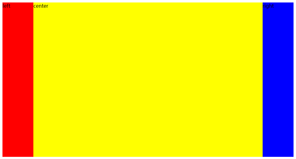
2.1 双飞翼布局float实现
三个部分通过按顺序向左浮动实现。
<!DOCTYPE html>
<html lang="en"><head><meta charset="UTF-8" /><meta http-equiv="X-UA-Compatible" content="IE=edge" /><meta name="viewport" content="width=device-width, initial-scale=1.0" /><title>双飞翼布局float实现</title><style>body {text-align: center;}/* 双飞翼布局 */.left {float: left;width: 100px;height: 500px;background-color: red;}.right {float: left;width: 100px;height: 500px;background-color: blue;}.center {float: left;width: calc(100% - 200px);height: 500px;background-color: yellow;}</style>
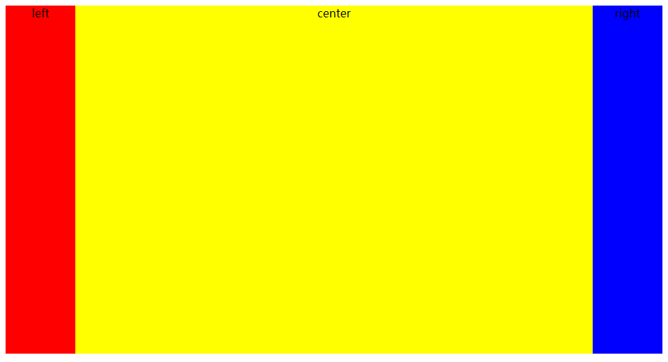
</head><body><div class="left">left</div><div class="center">center</div><div class="right">right</div>
</body></html>
效果:

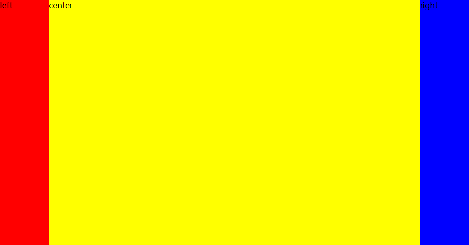
2.2 双飞翼布局absolute实现
设置父元素相对布局,用来实现内部元素的绝对布局。
<!--* @LastEditors: 一只爱吃萝卜的小兔子* @Date: 2022-07-13 18:15:23* @LastEditTime: 2022-07-13 18:26:34* @FilePath: \Web Worker\双飞翼布局absolute实现.html
-->
<!DOCTYPE html>
<html lang="en"><head><meta charset="UTF-8" /><meta http-equiv="X-UA-Compatible" content="IE=edge" /><meta name="viewport" content="width=device-width, initial-scale=1.0" /><title>双飞翼布局absolute实现</title><style>/* * {box-sizing: border-box;margin: 0;} *//* 双飞翼布局 */body {position: relative;/* width: 100%; */}.left {position: absolute;left: 0;width: 100px;height: 500px;background-color: red;}.right {position: absolute;right: 0;width: 100px;height: 500px;background-color: blue;}.center {position: absolute;left: 100px;width: calc(100% - 200px);height: 500px;background-color: yellow;}</style>
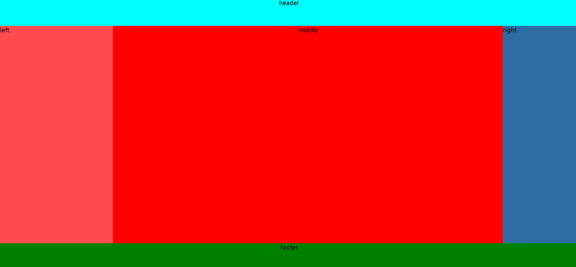
</head><body><div class="left">left</div><div class="center">center</div><div class="right">right</div>
</body></html>
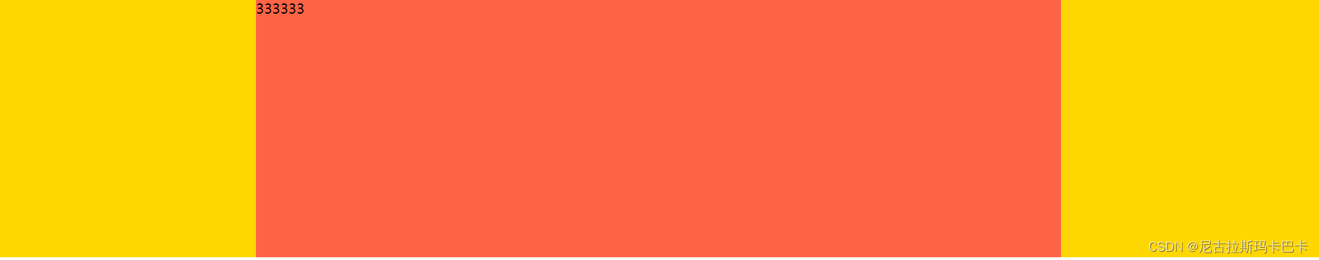
效果:
将注释内的内容加上:
作用是
1.盒模型的尺寸(宽高)是包含content、padding、border全部在内的尺寸;
2.将所有元素的外边距设置为0
<style>
* {box-sizing: border-box;margin: 0;}
</style>
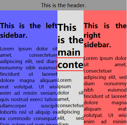
效果:(点击图片进行查看,可以清楚的看到,最边缘的百边消失了。)
2.2 双飞翼布局grid网格布局实现
<!--* @LastEditors: 一只爱吃萝卜的小兔子* @Date: 2022-07-13 18:15:23* @LastEditTime: 2022-07-13 18:47:23* @FilePath: \Web Worker\双飞翼布局grid网格布局实现.html
-->
<!DOCTYPE html>
<html lang="en"><head><meta charset="UTF-8" /><meta http-equiv="X-UA-Compatible" content="IE=edge" /><meta name="viewport" content="width=device-width, initial-scale=1.0" /><title>双飞翼布局grid网格布局实现</title><style>/* 双飞翼布局 */.container {text-align: center;display: grid;grid-template-columns: 100px 1fr 100px;}/* 双飞翼布局 */.left {height: 500px;background-color: red;}.right {height: 500px;background-color: blue;}.center {height: 500px;background-color: yellow;}</style>
</head><body><div class="container"><div class="left">left</div><div class="center">center</div><div class="right">right</div></div>
</body></html>
效果: