作用:
圣杯布局和双飞翼布局解决的问题是相同的,就是两边顶宽,中间自适应的三栏布局,中间栏要在放在文档流前面以优先渲染。
原理:
双飞翼布局为了让中间div内容不被遮挡,直接在中间div内部创建子div用于放置内容,在该div里用margin-left和margin-right为左右两栏div留出位置。
css代码:
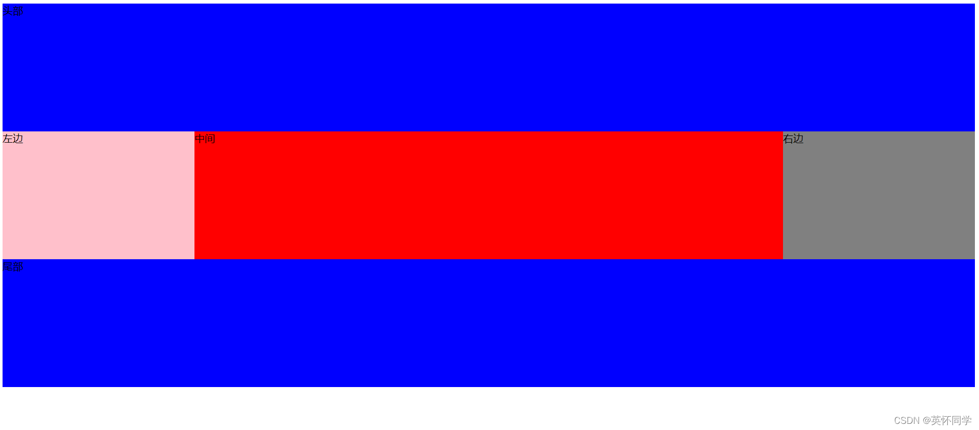
.header,.footer{height: 200px;width: 100%;background-color: #0000FF;}.content,.left,.right{float: left;height: 200px;}.content{width: 100%;background-color: red;}.left{width: 300px;background-color: pink;margin-left: -100%;}.right{width: 300px;background-color: grey;margin-left: -300px;}.center{height: 200px;margin-left: 300px;margin-right: 300px;}.container::after{content: "";display: block;clear: both;}body{min-width: 600px;}html代码:
<div class="header">头部</div><div class="container"><div class="content"><div class="center">中间</div></div><div class="left">左边</div><div class="right">右边</div></div>
<div class="footer">尾部</div>
运行效果:
优缺点:
优点:不会像圣杯布局那样变形。
缺点:多加了一层dom节点 。