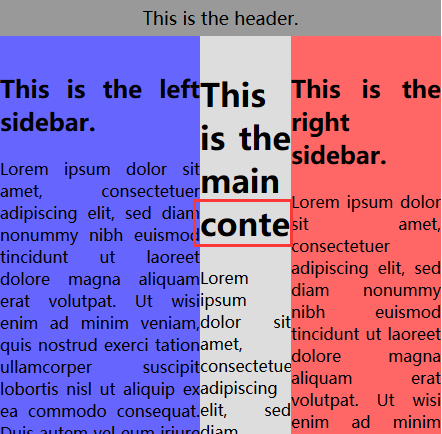
圣杯布局
圣杯布局是三列布局,中间宽度自适应,两边定宽,这样做的优势是重要的东西放在文档流前面可以优先渲染。也就是在html文档中,中间的部分要写在左右布局之前。
当然,这种布局是面向PC端的,移动端由于屏幕宽度较小,不推荐多列布局。
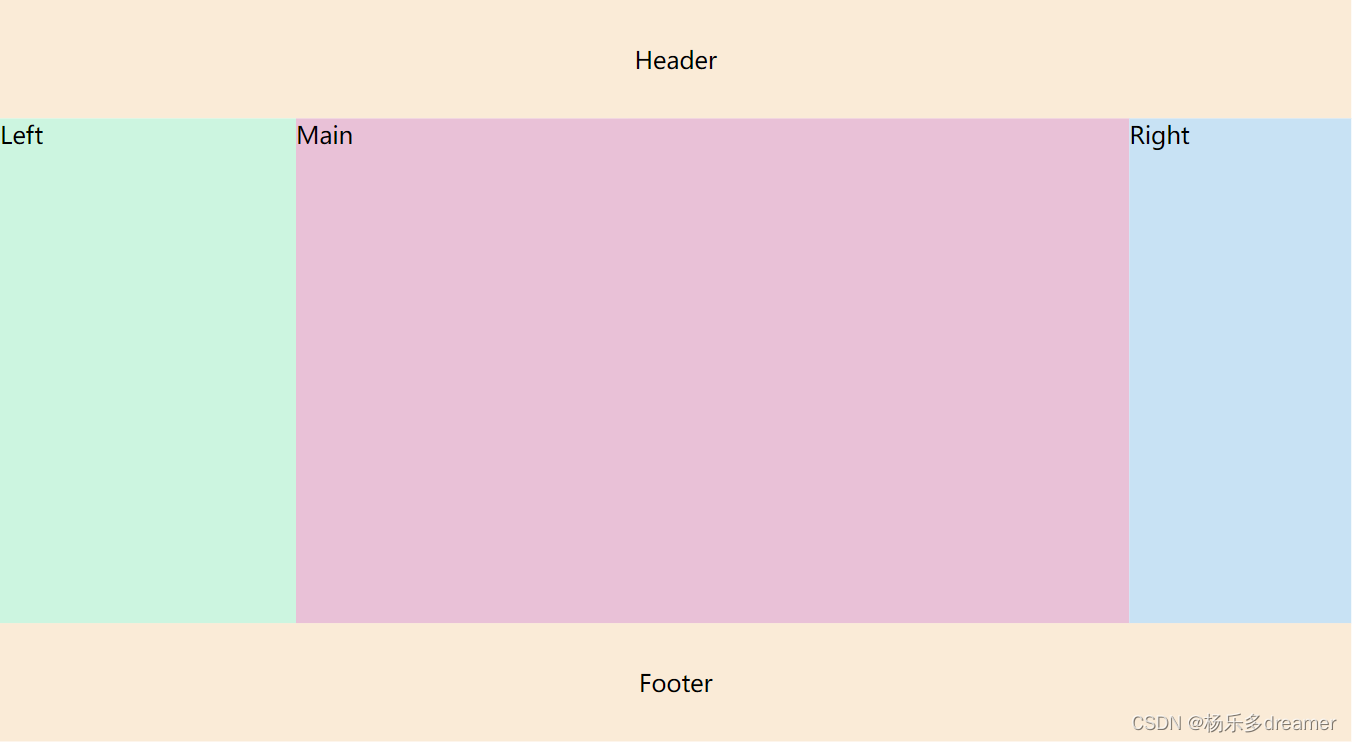
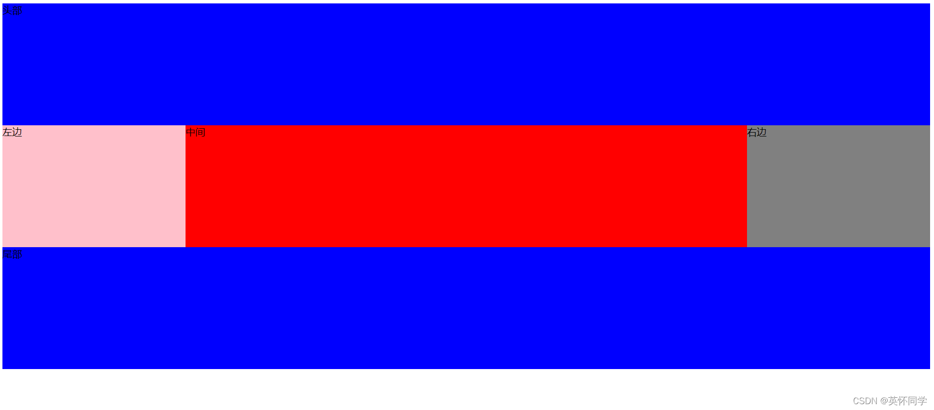
DOM结构:
<div class="header">Header</div><div class="bd"><div class="main">Main</div><div class="left">Left</div><div class="right">Right</div></div><div class="footer">Footer</div>
1、浮动 + margin-left 的负值(最常用)
<style>*{margin: 0;padding: 0;}html, body {width: 100%;height: 100%;}.header,.footer {width: 100%;height: 80px;line-height: 80px;background-color: antiquewhite;text-align: center;}/* 中间布局的样式 */.content {height: calc(100% - 160px);/* 根据左边栏和右边栏的宽度设置padding,留出位置放left和right */padding: 0 150px 0 200px;}/* main优先渲染,宽度设为100% */.main {width: 100%;height: 100%;float: left;background-color: rgb(233, 193, 215);}/* 左右栏的宽度固定 */.left {height: 100%;width: 200px;float: left;background-color: rgb(204, 245, 224);margin-left: -100%;/* 开启定位 设置left */position: relative; left: -200px;}.right {height: 100%;width: 150px;float: left;background-color: rgb(200, 226, 244);margin-left: -150px;position: relative;right: -150px;}</style>
2、定位布局
<style>*{margin: 0;padding: 0;}html, body {width: 100%;height: 100%;}.header,.footer {width: 100%;height: 80px;line-height: 80px;background-color: antiquewhite;text-align: center;}/* 中间布局的样式 */.content {width: 100%;height: calc(100% - 160px);/* 根据左边栏和右边栏的宽度设置padding,留出位置放left和right */padding: 0 150px 0 200px;position: relative;box-sizing: border-box;}.content div {position: absolute;height: 100%;text-align: center;}/* main优先渲染,宽度设为100% */.main {width: 100%;right: 0;background-color: rgb(233, 193, 215);}/* 左右栏的宽度固定 */.left {width: 200px;left: 0;background-color: rgb(204, 245, 224);}.right {width: 150px;right: 0;background-color: rgb(200, 226, 244);}</style>
3、flex布局(不用)
<div class="header">Header</div><div class="bd"><div class="left">Left</div><div class="main">Main</div><div class="right">Right</div></div><div class="footer">Footer</div>
<style>*{margin: 0;padding: 0;}html, body {width: 100%;height: 100%;}.header,.footer {width: 100%;height: 80px;line-height: 80px;background-color: antiquewhite;text-align: center;}/* 中间布局的样式 */.content {display: flex;justify-content: space-between;height: calc(100% - 160px);}/* main优先渲染,宽度设为100% */.main {width: 100%;right: 0;flex: 1;background-color: rgb(233, 193, 215);}/* 左右栏的宽度固定 */.left {width: 200px;height: 100%;background-color: rgb(204, 245, 224);}.right {width: 150px;height: 100%;background-color: rgb(200, 226, 244);}</style>
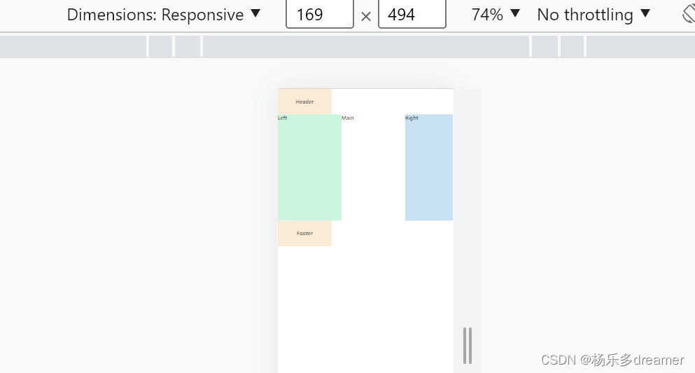
圣杯布局的问题
在浏览器窗口变窄到一定程度之后,布局全都乱掉了,原因是:因为左右盒子设置了相对定位,所以当左右盒子应该在的位置发生重叠时,一行放不下了,就会换行,造成布局混乱,有两种解决办法:
1、给父容器设置最小宽度,这个最小宽度的计算为:left盒子宽度*2 + right盒子宽度
2、使用双飞翼布局
双飞翼布局
给中间部分在套上一层容器,这样做以后,大的容器就不再需要设置padding值,左右栏盒子也不用再设置相对布局,代码精简了很多,而且不会出现上面变的特别窄布局会乱掉的问题。
DOM结构:
<div class="container"> <div class="main"><div class="content">main</div> </div><div class="left">left</div> <div class="right">right</div> </div>
<style>.left, .main,.right {float: left;text-align: center;min-height: 500px;}.left {width: 200px;background-color: rgb(204, 245, 224);margin-left: -100%;}.right {width: 300px;background-color: rgb(200, 226, 244);margin-left: -300px;}.main {width: 100%;background-color: rgb(233, 193, 215);}.content {margin: 0 300px 0 200px;}</style>