WPF 自定义控件TabControl
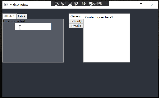
新TabControl效果:


新添加一个自定义控件ZTabControl:
public class ZTabControl : TabControl{#region Private属性#endregion#region 依赖属性定义public static readonly DependencyProperty TypeProperty;#endregion#region 依赖属性set getpublic EnumTabControlType Type{get { return (EnumTabControlType)GetValue(TypeProperty); }set { SetValue(TypeProperty, value); }}public object HeaderContent{get { return (object)GetValue(HeaderContentProperty); }set { SetValue(HeaderContentProperty, value); }}// Using a DependencyProperty as the backing store for HeaderContent. This enables animation, styling, binding, etc...public static readonly DependencyProperty HeaderContentProperty =DependencyProperty.Register("HeaderContent", typeof(object), typeof(ZTabControl));#endregion#region Constructorsstatic ZTabControl(){DefaultStyleKeyProperty.OverrideMetadata(typeof(ZTabControl), new FrameworkPropertyMetadata(typeof(ZTabControl)));ZTabControl.TypeProperty = DependencyProperty.Register("Type", typeof(EnumTabControlType), typeof(ZTabControl), new PropertyMetadata(EnumTabControlType.Line));}#endregion#region Override方法protected override DependencyObject GetContainerForItemOverride(){return new TabItem();}#endregion#region Private方法#endregion}
添加一个ControlEnum类文件,删除默认的类,创建一个枚举变量;
public enum EnumTabControlType{Line,Card,}
最后在Themes文件夹下的Generic.xaml中添加样式:
<ResourceDictionaryxmlns="http://schemas.microsoft.com/winfx/2006/xaml/presentation"xmlns:x="http://schemas.microsoft.com/winfx/2006/xaml"xmlns:local="clr-namespace:WpfApp10"><SolidColorBrush x:Key="TabItem.MouseOver.Border" Color="#7EB4EA" /><SolidColorBrush x:Key="TabItem.Disabled.Background" Color="#F0F0F0" /><SolidColorBrush x:Key="TabItem.Disabled.Border" Color="#D9D9D9" /><SolidColorBrush x:Key="TabItem.Selected.Background" Color="#00FFFFFF" /><SolidColorBrush x:Key="TabItem.Selected.Border" Color="#D7DDE4" /><Style x:Key="TabItemStyle" TargetType="{x:Type TabItem}"><Setter Property="FocusVisualStyle" Value="{x:Null}" /><Setter Property="Foreground" Value="#818181" /><Setter Property="Padding" Value="5,3,5,3" /><Setter Property="HorizontalContentAlignment" Value="Stretch" /><Setter Property="VerticalContentAlignment" Value="Stretch" /><Setter Property="SnapsToDevicePixels" Value="True" /><Setter Property="UseLayoutRounding" Value="True" /><Setter Property="BorderThickness" Value="0,0,0,2" /><Setter Property="Background" Value="#FFFFFF" /><Setter Property="BorderBrush" Value="Transparent" /><Setter Property="Template"><Setter.Value><ControlTemplate TargetType="{x:Type TabItem}"><Border x:Name="border" Background="{TemplateBinding Background}" BorderBrush="{TemplateBinding BorderBrush}"BorderThickness="{TemplateBinding BorderThickness}" Margin="{TemplateBinding Margin}"Padding="{TemplateBinding Padding}" SnapsToDevicePixels="{TemplateBinding SnapsToDevicePixels}"UseLayoutRounding="{TemplateBinding UseLayoutRounding}"><ContentPresenter x:Name="contentPresenter"Margin="{TemplateBinding Padding}"HorizontalAlignment="{Binding HorizontalContentAlignment,RelativeSource={RelativeSource AncestorType={x:Type ItemsControl}}}"VerticalAlignment="{Binding VerticalContentAlignment,RelativeSource={RelativeSource AncestorType={x:Type ItemsControl}}}"ContentSource="Header" Focusable="False" RecognizesAccessKey="True"SnapsToDevicePixels="{TemplateBinding SnapsToDevicePixels}" /></Border><ControlTemplate.Triggers><MultiDataTrigger><MultiDataTrigger.Conditions><Condition Binding="{Binding IsMouseOver, RelativeSource={RelativeSource Self}}" Value="true" /><Condition Binding="{Binding TabStripPlacement, RelativeSource={RelativeSource AncestorType={x:Type TabControl}}}" Value="Top" /><Condition Binding="{Binding Type, RelativeSource={RelativeSource AncestorType={x:Type TabControl}}}" Value="Line" /></MultiDataTrigger.Conditions><Setter TargetName="border" Property="Cursor" Value="Hand" /><Setter Property="BorderBrush" Value="#007ACC" /></MultiDataTrigger><MultiDataTrigger><MultiDataTrigger.Conditions><Condition Binding="{Binding IsSelected, RelativeSource={RelativeSource Self}}" Value="true" /><Condition Binding="{Binding TabStripPlacement, RelativeSource={RelativeSource AncestorType={x:Type TabControl}}}" Value="Top" /><Condition Binding="{Binding Type, RelativeSource={RelativeSource AncestorType={x:Type TabControl}}}" Value="Line" /></MultiDataTrigger.Conditions><Setter Property="Panel.ZIndex" Value="1" /><Setter Property="BorderBrush" Value="#007ACC" /><Setter Property="Foreground" Value="#007ACC" /><Setter Property="Background" Value="#FFFFFF" /></MultiDataTrigger><MultiDataTrigger><MultiDataTrigger.Conditions><Condition Binding="{Binding IsMouseOver, RelativeSource={RelativeSource Self}}" Value="true" /><Condition Binding="{Binding TabStripPlacement, RelativeSource={RelativeSource AncestorType={x:Type TabControl}}}" Value="Top" /><Condition Binding="{Binding Type, RelativeSource={RelativeSource AncestorType={x:Type TabControl}}}" Value="Card" /></MultiDataTrigger.Conditions><Setter TargetName="border" Property="Cursor" Value="Hand" /><Setter Property="Background" Value="#FFFFFF" /><Setter Property="BorderBrush" Value="#007ACC" /></MultiDataTrigger><MultiDataTrigger><MultiDataTrigger.Conditions><Condition Binding="{Binding IsSelected, RelativeSource={RelativeSource Self}}" Value="true" /><Condition Binding="{Binding TabStripPlacement, RelativeSource={RelativeSource AncestorType={x:Type TabControl}}}" Value="Top" /><Condition Binding="{Binding Type, RelativeSource={RelativeSource AncestorType={x:Type TabControl}}}" Value="Card" /></MultiDataTrigger.Conditions><Setter Property="Panel.ZIndex" Value="1" /><Setter Property="BorderBrush" Value="#D7DDE4" /><Setter Property="Background" Value="#FFFFFF" /><Setter Property="BorderThickness" Value="1,1,1,0" /><Setter Property="Foreground" Value="#64778D" /><Setter Property="Margin" Value="0,0,5,-1.3" /></MultiDataTrigger><MultiDataTrigger><MultiDataTrigger.Conditions><Condition Binding="{Binding IsSelected, RelativeSource={RelativeSource Self}}" Value="False" /><Condition Binding="{Binding TabStripPlacement, RelativeSource={RelativeSource AncestorType={x:Type TabControl}}}" Value="Top" /><Condition Binding="{Binding Type, RelativeSource={RelativeSource AncestorType={x:Type TabControl}}}" Value="Card" /></MultiDataTrigger.Conditions><Setter Property="Panel.ZIndex" Value="1" /><Setter Property="BorderBrush" Value="#D7DDE4" /><Setter Property="BorderThickness" Value="1,1,1,0" /><Setter Property="Background" Value="#F5F7F9" /><Setter Property="Foreground" Value="#64778D" /><Setter Property="Margin" Value="0,0,5,0" /></MultiDataTrigger><DataTrigger Binding="{Binding Type, RelativeSource={RelativeSource AncestorType={x:Type TabControl}}}" Value="Line"><Setter Property="Margin" Value="0" /><Setter Property="UseLayoutRounding" Value="True" /></DataTrigger><DataTrigger Binding="{Binding Type, RelativeSource={RelativeSource AncestorType={x:Type TabControl}}}" Value="Card"><Setter TargetName="border" Property="CornerRadius" Value="3,3,0,0" /></DataTrigger><MultiDataTrigger><MultiDataTrigger.Conditions><Condition Binding="{Binding IsEnabled, RelativeSource={RelativeSource Self}}" Value="false" /><Condition Binding="{Binding TabStripPlacement, RelativeSource={RelativeSource AncestorType={x:Type TabControl}}}" Value="Top" /></MultiDataTrigger.Conditions><Setter TargetName="contentPresenter" Property="Opacity" Value="0.56" /></MultiDataTrigger></ControlTemplate.Triggers></ControlTemplate></Setter.Value></Setter></Style><Style TargetType="{x:Type local:ZTabControl}"><Setter Property="Padding" Value="0" /><Setter Property="HorizontalContentAlignment" Value="Center" /><Setter Property="VerticalContentAlignment" Value="Center" /><Setter Property="Background" Value="{StaticResource TabItem.Selected.Background}" /><Setter Property="BorderBrush" Value="{StaticResource TabItem.Selected.Border}" /><Setter Property="BorderThickness" Value="0,1,0,0" /><Setter Property="Foreground" Value="{DynamicResource {x:Static SystemColors.ControlTextBrushKey}}" /><Setter Property="ItemContainerStyle" Value="{StaticResource TabItemStyle}" /><Setter Property="Template"><Setter.Value><ControlTemplate TargetType="{x:Type local:ZTabControl}"><Grid x:Name="templateRoot" ClipToBounds="true" KeyboardNavigation.TabNavigation="Local" SnapsToDevicePixels="true"><Grid.ColumnDefinitions><ColumnDefinition /><ColumnDefinition Width="auto" /></Grid.ColumnDefinitions><Grid.RowDefinitions><RowDefinition Height="Auto" /><RowDefinition Height="*" /></Grid.RowDefinitions><TabPanel x:Name="headerPanel" Grid.Row="0" Grid.Column="0" Margin="0,2,0,0"Panel.ZIndex="1" Background="Transparent" IsItemsHost="true" KeyboardNavigation.TabIndex="1" /><ContentPresenter Content="{TemplateBinding HeaderContent}" Grid.Column="1" /><Border x:Name="contentPanel" Grid.Row="1" Grid.ColumnSpan="2"Background="{TemplateBinding Background}"BorderBrush="{TemplateBinding BorderBrush}"BorderThickness="{TemplateBinding BorderThickness}"KeyboardNavigation.DirectionalNavigation="Contained" KeyboardNavigation.TabIndex="2" KeyboardNavigation.TabNavigation="Local" SnapsToDevicePixels="True"UseLayoutRounding="True"><ContentPresenter x:Name="PART_SelectedContentHost"Margin="{TemplateBinding Padding}"ContentSource="SelectedContent"SnapsToDevicePixels="{TemplateBinding SnapsToDevicePixels}" /></Border></Grid><ControlTemplate.Triggers><Trigger Property="IsEnabled" Value="false"><Setter TargetName="templateRoot" Property="TextElement.Foreground" Value="{DynamicResource {x:Static SystemColors.GrayTextBrushKey}}" /></Trigger></ControlTemplate.Triggers></ControlTemplate></Setter.Value></Setter></Style>
</ResourceDictionary>
注意如果样式文件在其他路径下面,需要在App.xaml文件中添加如下引用:
<Application x:Class="WpfApp10.App"xmlns="http://schemas.microsoft.com/winfx/2006/xaml/presentation"xmlns:x="http://schemas.microsoft.com/winfx/2006/xaml"xmlns:local="clr-namespace:WpfApp10"StartupUri="MainWindow.xaml"><Application.Resources><ResourceDictionary><ResourceDictionary.MergedDictionaries><ResourceDictionary Source="myControls/Themes/Generic.xaml"></ResourceDictionary></ResourceDictionary.MergedDictionaries></ResourceDictionary></Application.Resources>
</Application>
窗体Xaml代码:
Type可以选择Card或Line
<Grid><local:ZTabControl Margin="10" Type="Card"><local:ZTabControl.HeaderContent><Button Content="增加" Width="50" Height="25" /></local:ZTabControl.HeaderContent><TabItem Header="计算机"><Border><TextBlock Text="计算机" VerticalAlignment="Center" HorizontalAlignment="Center" /></Border></TabItem><TabItem Header="物联网"><Border><TextBlock Text="物联网" VerticalAlignment="Center" HorizontalAlignment="Center" /></Border></TabItem><TabItem Header="区块链"><Border><TextBlock Text="区块链" VerticalAlignment="Center" HorizontalAlignment="Center" /></Border></TabItem><TabItem Header="数据库"><Border><TextBlock Text="数据库" VerticalAlignment="Center" HorizontalAlignment="Center" /></Border></TabItem><TabItem Header="云计算"><Border><TextBlock Text="云计算" VerticalAlignment="Center" HorizontalAlignment="Center" /></Border></TabItem><TabItem Header="大数据"><Border><TextBlock Text="大数据" VerticalAlignment="Center" HorizontalAlignment="Center" /></Border></TabItem></local:ZTabControl></Grid>