其他基础控件
1.Window
2.Button
3.CheckBox
4.ComboBox
5.DataGrid
6.DatePicker
7.Expander
8.GroupBox
9.ListBox
10.ListView
11.Menu
12.PasswordBox
13.TextBox
14.RadioButton
15.ToggleButton
16.Slider
17.TreeView
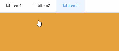
TabControl 实现下面的效果
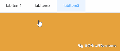
1)TabControl来实现动画;
TabControl分为横向和纵向;横向
Border设置RenderTransform的ScaleTransform.ScaleY="1",动画控制ScaleTransform.ScaleX从0到1;纵向
Border设置RenderTransform的ScaleTransform.ScaleX="1",动画控制ScaleTransform.ScaleY从0到1;
<ResourceDictionary xmlns="http://schemas.microsoft.com/winfx/2006/xaml/presentation"xmlns:x="http://schemas.microsoft.com/winfx/2006/xaml"xmlns:sys="clr-namespace:System;assembly=mscorlib"xmlns:wpfs="clr-namespace:WPFDevelopers.Minimal.Helpers"><ResourceDictionary.MergedDictionaries><ResourceDictionary Source="../Themes/Basic/ControlBasic.xaml"/><ResourceDictionary Source="../Themes/Basic/Animations.xaml"/></ResourceDictionary.MergedDictionaries><Thickness x:Key="BorderThickness">0,0,0,2</Thickness><Style x:Key="BaseTAndBTabItem" TargetType="{x:Type TabItem}" BasedOn="{StaticResource ControlBasicStyle}"><Setter Property="Cursor" Value="Hand" /><Setter Property="Background" Value="Transparent" /><Setter Property="MinHeight" Value="48"/><Setter Property="MinWidth" Value="100"/><Setter Property="BorderThickness" Value="{StaticResource BorderThickness}"/><Setter Property="Template"><Setter.Value><ControlTemplate TargetType="{x:Type TabItem}"><Grid Background="{TemplateBinding Background}"><VisualStateManager.VisualStateGroups><VisualStateGroup x:Name="SelectionStates"><VisualState x:Name="Unselected" /><VisualState x:Name="Selected"><Storyboard><DoubleAnimation Duration="00:00:.2"To="1"Storyboard.TargetName="PART_Border"Storyboard.TargetProperty="(Border.RenderTransform).(ScaleTransform.ScaleX)"/></Storyboard></VisualState></VisualStateGroup><VisualStateGroup x:Name="CommonStates"><VisualState x:Name="Normal" /><VisualState x:Name="MouseOver" /><VisualState x:Name="Disabled"/></VisualStateGroup></VisualStateManager.VisualStateGroups><Border x:Name="PART_Border" BorderThickness="{TemplateBinding BorderThickness}"RenderTransformOrigin=".5,.5"><Border.RenderTransform><ScaleTransform ScaleX="0" ScaleY="1"/></Border.RenderTransform></Border><ContentPresenter ContentSource="Header"VerticalAlignment="Center" HorizontalAlignment="Center"/></Grid><ControlTemplate.Triggers><Trigger Property="IsSelected" Value="True"><Setter TargetName="PART_Border" Property="BorderBrush" Value="{DynamicResource PrimaryNormalSolidColorBrush}" /><Setter Property="Background" Value="{DynamicResource DefaultBackgroundSolidColorBrush}" /><!--<Setter Property="FontWeight" Value="Black"/>--><Setter Property="Foreground" Value="{DynamicResource PrimaryNormalSolidColorBrush}"/></Trigger><Trigger Property="IsMouseOver" Value="True"><Setter Property="Foreground" Value="{DynamicResource PrimaryNormalSolidColorBrush}"/></Trigger></ControlTemplate.Triggers></ControlTemplate></Setter.Value></Setter></Style><Style x:Key="BaseLAndRTabItem" TargetType="{x:Type TabItem}" BasedOn="{StaticResource ControlBasicStyle}"><Setter Property="Cursor" Value="Hand" /><Setter Property="Background" Value="Transparent" /><Setter Property="MinHeight" Value="48"/><Setter Property="MinWidth" Value="100"/><Setter Property="BorderThickness" Value="{StaticResource BorderThickness}"/><Setter Property="Template"><Setter.Value><ControlTemplate TargetType="{x:Type TabItem}"><Grid Background="{TemplateBinding Background}"><VisualStateManager.VisualStateGroups><VisualStateGroup x:Name="SelectionStates"><VisualState x:Name="Unselected" /><VisualState x:Name="Selected"><Storyboard><DoubleAnimation Duration="00:00:.2"To="1"Storyboard.TargetName="PART_Border"Storyboard.TargetProperty="(Border.RenderTransform).(ScaleTransform.ScaleY)"/></Storyboard></VisualState></VisualStateGroup><VisualStateGroup x:Name="CommonStates"><VisualState x:Name="Normal" /><VisualState x:Name="MouseOver" /><VisualState x:Name="Disabled"/></VisualStateGroup></VisualStateManager.VisualStateGroups><Border x:Name="PART_Border" BorderThickness="{TemplateBinding BorderThickness}"RenderTransformOrigin=".5,.5"><Border.RenderTransform><ScaleTransform ScaleX="1" ScaleY="0"/></Border.RenderTransform></Border><ContentPresenter ContentSource="Header"VerticalAlignment="Center" HorizontalAlignment="Center"/></Grid><ControlTemplate.Triggers><Trigger Property="IsSelected" Value="True"><Setter TargetName="PART_Border" Property="BorderBrush" Value="{DynamicResource PrimaryNormalSolidColorBrush}" /><Setter Property="Background" Value="{DynamicResource DefaultBackgroundSolidColorBrush}" /><!--<Setter Property="FontWeight" Value="Black"/>--><Setter Property="Foreground" Value="{DynamicResource PrimaryNormalSolidColorBrush}"/></Trigger><Trigger Property="IsMouseOver" Value="True"><Setter Property="Foreground" Value="{DynamicResource PrimaryNormalSolidColorBrush}"/></Trigger></ControlTemplate.Triggers></ControlTemplate></Setter.Value></Setter></Style><Style x:Key="LeftTabItem" TargetType="{x:Type TabItem}" BasedOn="{StaticResource BaseLAndRTabItem}"><Setter Property="BorderThickness" Value="0,0,2,0"/></Style><Style x:Key="RightTabItem" TargetType="{x:Type TabItem}" BasedOn="{StaticResource BaseLAndRTabItem}"><Setter Property="BorderThickness" Value="2,0,0,0"/></Style><Style x:Key="TopTabItem" TargetType="{x:Type TabItem}" BasedOn="{StaticResource BaseTAndBTabItem}"><Setter Property="BorderThickness" Value="0,0,0,2"/></Style><Style x:Key="BottomTabItem" TargetType="{x:Type TabItem}" BasedOn="{StaticResource BaseTAndBTabItem}"><Setter Property="BorderThickness" Value="0,2,0,0"/></Style><Style TargetType="{x:Type TabControl}" BasedOn="{StaticResource ControlBasicStyle}"><Setter Property="TabStripPlacement" Value="Top" /><!--<Setter Property="Margin" Value="2" />--><!--<Setter Property="Padding" Value="2"/>--><Setter Property="Background" Value="{DynamicResource WhiteSolidColorBrush}" /><Setter Property="ItemContainerStyle" Value="{StaticResource TopTabItem}"/><Setter Property="Template"><Setter.Value><ControlTemplate TargetType="{x:Type TabControl}"><Grid ClipToBounds="True" SnapsToDevicePixels="True" KeyboardNavigation.TabNavigation="Local"><Grid.ColumnDefinitions><ColumnDefinition Name="ColumnDefinition0"/><ColumnDefinition Width="0" Name="ColumnDefinition1" /></Grid.ColumnDefinitions><Grid.RowDefinitions><RowDefinition Height="Auto" Name="RowDefinition0" /><RowDefinition Height="*" Name="RowDefinition1" /></Grid.RowDefinitions><Border x:Name="HeaderBorder" BorderBrush="{DynamicResource BaseSolidColorBrush}" BorderThickness="0,0,0,1" Grid.Row="0"Background="{DynamicResource WhiteSolidColorBrush}"><TabPanel IsItemsHost="True"Name="HeaderPanel" Panel.ZIndex="1"KeyboardNavigation.TabIndex="1"/></Border><Grid Name="ContentPanel"KeyboardNavigation.TabIndex="2" KeyboardNavigation.TabNavigation="Local" KeyboardNavigation.DirectionalNavigation="Contained" Grid.Column="0" Grid.Row="1"><Border><ContentPresenter Content="{TemplateBinding SelectedContent}" ContentTemplate="{TemplateBinding SelectedContentTemplate}" ContentStringFormat="{TemplateBinding SelectedContentStringFormat}" ContentSource="SelectedContent" Name="PART_SelectedContentHost" Margin="2" SnapsToDevicePixels="{TemplateBinding UIElement.SnapsToDevicePixels}" /></Border></Grid></Grid><ControlTemplate.Triggers><Trigger Property="TabControl.TabStripPlacement" Value="Bottom"><Setter TargetName="RowDefinition0" Property="RowDefinition.Height" Value="*" /><Setter TargetName="RowDefinition1" Property="RowDefinition.Height" Value="Auto" /><Setter TargetName="HeaderBorder" Property="Grid.Row" Value="1" /><Setter TargetName="ContentPanel" Property="Grid.Row" Value="0" /><Setter TargetName="HeaderBorder" Property="BorderThickness" Value="0,1,0,0" /><Setter Property="ItemContainerStyle" Value="{StaticResource BottomTabItem}"/></Trigger><Trigger Property="TabControl.TabStripPlacement" Value="Left"><Setter TargetName="ContentPanel" Property="Grid.Row" Value="0" /><Setter TargetName="ContentPanel" Property="Grid.Column" Value="1" /><Setter TargetName="ColumnDefinition0" Property="ColumnDefinition.Width" Value="Auto" /><Setter TargetName="ColumnDefinition1" Property="ColumnDefinition.Width" Value="*" /><Setter TargetName="RowDefinition0" Property="RowDefinition.Height" Value="*" /><Setter TargetName="RowDefinition1" Property="RowDefinition.Height" Value="0" /><Setter TargetName="HeaderBorder" Property="BorderThickness" Value="0,0,1,0" /><Setter Property="ItemContainerStyle" Value="{StaticResource LeftTabItem}"/></Trigger><Trigger Property="TabControl.TabStripPlacement" Value="Right"><Setter TargetName="ContentPanel" Property="Grid.Row" Value="0" /><Setter TargetName="HeaderBorder" Property="Grid.Column" Value="1" /><Setter TargetName="ContentPanel" Property="Grid.Column" Value="0" /><Setter TargetName="ColumnDefinition0" Property="ColumnDefinition.Width" Value="*" /><Setter TargetName="ColumnDefinition1" Property="ColumnDefinition.Width" Value="Auto" /><Setter TargetName="RowDefinition0" Property="RowDefinition.Height" Value="*" /><Setter TargetName="RowDefinition1" Property="RowDefinition.Height" Value="0" /><Setter TargetName="HeaderBorder" Property="BorderThickness" Value="1,0,0,0" /><Setter Property="ItemContainerStyle" Value="{StaticResource RightTabItem}"/></Trigger></ControlTemplate.Triggers></ControlTemplate></Setter.Value></Setter></Style></ResourceDictionary>2)Styles.TabControl.xaml 代码如下;
<UniformGrid Columns="2" Rows="2" Margin="0,10"><UniformGrid.Resources><Style TargetType="{x:Type Rectangle}"><Setter Property="Width" Value="{x:Static SystemParameters.PrimaryScreenWidth}"/><Setter Property="Height" Value="400"/></Style></UniformGrid.Resources><TabControl><TabItem Header="TabItem1"><Rectangle Fill="{DynamicResource DangerSolidColorBrush}"/></TabItem><TabItem Header="TabItem2"><Rectangle Fill="{DynamicResource InfoSolidColorBrush}"/></TabItem><TabItem Header="TabItem3" ><Rectangle Fill="{DynamicResource WarningSolidColorBrush}"/></TabItem></TabControl><TabControl TabStripPlacement="Bottom"><TabItem Header="TabItem1"><Rectangle Fill="{DynamicResource InfoSolidColorBrush}"/></TabItem><TabItem Header="TabItem2"><Rectangle Fill="{DynamicResource DangerSolidColorBrush}"/></TabItem><TabItem Header="TabItem3" ><Rectangle Fill="{DynamicResource WarningSolidColorBrush}"/></TabItem></TabControl><TabControl TabStripPlacement="Left"><TabItem Header="TabItem1"><Rectangle Fill="{DynamicResource WarningSolidColorBrush}"/></TabItem><TabItem Header="TabItem2"><Rectangle Fill="{DynamicResource InfoSolidColorBrush}"/></TabItem><TabItem Header="TabItem3" ><Rectangle Fill="{DynamicResource DangerSolidColorBrush}"/></TabItem></TabControl><TabControl TabStripPlacement="Right" IsEnabled="False"><TabItem Header="TabItem1"><Rectangle Fill="{DynamicResource SuccessSolidColorBrush}"/></TabItem><TabItem Header="TabItem2"><Rectangle Fill="{DynamicResource InfoSolidColorBrush}"/></TabItem><TabItem Header="TabItem3" ><Rectangle Fill="{DynamicResource WarningSolidColorBrush}"/></TabItem></TabControl></UniformGrid>Nuget Install-Package WPFDevelopers.Minimal
[1][2]
参考资料
[1]
GitHub: https://github.com/WPFDevelopersOrg
[2]Gitee: https://gitee.com/WPFDevelopersOrg