WPF TabControl Styles
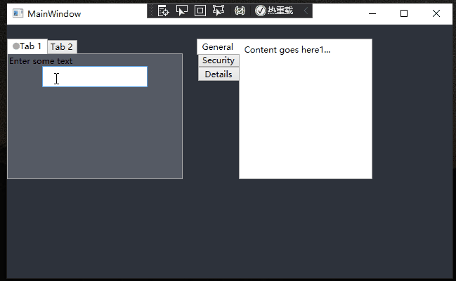
水平使用的TabControl
效果:

样式资源
<!-- 顶部TabControl控件样式 --><SolidColorBrush x:Key="TabItem.Static.Background" Color="White"/><SolidColorBrush x:Key="TabItem.Static.Border" Color="#ACACAC"/><SolidColorBrush x:Key="TabItem.MouseOver.Border" Color="#7EB4EA"/><SolidColorBrush x:Key="TabItem.Disabled.Background" Color="#F0F0F0"/><SolidColorBrush x:Key="TabItem.Disabled.Border" Color="#D9D9D9"/><SolidColorBrush x:Key="TabItem.Selected.Border" Color="#ACACAC"/><SolidColorBrush x:Key="TabItem.Selected.Background" Color="#FFFFFF"/><Style x:Key="TabItem.Style.TopTabStripPlacement" TargetType="{x:Type TabItem}"><Setter Property="Foreground" Value="Black"/><Setter Property="Background" Value="{StaticResource TabItem.Static.Background}"/><Setter Property="BorderBrush" Value="{StaticResource TabItem.Static.Border}"/><Setter Property="Margin" Value="0"/><Setter Property="Padding" Value="0,8,0,8"/><Setter Property="HorizontalContentAlignment" Value="Stretch"/><Setter Property="VerticalContentAlignment" Value="Stretch"/><Setter Property="Template"><Setter.Value><ControlTemplate TargetType="{x:Type TabItem}"><Border Padding="0 0 20 0" ><Grid x:Name="templateRoot" SnapsToDevicePixels="true" ><Border Background="{TemplateBinding Background}"></Border><ContentPresenter x:Name="contentPresenter" ContentSource="Header" Focusable="False"HorizontalAlignment="{Binding HorizontalContentAlignment, RelativeSource={RelativeSource AncestorType={x:Type ItemsControl}}}"Margin="{TemplateBinding Padding}" RecognizesAccessKey="True" TextBlock.FontSize="12" TextBlock.FontWeight="UltraBlack" TextBlock.FontFamily="幼圆"SnapsToDevicePixels="{TemplateBinding SnapsToDevicePixels}"VerticalAlignment="{Binding VerticalContentAlignment, RelativeSource={RelativeSource AncestorType={x:Type ItemsControl}}}"/><Grid Height="2" x:Name="bottomLine" VerticalAlignment="Bottom" Background="#498FD7" Visibility="Hidden"></Grid></Grid></Border><ControlTemplate.Triggers><Trigger Property="IsEnabled" Value="false"><Setter Property="Opacity" TargetName="contentPresenter" Value="0.56"/></Trigger><Trigger Property="IsSelected" Value="true"><Setter Property="Panel.ZIndex" Value="1"/><Setter Property="Opacity" TargetName="templateRoot" Value="1"/><Setter Property="Visibility" TargetName="bottomLine" Value="Visible"/><Setter Property="Foreground" Value="#498FD7"/></Trigger></ControlTemplate.Triggers></ControlTemplate></Setter.Value></Setter></Style><Style x:Key="TabControl.Style.TopTabStripPlacement" TargetType="{x:Type TabControl}"><Setter Property="Padding" Value="0"/><Setter Property="HorizontalContentAlignment" Value="Center"/><Setter Property="VerticalContentAlignment" Value="Center"/><Setter Property="Background" Value="{StaticResource TabItem.Selected.Background}"/><Setter Property="BorderBrush" Value="{StaticResource TabItem.Selected.Border}"/><Setter Property="BorderThickness" Value="0"/><Setter Property="Foreground" Value="{DynamicResource {x:Static SystemColors.ControlTextBrushKey}}"/><Setter Property="Template"><Setter.Value><ControlTemplate TargetType="{x:Type TabControl}"><Grid x:Name="templateRoot" ClipToBounds="true" SnapsToDevicePixels="true" KeyboardNavigation.TabNavigation="Local"><Grid.ColumnDefinitions><ColumnDefinition x:Name="ColumnDefinition0"/><ColumnDefinition x:Name="ColumnDefinition1" Width="0"/></Grid.ColumnDefinitions><Grid.RowDefinitions><RowDefinition x:Name="RowDefinition0" Height="Auto"/><RowDefinition x:Name="RowDefinition2" Height="Auto"/><RowDefinition x:Name="RowDefinition1" Height="*"/></Grid.RowDefinitions><TabPanel x:Name="headerPanel" Grid.Column="0" IsItemsHost="true" Grid.Row="0" KeyboardNavigation.TabIndex="1" Panel.ZIndex="1"/><Grid Grid.Row="1" Background="#A8D3FE" VerticalAlignment="Top" Height="1"></Grid><Border x:Name="contentPanel" BorderBrush="{TemplateBinding BorderBrush}" BorderThickness="{TemplateBinding BorderThickness}" Background="{TemplateBinding Background}" Grid.Column="0" KeyboardNavigation.DirectionalNavigation="Contained" Grid.Row="2" KeyboardNavigation.TabIndex="2" KeyboardNavigation.TabNavigation="Local"><ContentPresenter x:Name="PART_SelectedContentHost" ContentSource="SelectedContent" Margin="{TemplateBinding Padding}" SnapsToDevicePixels="{TemplateBinding SnapsToDevicePixels}"/></Border></Grid><ControlTemplate.Triggers><Trigger Property="IsEnabled" Value="false"><Setter Property="TextElement.Foreground" TargetName="templateRoot" Value="{DynamicResource {x:Static SystemColors.GrayTextBrushKey}}"/></Trigger></ControlTemplate.Triggers></ControlTemplate></Setter.Value></Setter></Style>MainWindow.xaml使用
<Window x:Class="TabControlStyle.MainWindow"xmlns="http://schemas.microsoft.com/winfx/2006/xaml/presentation"xmlns:x="http://schemas.microsoft.com/winfx/2006/xaml"xmlns:d="http://schemas.microsoft.com/expression/blend/2008"xmlns:mc="http://schemas.openxmlformats.org/markup-compatibility/2006"xmlns:local="clr-namespace:TabControlStyle"mc:Ignorable="d"Title="MainWindow" Height="450" Width="800"><Grid><Border  Height="212.493"  VerticalAlignment="Center" ><TabControl Width="441.81" HorizontalAlignment="Center"  Style="{DynamicResource TabControl.Style.TopTabStripPlacement}"><TabItem Header="检测" Style="{DynamicResource TabItem.Style.TopTabStripPlacement}"><WrapPanel Background="White" Margin="0 5"><Border BorderBrush="#FFD2DDE8" BorderThickness="1" Width="100" Height="150"/></WrapPanel></TabItem><TabItem Header="控制" Style="{DynamicResource TabItem.Style.TopTabStripPlacement}"><Grid Background="#FFE5E5E5"/></TabItem><TabItem Header="日志" Style="{DynamicResource TabItem.Style.TopTabStripPlacement}"><Grid Background="#FFE5E5E5"/></TabItem></TabControl></Border></Grid>
</Window>
积跬步以至千里:) (:一阵没来由的风