前言:采用python爬虫爬取天气数据然后采用echarts数据可视化画图分析未来天气变化趋势
从获取数据到可视化的流程
(熟悉爬虫爬取数据然后数据可视化这个过程)
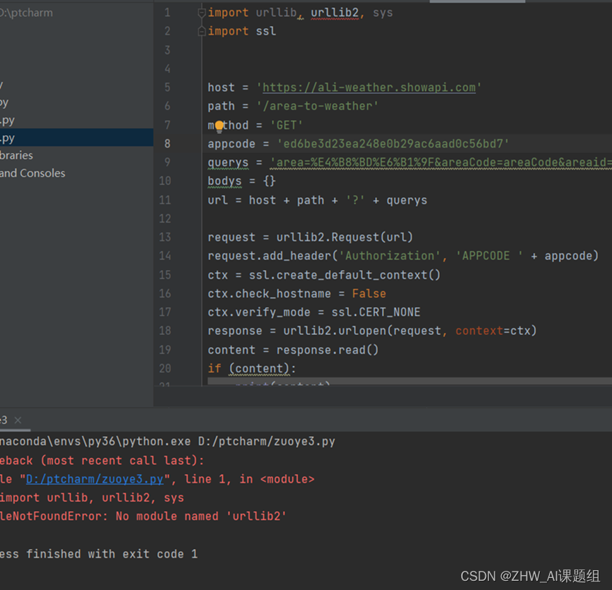
一、python爬取未来8-15天的天气数据
1、导入用到的一些python第三方库
import requests
import re
from bs4 import BeautifulSoup
import json
import pandas as pd
2、爬取网页源码,经过utf-8的转换得到网页的源码
url='http://www.weather.com.cn/weather15d/101290101.shtml'
rqg=requests.get(url)
html=rqg.content.decode('utf-8')
soup=BeautifulSoup(html,'lxml')
print(soup.prettify())
3、采用BeautifulSoup库提取时间信息
tt=soup.find_all("span",class_="time")
tt
4、利用列表推导式进行时间的过滤提取
time=[i.string for i in tt]
time 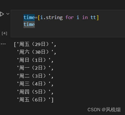
5、采用BeautifulSoup库提取天气信息
hh=soup.find_all("span",class_="tem")
hh 
6、利用列表推导式进行天气的过滤提取
tem=[i.get_text() for i in hh]
tem 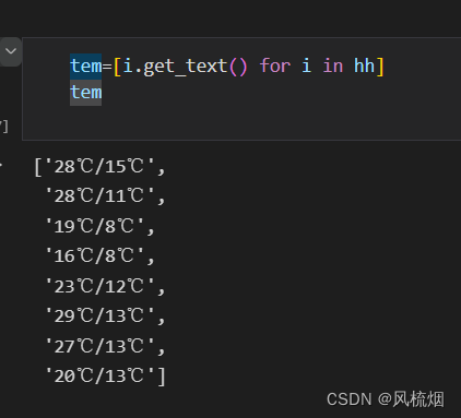
7、采用re库进行“/”分隔符来划分温度
tem1=[re.split('/',i) for i in tem]
tem1 
8、利用列表推导式提取最高温与最低温
h=[i[0] for i in tem1]
hl=[i[1] for i in tem1]
l 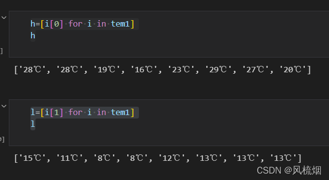
9、利用列表推导式把摄氏度的符号去除
[int(re.sub('℃','',i)) for i in h][int(re.sub('℃','',i)) for i in l] 
二、采用echarts数据可视化分析
<!DOCTYPE html>
<html lang="en"><head><meta charset="UTF-8"><meta http-equiv="X-UA-Compatible" content="IE=edge"><meta name="viewport" content="width=device-width, initial-scale=1.0"><title>气温变化分析</title><script src="js/echarts.js"></script>
</head><body><div id="main" style="width: 800px; height: 600px"></div><script type="text/javascript">var myChart = echarts.init(document.getElementById("main"));mytextStyle = {color: 'blue',fontStyle: 'normal',fontWeight: 1,fontFamily: '黑体',fontSize: 20,};var option = {grid: {show: true,x: 50, y: 66,borderColor: '#FA8072',},title: {show: true,text: '未来8-15天气温变化',subtext: '折线图',target: 'blank',subtarget: 'blank',textAlign: 'center',textBaseline: 'top',textStyle: mytextStyle,padding: 5,itemGap: 10,zlevel: 0,z: 2,left: '20%',top: '10',right: 'auto',bottom: 'anto',backgroundColor: 'yellow',borderColor: '#ccc',borderWidth: 2,shadowColor: 'red',showOffsetX: 0,showOffsetY: 0,shadowBlur: 10,},tooltip: { trigger: 'axis' },legend: { data: ['最高气温', '最低气温'] },toolbox: {show: true,feature: {mark: { show: true },dataView: { show: true, readOnly: false },magicType: { show: true, type: ['line', 'bar'] },restore: { show: true },saveAsImage: { show: true }}},calculable: true,xAxis: [{show: true, type: 'category',boundaryGap: false,data: ['周六(30日)', '周日(1日)', '周一(2日)', '周二(3日)', '周三(4日)', '周四(5日)', '周五(6日)']}],yAxis: [{show: true, type: 'value',axisLabel: { formatter: '{value} °C' }}],series: [{name: '最高气温',smooth: true, type: 'line',data: [28, 28, 19, 16, 23, 29, 27, 20],markPoint: {data: [{type: 'max', name: '最大值', symbol: 'diamond', symbolSize: 25,itemStyle: {normal: { color: 'red' }},},]},markLine: {data: [{type: 'average', name: '平均值',itemStyle:{normal: { borderType: 'dotted', color: 'darkred' }},}],},},{name: '最低气温',smooth: true, type: 'line', data: [15, 11, 8, 8, 12, 13, 13, 13],markPoint: {data: [{type: 'max', name: '最大值', symbol: 'diamond', symbolSize: 25,itemStyle: {normal: { color: 'red' }},},]},markLine: {data: [{type: 'average', name: '平均值',itemStyle:{normal: { borderType: 'dotted', color: 'darkred' }},}],},},],};myChart.setOption(option);</script>
</body></html>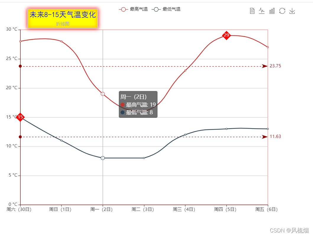
实现的功能比较简单,处理流程还是比较完善的已经尽量实现数据分析的自动化