1、外部样式表
方式1:
<link rel="stylesheet" type="text/css" href="文件路径"></link>方式2:(常用)
<style>@import url('文件地址')
</style>
2、伪类选择器
a:hover{属性:属性值} 鼠标悬停3、css常用属性
| 文本属性 | ||||
| font-size | 字体大小 | font-weight | 加粗 (100/400/700) | |
| font-family | 字体 | font-style | 倾斜 (italic/oblique/normal) | |
| color | 字体颜色 | text-align | 文本水平对齐 (left/center/right/justify) | |
| line-height | 行高 | text-indent | 首行缩进 | |
| letter-spacing | 字间距 | word-spacing | 英文间距 | |
| text-transform | 英文大小写 (capitalize首字母/lowercase小写/uppercase大写) | text-decoration | 文本修饰 (none没有/underline下划线/overline上划线/line-through删除线) | |
| text-shadow | 文本阴影 | box-shadow | 盒子阴影 ( inset 内阴影) | |
| /*注:justify 水平两端对齐,但是只对多行文本*/ /* 文本阴影: text-shadow:x轴 y轴 模糊程度 阴影颜色 */ | ||||
| 列表属性 | ||||
| list-style | none (去除列表样式) | list-style-type | (disc实心圆/circle空心圆/square实心正方形/none无) | |
| 背景属性 | ||||
| background-color | 背景颜色 (rgba 透明度) | background-image | 背景图片 ( url() ) | |
| background-repeat | 背景平铺 (no-repeat不平铺 repeat-xx轴平铺 repeat-yy轴平铺) | background-position | 背景位置 (xpx ypx / center居中) | |
| background-size | 背景大小 (cover contain) | background-attachment | 背景图固定 (finxd) ---视觉差效果 | |
| /*cover:把背景图扩展至足够大,以使背景图像完全覆盖背景区域。也许无法显示在背景定位区域中*/ /*contain:把图像扩展至最大尺寸,以使其宽度和高度完全适应内容区域。铺不满盒子,留白*/ | ||||
| 浮动属性 | ||||
| float | ( left / right ) | |||
| 盒子模型 | ||||
| padding | 内边距 | padding-方向 | top、bottom、left、right | |
| margin | 外边距 | margin-方向 | top、bottom、left、right | |
| border | 边框 | border-方向 | top、bottom、left、right | |
| /* border:1px solid 颜色 样式:solid实线、dashed虚线、dotted点线 */ /* margin (可以使用负值) */ | ||||
| 溢出属性 | ||||
| overflow | hidden(隐藏)/scroll(滚动)/auto(自动) | |||
| overflow-x | X轴溢出 | overflow-y | Y轴溢出 | |
| 定位属性 | ||||
| opsition | fixed | 固定定位(脱离文档流) | ||
| relative | 相对定位 | |||
| absolute | 绝对定位(脱离文档流) | |||
| sticky | 粘性定位 | |||
| 其它属性 | ||||
| display | 元素类型互相转换 | none(隐藏)、inline(行内)/block(块)/inline-block(行内块) | ||
| opacity | 透明度 | z-index | 层级 | |
| white-space | 文本是否换行 | outline | none ( 清除表格样式 ) | |
| border-radius | 圆角边框 | ::-webkit-scrollbar | display:none(取消滚动条) | |
例:半圆(border)
<style>div {width: 200px;height: 100px;background-color: skyblue;border-top-left-radius: 100px;border-top-right-radius: 100px;/*或者 border-radius: 100px 100px 0 0; */}
</style>
4、显示省略号
overflow:hidden;
white-space:nowrap;
text-overflow:ellipsis;
#注释:固定的宽度
5、样式清除
*{margin:0,padding:0}6、CSS三角形
.box {width: 0;height: 0;border: 20px solid transparent;border-bottom: 20px solid skyblue;}7、CSS水平垂直居中
1.基于浏览器窗口
.box {  height: 200PX;width: 200PX;background-color: skyblue;position: absolute; top: 50%;left: 50%;margin-top: -100px;margin-left: -100px;}2.基于父盒子嵌套子盒子/*方式一*/.box { //父盒子height: 400PX;width: 400PX;background-color: skyblue;margin: 0 auto;position: relative;  //必写}.box2 { //子盒子width: 200px;height: 200px;background-color: tan;position: absolute;top: 200px;left: 200px;margin-left: -100px;margin-top: -100px;}/*方式二*/.box1 { position: relative;width: 200px;height: 200px;background-color: pink;}.box2 {  position: absolute;top: 0;left: 0;bottom: 0;right: 0;margin: auto;width: 100px;height: 100px;background-color: skyblue;}/*方式三*/.box1 { width: 200px;height: 200px;background-color: pink;}.box2 {  width: 50%;height: 50%;transform: translate(50%,50%);  //css3 --- 2D平移background-color: skyblue;}3.弹性盒子 display:flex
.box1 {width: 200px;height: 200px;background-color: skyblue;display: flex;justify-content: center;align-items: center;}
.box2 {width: 100px;height: 100px;background-color: tan;}
8、精灵图
好处 1.减少服务器的请求次数,从而提高页面的加载速度
2.减小图片的体积
用法 backgrund-position: x轴 y轴
9、宽高自适应
min-height  //最小高度(常用)
max-height
min-width
max-width盒子根据窗口的大小进行自适应
body,html { height:100% }calc() ---动态计算长度值(支持:+、-、*、/ 运算)
例如:width: calc(100% - 200px)
10、清除浮动
方法1: 给父元素添加 overflow:hidden(缺点:会隐藏溢出的元素)
方法2: 在浮动的元素下方添加空块元素,并给该元素添加声明 clear:both(缺点:添加无意义的空标签,不利于代码可读性,且降低了浏览器的性能)
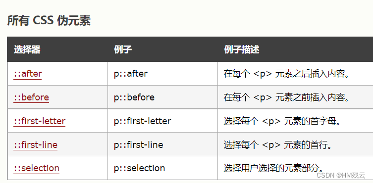
方法3: 万能清除浮动方法(父元素添加伪元素 ::after)选择器::after{height:0,content:"",clear:both,display:block,overflow:hidden / visibility:hidden}visibility:hidden //占位隐藏display:none //不占位隐藏11、伪元素
选择器::before{   //在.....之前content:"内容"}
选择器::after{   //在.....之后content:"内容"}
12、CSS3---基础
1. 层级选择器
- 子代选择器: >
- 兄弟选择器: + (当前元素后面的第一个兄弟)
- ~ (当前元素后面的所有兄弟)
- 属性选择器 : [ 属性名 ]
- 标签名[ 属性名 ]
- 结构伪类选择器: X:first-child(第一个元素)
X:last-child(最后一个元素)
X:nth-child(n)(索引值为n的子元素 2n/even:偶数,2n-1/odd:奇数) - 目标伪类选择器: E:target
例 :简易版---手风琴
<div> //html<a href="#aaa">目标1</a><div id="aaa">金樽清酒斗十千,玉盘珍羞直万钱。</div><a href="#bbb">目标2</a><div id="bbb">行路难,行路难,多歧路,今安在。</div><a href="#ccc">目标3</a><div id="ccc">长风破浪会有时,直挂云帆济沧海。</div></div> a{ //cssdisplay: block;}div[id] { /* 属性选择器 */display: none;}div[id]:target { /* 目标伪类选择器 */display: block;}2. 怪异盒模型 ( box-sizing )
- 标准盒模型 content-box
- 怪异盒模型 border-box
3. 渐变
- 线性渐变 --- background: linear-gradient ( to 方位 ,red , green )
- 支持多颜色渐变
- 支持方向,( to left 或者 to bottom right )
- 支持角度的写法 ( 数值deg )
- 径向渐变 --- background: radial-gradient ( circle, red ,green );
- 颜色后面添加百分比(%),控制过渡的展示比例(注:没有渐变效果)
- circle:渐变为最大的圆形
- 线性重复渐变 --- background: repeating-linear-gradient(red,green 10%);
- 径向重复渐变 --- background: repeating-radial-gradient(red,green 10%);
例 :太极 --- 案例

<body><div class="box1"></div>
</body>
<style>*{margin: 0;padding: 0;}body{background-color: #ccc;}.box1{margin: 100px auto;width: 240px;height: 240px;background: linear-gradient(#fff 50%,#000 50%);display: flex;align-items: center;justify-content: center;border-radius: 50%;}.box1::before{content: '';width: 120px;height: 120px;display: block;border-radius: 50%;background: radial-gradient(#fff 25%,#000 25%);}.box1::after{content: '';width: 120px;height: 120px;display: block;border-radius: 50%;background: radial-gradient(#000 25%,#fff 25%);}</style>4. 过渡(transition)
- transition:all/具体属性值 运动时间s/ms 动画类型 延迟时间s/ms
- all: 所有属性
- linear/匀速、ease/逐渐慢下来、ease-in/加速、ease-out/减速、ease-in-out/先加速后减速
- 谁要过渡,给谁加
5. 2D(transform)
| translateX() | x轴平移 |
| translateY() | y轴平移 |
| translate(Xpx,Ypx) | 对角平移 |
| scale(数值) | 缩放 数值<1:缩小 数值>1:放大 负值:倒像放大效果 |
| scaleX(数值) | X轴缩放 |
| scaleY(数值) | Y轴缩放 |
| rotate(数值deg) | 旋转 负值:逆时针旋转 负值:顺时针旋转 |
| rotateX(数值deg) | X轴旋转 |
| rotateY(数值deg) | Y轴旋转 |
| skew(数值deg) | 倾斜 |
| skewX(数值deg) | X轴倾斜 |
| skewY(数值deg) | Y轴倾斜 |
- 改变中心点位置:transform-origin:位置方向(top) 位置方向(left) (默认:center)
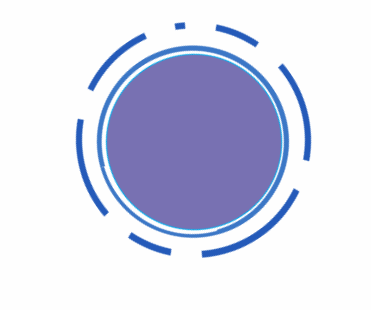
6. 关键帧动画(animation)
- animation:动画名称 持续时间 过渡类型/linear 循环次数/infinite 循环中是否反向运动 延迟时间 保留动画最后状态;
- 动画停止:animation-play-state:paused (结合鼠标hover,只能单一写)
- 过渡类型:steps(1,end)===steps-end / steps(1,start)===steps-start(步数---直接进行关键帧跳跃)
- end:保留当前帧,看不见最后一帧、start:保留下一帧,看不见第一帧
- 循环次数:(infinite:无限次)
- 保留动画最后状态:forwards
- 循环中是否反向运动:(reverse:反方向)、(normal:正方向)
-
/*声明动画*/
@keyframes 动画名称{from{}to{}
}@keyframes 动画名称{0%{}...100%{}
}
7. 3D(transform)
- transform-style: preserve-3d; // 开启css3d模式
- perspective:数值 // 景深-位移
| translate3d(X, Y, Z) | 位移 |
| rotate3d (X, Y, Z, 数值deg) | 旋转 前面三个值取值0-1 |
| scale3d (X, Y, Z) | 缩放 |
3D旋转正方体-案例

<div class="box1"><div>1</div><div>2</div><div>3</div><div>4</div><div>5</div><div>6</div></div> <style>* {margin: 0;padding: 0;}.box1 {display: flex;justify-content: center;align-items: center;width: 600px;height: 600px;position: relative;transform-style: preserve-3d; // 开启css3d模式transform: rotateX(-10deg) rotateY(-10deg);animation: run 10s linear infinite;}@keyframes run {0% {transform: rotateX(-10deg) rotateY(-10deg);}50% {transform: rotateX(360deg) rotateY(360deg);}100% {transform: rotateX(-10deg) rotateY(-10deg);}}.box1 div {position: absolute;width: 200px;height: 200px;line-height: 200px;text-align: center;font-size: 100px;color: #fff;opacity: 0.5;}.box1 div:nth-child(1) {background-color: pink;transform: translateZ(100px);}.box1 div:nth-child(2) {background-color: gray;transform: translateX(100px) rotateY(90deg);}.box1 div:nth-child(3) {background-color: greenyellow;transform: translateY(-100px) rotateX(90deg);}.box1 div:nth-child(4) {background-color: skyblue;transform: translateY(100px) rotateX(-90deg);}.box1 div:nth-child(5) {background-color: rebeccapurple;transform: translateX(-100px) rotateY(-90deg);}.box1 div:nth-child(6) {background-color: #ff9900;transform: translateZ(-100px) rotateY(-180deg);}</style>8. 网格布局(display:grid)
- display:grid // 块级网格
- display:inline-grid // 行内块级网格 --- 了解
- grid-template-rows: //规定行
- grid-template-columns: //固定列
| 固定值 | grid-template-rows:200px 200px 200px grid-template-columns:200px 200px 200px |
| 百分比 | grid-template-rows:25% 25% 25% 25% grid-template-columns:25% 25% 25% 25% |
| repeat | grid-template-rows:repeat(3/重复几次,33.33%) grid-template-columns:repeat(3/重复几次,33.33%) |
| repeat autofill 自动填充 | grid-template-rows:repeat(auto-fill,33.33%) grid-template-columns:repeat(auto-fill,33.33%) |
| fr片段 | grid-template-rows:1fr 2fr 1fr grid-template-columns:1fr 2fr 1fr |
| /* 注:后面的取值数量代表是多少行,多少列 */ | |
| 行间距 | row-gap:行间距 |
| 列间距 | column-gap:列间距 |
| 间距(复合属性) | gap:行间距 列间距 |
| 区域合并(父盒子) | grid-template-areas:' a a c ' ' d e f ' ' g h i ' |
| 区域命名(子盒子) | grid-area:a |
| 改变项目顺序 | grid-auto-flow:column |
| 对齐方式 | justify-content |
| align-content | |
| 对齐方式-复合属性 | place-content:center conter |
| 对齐方式 | justify-items |
| align-items | |
| 对齐方式-复合属性 | place-items:center conter |
| 项目属性 | 列:grid-column: 起始网格线 / 结束网格线 |
| 行:grid-row: 起始网格线 / 结束网格线 | |
网格布局-案例

<div class="box"><div></div><div></div><div></div><div></div><div></div><div></div></div> <style>.box {margin: 100px auto;width: 650px;height: 320px;display: grid;grid-template-rows: repeat(auto-fill, 100px);grid-template-columns: repeat(auto-fill, 100px);grid-template-areas:'a a a a b b' // 区域命名与合并'a a a a g g''d d e f g g';gap: 10px 10px; // 间距} .box div:nth-child(1){grid-area: a;background: rebeccapurple;}.box div:nth-child(2){grid-area: b;background: red;}.box div:nth-child(3){grid-area: g;background: pink;}.box div:nth-child(4){grid-area: d;background: pink;}.box div:nth-child(5){grid-area: e;background: skyblue;}.box div:nth-child(6){grid-area: f;background: tan;}</style>