学习目标:
css样式学习、总结,知识巩固
学习内容:
在这里我将会发布一些自己学习过程中完成的css实例,可能是跟着网上学习的练习作品,也可能是自己的随意的一个想法。每个作品中会列出编写思路,和编写过程中出现的问题。
目的就是巩固css的基础知识,防止遗忘
目录
一、css画时钟
1、涉及到的css技术
2、思路
3、实现
1、页面基本布局
2、css画出圆形作为表盘,页面上显示一个圆形
3、画刻度
4、指针和中心点的制作
5、css完成,利用js使指针动起来
4、问题
5、全部代码
二、 夜晚星空
1、最终效果图
2、主要用到的CSS
3、步骤
1、html结构
2、天空
3、满天繁星
效果如下
4、流星
5、月亮
6、加烟雾
四、问题
一、css画时钟
Document
1、涉及到的css技术
- 利用css绘制圆形
.circle{border-radius: 50%;// 将一个div变为圆形
}- 画线并将线按照中心点旋转
{transform:rotate(6deg);//旋转角度transform-origin: center 150px;//改变旋转中心点
}
2、思路
1、在页面上绘制一个div,长宽相等,css加圆角;
2、绘制表盘刻度及数字,使用旋转;利用js循环画出所有刻度和数字;
3、绘制时分秒指针;
4、利用setInterval让指针动起来。
3、实现
1、页面基本布局
<--外部圆形————表盘-->
<div class="time-clock"> <!-- 表盘 刻度 数字 --><ul></ul><!-- 时针 --><div id="hour" class="hour"></div><!-- 分针 --><div id="minute" class="minute"></div><!-- 秒针 --><div id="second" class="second"></div><!-- 中心点 --><div class="ball"></div></div>
2、css画出圆形作为表盘,页面上显示一个圆形
.time-clock {margin: 50px;width: 300px;height: 300px;border: 3px solid black;border-radius: 50%;position: relative;
}
3、画刻度
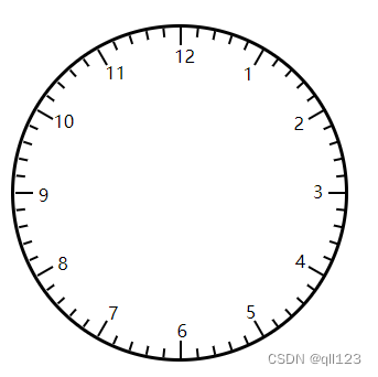
html元素中的 ul下加<li><span>数字</span></li>实现刻度和数字的画法。
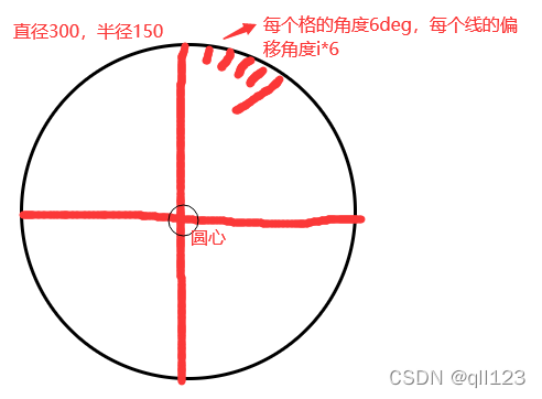
我们画了一个300px*300px的表盘,要再这个圆里面画出刻度线并把这个圆等分;
分析:刻度:12*5=60;表盘上的刻度总共有60个刻度。
度数:360/60=6deg;每个刻度占的度数;
偏移量:i*6 i 为表盘上的刻度6为偏移度数,得出每个刻度的偏移度
旋转中心:150px;我们画了一个直径300的圆,那它的中心点在150px处
接下来我们利用css角度偏移控制,刻度线的位置,利用js循环画出所有刻度线
先看css
.time-clock {margin: 50px;width: 300px;height: 300px;border: 3px solid black;border-radius: 50%;position: relative;ul {list-style: none;position: relative;width: 100%;height: 100%;li {width: 2px;height: 8px;position: absolute;background: black;left: 50%; transform-origin: center 150px;span {position: absolute;top: 15px;left: -5px;}}}
}
js画出所有线和数字
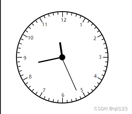
let ul = document.querySelector("ul");let num = 0;for(let i=0;i<60;i++){let li = document.createElement('li');li.style.transform = `rotate(${i*6}deg)`;if(i%5 == 0){li.style.height='16px'// 一个大格的线要长一些let span = document.createElement('span');let clockNum = i==0 ? 12 : num;span.innerText = clockNum +'';span.style.transform = `rotate(-${i*6}deg)`;num++li.appendChild(span);}ul.appendChild(li);}结果如下:
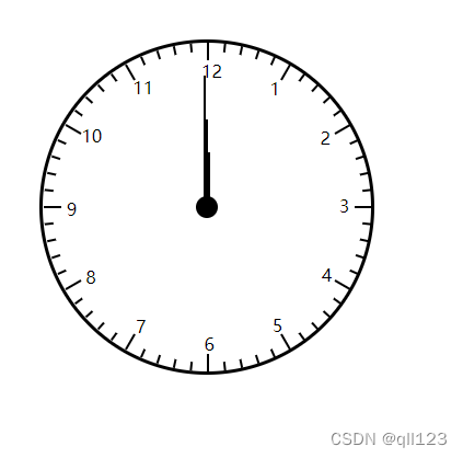
4、指针和中心点的制作
表盘画完了,我们开始画指针,这里指针就是三个div设置宽度和长度。中心点是一个小圆画法同第一步,主要是确认中心点。指针上不要使用transform,因为一会儿要写脚本通过transfrom改变指针的角度,让指针动起来,css中使用的transform会被脚本中的所替代。
.time-clock {margin: 50px;width: 300px;height: 300px;border: 3px solid black;border-radius: 50%;position: relative;.hour,.minute,.second{position: absolute;left:50%;top:50%;background:black;transform-origin: center bottom;}.hour{width:6px;height:50px;// 时针设置到中心点 margin: -50px 0 0 -3px;}.minute{width:4px;height:80px;// 时针设置到中心点 margin: -80px 0 0 -3px;}.second{width:2px;height: 120px;margin: -120px 0 0 -3px;}.ball{width:20px;height:20px;position: absolute;background: black;border-radius: 50%;left:50%;top:50%;transform: translate(-50%,-50%);}ul {list-style: none;position: relative;width: 100%;height: 100%;li {width: 2px;height: 8px;position: absolute;background: black;left: 50%; transform-origin: center 150px;span {position: absolute;top: 15px;left: -5px;}}}
}
5、css完成,利用js使指针动起来
let hour = document.querySelector('#hour');let minute = document.querySelector('#minute');let second = document.querySelector('#second');// hour.style.transform=`rotate(${5*30}deg)`;setInterval(()=>{let date = new Date();let h = date.getHours();let m = date.getMinutes();let s = date.getSeconds();hour.style.transform=`rotate(${h*30+m/2}deg)`;minute.style.transform=`rotate(${m*6}deg)`;second.style.transform=`rotate(${s*6}deg)`;},1000)4、问题
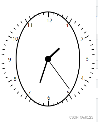
犯了一个粗心的问题,开始想着居中,把body的display设置成了flex布局,结果当页面缩小的时候表盘也缩小了。成了这个样子。
5、全部代码
这里的css使用less写的,生成的css放到了 css文件夹下;
<!DOCTYPE html>
<html lang="en">
<head><meta charset="UTF-8"><meta http-equiv="X-UA-Compatible" content="IE=edge"><meta name="viewport" content="width=device-width, initial-scale=1.0"><title>Document</title><link rel="stylesheet" href="./css/time.css">
</head>
<body><div class="time-clock"><!-- 表盘 刻度 数字 --><ul></ul><!-- 时针 --><div id="hour" class="hour"></div><!-- 分针 --><div id="minute" class="minute"></div><!-- 秒针 --><div id="second" class="second"></div><!-- 中心点 --><div class="ball"></div></div>
</body>
<script>let ul = document.querySelector("ul");let num = 0;for(let i=0;i<60;i++){let li = document.createElement('li');li.style.transform = `rotate(${i*6}deg)`;if(i%5 == 0){li.style.height='16px'// 一个大格的线要长一些let span = document.createElement('span');let clockNum = i==0 ? 12 : num;span.innerText = clockNum +'';span.style.transform = `rotate(-${i*6}deg)`;num++li.appendChild(span);}ul.appendChild(li);}let hour = document.querySelector('#hour');let minute = document.querySelector('#minute');let second = document.querySelector('#second');setInterval(()=>{let date = new Date();let h = date.getHours();let m = date.getMinutes();let s = date.getSeconds();hour.style.transform=`rotate(${h*30+m/2}deg)`;minute.style.transform=`rotate(${m*6}deg)`;second.style.transform=`rotate(${s*6}deg)`;},1000)
</script>
</html>
// out: ../css/
* {margin: 0;padding: 0;
}body {width: 100%;height: 100%;
}.time-clock {margin: 50px;width: 300px;height: 300px;border: 3px solid black;border-radius: 50%;position: relative;.hour,.minute,.second{position: absolute;left:50%;top:50%;background:black;transform-origin: center bottom;}.hour{width:6px;height:50px;// 时针设置到中心点 margin: -50px 0 0 -3px;}.minute{width:4px;height:80px;// 时针设置到中心点 margin: -80px 0 0 -3px;}.second{width:2px;height: 120px;margin: -120px 0 0 -3px;}.ball{width:20px;height:20px;position: absolute;background: black;border-radius: 50%;left:50%;top:50%;transform: translate(-50%,-50%);}ul {list-style: none;position: relative;width: 100%;height: 100%;li {width: 2px;height: 8px;position: absolute;background: black;left: 50%; transform-origin: center 150px;span {position: absolute;top: 15px;left: -5px;}}}
}二、 夜晚星空
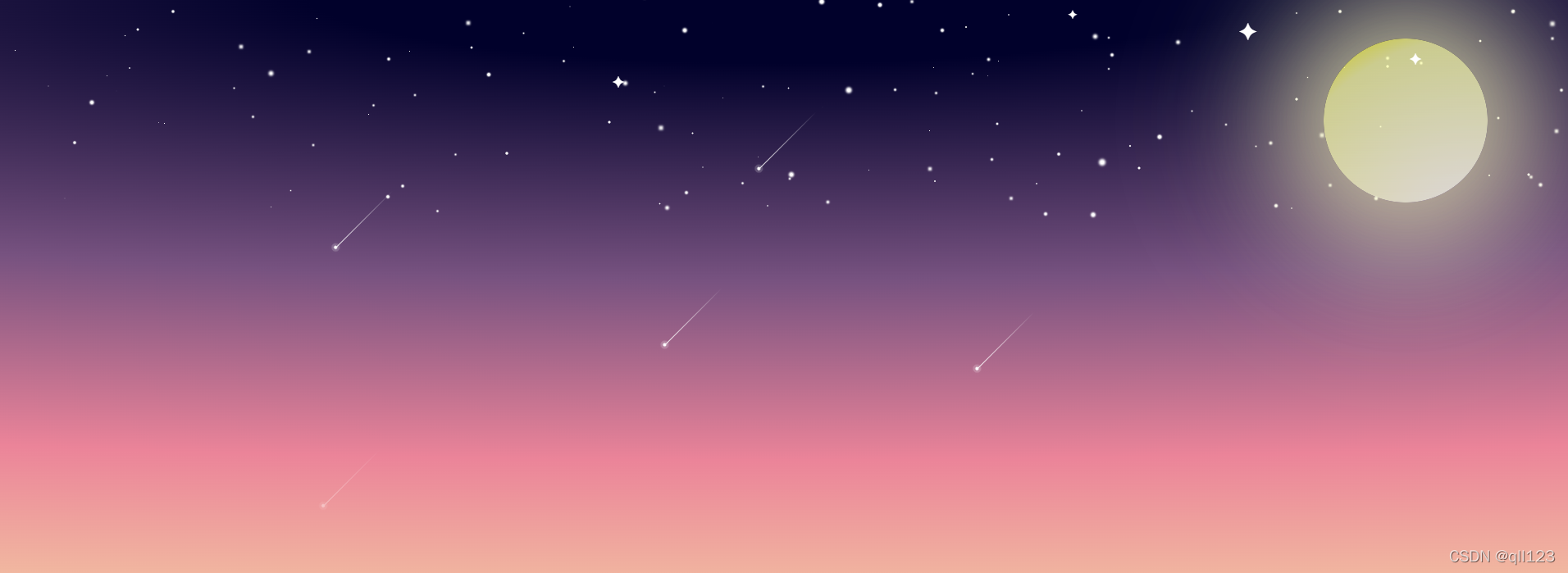
1、最终效果图
Document
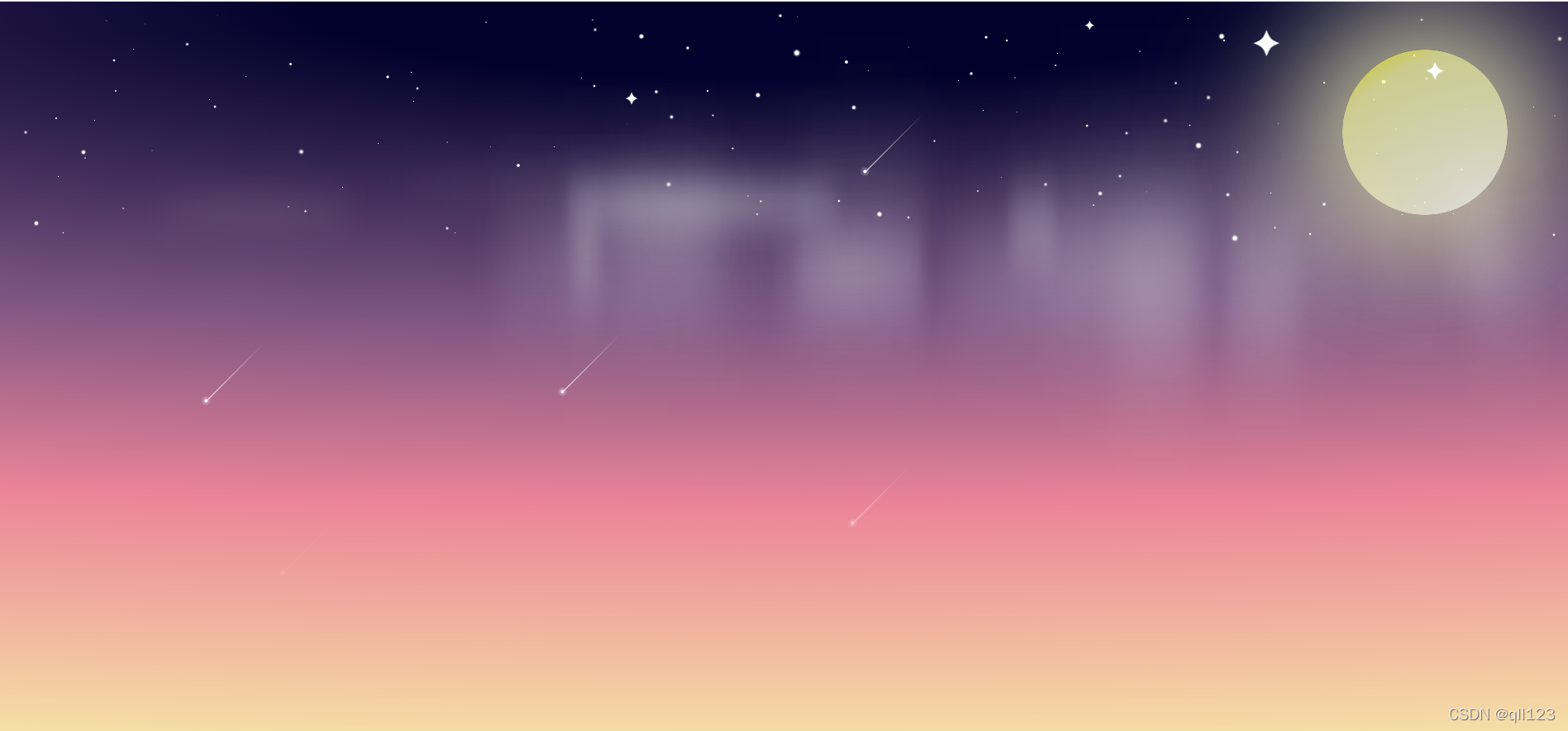
看到网上有人用css画了烟雾的效果,想要模仿。开始背景就是黑色感觉只有雾有些单调,就琢磨着加了些东西,按着自己的想法画了星星,月亮,流星等,就成了上面的图。
真正页面是动态的(* ̄︶ ̄)
2、主要用到的CSS
渐变
动画
模糊
3、步骤
自己练习的时候最开始画的是雾,开始只想练习这个来着。现在写步骤,会从背景、星空开始写,最后画雾。
1、html结构
<body><!-- 星星 --><div class="star"><span class="square">✦</span><span class="square">✦</span><span class="square">✦</span><span class="square">✦</span><!-- 流星 --><section><span></span><span></span><span></span><span></span><span></span></section></div><!-- 月亮 --><div class="moon"></div><!-- 烟雾 --><div class="mist"></div></body>2、天空
html,
body {width: 100%;height: 100vh;
}// body{
body {background: radial-gradient(300% 100% at top, #01012b 10%, #775280 40%, #eb8499 65%, #f7eca7);overflow: hidden;position: relative;
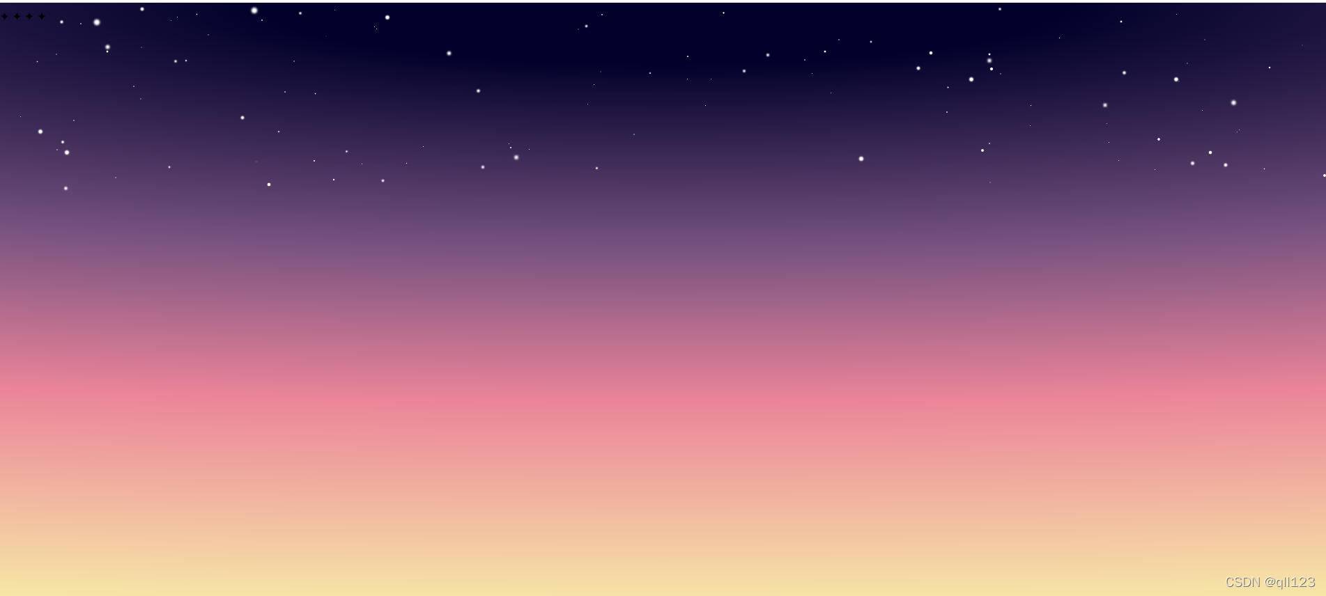
}3、满天繁星
随机在天上画上大小不同的小圆点,@keyframes blink 闪烁起来。animation-delay 延迟
// 星星let star=document.getElementsByClassName('star');for(let i = 0;i<150;i++){let size=Math.floor(Math.random()*3)+'px';let div = document.createElement('div');div.style=`width:${size};height:${size};top:${Math.random()*30}vh;left:${Math.random()*100}vw;transform:scale(${Math.random()*2});animation-delay:${Math.random()*2}s;animation: blink ${Math.floor(Math.random()*4)}s ease infinite alternate;`;star[0].appendChild(div);}.star {width: 100vw;height: 50vh;position: relative;div {border-radius: 50%;background-color: white;position: absolute;}
}
@keyframes blink {0% {box-shadow: 0 0 0 0 #fff;}100% {box-shadow: 0 0 1.4px 1.4px #fff;}
}效果如下
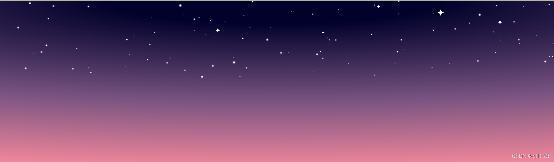
加入✦这样的星星
.star .square {display: block;position: absolute;top: 20px;right: 380px;font-size: 30px;z-index: 101;color: #fff;animation-delay: .5s;animation: lights 1.5s ease infinite alternate;
}.star .square:nth-child(2) {font-size: 20px;top: 20%;right: 60%;animation-delay: .8s;
}.star .square:nth-child(3) {font-size: 15px;top: 10px;right: 600px;animation-delay: 1s;
}.star .square:nth-child(4) {font-size: 20px;top: 60px;right: 180px;
}
@keyframes lights {0%,100% {transform: scale(1);}50% {transform: scale(1.5);}
}
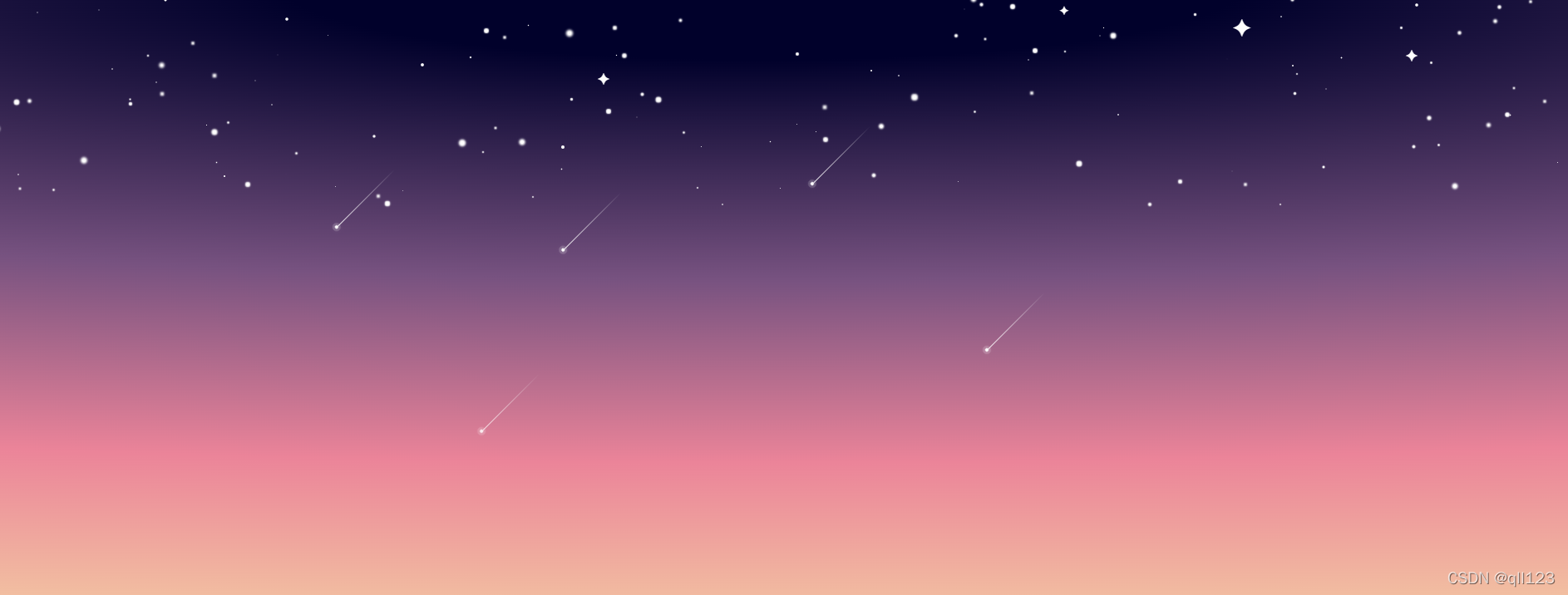
4、流星
// 星星
.star {width: 100vw;height: 50vh;position: relative;div {border-radius: 50%;background-color: white;position: absolute;}section{span{position: absolute;width: 4px;height:4px;border-radius: 50%;top:30px;right:300px;background-color: white;box-shadow: 0 0 0 3px rgba(255,255,255,.1),0 0 0 3px rgba(255,255,255,.1),0 0 9px rgba(255, 255, 255, 0.1);animation:meteor 3s linear infinite;opacity: 0;&::after{position: absolute;content: '';width:100px;height: 1px;top:50%;background:linear-gradient(100deg,#fff,transparent);}}span:nth-child(2){top:0;right:780px;animation-delay: 0.2s;animation-duration: 2s;}span:nth-child(3){top:0;right:680px;animation-delay: 0.4s;animation-duration: 4s;}span:nth-child(4){top:0;right:900px;animation-delay: 0.6s;animation-duration: 2.5s;}span:nth-child(5){top:0;right:1200px;animation-delay: 0.5s;animation-duration: 3s;}}
}
@keyframes meteor{0%{transform: rotate(315deg) translateX(0);opacity:1;}70%{opacity:1}100%{transform:rotate(315deg) translateX(-1000px);opacity:0}}
5、月亮
.moon {position: absolute;display: flex;top: 50px;right: 100px;width: 200px;height: 200px;border-radius: 50%;opacity: .8;justify-content: center;align-items: center;background: radial-gradient(circle at 90% 120%, #ffffff, #f8faa4 80%, #faf602 100%);box-shadow: 0 0 150px 60px #f0efb6;
}
6、加烟雾
随机画出一些长短不一的线条或者细长的椭圆之类的,随意吧。
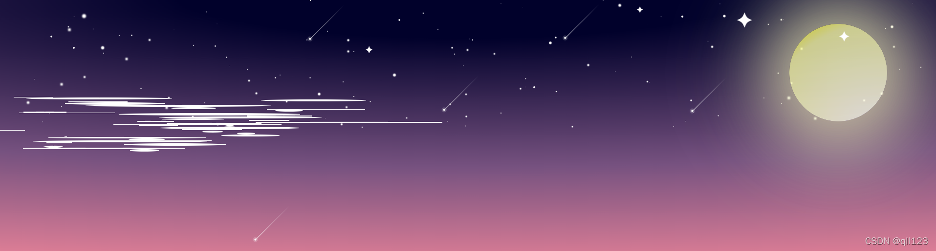
let num=40;let mist=document.getElementsByClassName('mist');for(i=0;i<num;i++){let span = document.createElement('span');span.style=`margin-left:${Math.random()*30}vw;width:${Math.random()*20}vw;filter:blur(${Math.floor((Math.random()*8)+6)}px);height:${Math.random()*5}px;--i:${Math.floor((Math.random()*40)+1)}`;// margin-top: ${Math.random()*10}px;mist[0].appendChild(span);}加上模糊效果 上面代码中的filter:blur(${Math.floor((Math.random()*8)+6)}px);数值自己随意调。
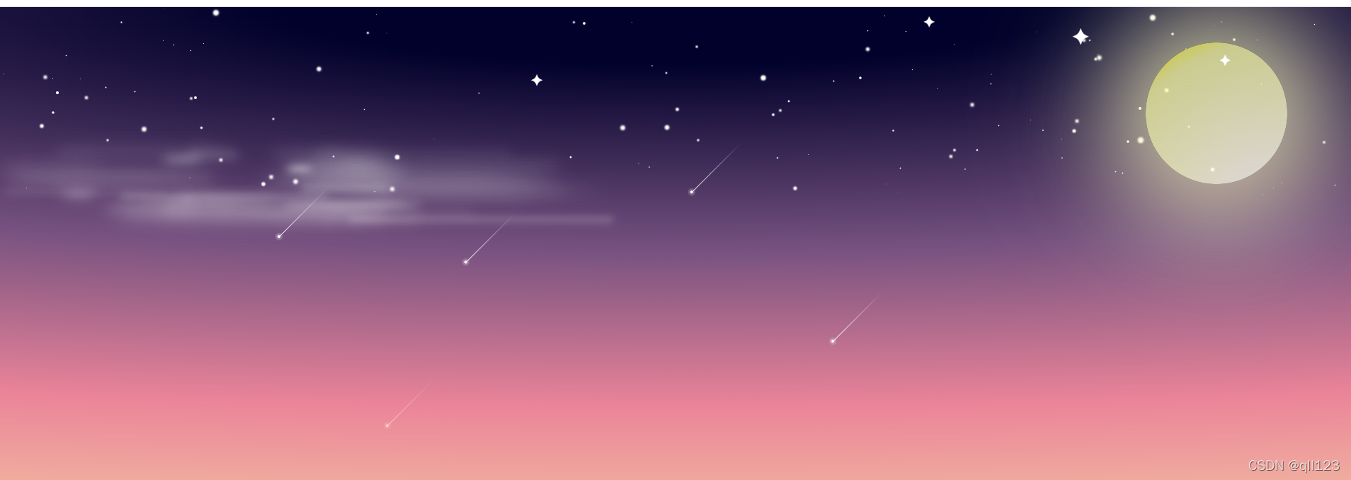
动起来
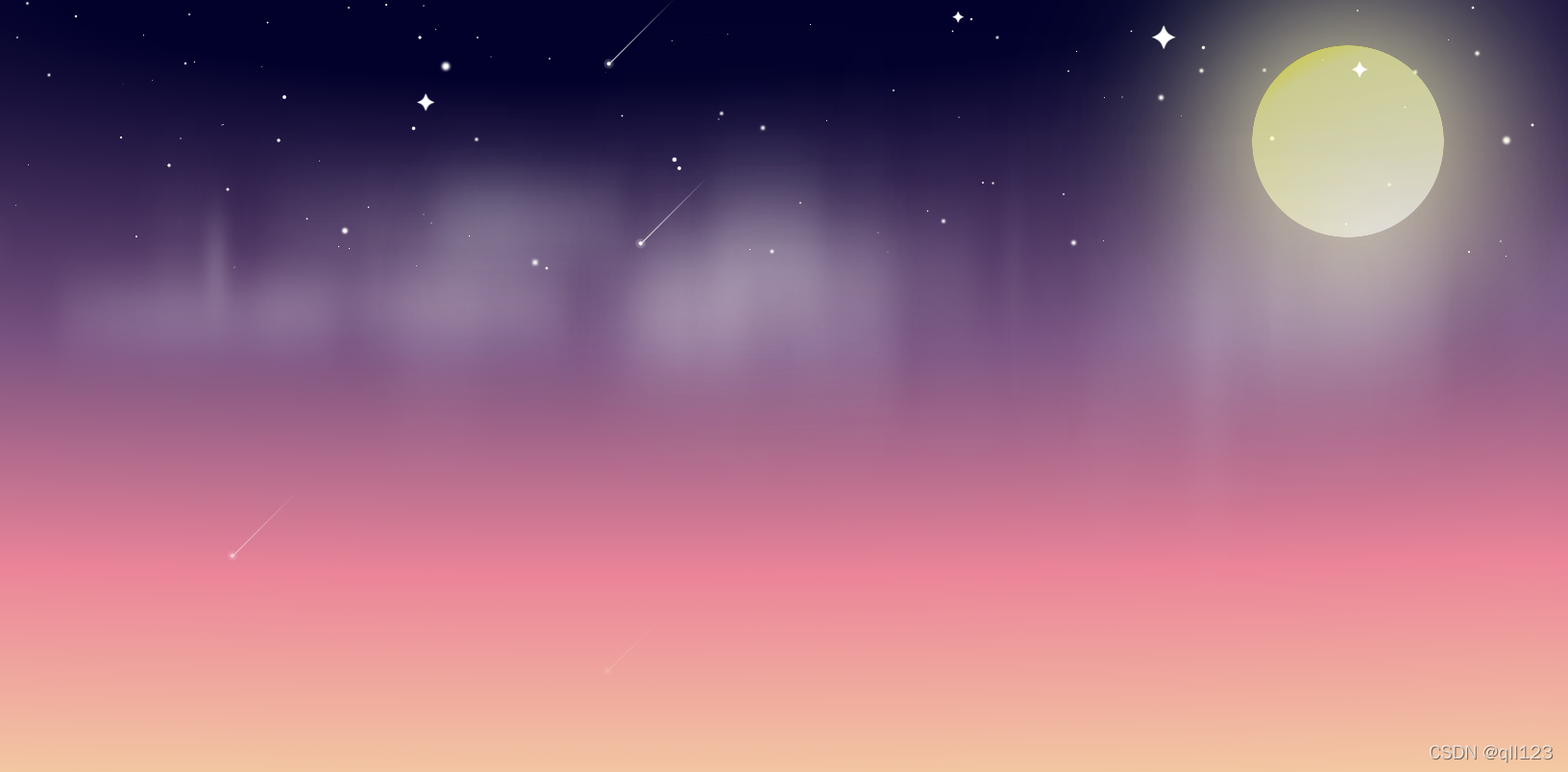
@keyframes fog {0% {opacity: 0;transform: translate(0) scaleY(1);}15% {opacity: 1;transform: translate(15vw, 30px) scaleY(4);}30% {opacity: 0.9;transform: translate(30vw, 40px) scaleY(6);}45% {opacity: 0.8;transform: translate(45vw, 60px) scaleY(8);}60% {opacity: 0.7;transform: translate(60vw, 70px) scaleY(10);}70% {opacity: 0.6;transform: translate(70vw, 50px) scaleY(8);}80% {opacity: 0.5;transform: translate(80vw, 40px) scaleY(6);}90% {opacity: 0.4;transform: translate(90vw, 30px) scaleY(4);}100% {opacity: 0;transform: translate(100vw, -100px) scaleY(2);}
}
完成;
四、问题
没遇到什么问题,自己瞎琢磨着乱写,想到哪就写哪,有些css的属性方法不知道就从网上搜,主要是为了熟悉css的各种属性。各种参数自己多试试就知道了。
开始想着这个有些麻烦,但是写完后感觉好像也没用到啥,主要就是渐变、动画。