Css 的几个常用案例
1. css 编写三角形
<!-- 三角形 --><div class='triangle-page'><div class="triangle-top"></div><div class="triangle-right"></div><div class="triangle-bottom"></div><div class="triangle-left"></div></div>
/* 三角形样式-上-右-下-左 */
.triangle-page {width: 50%;margin: 0 auto;
}
.triangle-top {width: 0;height: 0;border-right: 50px solid transparent;border-left: 50px solid transparent;border-top: 50px solid red;
}
.triangle-right {width: 0;height: 0;border-top: 50px solid transparent;border-bottom: 50px solid transparent;border-right: 50px solid blue;
}
.triangle-bottom {width: 0;height: 0;border-right: 50px solid transparent;border-left: 50px solid transparent;border-bottom: 50px solid yellow;
}
.triangle-left {width: 0;height: 0;border-top: 50px solid transparent;border-bottom: 50px solid transparent;border-left: 50px solid green;
}

<!-- 直角三角形 -->
<div class="right-triangle"><div class="left-top"></div><div class="left-bottom"></div>
</div>
/* 直角三角形 */
.right-triangle {width: 50%;margin: 0 auto;
}
.right-triangle .left-top {width: 0;height: 0;border-top: 50px solid #ccc;border-right: 50px solid transparent;
}
.right-triangle .left-bottom {width: 0;height: 0;border-bottom: 50px solid #ccc;border-right: 50px solid transparent;
}
2. css编写燕尾型
<!-- 燕尾型 --><div class="container" style="margin-top: 25px;"><div class="step"></div></div>
/* 单个-燕尾型 */
.container .step {background-color: #0979CB;position: relative;display: inline-block;width: 120px;height: 40px;
}
.step::before {content: '';position: absolute;left: -10px;background: white;width: 40px;height: 40px;transform: rotate(-45deg);z-index: 1;box-shadow: 3px 3px 0px 0px white;
}
.step::after {content: '';position: absolute;right: -20px;border-top: 20px solid transparent;border-bottom: 20px solid transparent;border-left: 20px solid #0979CB;
}
<!-- 多个-燕尾型 -->
<div class="step-container" style="margin-top: 25px;"><div class="step step1"></div><div class="step2"></div><div class="step2"></div><div class="step2"></div>
</div>
/* 单个-燕尾型 */
.step-container {display: flex;overflow: hidden;align-items: center;
}
.step-container div.step,
.step-container div.step2 {background-color: #0979CB;position: relative;display: inline-block;flex-basis: 100px;height: 40px;
}
.step-container div.step:after,
.step-container div.step2:after {content: '';position: absolute;right: -26px;background: #0979CB;width: 40px;height: 40px;transform: rotate(-45deg);z-index: 1;box-shadow: 3px 3px 0px 0px white;
}
.step-container div.step2 {background-color: #ccc;
}
.step-container div.step2:after {background: #ccc;
}
.step-container div.step1:before {content: '';position: absolute;left: -10px;background: white;width: 40px;height: 40px;transform: rotate(-45deg);z-index: 1;box-shadow: 3px 3px 0px 0px white;
}
3. css编写多边形
(1)平行四边形
<!-- 平行四边形 -->
<div class="parallelogram"><div class="paralle"></div></div>
.parallelogram  {width: 50%;margin: 0 auto;
}
.parallelogram .paralle {width: 150px;height: 100px;background: red;/* 旋转的度数 *//* transform: skew(-45deg); */transform: skew(20deg);/* 起始位置 */transform-origin: left top;
}
(2)梯形
<!-- 梯形 -->
<div class="trapezoid"><div class="trape"></div>
</div>
/* 梯形 */
.trapezoid {width: 50%;margin: 0 auto;margin-top: 20px;
}
.trapezoid .trape {width: 100px;height: 0;/* border-top: 100px solid greenyellow; */border-bottom: 100px solid greenyellow;border-left: 100px solid transparent;border-right: 100px solid transparent;
}
(3)五边形
<div class="pentagon"><div class="pent"></div>
</div>
/* 五边形 */
.pentagon {width: 50%;margin: 0 auto;margin-top: 20px;
}
.pentagon .pent {position: relative;width: 54px;border-width: 50px 18px 0;border-style: solid;border-color: aqua transparent;
}
.pentagon .pent::before {content: "";position: absolute;width: 0;height: 0;top: -85px;left: -18px;border-width: 0 45px 35px;border-style: solid;border-color: transparent transparent aqua;
}
(4)六边形
<!-- 六边形 -->
<div class="hexagon"><div class="hexa"></div>
</div>
/* 六边行 */
.hexagon {width: 50%;margin: 0 auto;margin-top: 50px;
}
.hexagon .hexa {position: relative;width: 100px;height: 50px;background: burlywood;
}
.hexagon .hexa::before {content: "";position: absolute;width: 0;height: 0;top: -25px;left: 0;border-left: 50px solid transparent;border-right: 50px solid transparent;border-bottom: 25px solid burlywood;
}
.hexagon .hexa::after {content: "";position: absolute;width: 0;height: 0;bottom: -25px;left: 0;border-left: 50px solid transparent;border-right: 50px solid transparent;border-top: 25px solid burlywood;
}
(5)五角形
<!-- 五角星 --><div class="five-star"><div class="star"></div></div>
/** 五角星 */
.five-star {width: 50%;margin: 0 auto;margin-top: 90px;
}
.five-star .star {position: relative;width: 0;height: 0;border-left: 100px solid transparent;border-right: 100px solid transparent;border-bottom: 70px solid red;transform: rotate(35deg);display: block;
}
.five-star .star::before {position: absolute;width: 0;height: 0;border-left: 30px solid transparent;border-right: 30px solid transparent;border-bottom: 80px solid red;transform: rotate(-35deg);content: '';top: -45px;left: -65px;display: block;
}
.five-star .star::after {position: absolute;width: 0;height: 0;border-left: 100px solid transparent;border-right: 100px solid transparent;border-bottom: 70px solid red;transform: rotate(-70deg);top: 3px;left: -105px;display: block;content: '';
}
(6)爱心
<!-- 爱心 --><div class="heart-box"><div class="heart"></div></div>
/** 爱心 */
.heart-box {width: 50%;margin: 0 auto;margin-top: 90px;
}
.heart-box .heart {position: relative;width: 100px;height: 90px;
}
.heart-box .heart::before,
.heart-box .heart::after {position: absolute;content: '';width: 50px;height: 80px;background: red;top: 0;left: 50px;border-radius: 50px 50px 0 0;transform: rotate(-45deg);transform-origin: 0 100%;
}
.heart-box .heart::after {left: 0;transform: rotate(45deg);transform-origin: 100% 100%;
}
4. css伪类的妙用
<!-- 对话框 --><div class="dialog-box"><div class="dialog"></div></div>
/* 对话框 */
.dialog-box {width: 50%;margin: 0 auto;margin-top: 50px;
}
.dialog-box .dialog {position: relative;width: 120px;height: 80px;background: #ccc;border-radius: 10px;
}
.dialog-box .dialog::before {content: '';position: absolute;width: 0;height: 0;top: 26px;right: 100%;border-top: 13px solid transparent;border-bottom: 13px solid transparent;border-right: 26px solid #ccc;
}
5. css浮动的清除
(1)浮动产生的原因
一般是一个盒子里使用了CSS float浮动属性,导致父级对象盒子不能被撑开,这样CSS float浮动就产生了。
简单地说,浮动是因为使用了float:left或float:right或两者都是有了而产生的浮动。(如下图)

<div class="float-reason"><div class="left-box"></div><div class="right-box"></div>
</div>
.float-reason {border: 1px solid red;width: 50%;
}
.float-reason .left-box {float: left;width: 40%;height: 100px;border: 1px solid black;
}
.float-reason .right-box {float: right;width: 40%;height: 100px;border: 1px solid black;
}
(2)浮动产生的影响
- 背景不能正常显示
- 边框不能撑开
- margin和padding值不能正确显示
(3)清除浮动的方法
新建一个样式选择器CSS命名为“.clear”,并且对应选择器样式为“clear:both”,然后我们在父级“”结束前加此div引入“class=“clear””样式。这样即可清除浮动。
<div class="float-reason"><div class="left-box"></div><div class="right-box"></div><div class="clear"></div>
</div>
/* 追加 */
.clear {clear: both;
}
- 对父级CSS选择器加overflow:hidden样式,可以清除父级内使用float产生浮动。优点是可以很少CSS代码即可解决浮动产生。
.float-reason {border: 1px solid red;width: 50%;overflow: hidden; // 父级增加
}

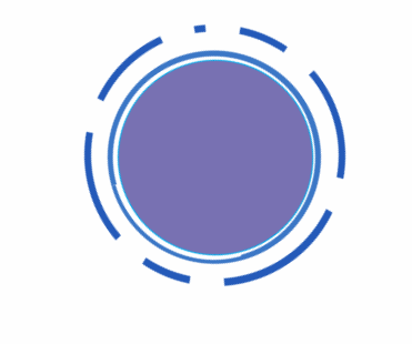
6. css实现图片旋转
<div class="rotate-box"><img class="rotate-img" src="../../static/images/small.png" alt="">
</div>
.rotate-img {transform: rotate(360deg);-webkit-transform: rotate(360deg);animation: rotation 5s linear infinite;-moz-animation: rotation 5s linear infinite;-webkit-animation: rotation 5s linear infinite;-o-animation: rotation 5s linear infinite;
}
@-webkit-keyframes rotation{from {-webkit-transform: rotate(0deg);}to {-webkit-transform: rotate(360deg);}
}