最近我在youtube上跟着大神学习200个CSS小案例,作者Online Tutorials 编码的内容很实用,案例中涉及定位、变换、动画等概念,适合进一步学习和巩固CSS知识,能帮助我们实现页面的特效。
youtube视频链接:https://www.youtube.com/watch?v=TawH-AqHTXc&list=PL5e68lK9hEzdYG6YQZCHtM9gon_cDNQMh&ab_channel=OnlineTutorials
目录
1.Simple Parallax Scrolling Effect(简单的视差滚动效果)
2.Fullscreen Video Background(全屏视频背景)
3.Transform Effects on Scroll(滚动时产生的变换效果)
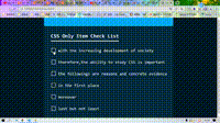
5.Creative Check List(有创意性的清单)
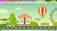
6.Moving Car Using CSS Animation Effects(用CSS动画实现小车移动)
7.Awesowe Social Media Button Hover Animation(了不起的社交媒体按钮悬停动画)
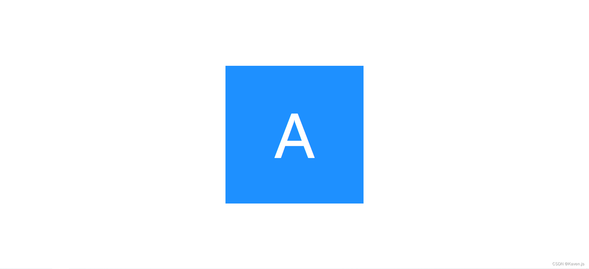
8.Align Text Center Vertical and Horizontal(垂直和水平对齐文本中心)
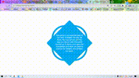
9.Creative DIV Shape(创意性的div形状)
10.how to create css Icon Hover Effect(如何创建css图标悬停效果)
1.Simple Parallax Scrolling Effect(简单的视差滚动效果)
<!DOCTYPE html>
<html lang="en">
<head><meta charset="UTF-8"><meta http-equiv="X-UA-Compatible" content="IE=edge"><meta name="viewport" content="width=device-width, initial-scale=1.0"><title>Moon Light Parallax Effects With CSS</title><link rel="stylesheet" href="style.css">
</head>
<body><section><img src="bg.jpg" id="bg" alt=""><img src="moon.png" id="moon" alt=""><img src="mountain.png" id="mountain" alt=""><img src="road.png" id="road" alt=""><h2 id="text">Moon Light</h2></section><script>let bg=document.getElementById('bg');let moon=document.getElementById('moon');let mountain=document.getElementById('mountain');let road=document.getElementById('road');let text=document.getElementById('text');window.addEventListener('scroll',function(){var value=window.scrollY;bg.style.top=-value*0.5+'px';moon.style.left=-value*0.5+'px';mountain.style.top=-value*0.15+'px';road.style.top=value*0.15+'px';text.style.top=value*1+'px';})</script>
</body>
</html>
*{margin: 0;padding: 0;font-family: 'Poppins',sans-serif;
}
body{background: #0a2a43;min-height: 1500px;/*设置元素的最小高度*/
}
section{/* 相对定位 */ position: relative;width: 100%;height: 100vh;/*vh 视口的初始包含块的高度的 1%*/overflow: hidden;/* 弹性布局,它能够扩展和收缩 flex 容器内的元素,以最大限度地填充可用空间 */display: flex;/* 居中对齐 *//* 横向 */justify-content: center;/* 纵向 */align-items: center;
}
section:before{content: '';position: absolute;/* 相对于section进行定位 */bottom: 0;width: 100%;height: 100px;background: linear-gradient(to top,#0a2a43,transparent);z-index: 10000;
}
section:after{content: '';position: absolute;top: 0;left: 0;width: 100%;height: 100%;background:#0a2a43;/* 因为这里设置了在最高层显示 */z-index: 10000;/* mix-blend-mode CSS 属性描述了元素的内容应该与元素的直系父元素的内容和元素的背景如何混合。 */mix-blend-mode: color;
}
section img{position: absolute;top: 0;left: 0;width: 100%;height: 100%;;/* object-fit CSS 属性指定可替换元素(例如:<img> 或 <video>)的内容应该如何适应到其使用高度和宽度确定的框。 */object-fit: cover;/* pointer-events CSS 属性指定在什么情况下 (如果有) 某个特定的图形元素可以成为鼠标事件的 target (en-US)。 */pointer-events: none;
}
#text{position: relative;color: #fff;font-size: 10em;
}
#road{z-index: 2;
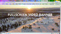
}2.Fullscreen Video Background(全屏视频背景)
<!DOCTYPE html>
<html lang="en"><head><meta charset="UTF-8" /><meta http-equiv="X-UA-Compatible" content="IE=edge" /><meta name="viewport" content="width=device-width, initial-scale=1.0" /><title>Fullscreen Video Background</title><link rel="stylesheet" href="style.css"></head><body><div class="banner"><video autoplay muted loop><source src="Mountains.mp4" type="video/mp4" /></video><div class="content"><h1>Fullscreen Video banner</h1><p>To accompany his instructions for depicting twilight, Latrobe drew alone Conestoga wagon—named for the Pennsylvania town just southeast ofColumbia where the vehicles were thought to have been built—travelingwest at dusk along the southern branch of the Juniata River, todayknown as the Raystown Branch. </p></div></div></body>
</html>
body{margin: 0;padding: 0;font-family: 'Poppins', sans-serif;height: 1000px;
}
.banner{width: 100%;height: 100vh;overflow: hidden;display: flex;justify-content: center;align-items: center;
}
.banner video{/* 让它脱离文档流 */position: absolute;top: 0;left: 0;object-fit: cover;width: 100%;height: 100%;pointer-events: none;
}
.banner .content{position: relative;z-index: 1;max-width: 1000px;text-align: center;
}
.banner .content h1{margin: 0;padding: 0;font-size: 4em;text-transform: uppercase;color: #fff;
}
.banner .content p{font-size: 1.5em;color: #fff;
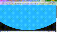
}3.Transform Effects on Scroll(滚动时产生的变换效果)
<!DOCTYPE html>
<html lang="en">
<head><meta charset="UTF-8"><meta http-equiv="X-UA-Compatible" content="IE=edge"><meta name="viewport" content="width=device-width, initial-scale=1.0"><title>Page Scroll Effects</title><link rel="stylesheet" href="style.css">
</head>
<body><section><span class="curve"><img src="curve.png" alt=""></span></section><script>var scroll=document.querySelector('.curve');window.addEventListener('scroll',function(){// 宽度不变,高度缩短var value=1+window.scrollY/-500;scroll.style.transform=`scaleY(${value})`})</script>
</body>
</html>
*{margin:0;padding: 0;
}
body{height: 200vh;background: #111;
}
section{position: absolute;width: 100%;height: calc(100% - 200px);background: #2abbff;
}
section .curve{position: absolute;bottom: -200px;height: 200px;width: 100%;/* transform-origin CSS 属性让你更改一个元素变形的原点。 */transform-origin: top;
}
section .curve img{width: 100%;height: 100%;
}4.Fullscreen Overlay Responsive Navigation Menu(全屏覆盖响应式导航菜单)
<!DOCTYPE html>
<html lang="en"><head><meta charset="UTF-8" /><meta http-equiv="X-UA-Compatible" content="IE=edge" /><meta name="viewport" content="width=device-width, initial-scale=1.0" /><title>Fullscreen Menu</title><link rel="stylesheet" href="style.css" /></head><body><div id="toggleIcon" onclick="menuToggle()"></div><div id="menu-overlay"><ul><li><a href="#">Home</a></li><li><a href="#">About</a></li><li><a href="#">Services</a></li><li><a href="#">Portfolio</a></li><li><a href="#">Our Team</a></li><li><a href="#">Contact</a></li></ul></div><script>function menuToggle(){var nav=document.getElementById('menu-overlay');nav.classList.toggle('active');var toggleIcon=document.getElementById('toggleIcon');toggleIcon.classList.toggle('active');}</script></body>
</html>
*{margin: 0;padding: 0;font-family: 'Poppins' sans-serif;
}
#menu-overlay{/* 整页的效果 */position: fixed;top: 0;left: 0;right: 0;bottom: 0;background: #f00;/* 包含的项居中显示 */display: flex;justify-content: center;align-items: center;overflow-y: auto;/* 初始状态缩小为0.1 */transform: scale(0.1);transition: 0.5s;
}
#menu-overlay.active{transform: scale(1);
}
#menu-overlay ul{position: relative;
}
#menu-overlay ul li{position: relative;list-style: none;text-align: center;display: block;
}
#menu-overlay ul li a{position: relative;text-decoration: none;font-size:3.5em;padding: 0 10px;color: #fff;font-weight: 700;text-transform: uppercase;display: inline-block;
}
/* 黄线 */
#menu-overlay ul li a:before{content: '';position: absolute;/* 相对于a定位 */top: 50%;left: 0;width: 100%;height: 8px;background: #ff0;transform: scaleX(0);transform-origin: right;transition: 0.5s transform;
}
#menu-overlay ul li a:hover:before{transform: scaleX(1);transform-origin: left;transition: 0.5s transform;
}
#toggleIcon{position: fixed;top: 20px;right: 20px;width: 50px;height: 50px;background: #ff0 url(open.png);z-index: 1;cursor: pointer;
}
#toggleIcon.active{background: #ff0 url(close.png);
}
5.Creative Check List(有创意性的清单)
<!DOCTYPE html>
<html lang="en">
<head><meta charset="UTF-8"><meta http-equiv="X-UA-Compatible" content="IE=edge"><meta name="viewport" content="width=device-width, initial-scale=1.0"><title>Creative Item Check List</title><link rel="stylesheet" href="style.css">
</head>
<body><div class="list"><h2>CSS Only Item Check List</h2><label><input type="checkbox" name=""><i></i><span>with the increasing development of society</span></label><label><input type="checkbox" name=""><i></i><span>therefore,the ability to study CSS is important</span></label><label><input type="checkbox" name=""><i></i><span>the followings are reasons and concrete evidence</span></label><label><input type="checkbox" name=""><i></i><span>in the first place</span></label><label><input type="checkbox" name=""><i></i><span>moreover</span></label><label><input type="checkbox" name=""><i></i><span>last but not least</span></label></div>
</body>
</html>
* {margin: 0;padding: 0;font-family: consolas;box-sizing: border-box;
}
body {display: flex;justify-content: center;align-items: center;min-height: 100vh;background: #001925;
}
.list {padding: 30px 75px 10px 30px;position: relative;background: #042b3e;border-top: 50px solid #03a9f4;
}
.list h2 {color: #fff;font-size: 30px;padding: 10px 0;margin-left: 10px;display: inline-block;border-bottom: 4px solid #fff;
}
.list label {position: relative;display: block;margin: 40px 0;color: #fff;font-size: 24px;cursor: pointer;
}
.list input[type="checkbox"] {-webkit-appearance: none;
}
.list i {position: absolute;top: 0;display: inline-block;width: 25px;height: 25px;border: 2px solid #fff;
}
.list input[type="checkbox"]:checked ~ i {/* 用边框变换成对勾 */top: 1;border-top: none;border-right: none;height: 15px;width: 25px;transform: rotate(-45deg);
}
.list span{position: relative;left: 40px;transition: 0.5s;
}
.list span:before{content: '';position: absolute;top: 50%;left: 0;width: 100%;height: 1px;background: #fff;transform: translateY(-50%) scaleX(0);transform-origin: right;transition: 0.5s transform;
}
.list input[type="checkbox"]:checked~span:before{transform: translateY(-50%) scaleX(1);transform-origin: left;transition: 0.5s transform;
}
.list input[type="checkbox"]:checked~span{color: #154e6b;
}
6.Moving Car Using CSS Animation Effects(用CSS动画实现小车移动)
<!DOCTYPE html>
<html lang="en"><head><meta charset="UTF-8" /><meta http-equiv="X-UA-Compatible" content="IE=edge" /><meta name="viewport" content="width=device-width, initial-scale=1.0" /><title>Css Moving Background Animation</title><link rel="stylesheet" href="style.css" /></head><body><div class="bg"><img src="car.png" alt=""></div></body>
</html>
body {margin: 0;padding: 0;
}
.bg {position: relative;background: url(background.png);height: 100vh;background-size: cover;/* background-position CSS 属性为每一个背景图片设置初始位置。这个位置是相对于由 background-origin 定义的位置图层的。 */background-position: 0 0;background-repeat: repeat-x;animation: animate 5s linear infinite;
}
.bg img{position: absolute;bottom: 8px;left: 100px;
}
@keyframes animate {from {background-position: 0 0;}to {background-position: 100% 0;}
}
7.Awesowe Social Media Button Hover Animation(了不起的社交媒体按钮悬停动画)

<!DOCTYPE html>
<html lang="en"><head><meta charset="UTF-8" /><meta http-equiv="X-UA-Compatible" content="IE=edge" /><meta name="viewport" content="width=device-width, initial-scale=1.0" /><title>Social Media Button Hover Effects</title><linkrel="stylesheet"href="https://cdnjs.cloudflare.com/ajax/libs/font-awesome/6.2.1/css/all.min.css"integrity="sha512-MV7K8+y+gLIBoVD59lQIYicR65iaqukzvf/nwasF0nqhPay5w/9lJmVM2hMDcnK1OnMGCdVK+iQrJ7lzPJQd1w=="crossorigin="anonymous"referrerpolicy="no-referrer"/><link rel="stylesheet" href="style.css" /></head><body><ul><li><a href="#"><i class="fa-brands fa-facebook-f"></i>Facebook</a></li><li><a href="#"><i class="fa-brands fa-twitter"></i> Twitter</a></li><li><a href="#"><i class="fa-brands fa-google"></i>Google++</a></li><li><a href="#"><i class="fa-brands fa-linkedin"></i>Linkedin</a></li><li><a href="#"><i class="fa-brands fa-instagram"></i>Instagram</a></li></ul></body>
</html>
body{margin: 0;padding: 0;background: #262626;
}
ul{position: absolute;top: 50%;left: 50%;/* CSS 属性 translate 允许你单独声明平移变换,并独立于 transform 属性。 */transform: translate(-50%,-50%);margin: 0;padding: 0;display: flex;
}
ul li{list-style: none;
}
ul li a{position: relative;display: block;width: 150px;height: 80px;color: #fff;font-family: sans-serif;line-height: 80px;text-align: center;font-size: 16px;text-decoration: none;border: 1px solid #000;border-right: none;transition: .5s;
}
ul li a:last-child{border-right: 1px solid #000;
}
ul li a:before{content: '';position: absolute;top: 0;left: 0;width: 100%;height: 100%;background: red;overflow: hidden;z-index: -1;transform: scaleX(0);transform-origin: right;/* ease-in-out 先加速后减速 */transition: transform 0.5s ease-in-out;
}
ul li a:hover:before{transform: scaleX(1);transform-origin: left;
}
ul li:nth-child(1) a:before{background: #3b5999;
}
ul li:nth-child(2) a:before{background: #55acee;
}
ul li:nth-child(3) a:before{background: #dd4b39;
}
ul li:nth-child(4) a:before{background: #0077B5;
}
ul li:nth-child(5) a:before{background: #e4405f;
}
8.Align Text Center Vertical and Horizontal(垂直和水平对齐文本中心)
<!DOCTYPE html>
<html lang="en">
<head><meta charset="UTF-8"><meta http-equiv="X-UA-Compatible" content="IE=edge"><meta name="viewport" content="width=device-width, initial-scale=1.0"><title>Vertical Align Center</title><link rel="stylesheet" href="style.css">
</head>
<body><div class="main"><div class="content">A</div></div>
</body>
</html>
body {margin: 0;padding: 0;font-family: sans-serif;
}
.main {position: absolute;top: 50%;left: 50%;transform: translate(-50%, -50%);width: 300px;height: 300px;background: #1E90FF ;display: table;color: #fff;
}
.content{padding: 20px;display: table-cell;vertical-align: middle;text-align: center;font-size: 8em;
}
9.Creative DIV Shape(创意性的div形状)
<!DOCTYPE html>
<html lang="en"><head><meta charset="UTF-8" /><meta http-equiv="X-UA-Compatible" content="IE=edge" /><meta name="viewport" content="width=device-width, initial-scale=1.0" /><title>CSS Creative DIV Shape with Cool Hover Effects</title><link rel="stylesheet" href="style.css" /></head><body><div><p>Education is an essential part of our lives. It shapes the way we think,the way we act, and the way we interact with the world around us. Itallows us to gain the knowledge and skills we need to pursue our dreamsand achieve our goals.</p></div></body>
</html>
body{margin: 0;padding: 0;
}
div{position: absolute;top: 50%;left: 50%;transform: translate(-50%,-50%);width: 300px;height: 300px;border-radius: 50%;box-shadow: 0 0 0 15px #03a9f4;box-sizing: border-box;text-align: center;transition: .5s;
}
div:hover{border-radius: 0;
}
div:before{content:'';position: absolute;top: 0;left: 0;width: 100%;height: 100%;background: #03a9f4;z-index: -1;transform: rotate(-45deg);border-radius: 10px;
}
div p{margin: 0;padding: 0;color: #fff;font-size: 16px;padding: 20px;font-family: sans-serif;box-sizing: border-box;position: absolute;top: 50%;transform: translateY(-50%);transition: .5s;
}
div:hover p{/* x 偏移量 | y 偏移量 | 阴影模糊半径 | 阴影颜色 */box-shadow: 0 0 50px rgba(0, 0, 0, .5);
}
10.how to create css Icon Hover Effect(如何创建css图标悬停效果)
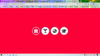
这里面如果Font Awesome不会使用的话,可以看我的《用ChatGPT撰写Font Awesome文章》
<!DOCTYPE html>
<html lang="en"><head><meta charset="UTF-8" /><meta http-equiv="X-UA-Compatible" content="IE=edge" /><meta name="viewport" content="width=device-width, initial-scale=1.0" /><title>Icon Hover Effect</title><link rel="stylesheet" href="style.css" /><linkrel="stylesheet"href="https://cdnjs.cloudflare.com/ajax/libs/font-awesome/6.2.1/css/all.min.css"integrity="sha512-MV7K8+y+gLIBoVD59lQIYicR65iaqukzvf/nwasF0nqhPay5w/9lJmVM2hMDcnK1OnMGCdVK+iQrJ7lzPJQd1w=="crossorigin="anonymous"referrerpolicy="no-referrer"/></head><body><ul><li><i class="fa-solid fa-gift"></i></li><li><i class="fa-solid fa-martini-glass"></i></li><li><i class="fa-solid fa-earth-asia"></i></li><li><i class="fa-solid fa-graduation-cap"></i></li></ul></body>
</html>
body {margin: 0;padding: 0;background: #ff003b;
}
ul {margin: 0;padding: 0;position: absolute;top: 50%;left: 50%;transform: translate(-50%, -50%);
}
ul li {list-style: none;float: left;margin: 10px;width: 100px;height: 100px;line-height: 100px;text-align: center;background: #fff;border-radius: 50%;font-size: 50px;position: relative;color: #262626;/* z-index 较大的元素会覆盖较小的元素在上层进行显示 */z-index: 1;
}
ul li:before {content: "";width: 100%;height: 100%;position: absolute;top: 0;left: 0;background: #ff003b;border-radius: 50%;transform: scale(0);transition: 0.5s ease-in-out;z-index: -1;
}
ul li:hover:before {transform: scale(0.9);
}
ul li:hover {color: #fff;
}