单行文本省略失效
- 要省略的盒子内没有其他块及元素
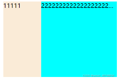
<div class="f"><div class="left">11111</div><div class="right"><span>222222222222222222222222222222222222222222222222</span></div></div>
.f {width: 300px;height: 200px;background-color: pink;margin: 100px auto;overflow: hidden;text-overflow: ellipsis;white-space: nowrap;display: flex;justify-content: flex-start;}.right {flex: 1;overflow: hidden;text-overflow: ellipsis;white-space: nowrap;background-color: aqua;}.left {width: 100px;background-color: antiquewhite;}
左边盒子固定宽度,右边盒子占满自适应
此时我们给class 为 right 的盒子添加了单行省略的代码
overflow: hidden; text-overflow: ellipsis; white-space: nowrap;
这个盒子正常将超出部分的内容省略
- 要省略的盒子内有其他块级元素
<div class="f"><div class="left">11111</div><div class="right"><div class="rightSon"><span>222222222222222222222222222222222222222222222222</span></div><div>456</div></div>
</div>
此时,如果要让文本单行省略,我们会想到将class 为rightSon 的盒子添加样式
.rightSon {width: 100%;overflow: hidden;text-overflow: ellipsis;white-space: nowrap;}
然后注释掉 right 盒子中的单行省略文本样式
.right {flex: 1;/* overflow: hidden;text-overflow: ellipsis;white-space: nowrap; */background-color: aqua;}
但是
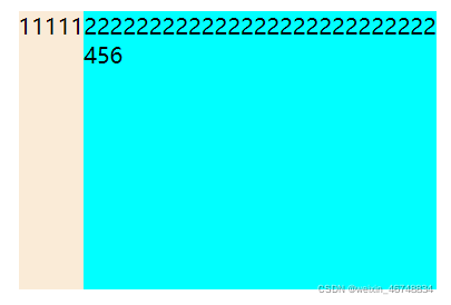
运行之后发现rightSon 盒子并没有实现单行文本省略,而且文字还撑到了left盒子中去
此时我们恢复right 盒子的单行文本省略的样式
.right {flex: 1;overflow: hidden;text-overflow: ellipsis;white-space: nowrap;background-color: aqua;}
运行后得到
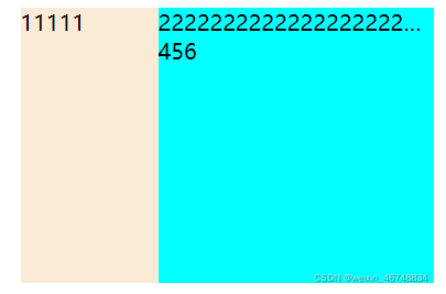
此时就得到我们想要的效果了
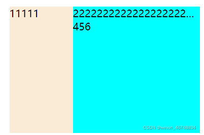
- 嵌套多个盒子
<div class="f"><div class="left">11111</div><div class="right"><div><div><div class="rightSon"><span>222222222222222222222222222222222222222222222222</span></div></div></div><div>456</div></div></div>
效果还是和原来一样
所以
右边装整体内容的right 盒子需要添加单行省略文本的样式
里面装文本的rightSon 盒子也需要添加单行文本省略的样式
中间的就不用添加单行省略文本样式了