PCA数据分析
PCA结果分析及可视化首推factoextra包,能处理各种R函数计算PCA的结果,有:
stats::prcomp()
FactoMiner::PCA()
ade4::dudi.pca()
ExPosition::epPCA()
如果我们想判断PCA中需要多少个主成分比较好,那么可以从主成分的特征值来考虑(Kaiser-Harris准则建议保留特征值大于1的主成分);特征值表示主成分所保留的变异量(所解释的方差);如用get_eigenvalue函来提取特征值,结果中第一列是特征值,第二列是可解释变异的比例,第三列是累计可解释变异的比例
> eig.val
> eig.val
eigenvalue variance.percent cumulative.variance.percent
Dim.1 4.1242133 41.242133 41.24213
Dim.2 1.8385309 18.385309 59.62744
Dim.3 1.2391403 12.391403 72.01885
Dim.4 0.8194402 8.194402 80.21325
Dim.5 0.7015528 7.015528 87.22878
Dim.6 0.4228828 4.228828 91.45760
Dim.7 0.3025817 3.025817 94.48342
Dim.8 0.2744700 2.744700 97.22812
Dim.9 0.1552169 1.552169 98.78029
Dim.10 0.1219710 1.219710 100.00000
除了卡特征值大于1作为主成分个数的阈值外,还可以设置总变异的阈值(累计)作为判断指标
除了看表格来判断,还可从图形上直观的感受下
fviz_eig(res.pca, addlabels = TRUE, ylim = c(0, 50))
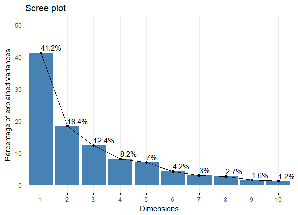 fviz_eig_PCA_plot
如果我们想提取PCA结果中变量的信息,则可用get_pca_var()
var
比如我们用于展示变量与主成分之间的关系,以及变量之间的关联,可直接用head(var$coord)查看,或者图形展示
fviz_pca_var(res.pca, col.var = "black")
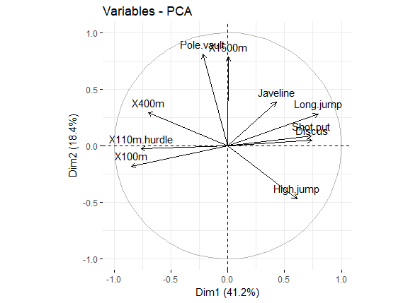 pca_var_corrd
图形解释,见原文吧:
Positively correlated variables are grouped together.
Negatively correlated variables are positioned on opposite sides of the plot origin (opposed quadrants).
The distance between variables and the origin measures the quality of the variables on the factor map. Variables that are away from the origin are well represented on the factor map
除了上面的Correlation circle外,还有Quality of representation(对应var$cos2),用于展示每个变量在各个主成分中的代表性(高cos2值说明该变量在主成分中有good representation,对应在Correlation circle图上则是接近圆周边上;低cos2值说明该变量不能很好的代表该主成分,对应Correlation circle图的圆心位置);对于变量来说,所有主成分上cos2值的和等于1,所以变量在越少主成分下累计cos2值接近于1,则其在Correlation circle上处于圆周圈上
library("corrplot")
corrplot(var$cos2, is.corr=FALSE)
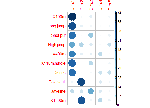 pca_var_cos2
对于cos2值的原文总结:
The cos2 values are used to estimate the quality of the representation
The closer a variable is to the circle of correlations, the better its representation on the factor map (and the more important it is to interpret these components)
Variables that are closed to the center of the plot are less important for the first components.
针对上述的cos2值,还有一个与其相关的则是Contributions to the principal components,也就是cos2值在各个主成分中的比例。。
简单的说,如果一个变量在PC1和PC2的Contributions很高的话,则说明该变量可有效解释数据的变异,我们可以用图形展示各个变量在PC1和PC2上的Contributions
fviz_pca_var(res.pca, col.var = "contrib",
gradient.cols = c("#00AFBB", "#E7B800", "#FC4E07")
)
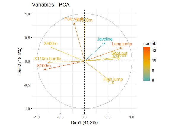 pca_var_contrib
以上均是对变量在PCA中的分析,下面则是观测值的分析
跟上述变量的分析一样,先用提取出individuals信息,会发现也有coord,cos2和contrib等信息
> ind
> ind
Principal Component Analysis Results for individuals
===================================================
Name Description
1 "$coord" "Coordinates for the individuals"
2 "$cos2" "Cos2 for the individuals"
3 "$contrib" "contributions of the individuals"
然后按照上面的模式来展示下individuals的点图,比如以cos2值来代表各个individuals点的圆圈大小
fviz_pca_ind(res.pca, pointsize = "cos2",
pointshape = 21, fill = "#E7B800",
repel = TRUE # Avoid text overlapping (slow if many points)
)
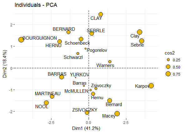 pca_ind_point
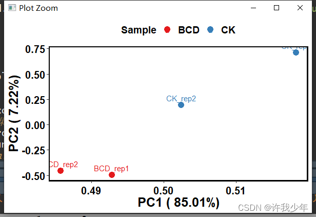
如果有分组信息,则可以将同一组的individuals圈在一起,如:
fviz_pca_ind(iris.pca,
geom.ind = "point", # show points only (nbut not "text")
col.ind = iris$Species, # color by groups
palette = c("#00AFBB", "#E7B800", "#FC4E07"),
addEllipses = TRUE, # Concentration ellipses
legend.title = "Groups"
)
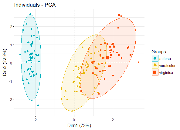 pca_ind_group
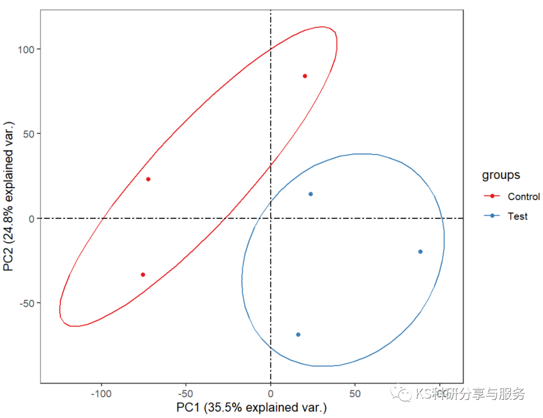
上述图形可改进用于展示置信椭圆和不规则图形等
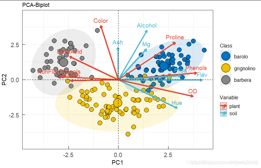
最后可以将vars和individuals同时在一张biplot图中展示(一般biplot图只用于展示变量较少的情况)
fviz_pca_biplot(iris.pca,
col.ind = iris$Species, palette = "jco",
addEllipses = TRUE, label = "var",
col.var = "black", repel = TRUE,
legend.title = "Species")
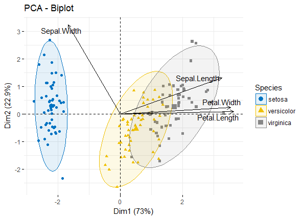 pca_biplot