引言
描述性分析是与数据科学项目甚至特定研究相关的任何分析生命周期的核心组成部分之一。数据聚合、汇总和可视化是支持这一数据分析领域的一些主要支柱。从传统商业智能时代到如今的人工智能时代,数据可视化一直是一种强大的工具,并因其在提取正确信息、清晰轻松地理解和解释结果方面的有效性而被组织广泛采用。然而,处理通常具有两个以上属性的多维数据集开始引发问题,因为我们的数据分析和通信媒介通常限于二维。在这篇文章中,我们将探索一些在多个维度(从1-D到6-D)中可视化数据的有效策略。
让我们开始吧,而不是我喋喋不休地谈论理论和概念。我们将使用UCI机器学习库提供的葡萄酒质量数据集。这些数据实际上由两个数据集组成,描述了葡萄牙“维诺维德”葡萄酒的红白变种的各种属性。本文中的所有分析都可以在我的GitHub存储库中作为Jupyter笔记本提供给那些渴望自己尝试的人!
首先,我们将加载以下分析所需的依赖项。
import pandas as pd
import matplotlib.pyplot as plt
from mpl_toolkits.mplot3d import Axes3D
import matplotlib as mpl
import numpy as np
import seaborn as sns
%matplotlib inline
我们将主要使用matplotlib和seaborn作为我们的可视化框架,但您可以自由查看并尝试使用您选择的任何其他框架。让我们看一下经过一些基本数据预处理步骤后的数据。
white_wine = pd.read_csv('winequality-white.csv', sep=';')
red_wine = pd.read_csv('winequality-red.csv', sep=';')# store wine type as an attribute
red_wine['wine_type'] = 'red'
white_wine['wine_type'] = 'white'# bucket wine quality scores into qualitative quality labels
red_wine['quality_label'] = red_wine['quality'].apply(lambda value: 'low' if value <= 5 else 'medium' if value <= 7 else 'high')
red_wine['quality_label'] = pd.Categorical(red_wine['quality_label'], categories=['low', 'medium', 'high'])
white_wine['quality_label'] = white_wine['quality'].apply(lambda value: 'low' if value <= 5 else 'medium' if value <= 7 else 'high')
white_wine['quality_label'] = pd.Categorical(white_wine['quality_label'], categories=['low', 'medium', 'high'])# merge red and white wine datasets
wines = pd.concat([red_wine, white_wine])# re-shuffle records just to randomize data points
wines = wines.sample(frac=1, random_state=42).reset_index(drop=True)
我们通过合并与红葡萄酒和白葡萄酒样本相关的数据集来创建一个单一的数据框架。我们还根据葡萄酒样品的质量属性创建了一个新的分类可变质量标签。现在让我们来看一下数据。
wines.head()
很明显,我们有几个葡萄酒样品的数字和分类属性。每个观察结果都属于红葡萄酒或白葡萄酒样品,属性是通过物理化学测试测量和获得的特定属性或特性。如果你想了解每个属性的详细解释,你可以查看Jupyter笔记本,但是这些名称是不言自明的。让我们对其中一些感兴趣的属性做一个简单的描述性总结统计。
subset_attributes = ['residual sugar', 'total sulfur dioxide', 'sulphates', 'alcohol', 'volatile acidity', 'quality']
rs = round(red_wine[subset_attributes].describe(),2)
ws = round(white_wine[subset_attributes].describe(),2)pd.concat([rs, ws], axis=1, keys=['Red Wine Statistics', 'White Wine Statistics'])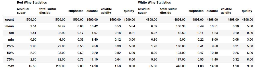
一维(1-D)中可视化数据
可视化所有数值数据及其分布的最快、最有效的方法之一是利用pandas的直方图
wines.hist(bins=15, color='steelblue', edgecolor='black', linewidth=1.0,xlabelsize=8, ylabelsize=8, grid=False)
plt.tight_layout(rect=(0, 0, 1.2, 1.2))
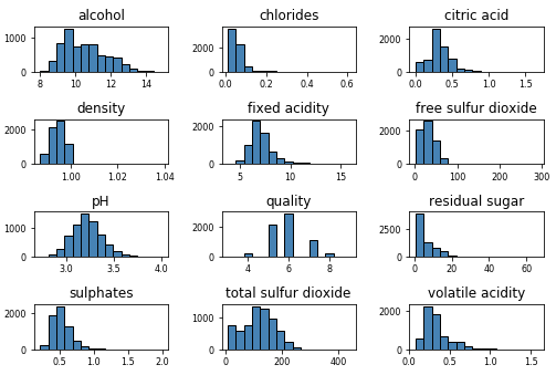
上面的图很好地说明了任何属性的基本数据分布。
让我们深入到可视化一个连续的数字属性。基本上,直方图或密度图可以很好地理解该属性的数据分布情况。
# Histogram
fig = plt.figure(figsize = (6,4))
title = fig.suptitle("Sulphates Content in Wine", fontsize=14)
fig.subplots_adjust(top=0.85, wspace=0.3)ax = fig.add_subplot(1,1, 1)
ax.set_xlabel("Sulphates")
ax.set_ylabel("Frequency")
ax.text(1.2, 800, r'$\mu$='+str(round(wines['sulphates'].mean(),2)), fontsize=12)
freq, bins, patches = ax.hist(wines['sulphates'], color='steelblue', bins=15,edgecolor='black', linewidth=1)# Density Plot
fig = plt.figure(figsize = (6, 4))
title = fig.suptitle("Sulphates Content in Wine", fontsize=14)
fig.subplots_adjust(top=0.85, wspace=0.3)ax1 = fig.add_subplot(1,1, 1)
ax1.set_xlabel("Sulphates")
ax1.set_ylabel("Frequency")
sns.kdeplot(wines['sulphates'], ax=ax1, shade=True, color='steelblue')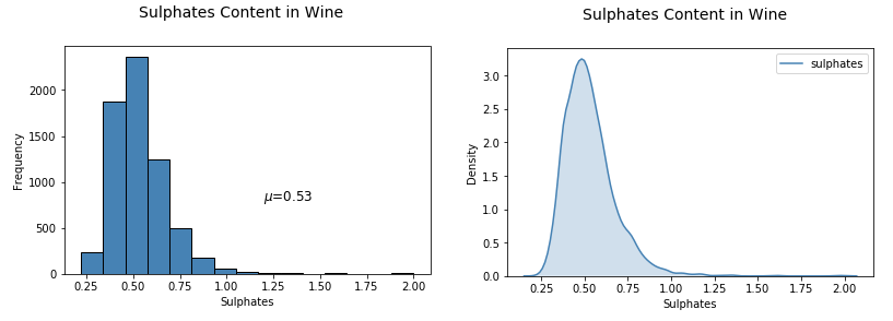
从上面的曲线图可以明显看出,葡萄酒sulphates的分布存在明显的右偏。
可视化一个离散的、分类的数据属性略有不同,条形图是实现这一点的最有效方法之一。你也可以使用饼图,但一般来说,尽量避免使用饼图,尤其是当不同类别的数量超过三个时。
# Bar Plot
fig = plt.figure(figsize = (6, 4))
title = fig.suptitle("Wine Quality Frequency", fontsize=14)
fig.subplots_adjust(top=0.85, wspace=0.3)ax = fig.add_subplot(1,1, 1)
ax.set_xlabel("Quality")
ax.set_ylabel("Frequency")
w_q = wines['quality'].value_counts()
w_q = (list(w_q.index), list(w_q.values))
ax.tick_params(axis='both', which='major', labelsize=8.5)
bar = ax.bar(w_q[0], w_q[1], color='steelblue', edgecolor='black', linewidth=1)
二维(2-D)中可视化数据
检查不同数据属性之间的潜在关系或相关性的最佳方法之一是利用成对关联矩阵,并将其描述为热力图。
# Correlation Matrix Heatmap
f, ax = plt.subplots(figsize=(10, 6))
corr = wines.corr()
hm = sns.heatmap(round(corr,2), annot=True, ax=ax, cmap="coolwarm",fmt='.2f',linewidths=.05)
f.subplots_adjust(top=0.93)
t= f.suptitle('Wine Attributes Correlation Heatmap', fontsize=14)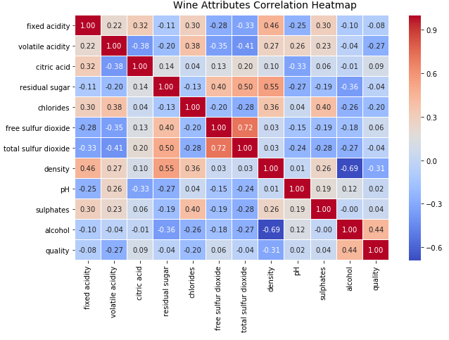
图中的梯度根据相关性的强度而变化,你可以清楚地看到,很容易发现潜在属性之间有很强的相关性。另一种可视化方法是在感兴趣的属性之间使用成对散点图。
# Pair-wise Scatter Plots
cols = ['density', 'residual sugar', 'total sulfur dioxide', 'fixed acidity']
pp = sns.pairplot(wines[cols], size=1.8, aspect=1.8,plot_kws=dict(edgecolor="k", linewidth=0.5),diag_kind="kde", diag_kws=dict(shade=True))fig = pp.fig
fig.subplots_adjust(top=0.93, wspace=0.3)
t = fig.suptitle('Wine Attributes Pairwise Plots', fontsize=14)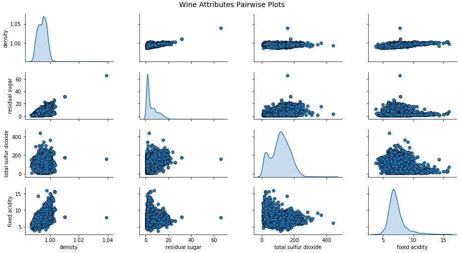
根据上面的图,您可以看到散点图也是观察数据属性的二维潜在关系或模式的一种不错的方式。
将多个属性的多变量数据可视化的另一种方法是使用平行坐标。
# Scaling attribute values to avoid few outiers
cols = ['density', 'residual sugar', 'total sulfur dioxide', 'fixed acidity']
subset_df = wines[cols]from sklearn.preprocessing import StandardScaler
ss = StandardScaler()scaled_df = ss.fit_transform(subset_df)
scaled_df = pd.DataFrame(scaled_df, columns=cols)
final_df = pd.concat([scaled_df, wines['wine_type']], axis=1)
final_df.head()# plot parallel coordinates
from pandas.plotting import parallel_coordinates
pc = parallel_coordinates(final_df, 'wine_type', color=('#FFE888', '#FF9999'))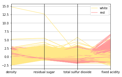
# Scatter Plot
plt.scatter(wines['sulphates'], wines['alcohol'],alpha=0.4, edgecolors='w')plt.xlabel('Sulphates')
plt.ylabel('Alcohol')
plt.title('Wine Sulphates - Alcohol Content',y=1.05)# Joint Plot
jp = sns.jointplot(x='sulphates', y='alcohol', data=wines,kind='reg', space=0, size=5, ratio=4)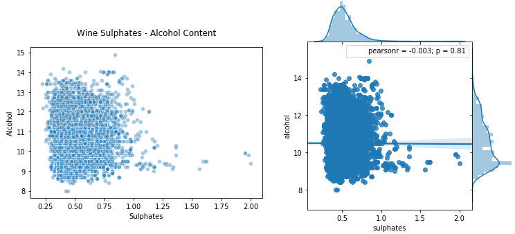
你可以看到上面生成的图清晰简洁,我们可以很容易地比较不同的分布。除此之外,方框图是另一种根据分类属性中的不同值有效描述数字数据组的方法。方框图是了解数据中四分位值以及潜在异常值的好方法。
# Box Plots
f, (ax) = plt.subplots(1, 1, figsize=(12, 4))
f.suptitle('Wine Quality - Alcohol Content', fontsize=14)sns.boxplot(x="quality", y="alcohol", data=wines,  ax=ax)
ax.set_xlabel("Wine Quality",size = 12,alpha=0.8)
ax.set_ylabel("Wine Alcohol %",size = 12,alpha=0.8)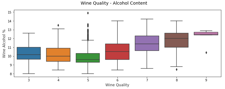
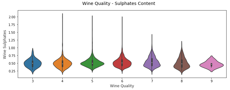
另一种类似的可视化方法是小提琴图,这是另一种使用核密度图(描述不同值下数据的概率密度)可视化分组数值数据的有效方法。
# Violin Plots
f, (ax) = plt.subplots(1, 1, figsize=(12, 4))
f.suptitle('Wine Quality - Sulphates Content', fontsize=14)sns.violinplot(x="quality", y="sulphates", data=wines,  ax=ax)
ax.set_xlabel("Wine Quality",size = 12,alpha=0.8)
ax.set_ylabel("Wine Sulphates",size = 12,alpha=0.8)