搞了一套和官网不同的option,也能渲染出效果来,虽然我不知道这个箱线图有啥意义啊哈哈哈~
需求:填充背景色(中间的横线我是真的无能为力了,有搞出来的小伙伴欢迎留言)
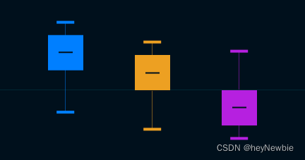
剩下的一些自定义轴刻度显示、tooltip的自定义就很常规了。。。
option: {color: ["#007FFF", "#F5A623", "#B620E0", "#F11455"],tooltip: {trigger: "item",},grid: {top: "10px",left: "60px",right: "0px",bottom: "30px",},legend: {textStyle: {color: "#fff"},icon: 'circle',bottom: 0},xAxis: {type: "category",boundaryGap: true,nameGap: 30,splitArea: {show: false,},axisLine: {lineStyle: {color: "rgba(0,205,225,0.25)",},},splitLine: {show: false,lineStyle: {color: "rgba(0,205,225,0.25)",},},},yAxis: {type: "value",splitArea: {show: false,},axisLabel: {color: "#fff",formatter: function (value) {return parseFloat(value).toFixed(2) + "%";},},axisLine: {lineStyle: {color: "rgba(0,205,225,0.25)",},},splitLine: {show: false,lineStyle: {color: "transparent",},},},series: [],},这个是基本的option
数据填充时 顺序为:
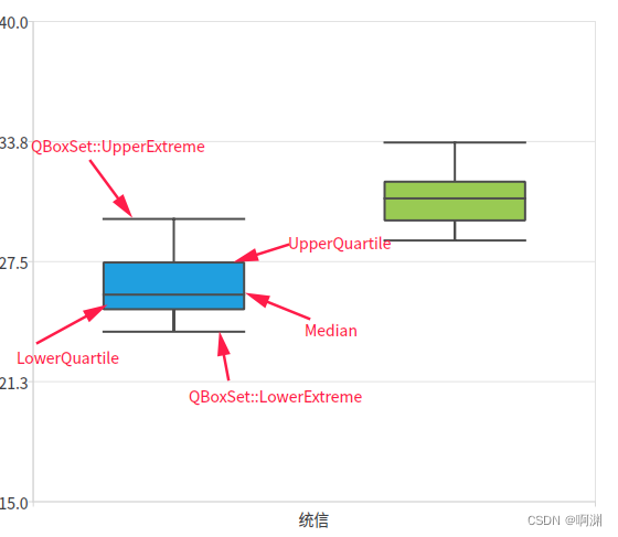
["base", "min", "Q1", "median", "Q3", "max"]和平时的习惯相反的
和官网不同的是series中的data
let tempSeries = [];
// _this.plateData 为请求回来的数据tempSeries = new Array(_this.plateData.length).fill().map((v,i) => {return {  name: _this.plateData[i].fundName,type: 'boxplot',itemStyle: {color: _this.option.color[i]    // 这里就填充了箱体的颜色,同时也会覆盖中间那跟横线的颜色},data: []}})_this.plateData.forEach((ele, eleIndex) => {let tempArr = new Array();tempArr.push(ele.min, ele.q1, ele.median, ele.q3, ele.max)    // base要是没有需求就可以不填 默认是在第一位 为 0tempSeries[eleIndex].data.push(tempArr)
})
配置tooltip
// tooltip
_this.option.tooltip.formatter = (params) => {let txt = '';txt += params.seriesName + '<br>' + params.marker + '上限值:' + params.data[5] + '%' + '<br>' + params.marker + '上四分位数:' + params.data[4] + '%' + '<br>' + params.marker + '中位数:' + params.data[3] + '%' + '<br>' + params.marker + '下四分位数:' + params.data[2] + '%' + '<br>' + params.marker + '下限值:' + params.data[1] + '%' + '<br>' return txt
}


](https://img-blog.csdnimg.cn/b7d5f168deff4064a604be2dfbb5d4fb.gif#pic_center)