22.盒须图(boxplot)
23.棉棒图(Stem Plot; Lollipop plot)
24.极坐标图
25.雷达图(Radar Chart)
22.盒须图(boxplot)
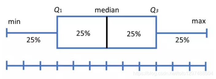
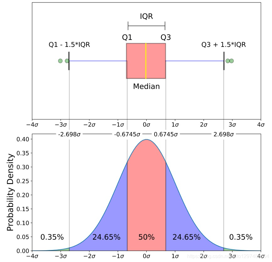
盒须图(也称为箱形图)是一种图表类型,通常用于说明性数据分析中,通过显示数据四分位数(或百分位数)和平均值来直观地显示数值数据的分布和偏度(skewness)。
箱形图于1977年由美国著名统计学家约翰·图基(John Tukey)发明。它能显示出一组数据的最大值、最小值、中位数、及上下四分位数。
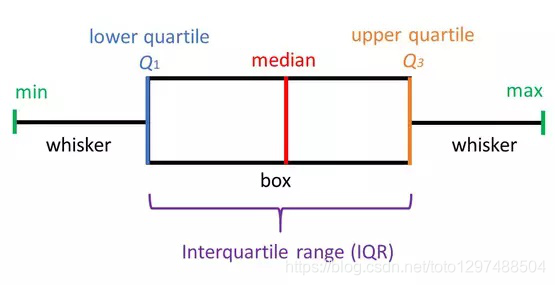
最小值(minimum)
下四分位数(Q1)
中位数(Median,也就是Q2)
上四分位数(Q3)
最大值(maximum)
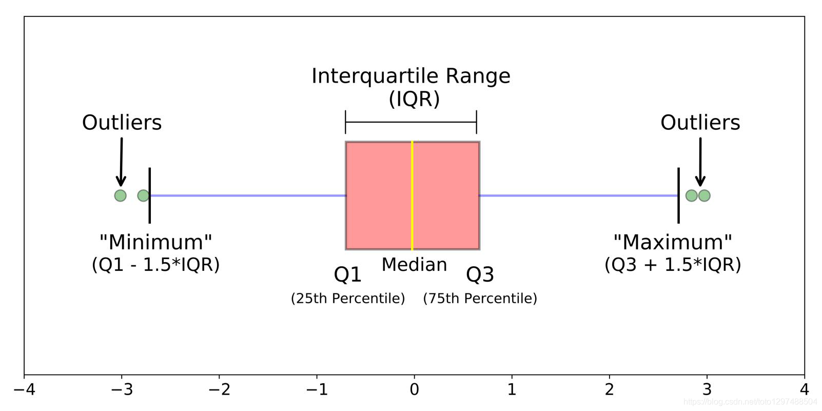
四分位间距(IQR)
箱形图将数据分为几个部分,每个部分包含该集中大约25%的数据。
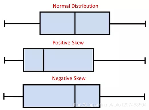
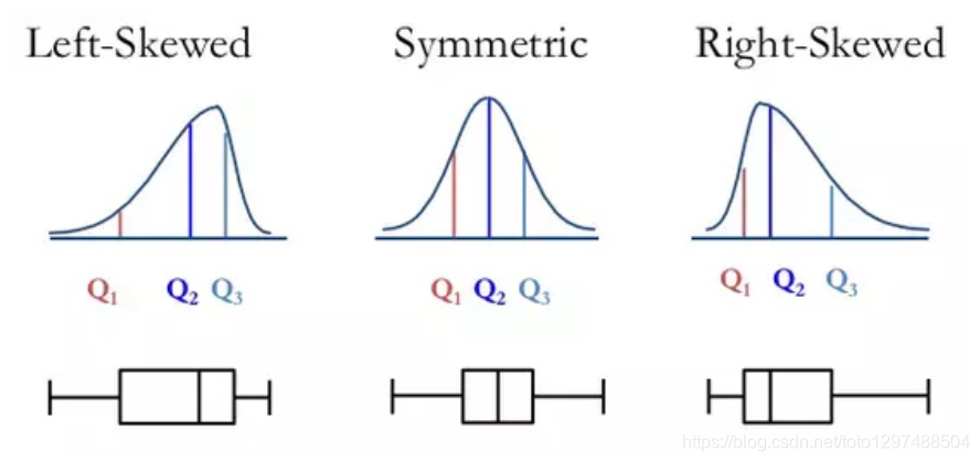
请注意,上图代表的数据是完美的正态分布,大多数箱形图均不符合这种对称性(每个四分位数的长度相同)。
箱形图形状将显示统计数据集是正态分布还是偏斜。
箱形图很有用,因为它们显示了数据集中的异常值(outliers,离群值)。
离群值是在数值上与其余数据相距遥远的观测值。
查看箱形图时,离群值定义为位于箱形图whiskers之外的数据点。
import matplotlib
import matplotlib.pyplot as plt
import numpy as np# Fixing random state for reproducibility
np.random.seed(19680801)# fake up some data
spread = np.random.rand(50) * 100
center = np.ones(25) * 50
flier_high = np.random.rand(10) * 100 + 100
flier_low = np.random.rand(10) * -100
data = np.concatenate((spread, center, flier_high, flier_low))fig1, ax1 = plt.subplots()
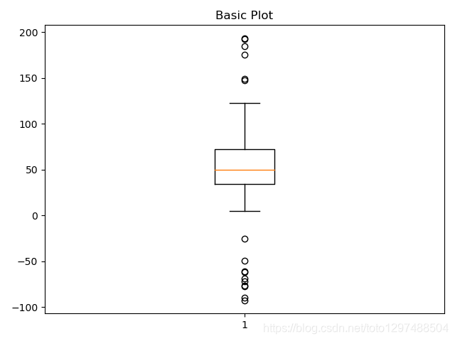
ax1.set_title('Basic Plot')
ax1.boxplot(data)plt.show()
import matplotlib
import matplotlib.pyplot as plt
import numpy as np# Fixing random state for reproducibility
np.random.seed(19680801)# fake up some data
spread = np.random.rand(50) * 100
center = np.ones(25) * 50
flier_high = np.random.rand(10) * 100 + 100
flier_low = np.random.rand(10) * -100
data = np.concatenate((spread, center, flier_high, flier_low))fig2, ax2 = plt.subplots()
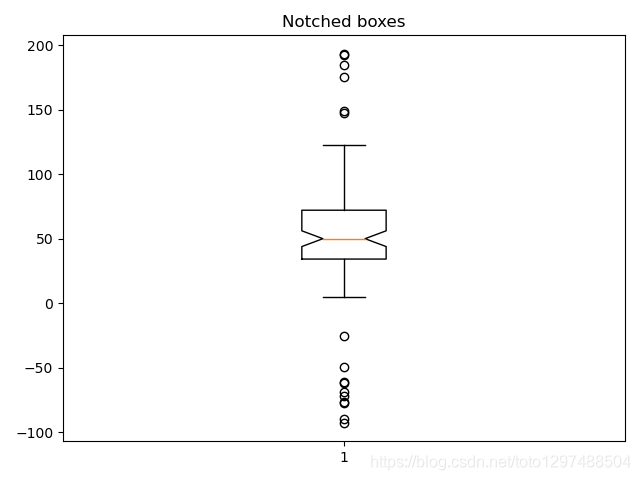
ax2.set_title('Notched boxes')
ax2.boxplot(data, notch=True)plt.show()
import matplotlib
import matplotlib.pyplot as plt
import numpy as np# Fixing random state for reproducibility
np.random.seed(19680801)# fake up some data
spread = np.random.rand(50) * 100
center = np.ones(25) * 50
flier_high = np.random.rand(10) * 100 + 100
flier_low = np.random.rand(10) * -100
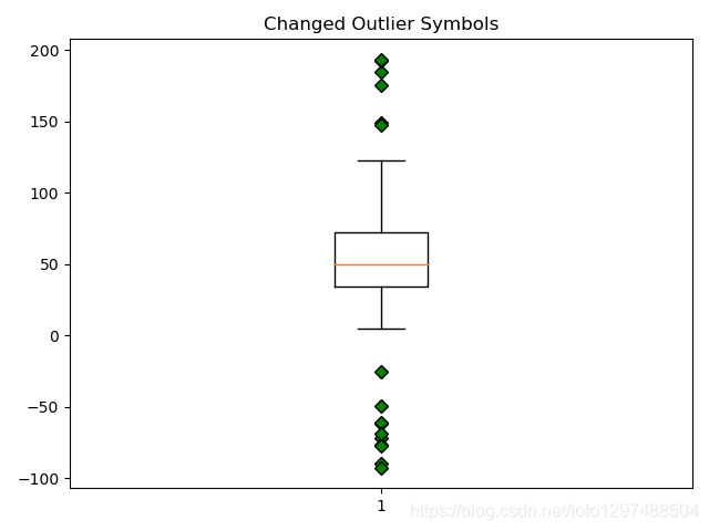
data = np.concatenate((spread, center, flier_high, flier_low))green_diamond = dict(markerfacecolor='g', marker='D')
fig3, ax3 = plt.subplots()
ax3.set_title('Changed Outlier Symbols')
ax3.boxplot(data, flierprops=green_diamond)plt.show()

Fake up some more data
import matplotlib
import matplotlib.pyplot as plt
import numpy as np# Fixing random state for reproducibility
np.random.seed(19680801)# fake up some data
spread = np.random.rand(50) * 100
center = np.ones(25) * 50
flier_high = np.random.rand(10) * 100 + 100
flier_low = np.random.rand(10) * -100
data = np.concatenate((spread, center, flier_high, flier_low))spread = np.random.rand(50) * 100
center = np.ones(25) * 40
flier_high = np.random.rand(10) * 100 + 100
flier_low = np.random.rand(10) * -100
d2 = np.concatenate((spread, center, flier_high, flier_low))
data.shape = (-1, 1)
d2.shape = (-1, 1)plt.show()
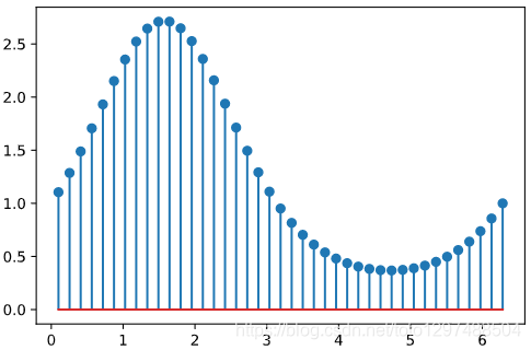
23.棉棒图(Stem Plot; Lollipop plot)
棉棒图绘制从基线到y坐标的垂直线,并在尖端(tip)放置一个标记。
import matplotlib.pyplot as plt
import numpy as npx = np.linspace(0.1, 2 * np.pi, 41)
y = np.exp(np.sin(x))plt.stem(x, y, use_line_collection=True)
plt.show()
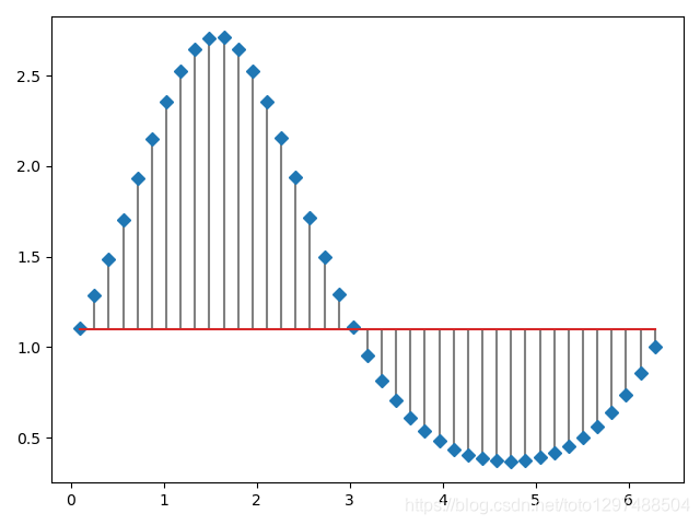
基线的位置可以使用bottom进行调整。 参数linefmt,markerfmt和basefmt控制plot的基本格式属性。 但是,并非所有属性都可以通过关键字参数进行配置。 对于更高级的控制,可调整pyplot返回的线对象。
import matplotlib.pyplot as plt
import numpy as npx = np.linspace(0.1, 2 * np.pi, 41)
y = np.exp(np.sin(x))markerline, stemlines, baseline = plt.stem(x, y, linefmt='grey', markerfmt='D', bottom=1.1, use_line_collection=True)
plt.show()
import numpy as np
import pandas as pd
import matplotlib.pyplot as pltdf = pd.DataFrame({'Product':['Apple', 'Banana', 'Beer', 'Juice', 'Cheese','Coffee', 'Red wine', 'Hotdog'],'Turnover':[30, 59, 92, 43, 123, 93, 103, 37]},columns=['Product', 'Turnover'])
print(df)
输出结果:
    Product  Turnover
0     Apple        30
1    Banana        59
2      Beer        92
3     Juice        43
4    Cheese       123
5    Coffee        93
6  Red wine       103
7    Hotdog        37
import numpy as np
import pandas as pd
import matplotlib.pyplot as pltdf = pd.DataFrame({'Product':['Apple', 'Banana', 'Beer', 'Juice', 'Cheese','Coffee', 'Red wine', 'Hotdog'],'Turnover':[30, 59, 92, 43, 123, 93, 103, 37]},columns=['Product', 'Turnover'])
print(df)plt.figure(figsize=(9, 6))(markerline, stemlines, baseline) = plt.stem(df['Product'], df['Turnover'], use_line_collection=True)
plt.setp(markerline, marker='*', markersize=15, markeredgewidth=2, color='gold')
plt.setp(stemlines, color='gold')
plt.setp(baseline, visible=False)plt.tick_params(labelsize=12)
plt.xlabel('Product', size=12)
plt.ylabel('Turnover(k dollars)', size=12)
plt.ylim(bottom=0)plt.show()
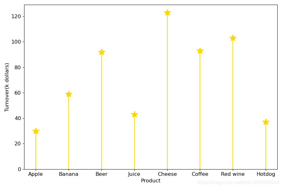
该图描述了每种产品的营业额。 在八种产品中,奶酪的销售额带来了最大的营业额。
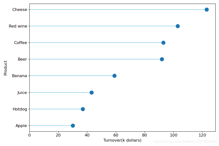
import pandas as pd
import matplotlib.pyplot as pltdf = pd.DataFrame({'Product':['Apple', 'Banana', 'Beer', 'Juice', 'Cheese','Coffee', 'Red wine', 'Hotdog'],'Turnover':[30, 59, 92, 43, 123, 93, 103, 37]},columns=['Product', 'Turnover'])
print(df)ordered_df = df.sort_values(by='Turnover').reset_index(drop=True)
my_range = range(1, len(df.index) + 1)plt.figure(figsize=(9, 6))plt.hlines(y=my_range, xmin=0, xmax=ordered_df['Turnover'], color='skyblue')
plt.plot(ordered_df['Turnover'], my_range, 'o', markersize=11)plt.yticks(ordered_df.index+1, ordered_df['Product'])
plt.tick_params(labelsize=12)
plt.xlabel('Turnover(k dollars)', size=12)
plt.ylabel('Product', size=12)
plt.xlim(left=0)plt.show()
24.极坐标图
调用subplot()创建子图时通过设置projection=’polar’,便可创建一个极坐标子图,然后调用plot()在极坐标子图中绘图。

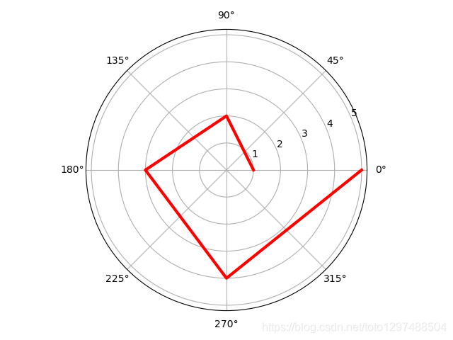
import numpy as np
import matplotlib.pyplot as plt# 极坐标下需要的数据有极径和角度
r = np.arange(1, 6, 1)  # 极径
theta = [i * np.pi / 2 for i in range(5)]  # 角度# 指定画图坐标为极坐标,projection='polar'
ax = plt.subplot(111, projection='polar')
ax.plot(theta, r, linewidth=3, color='r')ax.grid(True)plt.show()
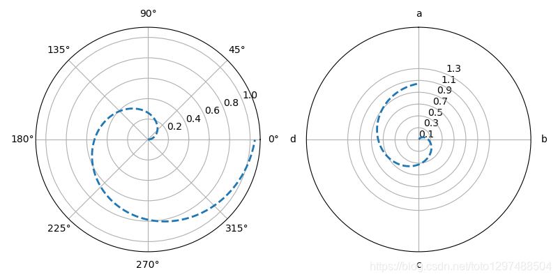
import numpy as np
import matplotlib.pyplot as plt# 极坐标参数设置
theta=np.arange(0,2*np.pi,0.02)
plt.figure(figsize=(8,4))
ax1= plt.subplot(121, projection='polar')
ax2= plt.subplot(122, projection='polar')
ax1.plot(theta,theta/6,'--',lw=2)
ax2.plot(theta,theta/6,'--',lw=2)
# 创建极坐标子图axax2.set_theta_direction(-1) # 坐标轴正方向改为顺时针
# set_theta_direction():坐标轴正方向,默认逆时针ax2.set_thetagrids(np.arange(0.0, 360.0, 90),['a','b','c','d'])
ax2.set_rgrids(np.arange(0.2,2,0.4))
# set_thetagrids():设置极坐标角度网格线显示及标签 → 网格和标签数量一致
# set_rgrids():设置极径网格线显示,其中参数必须是正数ax2.set_theta_offset(np.pi/2)
# set_theta_offset():设置角度偏移,逆时针,弧度制ax2.set_rlim(0.2,1.2)
ax2.set_rmax(2)
ax2.set_rticks(np.arange(0.1, 1.5, 0.2))
# set_rlim():设置显示的极径范围
# set_rmax():设置显示的极径最大值
# set_rticks():设置极径网格线的显示范围plt.show()
25.雷达图(Radar Chart)
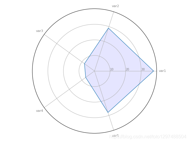
雷达图是一种由一系列等角辐条(称为radii)组成的图表,每个辐条代表一个变量。 轮辐的数据长度与数据点变量的大小(magnitude )相对于所有数据点上变量的最大大小(maximum magnitude)成正比。 绘制一条线连接每个辐条的数据值。 这使该图块具有星形外观,并且是该图块的流行名称之一的起源。
适用时机:
比较两个或两个以上具有不同特征的items或groups。
检查一个个数据点的相对值。
在一张雷达图上显示少于十个因素。
没有内置函数允许使用Matplotlib制作雷达图。 因此,我们必须使用基本函数来构建它。
输入数据是pandas data frame,其中每行代表一个个体,每列代表一个变量。
import matplotlib.pyplot as plt
import pandas as pd
from math import pi# Set data
df = pd.DataFrame({'group': ['A', 'B', 'C', 'D'],'var1': [38, 1.5, 30, 4],'var2': [29, 10, 9, 34],'var3': [8, 39, 23, 24],'var4': [7, 31, 33, 14],'var5': [28, 15, 32, 14]
})# number of variable
categories = list(df)[1:]
N = len(categories)
print(N)# We are going to plot the first line of the data frame.
# But we need to repeat the first value to close the circular graph:
values=df.loc[0].drop('group').values.flatten().tolist()
values += values[:1]
print(values)# What will be the angle of each axis in the plot? (we divide the plot / number of variable)
angles = [n / float(N) * 2 * pi for n in range(N)]
angles += angles[:1]
print(angles)# Initialise the spider plot
ax = plt.subplot(111, polar=True)# Draw one axe per variable + add labels labels yet
plt.xticks(angles[:-1], categories, color='grey', size=8)# Draw ylabels
ax.set_rlabel_position(0)
plt.yticks([10, 20, 30], ["10", "20", "30"], color="grey", size=7)
plt.ylim(0, 40)# Plot data
ax.plot(angles, values, linewidth=1, linestyle='solid')# Fill area
ax.fill(angles, values, 'b', alpha=0.1)plt.show()
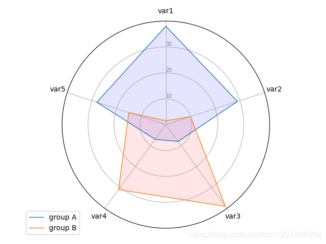
25.1.Radar chart with several individuals
# Libraries
import matplotlib.pyplot as plt
import pandas as pd
from math import pi# Set data
df = pd.DataFrame({'group': ['A', 'B', 'C', 'D'],'var1': [38, 1.5, 30, 4],'var2': [29, 10, 9, 34],'var3': [8, 39, 23, 24],'var4': [7, 31, 33, 14],'var5': [28, 15, 32, 14]
})# ------- PART 1: Create background# number of variable
categories = list(df)[1:]
N = len(categories)# What will be the angle of each axis in the plot? (we divide the plot / number of variable)
angles = [n / float(N) * 2 * pi for n in range(N)]
angles += angles[:1]# Initialise the spider plot
ax = plt.subplot(111, polar=True)# If you want the first axis to be on top:
ax.set_theta_offset(pi / 2)
ax.set_theta_direction(-1)# Draw one axe per variable + add labels labels yet
plt.xticks(angles[:-1], categories)# Draw ylabels
ax.set_rlabel_position(0)
plt.yticks([10, 20, 30], ["10", "20", "30"], color="grey", size=7)
plt.ylim(0, 40)# ------- PART 2: Add plots# Plot each individual = each line of the data
# I don't do a loop, because plotting more than 3 groups makes the chart unreadable# Ind1
values = df.loc[0].drop('group').values.flatten().tolist()
values += values[:1]
ax.plot(angles, values, linewidth=1, linestyle='solid', label="group A")
ax.fill(angles, values, 'b', alpha=0.1)# Ind2
values = df.loc[1].drop('group').values.flatten().tolist()
values += values[:1]
ax.plot(angles, values, linewidth=1, linestyle='solid', label="group B")
ax.fill(angles, values, 'r', alpha=0.1)# Add legend
plt.legend(loc='upper right', bbox_to_anchor=(0.1, 0.1))plt.show()
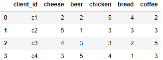
df = pd.DataFrame({'client_id': ['c1','c2','c3','c4'],'cheese': [2, 5, 4, 3],'beer': [2, 1, 3, 5],'chicken': [5, 3, 3, 4],'bread': [4, 3, 2, 1],'coffee': [2, 3, 5, 3]},columns=['client_id', 'cheese', 'beer', 'chicken', 'bread', 'coffee'])
df
# Libraries
import numpy as np
import matplotlib.pyplot as plt
import pandas as pd
from math import pi# Set data
df = pd.DataFrame({'client_id': ['c1','c2','c3','c4'],'cheese': [2, 5, 4, 3],'beer': [2, 1, 3, 5],'chicken': [5, 3, 3, 4],'bread': [4, 3, 2, 1],'coffee': [2, 3, 5, 3]},columns=['client_id', 'cheese', 'beer', 'chicken', 'bread', 'coffee'])categories = list(df)[1:]values = df.mean().values.flatten().tolist()
values += values[:1] # repeat the first value to close the circular graphangles = [n / float(len(categories)) * 2 * pi for n in range(len(categories))]
angles += angles[:1]fig, ax = plt.subplots(nrows=1, ncols=1, figsize=(8, 8), subplot_kw=dict(polar=True))plt.xticks(angles[:-1], categories, color='grey', size=12)
plt.yticks(np.arange(1, 6), ['1', '2', '3', '4', '5'], color='grey', size=12)
plt.ylim(0, 5)
ax.set_rlabel_position(30)ax.plot(angles, values, linewidth=1, linestyle='solid')
ax.fill(angles, values, 'skyblue', alpha=0.4)plt.show()
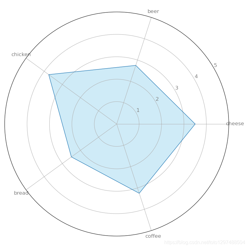
该雷达图描述了4个客户的平均产品偏好。 chicken是最受欢迎的产品.
# Libraries
import numpy as np
import matplotlib.pyplot as plt
import pandas as pd
from math import pi# Set data
df = pd.DataFrame({'client_id': ['c1','c2','c3','c4'],'cheese': [2, 5, 4, 3],'beer': [2, 1, 3, 5],'chicken': [5, 3, 3, 4],'bread': [4, 3, 2, 1],'coffee': [2, 3, 5, 3]},columns=['client_id', 'cheese', 'beer', 'chicken', 'bread', 'coffee'])categories = list(df)[1:]values = df.mean().values.flatten().tolist()
values += values[:1] # repeat the first value to close the circular graphangles = [n / float(len(categories)) * 2 * pi for n in range(len(categories))]
angles += angles[:1]fig, ax = plt.subplots(nrows=1, ncols=1, figsize=(8, 8), subplot_kw=dict(polar=True))plt.xticks(angles[:-1], categories, color='grey', size=12)
plt.yticks(np.arange(1, 6), ['1', '2', '3', '4', '5'], color='grey', size=12)
plt.ylim(0, 5)
ax.set_rlabel_position(30)# part 1
val_c1 = df.loc[0].drop('client_id').values.flatten().tolist()
val_c1 += val_c1[:1]
ax.plot(angles, val_c1, linewidth=1, linestyle='solid', label='Client c1')
ax.fill(angles, val_c1, 'skyblue', alpha=0.4)# part 2
val_c2 = df.loc[1].drop('client_id').values.flatten().tolist()
val_c2 += val_c2[:1]
ax.plot(angles, val_c2, linewidth=1, linestyle='solid', label='Client c2')
ax.fill(angles, val_c2, 'lightpink', alpha=0.4)plt.legend(loc='upper right', bbox_to_anchor=(0.1, 0.1))plt.show()
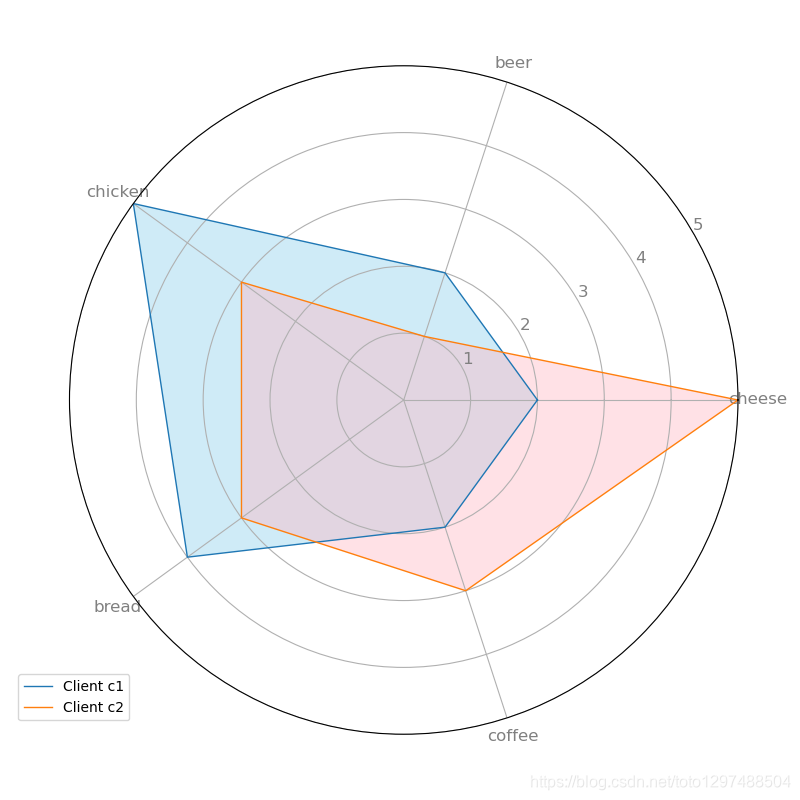
该雷达图显示了4个客户中2个客户的偏好。客户c1喜欢鸡肉和面包,不那么喜欢奶酪。 但是,客户c2比其他4种产品更喜欢奶酪,并且不喜欢啤酒。