import numpy as np
import pandas as pd
import matplotlib as mpl
import matplotlib. pyplot as plt
import seaborn as sns
第一个参数:要绘制的图像数据
第二个参数:shade 是否填充颜色
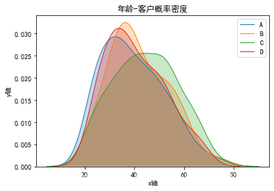
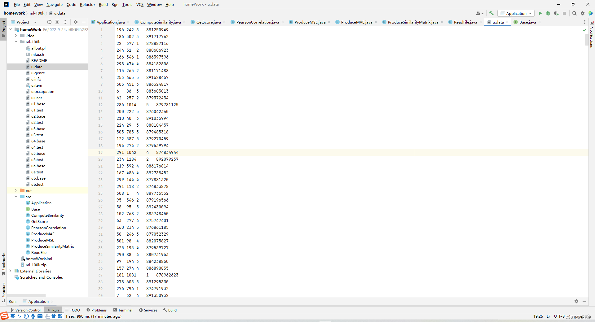
dataSet = pd. read_csv( r'F:\Pycharmworkspace\data\多分类问题\客户类别分类_多分类.csv' , sep= ',' )
label = np. unique( dataSet. iloc[ : , - 1 ] )
for i in range ( len ( label) ) : data = dataSet. loc[ dataSet. iloc[ : , - 1 ] == label[ i] , 'age' ] data. reset_index( drop= True , inplace= True ) sns. kdeplot( data, shade= True
, color= plt. cm. tab10( i) , linewidth= 1 , linestyle= '-' , label= label[ i] )
plt. xlabel( 'x轴' )
plt. ylabel( 'y轴' )
plt. title( '年龄-客户概率密度' ) ;
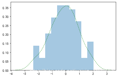
参数bins表示对传入的数据分成几组
rdata = np. random. randn( 100 )
sns. distplot( rdata, bins= 10 , hist= True , kde= True , hist_kws= { 'histtype' : 'bar' , 'alpha' : 0.4 } , kde_kws= { 'color' : 'g' , 'linestyle' : '--' , 'linewidth' : 1 , 'alpha' : 0.7 } ) ;
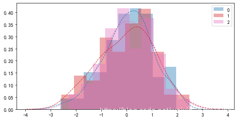
rdata = np. random. randn( 100 , 3 )
plt. figure( figsize= ( 8 , 4 ) )
for i in range ( 3 ) : sns. distplot( rdata[ : , i] , bins= 10 , hist= True , kde= True , hist_kws= { 'color' : plt. cm. tab10( i/ 3 ) , 'histtype' : 'bar' , 'alpha' : 0.4 } , kde_kws= { 'color' : plt. cm. tab10( i/ 3 ) , 'linestyle' : '--' , 'linewidth' : 1 , 'alpha' : 0.9 } , label= i)
plt. legend( ) ;