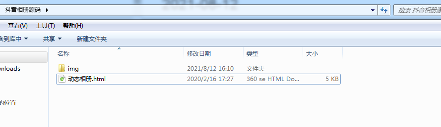
程序员的浪漫,话不多说上代码。
HTML:
<body><div id="cube"><!--外层盒子--><ul><li><img src="./imgs/1.jpg" ></li><li><img src="./imgs/2.jpg" ></li><li><img src="./imgs/3.jpg" ></li><li><img src="./imgs/4.jpg" ></li><li><img src="./imgs/5.jpg" ></li><li><img src="./imgs/6.jpg" ></li></ul><!--内层盒子--><ol><li><img src="./imgs/7.jpg" ></li><li><img src="./imgs/8.jpg" ></li><li><img src="./imgs/8.jpg" ></li><li><img src="./imgs/8.jpgg" ></li><li><img src="./imgs/8.jpgg" ></li><li><img src="./imgs/8.jpg" ></li></ol></div></body>css样式:
<style>/*默认样式*/
*{margin: 0;padding: 0;
}
ol,ul{list-style: none;}/*外层盒子*/
#cube{height: 200px;width: 200px;/* 将整个盒子至于中间 */position: absolute;left: 0;top: 0;bottom: 0;right: 0;margin: auto;/* 这是旋转基点 */transform-origin: -550px 550px 100;/* 设置景深 */perspective:800px; }#cube ul{width: 200px;height: 200px;transform-style: preserve-3d;animation: rotate1 5s linear infinite;
}
#cube ul img{width: 200px;height: 200px;
}
#cube ul li{width: 200px;height: 200px;position: absolute;/* 设置过渡时间 */transition: 2s;
}
#cube ul li:nth-child(1){left: 0;top: 0;opacity: .4;transform: translateZ(100px);}
#cube ul li:nth-child(2){left: 100px;top: 0;transform: rotateY(90deg);opacity: .4;}
#cube ul li:nth-child(3){left: -100px;top: 0;transform: rotateY(-90deg);opacity: .4;}
#cube ul li:nth-child(4){left: 0;top: 100px;transform: rotateX(-90deg);opacity:.4;}
#cube ul li:nth-child(5){left: 0;top: -100px;transform: rotateX(90deg);opacity: .4;}
#cube ul li:nth-child(6){left: 0;top: 0;transform: translateZ(-100px) rotateY(180deg);opacity: .4;} /* 内层盒子*/
#cube ol{width: 100px;height: 100px;position: absolute;left: 50px;top: 50px;/* 给内层盒子设置3d空间 */transform-style: preserve-3d;/* 设置动画 */animation: rotate1 5s linear infinite;
}
#cube ol img{width: 100px;height: 100px;
}
#cube ol li{width: 100px;height: 100px;position: absolute;
}
#cube ol li:nth-child(1){left: 0;top: 0;opacity: .7;transform: translateZ(50px);}
#cube ol li:nth-child(2){left: 100px;top: 0px;transform-origin: left;transform:translateZ(50px) rotateY(90deg);opacity: .7;}
#cube ol li:nth-child(3){left: -100px;top: 0px;transform-origin: right;transform:translateZ(50px) rotateY(-90deg);opacity: .7;}
#cube ol li:nth-child(4){left:0px;top: 100px;transform-origin: top;transform:translateZ(50px) rotateX(-90deg);opacity: .7;}
#cube ol li:nth-child(5){left:0px;top: -100px;transform-origin: bottom;transform:translateZ(50px) rotateX(90deg);opacity: .7;}
#cube ol li:nth-child(6){left:0px;top: 0px;transform: translateZ(-50px) rotateY(180deg);opacity: .7;}/*外层盒子鼠标移入效果*/
#cube:hover ul li:nth-child(1){transform: translateZ(200px) scale(1.5);opacity: .6;}
#cube:hover ul li:nth-child(2){transform:rotateY(90deg) translateZ(100px) scale(1.5);opacity: .6;}
#cube:hover ul li:nth-child(3){transform:rotateY(-90deg) translateZ(100px) scale(1.5);opacity: .6;}
#cube:hover ul li:nth-child(4){transform:rotateX(-90deg) translateZ(100px) scale(1.5);opacity: .6;}
#cube:hover ul li:nth-child(5){transform:rotateX(90deg) translateZ(100px) scale(1.5);opacity: .6;}
#cube:hover ul li:nth-child(6){transform:rotateY(180deg) translateZ(200px) scale(1.5);opacity: .6;}
/*旋转动画效果*/
@keyframes rotate1{0%{transform: rotateY(0);}100%{transform: rotateY(360deg);}
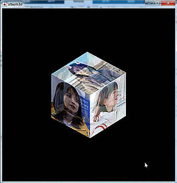
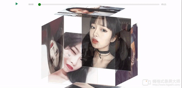
}</style>效果展示:
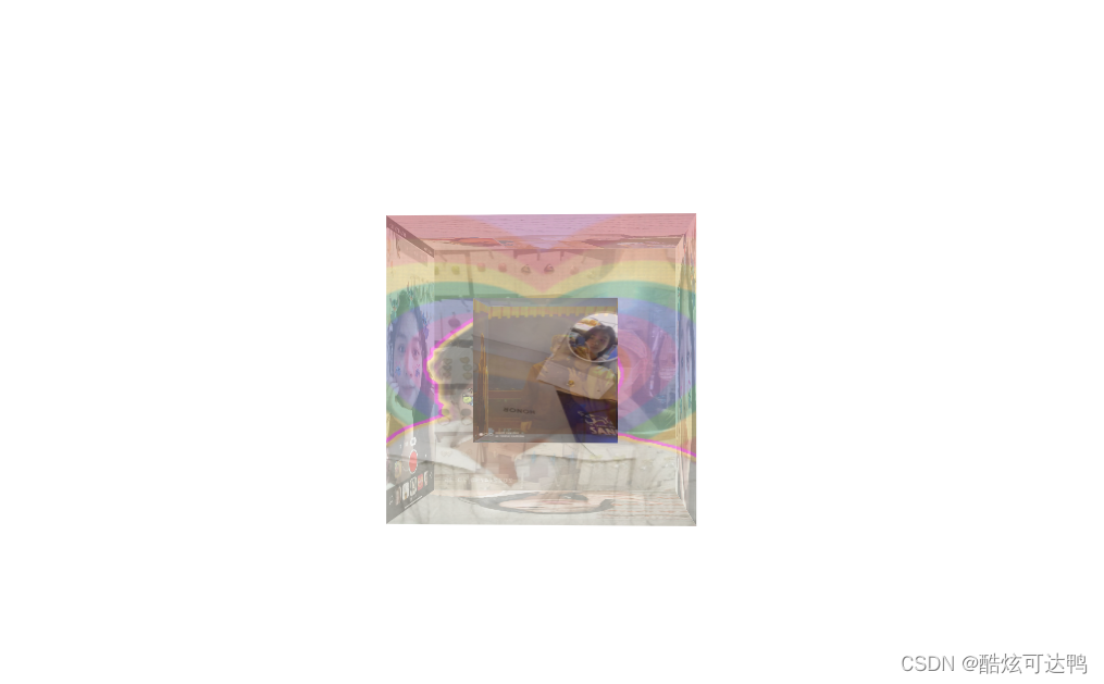
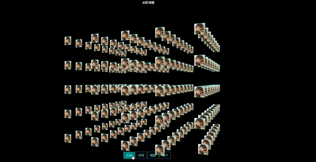
这个效果是一个动态旋转效果,这里不多做展示,大家自己研究,这个也是我第一次接触html制作相册的时候,在百度学的,大家有啥更玩的也可以一起讨论分享!