参考了别人文章画出了稍微好看一点的折线图

下面是代码
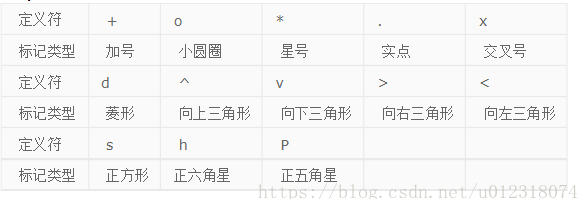
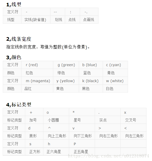
x=1:1:9;%x轴上的数据,第一个值代表数据开始,第二个值代表间隔,第三个值代表终止
name={'F1','F4','F5','F6','F8','F9','F10','F17','F18'}; %横坐标字符
a=[0.8201,0.6783,0.8568,0.962,0.2922,0.69,0.8443,0.2577,0.8499]; %a数据y值
b=[0.8234,0.834,0.9868,0.9562,0.1426,0.6626,0.8033,0.3049,0.9556]; %b数据y值
c=[0.8891,0.717,0.9963,0.7357,0.1032,0.4933,0.6927,0.1778,0.9681]; %c数据y值
d=[0.3162,0.6994,0.9999,0.7639,0.0001,0.5992,0.9858,0.7379,0.9957]; %d数据y值
figure('color',[1 1 1]);%设置背景为白色
plot(x,a,'--o','Color',[0.255,0.412,0.88],'lineWidth',2);
hold on
plot(x,b,'--+','Color',[0.76,0.068,0.1944],'lineWidth',2);
hold on
plot(x,c,'->','Color',[0,0.543,0.543],'lineWidth',2);
hold on
plot(x,d,'-s','Color',[0.3,0.3,0.35],'lineWidth',2); %线性,颜色,标记,粗细
axis([0,10,0,1]) %确定x轴与y轴框图大小
set(gca,'FontName','Times New Roman','FontSize',13,'LineWidth',1);%设置坐标轴字体大小
set(gca,'XTick',[1:1:9]) %x轴范围1-9,间隔1
set(gca, 'XTickLabel', name); %设置横坐标字符标签
set(gca,'YTick',[0:0.2:1]) %y轴范围0-1,间隔0.2
legend('KNN','RF','SVM','NN','location','SouthWest'); %右上角标注
xlabel('FAULT') %x轴坐标描述
ylabel('Accurary(%)') %y轴坐标描述
基础代码参考了这篇帖子:https://blog.csdn.net/u012318074/article/details/79894443
修改字体大小:https://blog.csdn.net/weixin_36075657/article/details/116474255
折线图自定义颜色:https://blog.csdn.net/qq_23847773/article/details/108757226