一、现象
<div class="box"><div>1</div><div>2</div><div>3</div><div>4</div><div>5</div><div>6</div><div>7</div></div>
1、box, flex布局后
.box {display: flex;flex-wrap: wrap;justify-content: space-between;background-color: grey;div {width: 80px;height: 80px;background-color: red;margin: 10px;}}
效果如图:
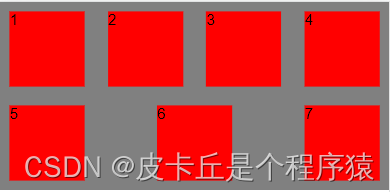
此时,它并不是我们想要的效果。。。
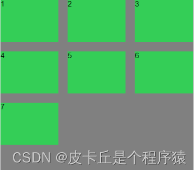
2、解决方案:用grid布局将得到有效解决
.box {display: grid;grid-template-columns: repeat(auto-fill, 80px);grid-gap: 10px;justify-content: center;background: grey;div {height: 80px;width: 80px;background: red;}}
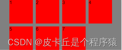
这是我们想要的效果了。
二、补充下grid布局和flex布局
flex和grid布局的差别:
flex是一维布局 ,grid是二维布局也就是说grid布局可以更好的操作行和列。flex布局和grid布局是现在的主流的两种布局方式
.box{display: grid;  // 开启grid布局grid-template-columns: repeat(3,30%);   // 设置列grid-template-rows: repeat(3,20%);  // 设置行grid-column-gap: 20px; // 设置网格之间的间距grid-row-gap: 20px; // 设置网格之间的间距
}
效果如图:
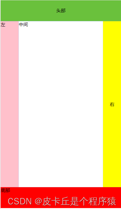
2、用grid布局做一个常用的网站布局
- html:
<div class="box"><div class="header">头部</div><div class="content"><div class="left">左</div><div class="middle">中间</div><div class="right">右</div></div><div class="bottom">底部</div></div>
- css:
box {height: 80vh;display: grid;grid-template-rows: 10% 80% 10%; // 设置行数background-color: grey;.header {background-color: #6ac13c;display: grid;align-content: center;justify-content: center; }.content {display: grid;grid-template-columns: 15% 70% 15%;background: #007aff;// grid-gap: 20px; // 网格之间的间隔// grid-column-gap: 20px; // 设置网格之间的间距==列// grid-row-gap: 20px; // 设置网格之间的间距==行.left {background-color: pink;}.middle {background: #ffffff;}.right {text-align: center;background: yellow;display: grid;align-items: center;}}.bottom {background-color: red;}}效果如图: