嵌入式之路,贵在日常点滴
---阿杰在线送代码
目录
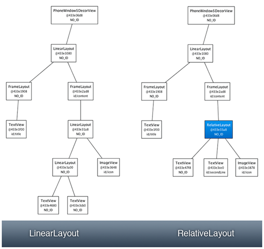
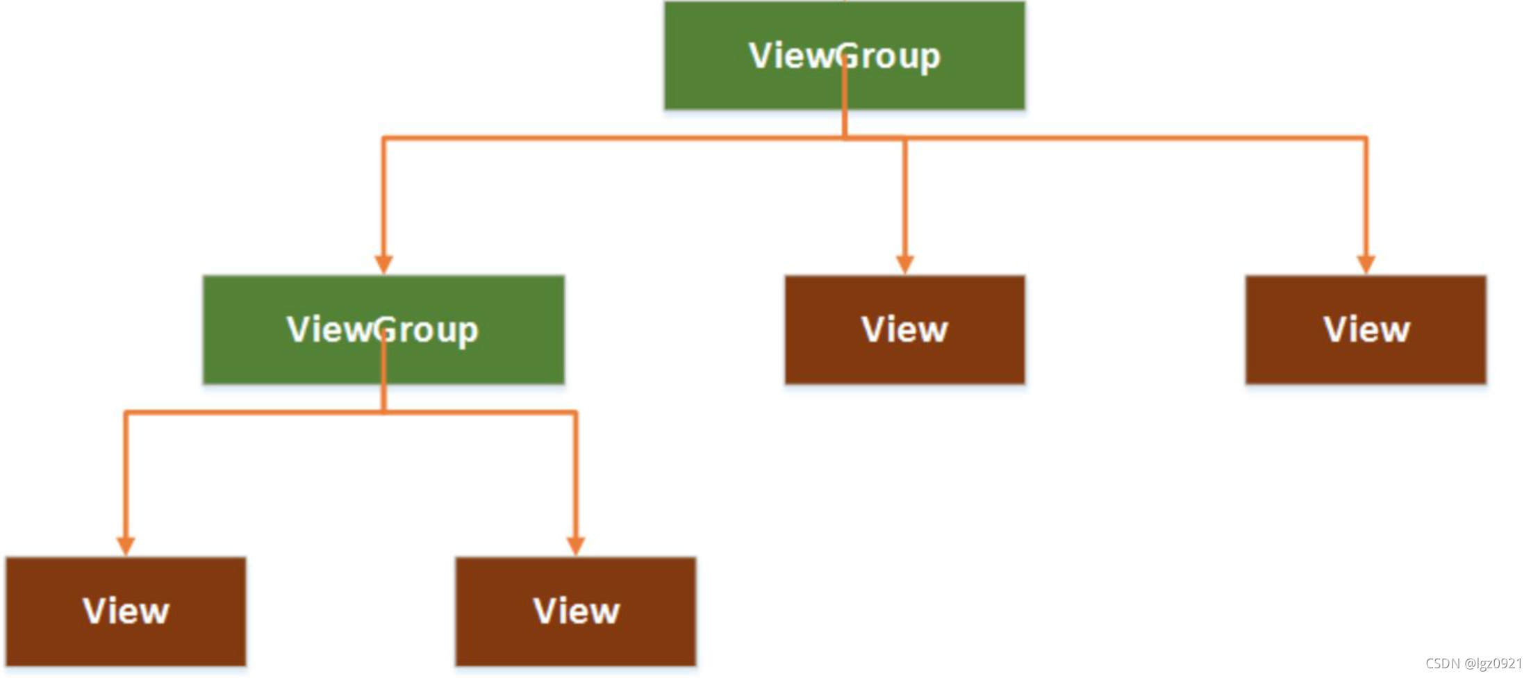
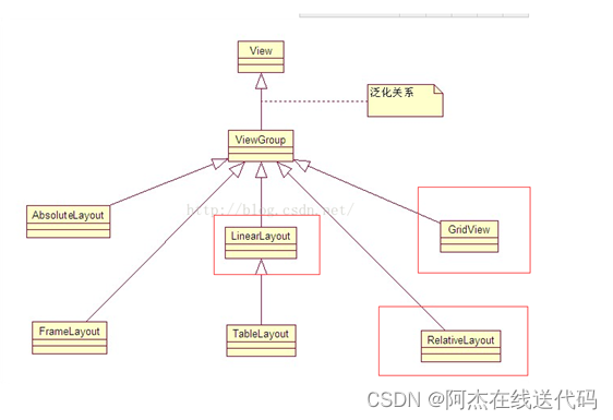
一、布局的种类
二、布局和页面的关系
三、显示一张美女图
控件的宽度和高度
四、布局背景颜色,背景图,显示两个美女
关于控件ID
五、常用布局之相对布局
RelativeLayout中子控件常用属性
关于控件ID使用注意点
六、 基础控件之Button,TextView,EditText,ImageView
控件布局
通过拖拽
通过代码编写
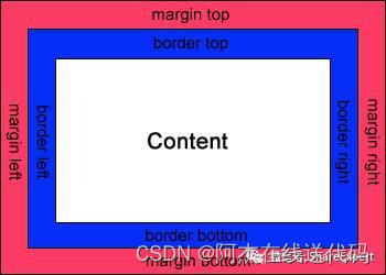
七、padding和margin
内边距padding
外边距margin
八、做出一个智能家居布局图(新大陆2016年物联网国赛题目)
Android圆角按键的实现
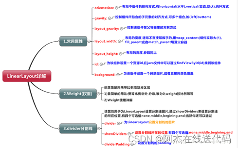
九、常用布局之线性布局
LinearLayout(线性布局)常用到的属性简单归纳一下:
layout_weight(权重)
divider分割线
用线性布局来做一个登录界面
其他:必备快捷键
下面涉及到两个主要的文件类型:
.xml负责页面布局效果,.java负责后台逻辑。
一、布局的种类
二、布局和页面的关系

运行结果:#ff0000红
整体框架
<RelativeLayout > //父布局
//往该布局添加控件
<TextView />
<Button/>
</RelativeLayout>
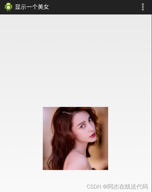
三、显示一张美女图

控件的宽度和高度
控件的宽度
android:layout_width="match_parent"
fill_parent和match_parent 都是大小跟父控件对齐
wrap_content 该控件有多大就显示多大
控件的高度
android:layout_height="match_parent"
<RelativeLayout xmlns:android="http://schemas.android.com/apk/res/android"xmlns:tools="http://schemas.android.com/tools"android:layout_width="match_parent"android:layout_height="match_parent"android:background="@drawable/bg"tools:context=".MainActivity" ></RelativeLayout>运行结果:

每个框架都有这三句话

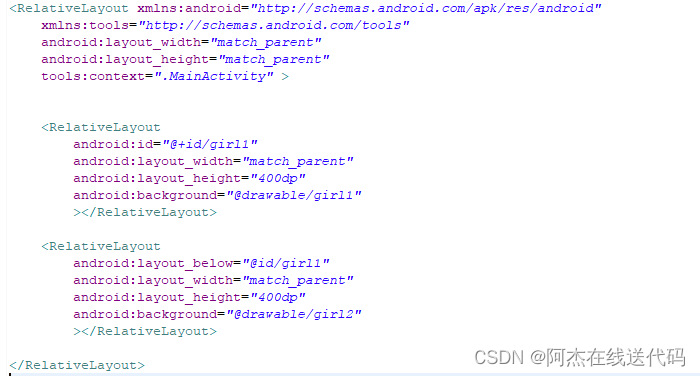
四、布局背景颜色,背景图,显示两个美女
关于控件ID
给控件起一个ID:
android:id="@+id/girl1"
让一个控件和跟其他控件起联系,比如放它下面(就利用到这个ID):
android:layout_below="@id/girl1"
运行结果:

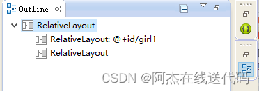
一个大布局底下有两个小布局
五、常用布局之相对布局
RelativeLayout中子控件常用属性
1、相对于父控件,例如:android:layout_alignParentTop=“true”
android:layout_alignParentTop 控件的顶部与父控件的顶部对齐;
android:layout_alignParentBottom 控件的底部与父控件的底部对齐;
android:layout_alignParentLeft 控件的左部与父控件的左部对齐;
android:layout_alignParentRight 控件的右部与父控件的右部对齐;
<RelativeLayout xmlns:android="http://schemas.android.com/apk/res/android"xmlns:tools="http://schemas.android.com/tools"android:layout_width="match_parent"android:layout_height="match_parent"tools:context=".MainActivity" ><RelativeLayout android:id="@+id/girl2"android:layout_alignParentBottom="true"android:layout_width="wrap_content"android:layout_height="wrap_content"android:background="@drawable/testpic32" ></RelativeLayout></RelativeLayout>运行结果:

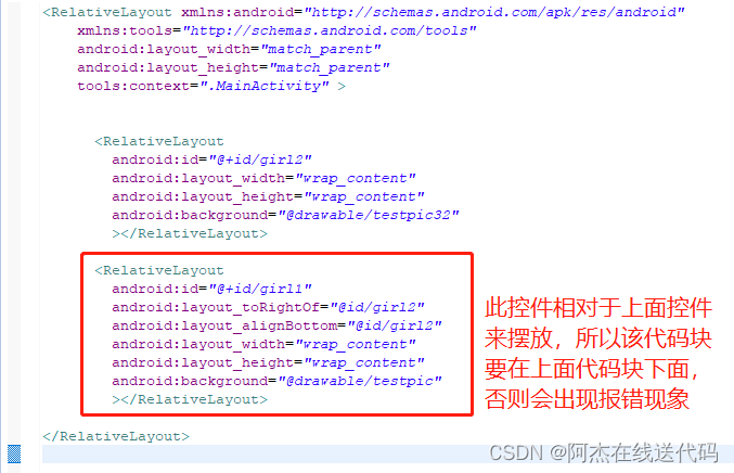
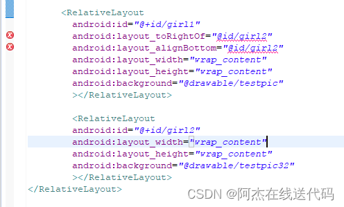
2、相对给定Id控件,例如:android:layout_above=“@id/**”
android:layout_above 控件的底部置于给定ID的控件之上;
android:layout_below 控件的底部置于给定ID的控件之下;
android:layout_toLeftOf 控件的右边缘与给定ID的控件左边缘对齐;
android:layout_toRightOf 控件的左边缘与给定ID的控件右边缘对齐;
android:layout_alignBaseline 控件的baseline与给定ID的baseline对齐;(少用)
android:layout_alignTop 控件的顶部边缘与给定ID的顶部边缘对齐;
android:layout_alignBottom 控件的底部边缘与给定ID的底部边缘对齐;
android:layout_alignLeft 控件的左边缘与给定ID的左边缘对齐;
android:layout_alignRight 控件的右边缘与给定ID的右边缘对齐;
<RelativeLayout xmlns:android="http://schemas.android.com/apk/res/android"xmlns:tools="http://schemas.android.com/tools"android:layout_width="match_parent"android:layout_height="match_parent"tools:context=".MainActivity" ><RelativeLayout android:id="@+id/girl2"android:layout_width="wrap_content"android:layout_height="wrap_content"android:background="@drawable/testpic32" ></RelativeLayout><RelativeLayout android:id="@+id/girl1"android:layout_toRightOf="@id/girl2"android:layout_alignBottom="@id/girl2"android:layout_width="wrap_content"android:layout_height="wrap_content"android:background="@drawable/testpic" ></RelativeLayout> </RelativeLayout>运行结果:
关于控件ID使用注意点
3、居中,例如:android:layout_centerInParent=“true”
android:layout_centerHorizontal 水平居中;
android:layout_centerVertical 垂直居中;
android:layout_centerInParent 父控件的中央;
<RelativeLayout xmlns:android="http://schemas.android.com/apk/res/android"xmlns:tools="http://schemas.android.com/tools"android:layout_width="match_parent"android:layout_height="match_parent"tools:context=".MainActivity" ><RelativeLayout android:id="@+id/girl1"android:layout_width="wrap_content"android:layout_height="wrap_content"android:background="@drawable/testpic" android:layout_centerInParent="true" ></RelativeLayout> </RelativeLayout>运行结果:
六、 基础控件之Button,TextView,EditText,ImageView
Button:按键
TextView:文本框
EditText:编辑文本
ImageView:图片框
控件布局
通过拖拽
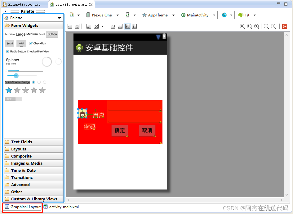
通过代码编写
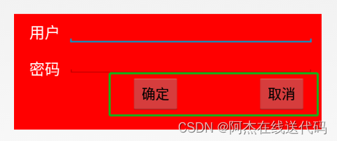
<RelativeLayout xmlns:android="http://schemas.android.com/apk/res/android"xmlns:tools="http://schemas.android.com/tools"android:layout_width="match_parent"android:layout_height="match_parent"android:paddingBottom="@dimen/activity_vertical_margin"android:paddingLeft="@dimen/activity_horizontal_margin"android:paddingRight="@dimen/activity_horizontal_margin"android:paddingTop="@dimen/activity_vertical_margin"tools:context=".MainActivity" ><RelativeLayoutandroid:layout_width="400dp"android:layout_height="150dp"android:layout_centerInParent="true"android:background="#ff0000" ><TextViewandroid:id="@+id/user"android:layout_width="wrap_content"android:layout_height="wrap_content"android:layout_marginLeft="20dp"android:layout_marginRight="10dp"android:layout_marginTop="10dp"android:text="用户"android:textColor="#ffffff"android:textSize="20dp" /><EditTextandroid:id="@+id/ed1"android:layout_width="320dp"android:layout_height="40dp"android:layout_toRightOf="@id/user" /><TextViewandroid:id="@+id/passwd"android:layout_width="wrap_content"android:layout_height="wrap_content"android:layout_below="@id/user"android:layout_marginLeft="20dp"android:layout_marginRight="10dp"android:layout_marginTop="20dp"android:text="密码"android:textColor="#ffffff"android:textSize="20dp" /><EditTextandroid:id="@+id/ed2"android:layout_width="320dp"android:layout_height="40dp"android:layout_below="@id/ed1"android:layout_toRightOf="@id/user" /><Buttonandroid:id="@+id/btn2"android:layout_width="wrap_content"android:layout_height="wrap_content"android:layout_alignParentRight="true"android:layout_below="@id/ed2"android:layout_marginRight="20dp"android:text="取消" /><Buttonandroid:id="@+id/btn1"android:layout_width="wrap_content"android:layout_height="wrap_content"android:layout_below="@id/ed2"android:layout_marginRight="30dp"android:layout_toLeftOf="@id/btn2"android:text="确定" /></RelativeLayout></RelativeLayout>运行结果:
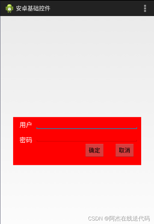
技巧总结:像这种边框有确认和取消两个按键的,先确定好靠近右布局边框的按键,比较好做。
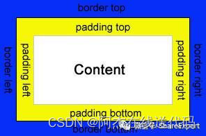
七、padding和margin
内边距padding
默认情况下,组件相互之间是紧紧靠在一起的。但是有时候需要组件各边之间有一定的内边距,那就可以通过以下几个属性来设置,内边距的值是具体的尺寸,如5dp。
-
android:padding:为组件的四边设置相同的内边距。
-
android:paddingLeft:为组件的左边设置内边距。
-
android:paddingRight:为组件的右边设置内边距。
-
android:paddingTop:为组件的上边设置内边距。
-
android:paddingBottom:为组件的下边设置内边距。
内边距的原理如下图所示:
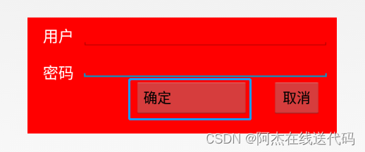
在六的例子进行举例子:
<Buttonandroid:id="@+id/btn1"android:layout_width="wrap_content"android:layout_height="wrap_content"android:paddingRight="100dp"android:layout_below="@id/ed2"android:layout_marginRight="30dp"android:layout_toLeftOf="@id/btn2"android:text="确定" />运行结果:
外边距margin
通过设置内边距,只能设置内容相对于组件之间的距离,而组件之间仍然是相邻挨着的。在实际开发中,有时候需要组件之间有一定的间隔距离,那么就需要用到外边距了,可以通过以下几个属性来设置。
-
android:layout_margin:本组件离上下左右各组件的外边距。
-
android:layout_marginStart:本组件离开始的位置的外边距。
-
android:layout_marginEnd:本组件离结束位置的外边距。
-
android:layout_marginBottom:本组件离下部组件的外边距。
-
android:layout_marginTop:本组件离上部组件的外边距。
-
android:layout_marginLeft:本组件离左部组件的外边距。
-
android:layout_marginRight:本组件离右部组件的外边距。
外边距的原理如下图所示:
<Buttonandroid:id="@+id/btn1"android:layout_width="wrap_content"android:layout_height="wrap_content"android:layout_below="@id/ed2"android:layout_marginRight="100dp"android:layout_toLeftOf="@id/btn2"android:text="确定" />运行结果:
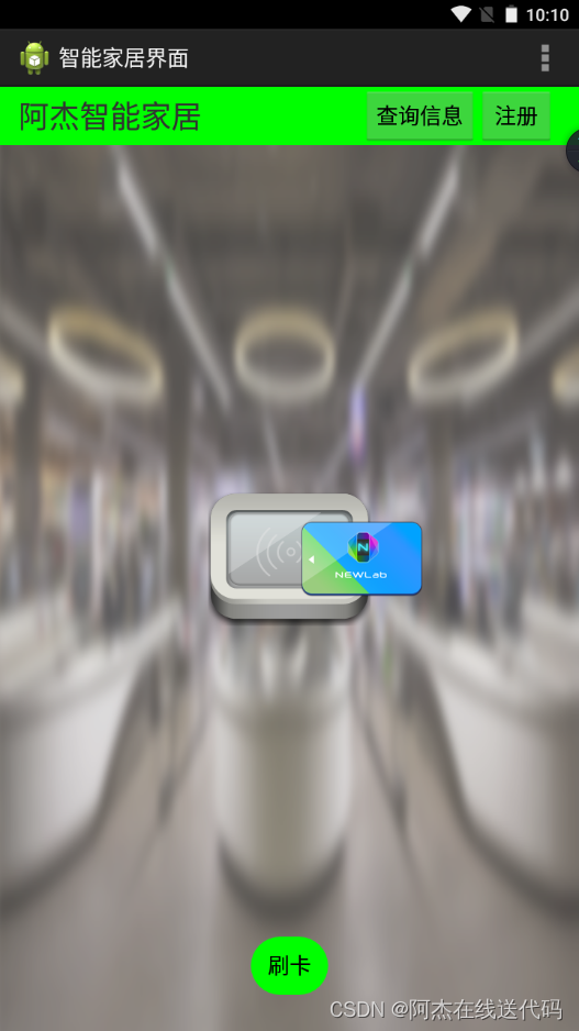
八、做出一个智能家居布局图(新大陆2016年物联网国赛题目)
<RelativeLayout xmlns:android="http://schemas.android.com/apk/res/android"xmlns:tools="http://schemas.android.com/tools"android:layout_width="match_parent"android:layout_height="match_parent"android:background="@drawable/bg_shopping_menu"tools:context=".MainActivity" ><RelativeLayout android:layout_width="match_parent"android:layout_height="wrap_content"android:background="#00ff00"><TextView android:layout_width="wrap_content"android:layout_height="wrap_content"android:text="阿杰智能家居"android:textSize="25dp"android:layout_marginLeft="15dp"android:layout_marginTop="6dp"/><Button android:id="@+id/zhuce"android:layout_width="wrap_content"android:layout_height="wrap_content"android:text="注册"android:layout_alignParentRight="true"android:layout_marginRight="20dp"/><Button android:layout_width="wrap_content"android:layout_height="wrap_content"android:text="查询信息"android:layout_toLeftOf="@id/zhuce"/></RelativeLayout><ImageView android:layout_width="wrap_content"android:layout_height="wrap_content"android:src="@drawable/pic_rf"android:layout_centerInParent="true"/><ImageView android:layout_width="wrap_content"android:layout_height="wrap_content"android:src="@drawable/card"android:layout_centerInParent="true"android:paddingLeft="120dp" /><Button android:layout_width="wrap_content"android:layout_height="wrap_content"android:background="@drawable/btn_selector"android:text="刷卡"android:layout_marginBottom="30dp"android:layout_centerHorizontal="true"android:layout_alignParentBottom="true"/></RelativeLayout>
运行结果:
Android圆角按键的实现
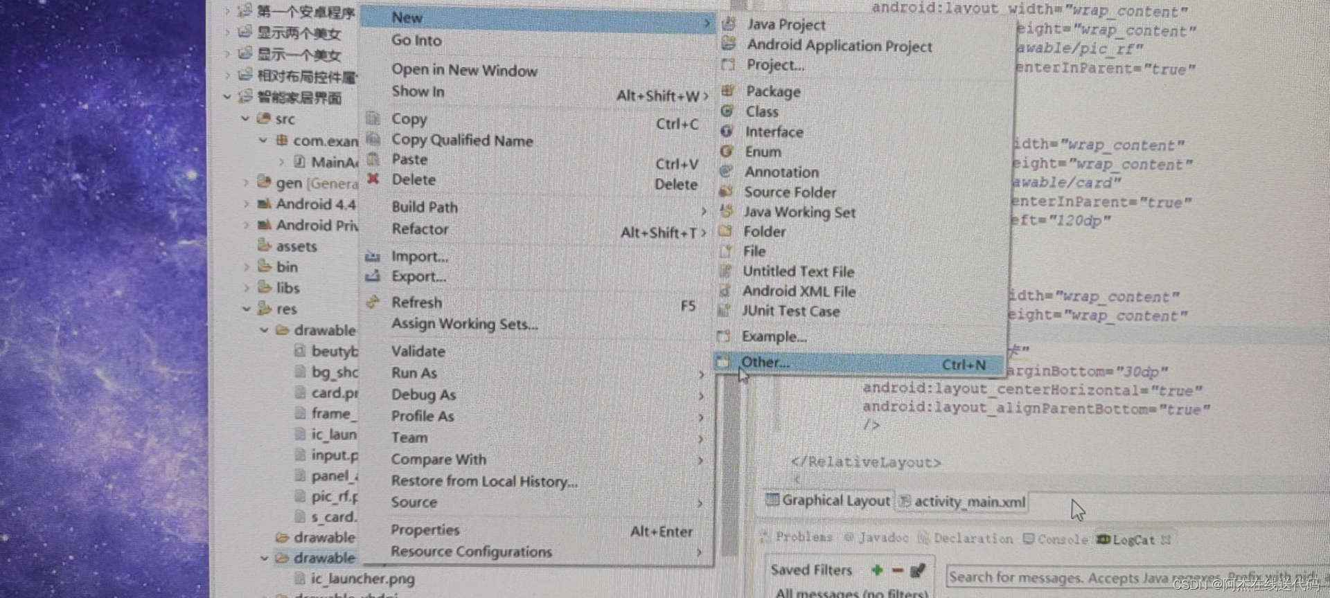
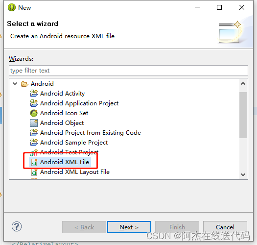
res->drawable-mdpi->右键-> Android->Android XML File->起个名称xxx.xml
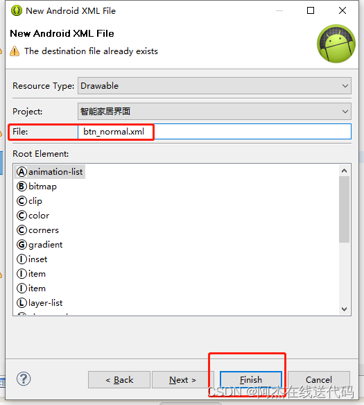
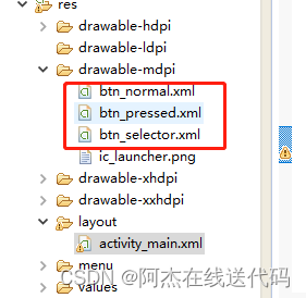
1、在res/drawable目录下新建按钮样式文件 btn_normal.xml(正常状态) 和 btn_pressed.xml(按下状态)。
btn_normal.xml文件:
<?xml version="1.0" encoding="utf-8"?>
<shapexmlns:android="http://schemas.android.com/apk/res/android"android:shape="rectangle"><!-- 圆角的半径 --><corners android:radius="10dp"/><!-- 填充颜色 --><solid android:color="#3a8fea"/></shape>
btn_pressed.xml文件:
<?xml version="1.0" encoding="utf-8"?>
<shape xmlns:android="http://schemas.android.com/apk/res/android"android:shape="rectangle"><!-- 圆角的半径 --><corners android:radius="10dp"/><!-- 填充颜色 --><solid android:color="#0662f5"/></shape>
2、在res/drawable目录下新建样式文件 btn_selector.xml 文件,定义按钮的不同状态样式。
btn_selector.xml文件:
<?xml version="1.0" encoding="utf-8"?>
<selector xmlns:android="http://schemas.android.com/apk/res/android"><!-- 正常状态 --><item android:drawable="@drawable/btn_normal" android:state_pressed="false"/><!-- 按下状态 --><item android:drawable="@drawable/btn_pressed" android:state_pressed="true"/></selector>
3、使用按钮样式
activity_main.xml
android:background="@drawable/btn_selector" 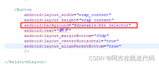
九、常用布局之线性布局
LinearLayout又称作线性布局,是一种非常常用的布局。
这个布局会将它所包含的控件在线性方向上依次排列。
既然是线性排列,肯定就不仅只有一个方向,这里一般只有两个方向:水平方向和垂直方向。
LinearLayout(线性布局)常用到的属性简单归纳一下:
| 属性名 | 解释 |
| android:orientation | 指定线性布局的方向(水平或者垂直) |
| android:width | 线性布局的容器宽度 |
| android:height | 线性布局的容器高度 |
| android:background | 线性布局的背景 |
| android:gravity | 线性布局中,子容器相对于父容器所在的位置 |
| android:layout_gravity | 容器相对它的父元素的对齐方式 |
| android:layout_weight | 权重,按比例来分配控件占用父控件的大小 |
orientation
| 属性值 | 解释 |
|---|---|
| android:orientation=“horizontal” | 指定线性布局方向:水平 |
| android:orientation=“vertical” | 指定线性布局方向:垂直 |
width
| 属性值 | 解释 |
|---|---|
| android:width=“xxxdp” | 指定线性布局的容器宽度为:xxxdp |
| android:width=“wrap_content” | 指定线性布局的容器宽度为:根据容器内容宽度大小来填充屏幕宽度 |
| android:width=“match_parent” | 指定线性布局的容器宽度为:撑满整个屏幕宽度 |
height
| 属性值 | 解释 |
|---|---|
| android:height=“xxxdp” | 指定线性布局的容器高度为:xxxdp |
| android:height=“wrap_content” | 指定线性布局的容器高度为:根据容器内容高度大小来填充屏幕高度 |
| android:height=“match_parent” | 指定线性布局的容器高度为:撑满整个屏幕高度 |
background
| 属性值 | 解释 |
|---|---|
| android:background="#000" | 指定线性布局的背景为:黑色(rgb颜色) |
| android:background="@android:color/black" | 指定线性布局的背景为:黑色(引用android系统自带的原始黑色) |
| andrid:background="@color/colorPrimary" | 指定线性布局的背景为:(根据res/color.xml 中的colorPrimary所定义的颜色设置) |
gravity
自身是父容器
| 属性值 | 解释 |
|---|---|
| android:gravity=“center” | 指定线性布局中,子容器相对于父容器所在的位置为:正中心 |
| android:gravity=“cente_verticalr” | 指定线性布局中,子容器相对于父容器所在的位置为:垂直方向的正中心 |
| android:gravity=“center_horizontal” | 指定线性布局中,子容器相对于父容器所在的位置为:水平方向的正中心 |
| android:gravity=“left” | 指定线性布局中,子容器相对于父容器所在的位置为:最左边(默认) |
| android:gravity=“right” | 指定线性布局中,子容器相对于父容器所在的位置为:最右边 |
| android:gravity=“top” | 指定线性布局中,子容器相对于父容器所在的位置为:最上方(默认) |
| android:gravity=“bottom” | 指定线性布局中,子容器相对于父容器所在的位置为:最下方 |
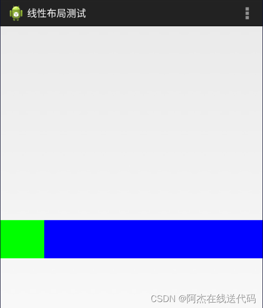
<RelativeLayout xmlns:android="http://schemas.android.com/apk/res/android"xmlns:tools="http://schemas.android.com/tools"android:layout_width="match_parent"android:layout_height="match_parent"tools:context=".MainActivity" ><LinearLayoutandroid:layout_width="match_parent"android:layout_height="70dp"android:layout_centerInParent="true"android:background="#ff0000"android:orientation="horizontal" ><LinearLayoutandroid:layout_width="0dp"android:layout_height="70dp"android:layout_weight="1"android:orientation="vertical"android:background="#00ff00" > <TextViewandroid:layout_width="match_parent"android:layout_height="0dp"android:layout_weight="1"android:gravity="center"android:text="账号" /><TextViewandroid:layout_width="match_parent"android:layout_height="0dp"android:layout_weight="1"android:gravity="center"android:text="密码" /></LinearLayout><LinearLayoutandroid:layout_width="0dp"android:layout_height="70dp"android:layout_weight="5"android:background="#0000ff" ></LinearLayout></LinearLayout></RelativeLayout>运行结果:
layout_gravity
自身是子容器
| 属性值 | 解释 |
|---|---|
| android:gravity=“center” | 指定线性布局中,子容器相对于父容器所在的位置为:正中心 |
| android:gravity=“cente_verticalr” | 指定线性布局中,子容器相对于父容器所在的位置为:垂直方向的正中心 |
| android:gravity=“center_horizontal” | 指定线性布局中,子容器相对于父容器所在的位置为:水平方向的正中心 |
| android:gravity=“left” | 指定线性布局中,子容器相对于父容器所在的位置为:最左边(默认) |
| android:gravity=“right” | 指定线性布局中,子容器相对于父容器所在的位置为:最右边 |
| android:gravity=“top” | 指定线性布局中,子容器相对于父容器所在的位置为:最上方(默认) |
| android:gravity=“bottom” | 指定线性布局中,子容器相对于父容器所在的位置为:最下方 |
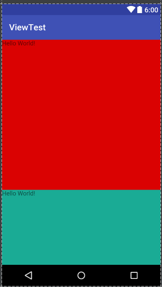
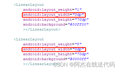
layout_weight(权重)
当我们给一个view设置了android:layout_weight属性,意味着赋予它话语权,常规思维就是谁的weight大,谁说了算(空间占比大)。
| 属性值 | 解释 |
|---|---|
| android:layout_weight=“2” | 该单元权重为2 |
<RelativeLayout xmlns:android="http://schemas.android.com/apk/res/android"xmlns:tools="http://schemas.android.com/tools"android:layout_width="match_parent"android:layout_height="match_parent"tools:context=".MainActivity" ><LinearLayout android:layout_width="match_parent"android:layout_height="70dp"android:background="#ff0000"android:layout_centerInParent="true" android:orientation="horizontal" ><LinearLayout android:layout_weight="1"android:layout_width="0dp"android:layout_height="70dp"android:background="#00ff00"></LinearLayout><LinearLayout android:layout_weight="5"android:layout_width="0dp"android:layout_height="70dp"android:background="#0000ff"></LinearLayout></LinearLayout></RelativeLayout>
运行结果:
注意点:
divider分割线
fenge.xml
<?xml version="1.0" encoding="utf-8"?>
<shape xmlns:android="http://schemas.android.com/apk/res/android" android:shape="line"><size android:width="200dp"android:height="2dp"/><stroke android:color="#000000"/></shape>
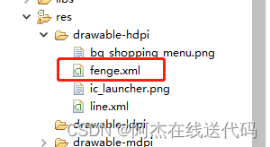
android:divider="@drawable/fenge"android:dividerPadding="2dp"android:showDividers="middle|end"例子
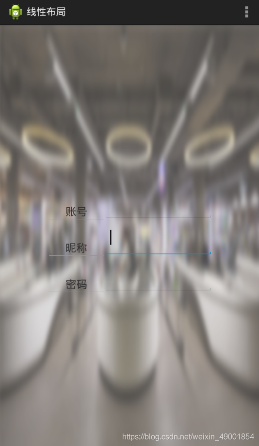
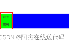
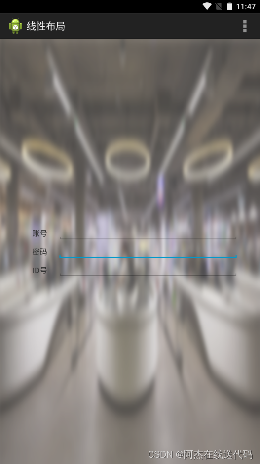
<LinearLayoutandroid:layout_width="0dp"android:layout_height="100dp"android:layout_weight="1"android:divider="@drawable/fenge"android:dividerPadding="2dp"android:showDividers="middle|end"android:orientation="vertical" >用线性布局来做一个登录界面
<RelativeLayout xmlns:android="http://schemas.android.com/apk/res/android"xmlns:tools="http://schemas.android.com/tools"android:layout_width="match_parent"android:layout_height="match_parent"android:background="@drawable/bg_shopping_menu"tools:context=".MainActivity" ><LinearLayoutandroid:layout_width="400dp"android:layout_height="100dp"android:layout_centerInParent="true"android:orientation="horizontal" ><LinearLayoutandroid:layout_width="0dp"android:layout_height="100dp"android:layout_weight="1"android:orientation="vertical" ><TextViewandroid:layout_width="match_parent"android:layout_height="0dp"android:layout_weight="1"android:gravity="center"android:text="账号" /><TextViewandroid:layout_width="match_parent"android:layout_height="0dp"android:layout_weight="1"android:gravity="center"android:text="密码" /><TextViewandroid:layout_width="match_parent"android:layout_height="0dp"android:layout_weight="1"android:gravity="center"android:text="ID号" /></LinearLayout><LinearLayoutandroid:layout_width="0dp"android:layout_height="100dp"android:layout_weight="5"android:orientation="vertical" ><EditTextandroid:layout_width="match_parent"android:layout_height="0dp"android:layout_weight="1" /><EditTextandroid:layout_width="match_parent"android:layout_height="0dp"android:layout_weight="1" /><EditTextandroid:layout_width="match_parent"android:layout_height="0dp"android:layout_weight="1" /></LinearLayout></LinearLayout></RelativeLayout>运行结果:
其他:必备快捷键
Ctrl +shift+ /
注释光标所在行代码,会根据当前不同文件类型使用不同的注释符号
Ctrl + Alt + L
格式化代码,可以对当前文件和整个包目录使用
Ctrl + R
在当前文件进行文本替换
Ctrl + Y
删除光标所在行 或 删除选中的行
alt+左/右方向键
回到上一个/下一个位置
想使用自动补全时,最快的办法是跳着输入字母。
比如你想快速输入android:layout_width,就直接打wi等等,打几个关键字然后Alt+/自动补全.