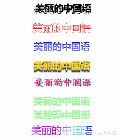
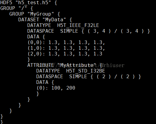
简单粗暴,直接上马:
<!DOCTYPE html>
<html><head><meta charset="UTF-8"><title></title></head><body><h1 class="vintage1">美丽的中国语</h1><h1 class="vintage2">美丽的中国语</h1><h1 class="vintage3">美丽的中国语</h1><h1 class="vintage4">美丽的中国语</h1><h1 class="vintage5">美丽的中国语</h1><h1 class='text-reflect-base'>美丽的中国语</h1><div class="text"><p>美丽的中国语</p></div>
<style>
body{text-align: center;
}
.vintage1{
background: #EEE url(data:image/gif;base64,iVBORw0KGgoAAAANSUhEUgAAAAQAAAAECAIAAAAmkwkpAAAAHklEQVQImWNkYGBgYGD4//8/A5wF5SBYyAr+//8PAPOCFO0Q2zq7AAAAAElFTkSuQmCC) repeat;
text-shadow: 5px -5px black, 4px -4px white;
font-weight: bold;
-webkit-text-fill-color: transparent;
-webkit-background-clip: text }
.vintage2{
color: transparent;
-webkit-text-stroke: 1px red;
letter-spacing: 0.04em;}
.vintage3 {
color: transparent;
background-color : blue;
text-shadow : rgba(255,255,255,0.5) 0 5px 6px, rgba(255,255,255,0.2) 1px 3px 3px;
-webkit-background-clip : text;
}
.vintage4{
color: gold;
letter-spacing: 0;
text-shadow: 0px 1px 0px #999, 0px 2px 0px #888, 0px 3px 0px #777, 0px 4px 0px #666, 0px 5px 0px #555, 0px 6px 0px #444, 0px 7px 0px #333, 0px 8px 7px #001135 }
.vintage5{font-family:cursive;text-shadow:6px 2px 2px #333;color:deeppink
}
.text-reflect-base{color: palegreen;-webkit-box-reflect:below 10px;
}
.text{width: 300px;height: 200px;position: absolute;left: 50%;margin-left: -150px;background-image: -webkit-linear-gradient(left,blue,#66ffff 10%,#cc00ff 20%,#CC00CC 30%, #CCCCFF 40%, #00FFFF 50%,#CCCCFF 60%,#CC00CC 70%,#CC00FF 80%,#66FFFF 90%,blue 100%);-webkit-text-fill-color: transparent;/* 将字体设置成透明色 */-webkit-background-clip: text;/* 裁剪背景图,使文字作为裁剪区域向外裁剪 */-webkit-background-size: 200% 100%; -webkit-animation: masked-animation 4s linear infinite;font-size: 35px;
}
@keyframes masked-animation {0% {background-position: 0  0;}100% {background-position: -100%  0;}
}</style></body>
</html>
没有什么难的,都是css和html,看见喜欢的就直接用咯!


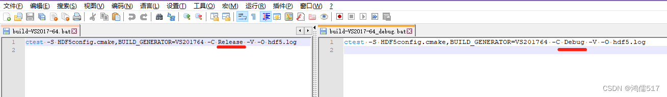
![[HDF5]如何使用CMake一起编译自己的代码和HDF5库](https://img-blog.csdnimg.cn/80aad4c59d4d4b2582804c416e00a2b5.jpg)