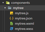
插件来自:select-cy - DCloud 插件市场
1、组件代码
<template><view class="uni-select-cy" :style="{ 'z-index': zindex }"><view class="uni-select-cy-select" :class="{ active: active }" @click.stop="handleSelect"><!-- 禁用mask --><view class="uni-disabled" v-if="disabled"></view><!-- 清空 --><view class="close-icon close-postion" v-if="realValue.length && !active && !disabled && showClearIcon"><text @click.stop="handleRemove(null)"></text></view><!-- 显示框 --><view class="uni-select-multiple" v-show="realValue.length"><view class="uni-select-multiple-item" v-for="(item, index) in realValue" :key="index">{{ item }}<view class="close-icon" v-if="showValueClear"><text @click.stop="handleRemove(index)"></text> </view></view></view><!-- 为空时的显示文案 --><view v-if="realValue.length == 0 && showplaceholder">{{ placeholder }}</view><!-- 禁用图标 --><view class="uni-select-cy-icon" :class="{ disabled: disabled }"><text></text></view></view><!-- 下拉选项 --><scroll-view class="uni-select-cy-options" :scroll-y="true" v-show="active"><template><viewclass="uni-select-cy-item":class="{ active: realValue.includes(item[svalue]) }"v-for="(item, index) in options":key="index"@click.stop="handleChange(index, item)">{{ item[slabel] }}</view></template></scroll-view></view>
</template><script>
export default {name: 'select-cy',props: {// 是否显示全部清空按钮showClearIcon: {type: Boolean,default: false,},// 是否显示单个删除showValueClear: {type: Boolean,default: true,},zindex: {type: Number,default: 999,},// 禁用组件disabled: {type: Boolean,default: false,},options: {type: Array,default() {return [];},},value: {type: Array,default() {return [];},},placeholder: {type: String,default: '请选择',},showplaceholder: {type: Boolean,default: true,},slabel: {type: String,default: 'text',},svalue: {type: String,default: 'value',},},data() {return {active: false, // 组件是否激活,changevalue: [], // 搜索框同步realValue: [],};},mounted() {// 初始化this.init();},methods: {close() {this.active = false;},init() {if (this.value.length > 0) {this.changevalue = this.options.forEach((item) => {this.value.forEach((i) => {if (item[this.svalue] === i[this.svalue]) {return item;}});});this.realValue = this.value;} else {this.changevalue = [];this.realValue = [];}},// 点击展示选项handleSelect() {if (this.disabled) return;this.active = !this.active;},// 移除数据handleRemove(index) {if (index === null) {this.realValue = [];this.changevalue = [];} else {this.realValue.splice(index, 1);this.changevalue.splice(index, 1);}this.$emit('change', this.changevalue, this.realValue);},// 点击组件列handleChange(index, item) {const arrIndex = this.realValue.indexOf(item[this.svalue]);if (arrIndex > -1) {this.changevalue.splice(arrIndex, 1);this.realValue.splice(arrIndex, 1);} else {this.changevalue.push(item);this.realValue.push(item[this.svalue]);}console.log(this.realValue, 'this.realValue');this.$emit('change', this.changevalue, this.realValue);},},
};
</script><style lang="scss" scoped>
.uni-select-cy {position: relative;z-index: 999;.uni-select-mask {width: 100%;height: 100%;}/* 删除按钮样式*/.close-icon {height: 100%;width: 20px;display: flex;align-items: center;justify-content: center;z-index: 3;cursor: pointer;text {position: relative;background: #c0c4cc;width: 13px;height: 13px;border-radius: 50%;border: 1px solid #bbb;&::before,&::after {content: '';position: absolute;left: 20%;top: 50%;height: 1px;width: 60%;transform: rotate(45deg);background-color: #909399;}&::after {transform: rotate(-45deg);}}}//所有情空的定位.close-postion {position: absolute;right: 35px;top: 0;height: 100%;width: 15px;}/* 多选盒子 */.uni-select-multiple {overflow-x: auto;display: flex;.uni-select-multiple-item {background: #f4f4f5;margin-right: 5px;padding: 2px 4px;border-radius: 4px;color: #909399;display: flex;}}// select部分.uni-select-cy-select {user-select: none;position: relative;z-index: 3;height: 36px;padding: 0 30px 0 10px;box-sizing: border-box;border-radius: 4px;border: 1px solid rgb(229, 229, 229);display: flex;align-items: center;font-size: 14px;color: #999;.uni-disabled {position: absolute;left: 0;width: 100%;height: 100%;z-index: 19;cursor: no-drop;background: rgba(255, 255, 255, 0.5);}.uni-select-cy-input {font-size: 14px;color: #999;display: block;width: 96%;overflow: hidden;text-overflow: ellipsis;white-space: nowrap;line-height: 30px;box-sizing: border-box;&.active {color: #333;}}.uni-select-cy-icon {cursor: pointer;position: absolute;right: 0;top: 0;height: 100%;width: 30px;display: flex;align-items: center;justify-content: center;&::before {content: '';width: 1px;height: 100%;position: absolute;left: 0;top: 0;background-color: #e5e5e5;}text {display: block;width: 0;height: 0;border-width: 12rpx 12rpx 0;border-style: solid;border-color: #bbb transparent transparent;transition: 0.3s;}&.disabled {cursor: no-drop;text {width: 20rpx;height: 20rpx;border: 2px solid #ff0000;border-radius: 50%;transition: 0.3s;position: relative;z-index: 999;&::after {content: '';position: absolute;top: 50%;left: 0;width: 100%;height: 2px;margin-top: -1px;background-color: #ff0000;transform: rotate(45deg);}}}}&.active .uni-select-cy-icon {text {transform: rotate(180deg);}}}// options部分.uni-select-cy-options {user-select: none;position: absolute;top: calc(100% + 5px);left: 0;width: 100%;height: 500rpx;border-radius: 4px;border: 1px solid rgb(229, 229, 229);background: #fff;padding: 5px 0;box-sizing: border-box;z-index: 9;.uni-select-cy-item {padding: 0 10px;box-sizing: border-box;cursor: pointer;line-height: 2.5;transition: 0.3s;font-size: 14px;&.active {color: #409eff;background-color: #f5f7fa &hover {color: #409eff;background-color: #f5f7fa;}}&:hover {background-color: #f5f5f5;}}}
}
</style>
2、使用说明
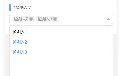
## 插件使用方法:`<select-lay :value="tval" name="name" :options="datalist" @selectitem="selectitem"></select-lay>`## 配置参数:|     属性名      |  类型   | 默认值 | 说明                                             |
| :-------------: | :-----: | :----: | ------------------------------------------------ |
|  showClearIcon  | Boolean | false  | 是否显示全部清空按钮                             |
| showValueClear  | Boolean |  true  | 是否显示单个删除                                 |
|     zindex      | Number  |   ""   | 层级,默认 999,防止多个组件一起使用时下拉栏穿透 |
|     slabel      | String  |  text  | 自定义列表中键值对关系,参考示例                 |
|     svalue      | String  | value  | 自定义列表中键值对关系,该值对应 value,参考示例 |
|   placeholder   | String  | 请选择 | 无选项时展示的文字                               |
| showplaceholder | Boolean |  true  | 下拉时是否展示请选择按钮                         |
|     options     |  Array  |   无   | 数据列表                                         |
|    disabled     | Boolean | false  | 是否禁用                                         |
|      value      |  Array  |   无   | 选中值及回显                                     |## 事件:| 事件名  |            说明            | 返回值                              |
| :-----: | :------------------------: | ----------------------------------- |
| @change | 点击项目或者删除触发的事件 | 返回全量选中项及只有 value 的选中项 |## 说明:此插件依赖 scss,请务必安装!!!## 示例:```<template><view class="content"><form @submit="formSubmit"><view class="item">写法:</view><select-cy :value="tval" placeholder="请选择项目" :options="datalist" @change="change"></select-cy><select-cy :value="tval" placeholder="请选择项目1" :options="datalist" @change="change"></select-cy><button type="submit" @click="formSubmit">提交</button></form></view></template><script>export default {data() {return {//模拟数据列表datalist: [],//模拟初始数据tval: []};},onReady() {this.datalist = [{label: 'label1',value: 'value1'},{label: 'label2',value: 'value2'},{label: 'label3',value: 'value3'},{label: 'label4',value: 'value4'},{label: 'label5',value: 'value5'},{label: 'label6',value: 'value6'},{label: 'label7',value: 'value7'},{label: 'label8',value: 'value8'},{label: 'label9',value: 'value9'}];},methods: {formSubmit(e) {console.log(this.tval,'提交参数');},change(item,value) {console.log(item,value);this.tval = value;}}};</script><style lang="scss">.content {width: 300px;padding: 20px 0;margin: 0 auto;.item {margin-bottom: 10px;}.btn {margin-top: 20px;}}</style>```