文章目录
- 1.Matplotlib画图简单实现
- 2.折线图
- 2.1绘制折线图
- 2.2设置线的格式
- 2.3设置折点
- 2.4.图片的保存和导出
- 2.5设置刻度
- 2.6显示中文
- 2.7实例:每分钟心脏跳动图
- 3.拓展
- 3..1一图多线
- 3.2一图多个坐标子图
- 3.3坐标轴设置

1.Matplotlib画图简单实现
Matplotlib在一个绘制2D图片的库
import matplotlib.pyplot as plt
#第一个表示x轴,第二个列表表示y轴
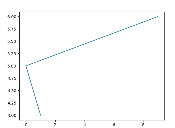
plt.plot([1,0,9],[4,5,6])
plt.show()

2.折线图
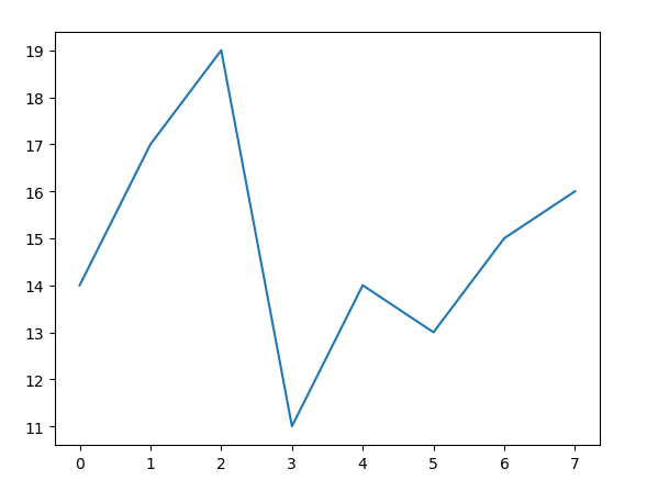
2.1绘制折线图
from matplotlib import pyplot as plt
#设置x
x=range(0,8)
#设置y
y=[14,17,19,11,14,13,15,16]
#plot函数需要两个参数,一个是x一个是y
plt.plot(x,y)
plt.show()
接下来逐步对折线图进行修改
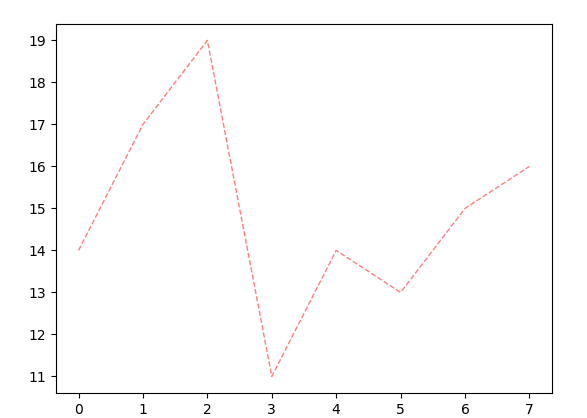
2.2设置线的格式
# plt.plot(x,y)
#对折线进行修饰
#color设置为红色,alpha设置为透明度,linestyle表示线的样式,linewidth表示线的宽度
#color还可以设置为16进制的色值,可在网上查看各种颜色对应的色值
plt.plot(x,y,color='red',alpha=0.5,linestyle='--',linewidth=1)
plt.show()
'''线的样式
-	实线(solid)
--  短线(dashed)
-.	短点相间图
:	虚电线(dotted)
'''
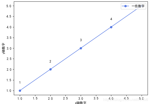
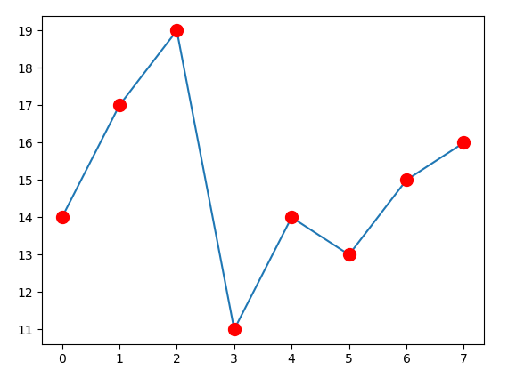
2.3设置折点
#maker是设置折点的样式	markersize是设置结点大小,后面两个参数分别设置折点内部
plt.plot(x,y,marker='o',markersize=10,markerfacecolor='red',markeredgecolor='red',markedgewidth=5)
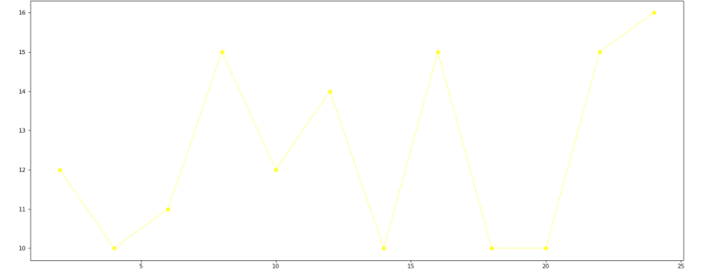
2.4.图片的保存和导出
import random
#生成的x列表一共有12个数
x=range(2,26,2)
#按照x的长度进行随机生成数字,randint是随机生成整数
y=[random.randint(10, 16) for i in x]
#保存图片
plt.figure(figsize=(20,8),dpi=80)
plt.plot(x,y,color='yellow',alpha=0.8,marker='o',linestyle='--',linewidth=1)
#plot.show()会释放figure资源,如果在显示图像之后保存图片,则会清空为空图片
#plt.savfig('图片名')
plt.savefig('python初阶\案例图片.png')
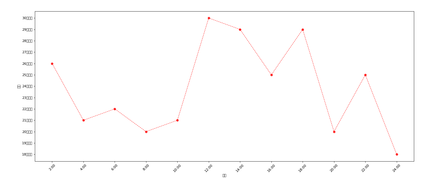
2.5设置刻度
import random
from matplotlib import font_manager
#生成的x列表一共有12个数
x=range(2,26,2)
#按照x的长度进行随机生成数字,randint是随机生成整数
y=[random.randint(15,30) for i in x]
#保存图片
plt.figure(figsize=(20,8),dpi=80)
#设置x列表标签
x_ticks_label=["{}:00".format(i) for i in x]
#rotation表示旋转角度
#设置x坐标点
plt.xticks(x,x_ticks_label,rotation=45)
y_ticks_label=['{}摄氏度'.format(i) for i in range(min(y),max(y)+1)]
#设置x坐标轴的名称
plt.xlabel("时间")
#设置y坐标z
plt.ylabel("温度")
#设置y坐标点
plt.yticks(range(min(y),max(y)+1),y_ticks_label)
plt.plot(x,y,color='red',alpha=0.8,marker='o',linestyle='--',linewidth=1)
plt.show()
2.6显示中文
matplotlib只显示应为,无法显示中文,需要修改matplotlib的默认字体
通过matplotlib下的font_manger可以解决
import random
from matplotlib import font_manager
#设置文字路径,在:\windows\Fonts路径下有文字
my_font=font_manager.FontProperties(fname="C:\Windows\Fonts\C:\Windows\Fonts\SIMLI.TTF",size=20)
#生成的x列表一共有12个数
x=range(2,26,2)
#按照x的长度进行随机生成数字,randint是随机生成整数
y=[random.randint(15,30) for i in x]
#保存图片
plt.figure(figsize=(20,8),dpi=80)
#设置x列表标签
x_ticks_label=["{}:00".format(i) for i in x]
#rotation表示旋转角度
#设置x坐标
plt.xticks(x,x_ticks_label,rotation=45)
y_ticks_label=['{}摄氏度'.format(i) for i in range(min(y),max(y)+1)]
plt.xlabel("时间",fontproperties=my_font)
plt.ylabel("温度",fontproperties=my_font)
#设置y坐标
plt.yticks(range(min(y),max(y)+1),y_ticks_label,fontproperties=my_font)
plt.plot(x,y,color='red',alpha=0.8,marker='o',linestyle='--',linewidth=1)
plt.title("温度表",fontproperties=my_font,color='red')
plt.show()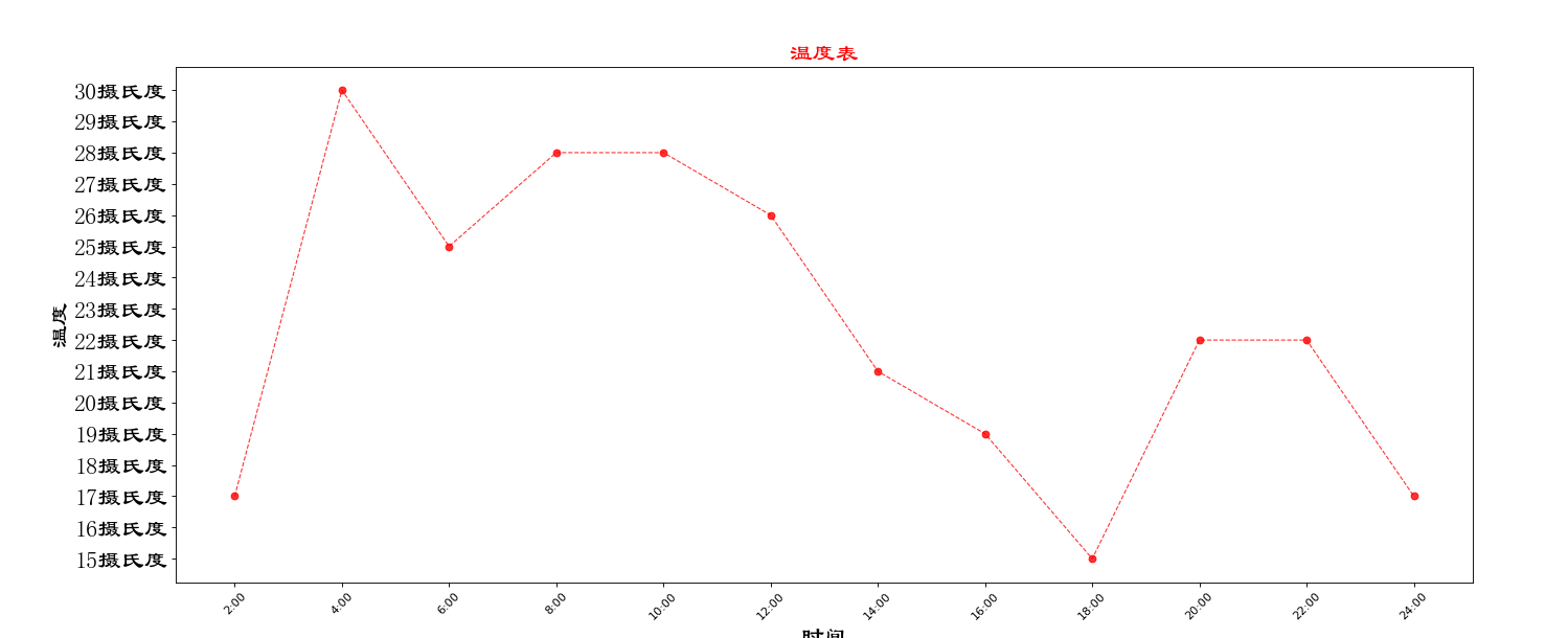
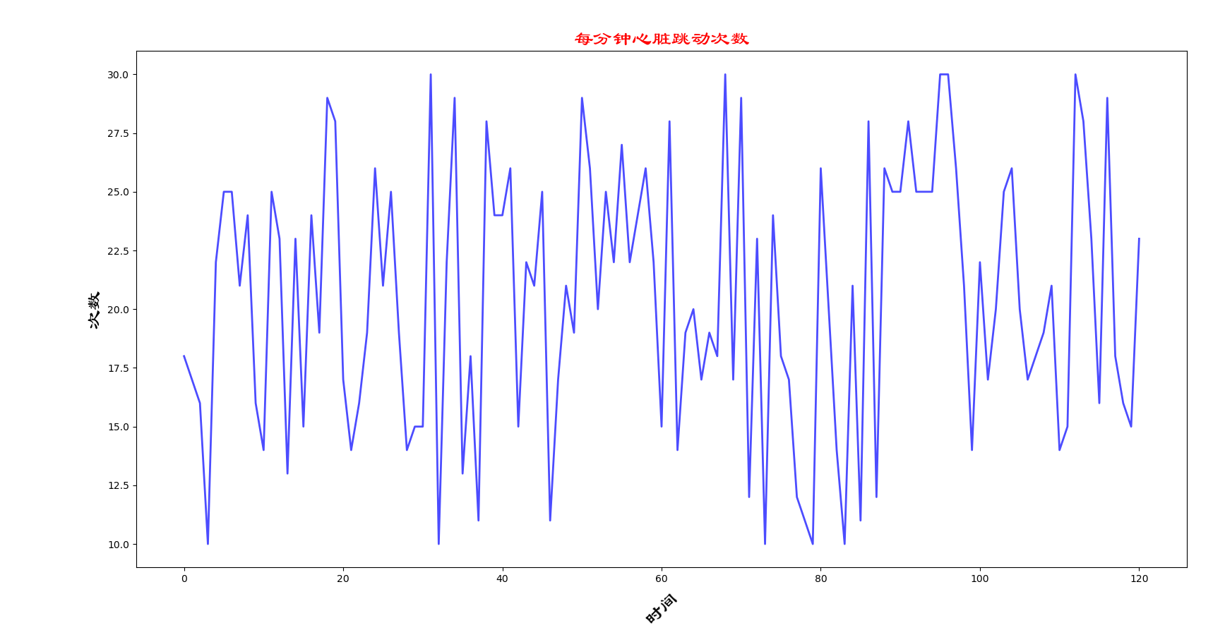
2.7实例:每分钟心脏跳动图
from matplotlib import pyplot as plt
import random
from matplotlib import font_manager
#设置字体路径
my_font=font_manager.FontProperties(fname="C:\Windows\Fonts\C:\Windows\Fonts\SIMLI.TTF",size=20)
#画图
x=range(0,121)
y=[random.randint(10,30) for i in x]
#设置坐标轴名称
plt.xlabel("时间",fontproperties=my_font,rotation=45)
plt.ylabel("次数",fontproperties=my_font)
#设置坐标轴结点
plt.plot(x,y,color='blue',linewidth=2,alpha=0.7)
plt.title("每分钟心脏跳动数",color='red',fontproperties=my_font)
plt.show()

3.拓展
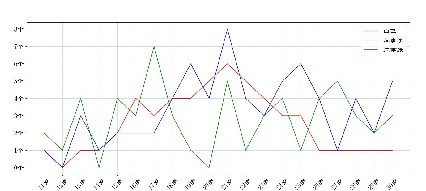
3…1一图多线
from matplotlib import pyplot as plt
import random
from matplotlib import font_manager
my_font=font_manager.FontProperties(fname='C:\Windows\Fonts\C:\Windows\Fonts\SIMLI.TTF',size=20)
x=range(11,31)
y1=[1,0,1,1,2,4,3,4,4,5,6,5,4,3,3,1,1,1,1,1]
y2=[1,0,3,1,2,2,2,4,6,4,8,4,3,5,6,4,1,4,2,5]
y3=[2,1,4,0,4,3,7,3,1,0,5,1,3,4,1,4,5,3,2,3]
#设置x轴刻度
x_ticks_label=['{}岁'.format(i) for i in x]
#设置图形
plt.figure(figsize=(20,8),dpi=80)
#画图,zoder是控制画图流程的属性,其值越大则表示画图的时间越晚
plt.plot(x,y1,color='red',label='自己',zorder=5)
plt.plot(x,y2,color='blue',label='同事李',zorder=10)
plt.plot(x,y3,color='green',label='同事张',zorder=15)
#编辑x轴标签
y_ticks_label=['{}个'.format(i) for i in range(0,9)]
plt.yticks(range(0,9),y_ticks_label,fontproperties=my_font)
plt.xticks(x,x_ticks_label,fontproperties=my_font,rotation=45)
#绘制网格->grid
plt.grid(alpha=0.5)
plt.legend(prop=my_font,loc='upper right')
#展示
plt.show()
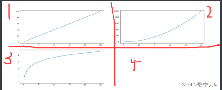
3.2一图多个坐标子图
import numpy as np
x=np.arange(1,100)
#设置画布
fig=plt.figure(figsize=(20,8),dpi=80)
#使用add_subplot方法向 fig新增子图
#           #解释参数#
# (2,2,1)表示将画布分为2行2列,1表示占用序号为1的画布位置
ax1=fig.add_subplot(2,2,1)
plt.plot(x,x)
ax2=fig.add_subplot(2,2,2)
plt.plot(x,x**2)
ax3=fig.add_subplot(2,2,3)
plt.plot(x,np.log(x))
plt.show()
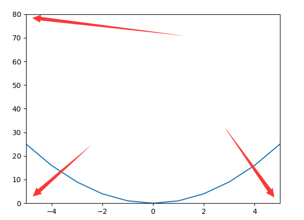
对纵坐标进行改进
y=np.arange(-10,10)
z=y**2
plt.plot(y,z)
#对输出的范围进行限制,限制y的取值为-5到5
#限制z的取值为0到80
#可以理解为x.limit;y.limit;
plt.xlim([-5,5])
plt.ylim([0,80])
plt.show()
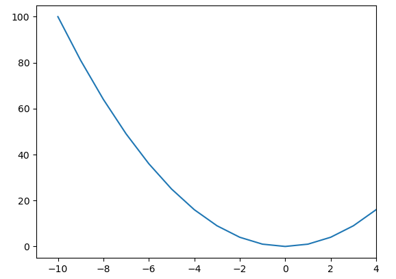
y=np.arange(-10,10)
z=y**2
plt.plot(y,z)
#设置x的最大值为4
plt.xlim(xmax=4)
#设置x的最小值为4
#plt.xlim(xmin=4)
plt.show()
3.3坐标轴设置
x = [-3,-2,-1,0,1,2,3]
y = range(0,14,2)
#取坐标轴的四条边
ax = plt.gca()
plt.plot(x,y)
plt.show()
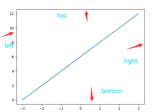
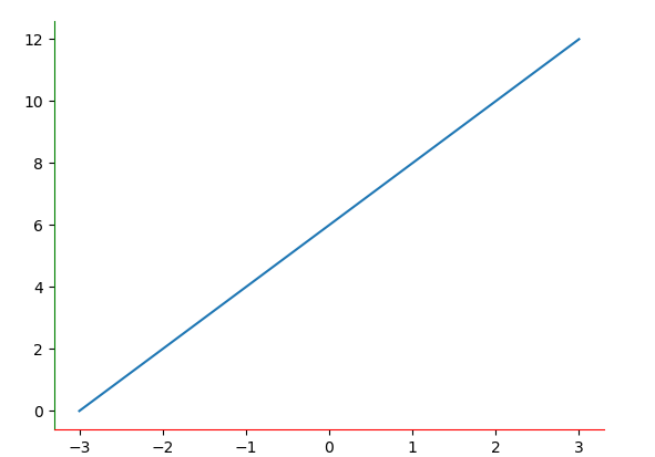
x = [-3,-2,-1,0,1,2,3]
y = range(0,14,2)
#取坐标轴的四条边
ax = plt.gca()
#分别对四条轴进行设置
#取消右轴
ax.spines['right'].set_color('none')
#取消上轴
ax.spines['top'].set_color('none')
#设置下轴为红色
ax.spines['bottom'].set_color('red')
#设置左轴是绿色
ax.spines['left'].set_color('green')
plt.plot(x,y)
plt.show()
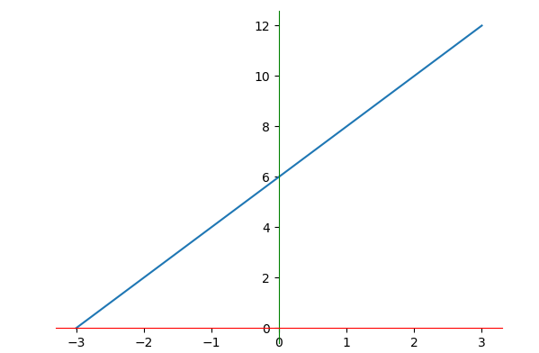
设置为标准坐标轴
x = [-3,-2,-1,0,1,2,3]
y = range(0,14,2)
#取坐标轴的四条边
ax = plt.gca()
#分别对四条轴进行设置
#取消右轴
ax.spines['right'].set_color('none')
#取消上轴
ax.spines['top'].set_color('none')
#设置下轴为红色
ax.spines['bottom'].set_color('red')
#设置左轴是绿色
ax.spines['left'].set_color('green')
#将下轴的‘0’移动到中间
ax.spines['bottom'].set_position(('data',0))
#将左轴的‘0’移动到中间
ax.spines['left'].set_position(('data',0))
plt.plot(x,y)
plt.show()