CommTable.vue table组件
<template><div><el-table:data="tableData"border:class="tabClass ? tabClass : null":showHeader="showHeader ? showHeader : true":spanMethod="spanMethod ? spanMethod : null"element-loading-text="加载中..."v-loading="loading":height="height ? height : null":maxHeight="maxHeight ? maxHeight : null":ref="tabRef ? tabRef : null":header-cell-style="smallRow ? lineStyle : null":cell-style="smallRow ? lineStyle : null"@sort-change="sortByKey"@selection-change="selectionChange":row-key="rowKey ? rowKey : null"><!-- 详情内容展示 需要showExpand属性  --><el-table-column type="expand" v-if="showExpand"><template slot-scope="{ row }"><slot name="expand" :data="row"></slot></template></el-table-column><!-- checkout复选框  selectionObj对象 {show: true, fixed: true}--><el-table-column type="selection" align="center" width="50" v-if="selectionObj.show" :fixed="selectionObj.fixed ? true : false "></el-table-column><el-table-columnv-for="({ prop, label, width, minWidth ,sortBy, slotName, countLimit, childrenList, className, columnFlag, fixed }, index) in tablecolumn":key="index":prop="prop ? prop : null":label="label ? label : null":width="width ? width : null":min-width="minWidth ? minWidth : 100":sort-by="sortBy ? sortBy : null":sortable="sortBy ? (columnFlag ? 'column' : true) : null":className="className ? className : null":fixed="fixed ? fixed : null":render-header="renderHeader ? renderHeader : null"align="center"><!-- 自定义表头 --><template  slot="header" ><slot v-if="slotName" :name="slotName+'Header'" ></slot></template><!-- 自定义内容 --><template v-if="!childrenList" slot-scope="{row, $index}"><!-- 自定义tamplate --><!-- prop没有值的情况 传整个row --><div  v-if="slotName" ><slot :name="slotName" :data="prop ? row[prop] : null" :index="$index" :rowData="row"></slot></div><!-- 字数(countLimit控制)超出显示tip --><div v-else><div v-if="row[prop] && row[prop].length > (countLimit ? countLimit : 50)"><el-tooltip effect="dark" :content="row[prop]" placement="top" popper-class="tooltipsCont"><span class="limitInfo">{{row[prop] | textSubstr((countLimit ? countLimit : 50))}}</span></el-tooltip></div><div  v-else><span >{{row[prop] | emptyText}}</span></div></div></template><!-- 如果有多组数据 注: 必传prop  childrenList为数据配置项 --><el-table-columnv-if="childrenList && childrenList.length > 0"v-for="(item, index) in childrenList":label="item.label":key="index":width="width ? width : null":min-width="minWidth ? minWidth : 100"align="center"><template slot-scope="{row, $index}"><!-- 自定义tamplate --><div  v-if="slotName"><!-- 插槽传值 data:数组数据 prop:当前数组对象的key index:行索引 --><slot  :name="slotName" :data="prop ? row[prop] : []" :prop="item.prop" :rowData="row" :index="$index"></slot></div><!-- 不是自定义默认遍历数据 row[prop] 获取数组 item.prop为数组配置项的prop --><div v-else ><div class="flex-column"><div v-for="(dataItem, dataIndex) in row[prop]" :key="dataIndex">{{dataItem[item.prop]}}</div></div></div></template></el-table-column></el-table-column></el-table><!-- 分页插槽 --><slot name="el-pagination"></slot></div>
</template>
<script>
import { PropsType } from "../propsType.js";
import Sortable from "sortablejs";
export default {name: "comm_table",data() {return {lineStyle:{'font-size': '14px','height': '45px','padding': '3px 0'},};},props: {tableData: PropsType.Array,tablecolumn: PropsType.Array,loading: PropsType.Boolean,//loadingshowExpand: PropsType.Boolean,//是否展示详情行selectionObj: PropsType.Object,//是否展示详情行height: PropsType.Number,//表格高度maxHeight: PropsType.Number,//表格最大高tabRef:  PropsType.String,//表格refsmallRow: PropsType.Boolean,//控制表格行高showHeader: PropsType.Boolean,//是否显示表头spanMethod: PropsType.Function,//合并行合并列renderHeader: PropsType.Function,//自定义表头tabClass: PropsType.String,//表格class [拖动表格需要的参数]rowKey: PropsType.String,//表格唯一标识 [拖动表格需要的参数]dragTableFlag: PropsType.Boolean,//是否可拖动表格排序 [拖动表格需要的参数]},watch: {},methods: {sortByKey (column) {//排序let params = {}if(column.order){if (column.column) {params.orderBy = column.column.sortByparams.desc = column.column.order === 'descending'params.order = true;}}else{//排序恢复params.order = false;}// else {//自定义初始化排序 看情况传入//例如// params.orderBy = 'avgSales'// params.desc = true// }this.$emit('sortChange', params)},selectionChange(val) {// 表格checkbox 选择行回调this.$emit('selectionChange', val)},rowDrop() {// 此时找到的元素是要拖拽元素的父容器const tbody = document.querySelector(`.${this.tabClass} .el-table__body-wrapper tbody`);const _this = this;Sortable.create(tbody, {// 指定父元素下可被拖拽的子元素draggable: ".el-table__row",onEnd({ newIndex, oldIndex }) {if (newIndex !== oldIndex) {const currRow = _this.tableData.splice(oldIndex, 1)[0];_this.tableData.splice(newIndex, 0, currRow);_this.$emit('getDragTableSort', _this.tableData);}},});},},filters: {textSubstr (value, qtd = 50, mask = '...') {if (!value) return '-';return value.length > qtd ? `${value.substring(0, qtd)}${mask}` : value},emptyText(value){//数据为0的情况显示if(value === ''){return '-'}return value ?? '-'; //或者 (value !== undefined && value !== null) ? vaule : '-'}},mounted() {this.dragTableFlag && this.rowDrop();},
};
</script>
<style lang="scss">
.tooltipsCont{max-width: 500px;max-height: 450px;
}
</style>
<style lang="scss" scoped>
.limitInfo{cursor: pointer;
}
.flex-column{display: flex;flex-direction: column;justify-content: center;align-items: center;
}
</style>
组件中使用的 propsType.js
export const PropsType = {Array: {type: Array,default: ()=>([])},Object: {type: Object,default: ()=>({})},Boolean: {type: Boolean,default: false,},String: {type: String,default: ''},Number: {type: Number,default: 0},Function: Function,Promise: Promise
}如何使用CommTable组件【基本展示】
<template><div class="content"><div><h1>EC2</h1><CommTabletabRef="ec2Table":tableData="tableData":height="450":tablecolumn="tablecolumn":loading="tableLoading":smallRow="true"@sortChange="getSortParams"><template v-slot:state="{data, index}">{{data ? '显示' : '隐藏'}}</template><template v-slot:desired="{data, index}">{{desiredList.filter(e=>e.value===data)[0].label || '-'}}</template><template v-slot:skuProductList="{data, index, prop}"><!-- prop是属性 data是当前值 --><div class="flex-column"><span v-for="(item, itemIndex) in data" :key="itemIndex">{{item[prop]}}</span></div></template><template v-slot:operate="{rowData, index}"><el-button @click="openEC2Dialog(rowData)" size="mini" type="primary">编辑</el-button></template><el-pagination slot="el-pagination" @size-change="handleSizeChange" @current-change="handleCurrentChange" :current-page.sync="pageNum" :page-sizes="[10, 15, 20, 30, 50]" :page-size="pageSize" layout="total, sizes, prev, pager, next, jumper" :total="total"></el-pagination></CommTable></div><EC2Dialog :dialogVisible.sync="ec2visible" :rowObj="selectRow"></EC2Dialog></div>
</template>
<script>
import CommTable from "src/components/partials/CommTable.vue";
import EC2Dialog from './components/editEC2Dialog.vue';
export default {name: "operationManagement",components: {CommTable,EC2Dialog},data() {const skuProductColumn = [{prop: 'name', label: 'sku'},{prop: 'count', label: '数量'},{prop: 'price', label: '价格'},];return {tableData: [],tablecolumn: [{ prop: "id", label: "ID" },{ prop: "name", label: "名称" },{ prop: "state", label: "状态" , slotName: 'state'},{ prop: "instances", label: "实用类型" },{ prop: 'skuProductList',label: 'sku信息', slotName: 'skuProductList', minWidth: 200, childrenList: skuProductColumn},{ prop: "privateIPAddres", label: "私有IP地址", sortBy: "privateIPAddres", countLimit: 3, width: 120 },{ prop: "publicIPAddres", label: "公有IP地址" },{ prop: "functionDescription", label: "描述" },{ prop: "desired", label: "预期状态" ,slotName: 'desired'},{ prop: '', label: '操作', slotName: 'operate',}],desiredList: [{ value: 'stop', label: '停止' },{ value: 'delete', label: '删除' },{ value: 'start', label: '启动' },],tableLoading: false,ec2visible: false,pageSize: 15,pageNum: 1,total: 0,selectRow: {}};},methods: {initData() {this.tableLoading = true;setTimeout(() => {this.tableLoading = false;this.tableData = [...Array(10).keys()].map((e) => ({id: e,name: "name" + e,state: false,instances: "实用类型",privateIPAddres: "私有IP地址",publicIPAddres: "公有IP地址",functionDescription: "描述",desired: Math.random() > .5 ? 'stop' : 'delete',skuProductList: [{name: 'H60523D1', count: 2, price: 39.99},{name: 'H60523D2', count: 10, price: 5.99},]}));this.total = 10}, 1000);},openEC2Dialog(row) {this.selectRow = Object.assign({},row);console.log(this.selectRow,'selectRow')this.ec2visible = true;},getSortParams(params) {console.log("sore", params);},handleCurrentChange(val) {this.pageNum = val;this.initData();},handleSizeChange(val) {this.pageSize = val;this.pageNum = 1;this.initData();},},mounted() {this.initData();},
};
</script>
<style lang="scss" scoped>
.content {padding: 20px;
}
.flex-column{display: flex;flex-direction: column;justify-content: center;align-items: center;
}
</style>
**column的配置项介绍 **
{ prop, label, width, minWidth ,sortBy, slotName, countLimit, childrenList, className, columnFlag, fixed }
prop: 字段值
label: 显示名称
…宽度
sortBy: 是排序 当有设置的时候 给定一个字符串 然后 就会通过事件返回这个字符串的排序对象参数
slotName : 是自定义字段 有时候表格内容可能需要改动 添加按钮什么的就需要添加这个
countLimit: 字段展示的字符数
childrenList: 数组数据配置 => [{prop:‘字段值’, label:‘表头’}];
className: 给列名添加类名
columnFlag: 区分前后台排序 默认为前台排序 为true时 后台排序
fixed: 定位
tablecolumn: [{ prop: "id", label: "ID" },{ prop: "name", label: "名称" },{ prop: "state", label: "状态" , slotName: 'state'},{ prop: "instances", label: "实用类型" },{ prop: 'skuProductList',label: 'sku信息', slotName: 'skuProductList', minWidth: 200, childrenList: skuProductColumn},{ prop: "privateIPAddres", label: "私有IP地址", sortBy: "privateIPAddres", countLimit: 3, width: 120 },{ prop: "publicIPAddres", label: "公有IP地址" },{ prop: "functionDescription", label: "描述" },{ prop: "desired", label: "预期状态" ,slotName: 'desired'},{ prop: '', label: '操作', slotName: 'operate',}],
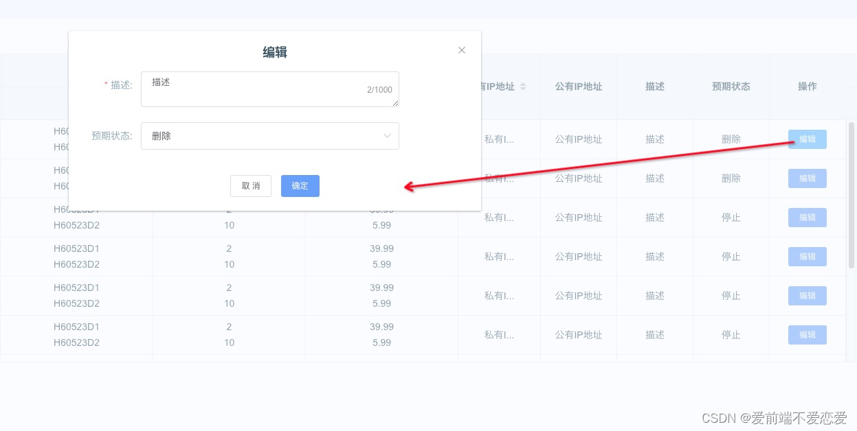
我调用的时候 有些字段是自定义字段 需要枚举值才可以展示 还有最后的操作按钮
展示一下效果
分页也是可选的 不需要可以不传入插槽就行了

按钮点击的弹框 事件参数都是可以获取当前表格的值
// 插槽会返回当前插名称 根据插槽名称自定义样式 当前数据 data 如果没有传prop 返回即为空;
当前行数据rowData 和 当前行索引index
//<slot  :name="slotName" :data="prop ? row[prop] : null" :prop="item.prop" :rowData ="row" :index="$index"></slot>
//比如编辑按钮 我们只需要拿到行数据和索引就可以操作你的数据了<template v-slot:operate="{rowData, index}"><el-button @click="openEC2Dialog(rowData)" size="mini" type="primary">编辑					</el-button></template>
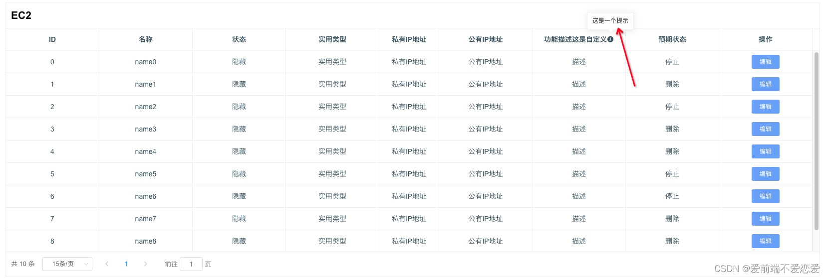
支持自定义表头功能
两种方法
一: 传递renderHeader方法
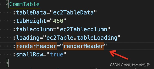
methods里添加方法
renderHeader(h, { column }) {switch (column.property) {case 'functionDescription':return [h('span', {}, [column.label+'这是自定义']), h('el-tooltip', { props: { placement: 'top', effect: 'light' } }, [h('div', { slot: 'content' }, [h('p', {}, ['一个提示'])]), h('i', { class: 'helpTips el-icon-info' ,style: 'cursor:pointer;'})])]default:return [h('span', {}, [column.label])]}},
然后查看效果
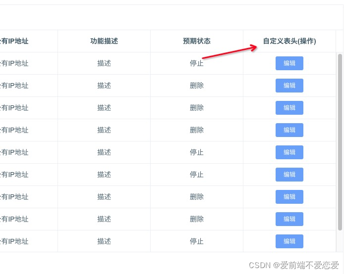
二:通过插槽

这里的是slotName+'Header’的方式 只要定义了slotName然后就可以设置了
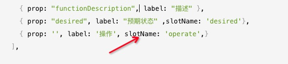
我这里改动的是操作的显示 查看一下效果
这两种方法都可以改变表头 但是不要一起使用 一起使用会被第一个方法覆盖 插槽就不生效了~
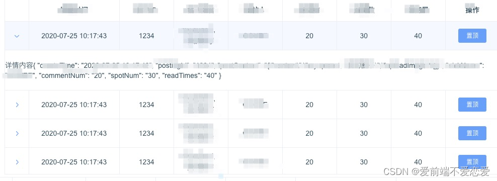
详情内容展示
CommTable组件传入 showExpand true
然后在
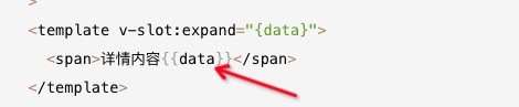
自定义内容就行了
<CommTable:tableData="tableData":maxHeight="350":tablecolumn="tablecolumn":showExpand="true":loading="tableLoading":smallRow="true"><template v-slot:expand="{data}"><span>详情内容{{data}}</span></template><template v-slot:postContent="{data, index}"><div style="max-height: 46px;cursor: pointer;" v-clamp v-html="JSON.parse(data).content"></div></template><template v-slot:operate="{rowData, index}"><el-button @click="openTimeSelDialog(rowData)" size="mini" type="primary">置顶</el-button></template></CommTable>
效果图
可拖动表格支持
//表格组件使用插件 sortablejs 自行npm下载依赖
import Sortable from "sortablejs";
使用案例
//template
//需要传入的字段:
// dragTableFlag: 是否可以拖动 默认false 为true的时候需要传入下面的字段
//rowKey:能唯一确定行的key
//tabClass: 这个需要给定一个值 如果是多个表格都需要拖动要唯一
//@getDragTableSort: 为拖动后的回调 返回内容为当前表格数据
<CommTable:tableData="tableData":maxHeight="350":tablecolumn="tablecolumn":loading="tableLoading":dragTableFlag="true"@getDragTableSort="getDragTableSort"rowKey="id":tabClass='`detailClass${rowId}`':smallRow="true"></CommTable>//methodsgetDragTableSort(data){console.log(data);//为表格当前排序的值 可以在这里作相应的取值操作或请求}
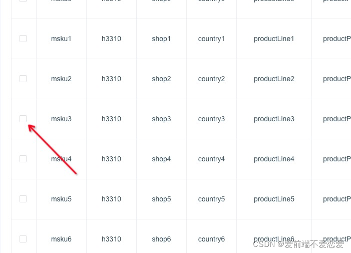
表格复选框选择 及其定位功能
checkbox 回调函数selectionChange
:selectionObj=“{show: true, fixed: true}” 是否显示行复选框 是否定位
<CommTable:tableData="tableData":tablecolumn="tablecolumn":selectionObj="{show: true, fixed: true}"ref="tableRef"@selectionChange="selectionChange":loading="loading"></CommTable>
效果查看


![[NOIP2013]记数问题](https://img-blog.csdnimg.cn/ea6edd365b724fabbe99deb0f1bc606e.png?x-oss-process=image/watermark,type_d3F5LXplbmhlaQ,shadow_50,text_Q1NETiBAUGx1dG_lkag=,size_20,color_FFFFFF,t_70,g_se,x_16)