一、模态框
1、模态框:若对话框不关闭,不能操作其父窗口
2、非模态框:对话框不关闭,可以操作其窗口
二、Vue组件实现模态框的功能
1、模态框是一个子组件
2、显示和隐藏由父组件决定
3、对话框的标题也是由父组件传递的
4、对话框的主显示区的内容由父组件决定的,使用插槽
5、对话框的宽度、高度、位置也是由父组件决定的
三、示例
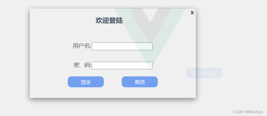
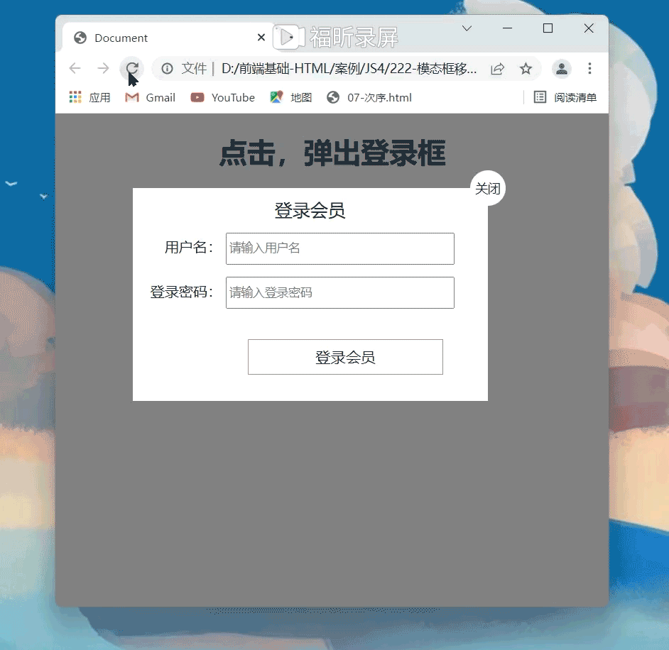
将登录的功能加入模态框中
子组件HTML代码
<template><div id="app"><div class="dialog-model"><!-- 根元素,z-index 需要高于父容器其他元素 --><div class="dialog-wrapper" @click="onClose" v-show="isShow"><!-- 加载一个具有透明度的背景,使根元素透明,子元素会继承该透明度 --><transition name="drop">               <div class="dialog-container" v-show="isShow"><span class="close-btn" @click="onClose">x</span><slot></slot></div></transition></div></div></div>
</template>
注意
其中<slot>标签为插槽,插槽相当于起到占位符的作用,插槽里面的内容由父组件决定。
子组件JS代码
<script>
export default {props:{isShow:{type:Boolean,default:false}},methods: {onClose() {this.$emit("on-close",false);},},
}
</script>
注意
模态框的开启和关闭由父组件决定,父组件传递boolean控制模态框,子组件通过props接收
自组件的Css代码
<style lang="scss" scoped>
.drop-enter-active {transition: all 0.5s;
}
.drop-leave-active {transition: all 0.3s;
}
.drop-enter {transform: translateY(-500px);
}
.drop-leave-active {transform: translateY(-500px);
}
.dialog-model{position: absolute;z-index: 5;.dialog-wrapper{position: fixed;height: 100%;width:100%;z-index:5;top: 0;left: 0;bottom: 0;right: 0;background-color: #eee;opacity: 0.9;.dialog-container{position:fixed;z-index: 80;top: 10%;left: 25%;width: 30%;background-color: #eee;border-radius: 3px;box-shadow: 0 5px 15px rgba(0,0,0,0.5);span{padding: 0 5px;float: right;cursor: pointer;font-size: 18px;font-weight: bold;}}}
}
</style>
父组件代码
<template><div id="app"><img alt="Vue logo" src="./assets/logo.png" /><button @click="openModal">打开对话框</button><Modal class="modal" :isShow="flag" @on-close="closeThis()"><h3>欢迎登陆</h3><div><form action="#" class="biaoDan"><div class="userMsg"><span>用户名:<input type="text" name="" value="" /></span><span>密 码:<input type="password" name="" value="" /></span></div><div class="btn"><button>登录</button><button>取消</button></div></form></div></Modal></div>
</template>将表格写入插槽的位置
父组件JS代码:
<script>
import Modal from "./components/Modal.vue";
export default {name: "App",components: {Modal,},data() {return {flag: true,};},methods: {closeThis(val) {this.flag = val;},openModal() {this.flag = true;},},
};
</script>
父组件的CSS代码:
<style lang="scss" scoped>
#app {font-family: Avenir, Helvetica, Arial, sans-serif;-webkit-font-smoothing: antialiased;-moz-osx-font-smoothing: grayscale;text-align: center;color: #2c3e50;margin-top: 60px;button {width: 100px;height: 30px;border: none;color: white;text-align: center;background-color: cornflowerblue;border-radius: 10px;cursor: pointer;}.modal {div {display: flex;flex-direction: row;justify-content: space-around;align-items: center;.biaoDan {width: 300px;display: flex;flex-direction: column;justify-content: center;align-items: center;margin-bottom: 30px;.userMsg{display: flex;flex-direction: column;align-items: end;span{margin-top:30px ;}}.btn {width: 100%;margin-top: 20px;display: flex;flex-direction: row;justify-content: space-around;align-items: center;}}}}
}
</style>
在这里应用的scss编译修饰
这里需要注意的是,当制作登录框时会碰到,input输入框和前面的文字往往无法对齐,这里采取的