原理:
用div的左边框和右边框实现两个半圆
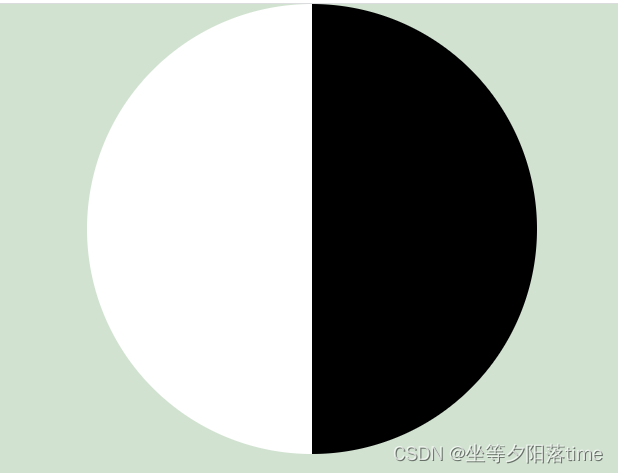
然后用div的before 和 after 伪元素 画 两个小圆
注意:伪元素不加绝对定位,怎么完整显示出来?转为块级元素,宽高就生效了。
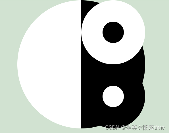
然后把小圆的位置移到中间即可

最后加上旋转的动画。
实现:
<!DOCTYPE html>
<html lang="en">
<head><meta charset="UTF-8"><meta http-equiv="X-UA-Compatible" content="IE=edge"><meta name="viewport" content="width=device-width, initial-scale=1.0"><title>八卦图旋转</title><style>* {margin: 0;padding: 0;}body {background: rgb(209, 226, 209);}.eight-diagrams {width: 0px;height: 600px;margin: 0 auto;border-radius: 50%;border-left: 300px solid white;border-right: 300px solid black;animation: rotate 3s linear infinite;}.eight-diagrams::before {content: "";display: block;width: 100px;height: 100px;background: black;border-radius: 50%;border: 100px solid white;margin: 0px 0px 0px -145px;}.eight-diagrams::after {content: "";display: block;width: 100px;height: 100px;background: white;border-radius: 50%;border: 100px solid black;margin: 0px 0px 0px -145px;}@keyframes rotate{0% {transform: rotate(0);}  100% {transform: rotate(350deg);}  }</style>
</head>
<body><div class="eight-diagrams"></div>
</body>
</html>