话不多说直接上代码
目录
1、wxml
2、js
3、wxss
4、json
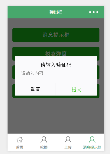
5、效果展示(具体内容可以自定义)
1、wxml
<!--pages/components/confirmBox/confirmBox.wxml-->
<wxs src="../../../filter/urlFilter.wxs" module="filter" />
<view class="confirmBox_warp" style="{{opt.wrapStyle}}" wx:if="{{isShow}}"><view class="count" style="width:{{opt.widths?opt.widths:'600'}}rpx"><view style="" class="paddClass {{opt.showCancel || opt.showConfirm? 'paddingNo': ''}}"><!-- 关闭按钮 --><view class="confirm_close_cont" bindtap="closeConfirm" wx:if="{{!opt.close}}"><image  class="confirm_close" mode="widthFix" bindtap="hide" src="{{filter.imgFullPath('/images/icon-close.png')}}"></image></view><!-- header --><view class="headers" style="{{opt.headerStyle}}" wx:if="{{opt.header}}">{{opt.header}}</view><view class="body"><slot name="top"></slot><slot name="center"></slot><slot name="bottom"></slot></view></view><view class="footer" style="{{opt.footerStyle}}" wx:if="{{opt.showCancel || opt.showConfirm}}"><view class="li" wx:if="{{opt.showCancel && !opt.showCancelContact}}" bindtap="cancelCb" style="{{opt.cancelStyle}}">{{opt.cancelText}}</view><view class="li" wx:if="{{opt.showCancelContact}}"  style="{{opt.cancelStyle}}"><button class="contactBtn" open-type="contact">{{opt.cancelText}}</button></view><view class="li" wx:if="{{opt.showConfirm && !opt.showConfirmContact}}" bindtap="confirmCb" style="{{opt.confirmStyle}}">{{opt.confirmText}}</view><view class="li" wx:if="{{opt.showConfirmContact}}"  style="{{opt.confirmStyle}}"><button class="contactBtn" open-type="contact">{{opt.confirmText}}</button></view></view></view>
</view>
2、js
// pages/components/confirmBox/confirmBox.js
Component({options: {multipleSlots: true // 允许使用插槽},/*** 组件的属性列表*/properties: {isShow:{type:Boolean,value:false},opt:{type:Object,value:{wrapStyle: '',widths:'',close:false, //默认显示关闭按钮header:'',showCancel: false,showCancelContact: false,showConfirmContact: false, showConfirm: false,cancelText: '取消',confirmText: '确定',confirmStyle: '',cancelStyle: ''},observer:function(newVal,oldVal){this.data.opt = {...oldVal,...newVal}this.setData({opt:this.data.opt})}}},/*** 组件的初始数据*/data: {},/*** 组件的方法列表*/methods: {closeConfirm:function (){this.setData({isShow:false})},cancelCb: function(){this.triggerEvent('cancelCb');},confirmCb:function(){this.triggerEvent('confirmCb');}}
})
3、wxss
/* pages/components/confirmBox/confirmBox.wxss */
.confirmBox_warp{position: fixed;top: 0rpx;left: 0rpx;height: 100%;width: 100%;background-color: rgba(0, 0, 0, 0.3);z-index: 11111111111199;
}
.confirmBox_warp .count{width: 600rpx;position: absolute;top: 50%;left: 50%;transform: translateX(-50%) translateY(-50%);background-color: #ffffff;border-radius: 16rpx;}
.confirmBox_warp .count .paddClass{padding: 60rpx 40rpx;
}
.confirmBox_warp .count .paddingNo {padding-bottom: 0;
}
.confirmBox_warp .count .confirm_close_cont{padding: 20rpx;position: absolute;top: 0rpx;right: 0rpx;
}
.confirmBox_warp .count .confirm_close{width: 21rpx;height: 21rpx;
}
.confirmBox_warp .count .headers{text-align: center;color: #333333;font-size: 32rpx;line-height: 44rpx;
}
.confirmBox_warp .footer {display: flex;justify-content: space-between;height: 100rpx;border-top: 0.5px solid #E3E3E3;margin-top: 20rpx;/* margin-bottom: 10rpx; */
}
.confirmBox_warp .footer .li {flex: 1;border-right: 0.5px solid #E3E3E3;text-align: center;line-height: 100rpx;color: #333333;font-size: 32rpx;
}
.confirmBox_warp .footer .li .contactBtn{background-color: #ffffff;text-align: center;line-height: 80rpx;padding: 0rpx;/* color: #FE4561; */font-size: 32rpx;font-weight: normal;    width: 100%;
}
.confirmBox_warp .footer .li:last-child {border: none;
}
4、json
{"component": true,"usingComponents": {}
}
5、效果展示(具体内容可以自定义)
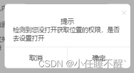
可以参考--文章:微信小程序获取定位、通过地点文本获取经纬度进行导航