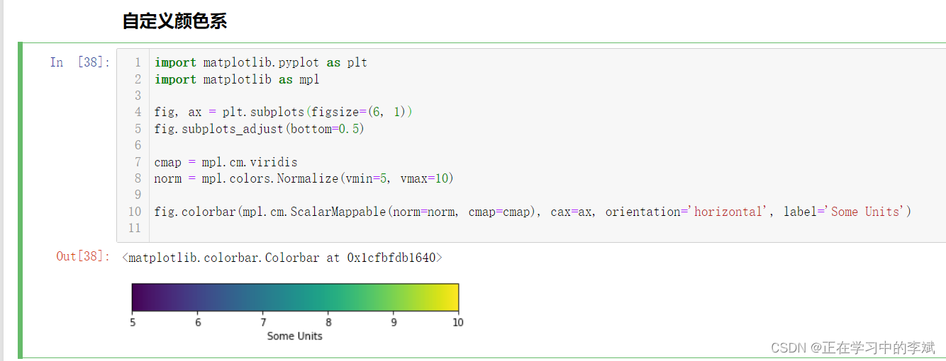
import matplotlib. pyplot as plt
import matplotlib as mplfig, ax = plt. subplots( figsize= ( 6 , 1 ) )
fig. subplots_adjust( bottom= 0.5 ) cmap = mpl. cm. viridis
norm = mpl. colors. Normalize( vmin= 5 , vmax= 10 ) fig. colorbar( mpl. cm. ScalarMappable( norm= norm, cmap= cmap) , cax= ax, orientation= 'horizontal' , label= 'Some Units' )
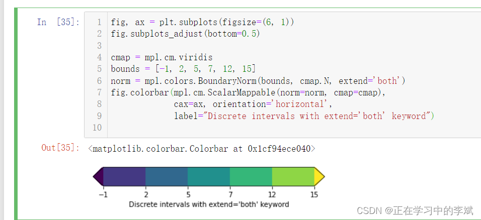
fig, ax = plt. subplots( figsize= ( 6 , 1 ) )
fig. subplots_adjust( bottom= 0.5 ) cmap = mpl. cm. viridis
bounds = [ - 1 , 2 , 5 , 7 , 12 , 15 ]
norm = mpl. colors. BoundaryNorm( bounds, cmap. N, extend= 'both' )
fig. colorbar( mpl. cm. ScalarMappable( norm= norm, cmap= cmap) , cax= ax, orientation= 'horizontal' , label= "Discrete intervals with extend='both' keyword" )
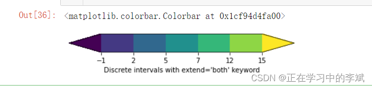
fig. colorbar( mpl. cm. ScalarMappable( norm= norm, cmap= cmap) , cax= ax, orientation= 'horizontal' , extendfrac= 'auto' , label= "Discrete intervals with extend='both' keyword" )
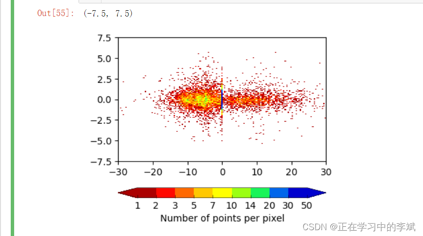
import cmaps
import matplotlib as mplprocess_data = pd. read_excel( r".\text_data.xlsx" )
process_data. head( )
x_data = process_data. iloc[ : , 14 ]
y_data = process_data. iloc[ : , 13 ]
bounds = [ 1 , 2 , 3 , 5 , 7 , 10 , 14 , 20 , 30 , 50 ]
norm = mpl. colors. BoundaryNorm( bounds, cmap. N) nbins = 150
H, xedges, yedges = np. histogram2d( x_data, y_data, bins= nbins)
H = np. rot90( H)
H = np. flipud( H)
Hmasked = np. ma. masked_where( H== 0 , H)
fig, ax = plt. subplots( figsize= ( 4 , 3.5 ) , dpi= 100 , facecolor= "w" )
density_scatter = ax. pcolormesh( xedges, yedges, Hmasked, cmap= cmaps. GMT_seis, norm= norm)
colorbar = fig. colorbar( density_scatter, aspect= 17 , orientation= 'horizontal' , extendfrac= 'auto' , extend= 'both' , label= "Number of points per pixel" )
colorbar. ax. tick_params( left= True , direction= "in" , width= .4 , labelsize= 10 )
colorbar. ax. tick_params( which= "minor" , bottom= False )
colorbar. outline. set_linewidth( .4 )
ax. set_xlim( - 30 , 30 )
ax. set_ylim( - 7.5 , 7.5 )
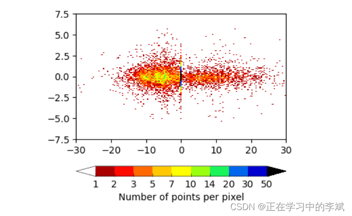
import cmaps
import matplotlib as mplprocess_data = pd. read_excel( r".\text_data.xlsx" )
process_data. head( )
x_data = process_data. iloc[ : , 14 ]
y_data = process_data. iloc[ : , 13 ] cmap = mpl. cm. get_cmap( "GMT_seis" ) . copy( )
cmap. set_extremes( over= "black" , under= 'w' )
bounds = [ 1 , 2 , 3 , 5 , 7 , 10 , 14 , 20 , 30 , 50 ]
norm = mpl. colors. BoundaryNorm( bounds, cmap. N) nbins = 150
H, xedges, yedges = np. histogram2d( x_data, y_data, bins= nbins)
H = np. rot90( H)
H = np. flipud( H)
Hmasked = np. ma. masked_where( H== 0 , H)
fig, ax = plt. subplots( figsize= ( 4 , 3.5 ) , dpi= 100 , facecolor= "w" )
density_scatter = ax. pcolormesh( xedges, yedges, Hmasked, cmap= cmap, norm= norm)
colorbar = fig. colorbar( density_scatter, aspect= 17 , orientation= 'horizontal' , extendfrac= 'auto' , extend= 'both' , label= "Number of points per pixel" )
colorbar. ax. tick_params( left= True , direction= "in" , width= .4 , labelsize= 10 )
colorbar. ax. tick_params( which= "minor" , bottom= False )
colorbar. outline. set_linewidth( .4 )
ax. set_xlim( - 30 , 30 )
ax. set_ylim( - 7.5 , 7.5 )
plt. savefig( r'.\custom_example3.png' , bbox_inches= 'tight' , dpi= 300 )