这里写目录标题
- 1. text-align: center;文字水平居中;margin: 0 auto;自身水平居中
- 2. 绝对定位+margin(元素需要固定宽高)
- 3. 绝对定位+ transform: translate(-50%,-50%);
- 4. 绝对定位+margin: auto;
- 5.父元素设置display: flex;justify-content: center;align-items:center;子元素自动垂直居中
- 6. 父元素:display: flex;子元素: margin: auto;
- 7. 父元素:display: table-cell;vertical-align: middle;子元素:margin: 0 auto;
- 8. flex弹性布局
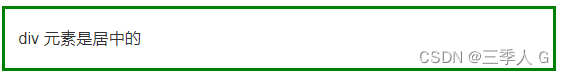
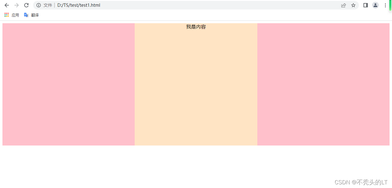
1. text-align: center;文字水平居中;margin: 0 auto;自身水平居中
<!DOCTYPE html>
<html lang="en">
<head><meta charset="UTF-8"><meta http-equiv="X-UA-Compatible" content="IE=edge"><meta name="viewport" content="width=device-width, initial-scale=1.0"><title>Document</title><style>.parent{height: 100%;width: 100%;background-color: pink;}.son{position: relative;height: 400px;width: 400px;background-color: bisque;text-align: center;margin: 0 auto;}</style>
</head>
<body><div class="parent"><div class="son"><div class="child">我是内容</div></div></div>
</body>
</html>
2. 绝对定位+margin(元素需要固定宽高)
top:50%;left: 50%;margin-left: -50px;margin-top: -50px;
缺点:需要固定宽高
<!DOCTYPE html>
<html lang="en"><head><meta charset="UTF-8"><meta http-equiv="X-UA-Compatible" content="IE=edge"><meta name="viewport" content="width=device-width, initial-scale=1.0"><title>Document</title><style>.parent{height: 100%;width: 100%;background-color: pink;}.son{position: relative;height: 400px;width: 400px;background-color: bisque;margin: 0 auto;}.child{height: 100px;width: 100px;background-color: burlywood;position:absolute;top:50%;left: 50%;margin-left: -50px;margin-top: -50px;line-height: 100px;  text-align: center;}</style></head><body><div class="parent"><div class="son"><div class="child">我是内容</div></div></div></body>
</html>
以下代码可以使文字垂直居中
height: 100px;line-height: 100px;
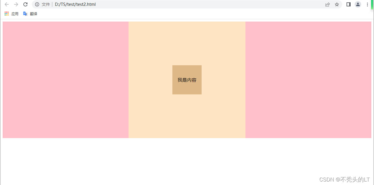
3. 绝对定位+ transform: translate(-50%,-50%);
优点:无需固定元素的宽高
<!DOCTYPE html>
<html lang="en"><head><meta charset="UTF-8"><meta http-equiv="X-UA-Compatible" content="IE=edge"><meta name="viewport" content="width=device-width, initial-scale=1.0"><title>Document</title><style>.parent{height: 100%;width: 100%;background-color: pink;}.son{position: relative;height: 400px;width: 400px;background-color: bisque;margin: 0 auto;}.child{background-color: burlywood;position:absolute;top:50%;left: 50%;transform: translate(-50%,-50%);text-align: center;}</style></head><body><div class="parent"><div class="son"><div class="child">我是内容</div></div></div></body>
</html>
4. 绝对定位+margin: auto;
以下需设置都为0top:0;left: 0;right: 0;bottom: 0;
<!DOCTYPE html>
<html lang="en"><head><meta charset="UTF-8"><meta http-equiv="X-UA-Compatible" content="IE=edge"><meta name="viewport" content="width=device-width, initial-scale=1.0"><title>Document</title><style>.parent{height: 100%;width: 100%;background-color: pink;}.son{position: relative;height: 400px;width: 400px;background-color: bisque;margin: 0 auto;}.child{height: 100px;width: 100px;background-color: burlywood;position:absolute;top:0;left: 0;right: 0;bottom: 0;margin: auto;text-align: center;}</style></head><body><div class="parent"><div class="son"><div class="child">我是内容</div></div></div></body>
</html>
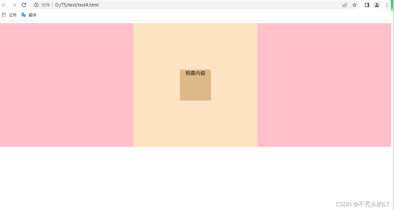
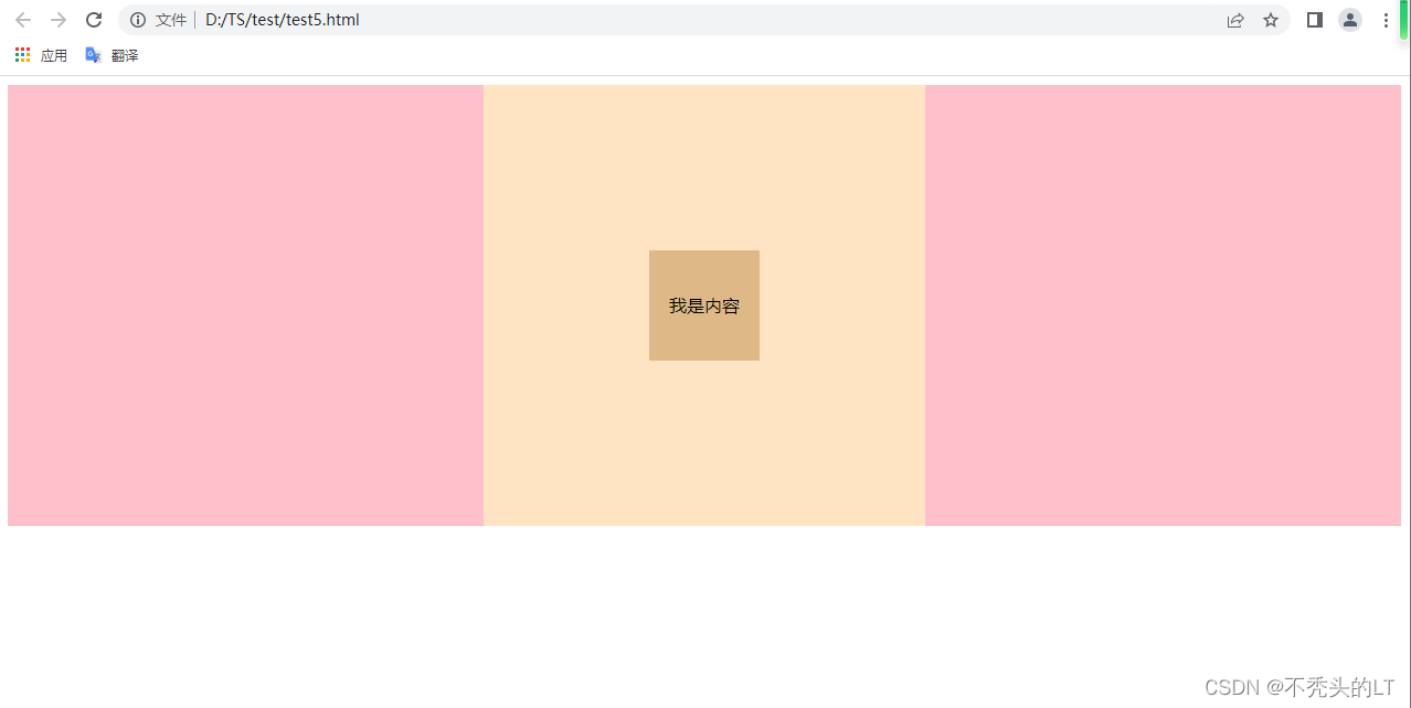
5.父元素设置display: flex;justify-content: center;align-items:center;子元素自动垂直居中
<!DOCTYPE html>
<html lang="en"><head><meta charset="UTF-8"><meta http-equiv="X-UA-Compatible" content="IE=edge"><meta name="viewport" content="width=device-width, initial-scale=1.0"><title>Document</title><style>.parent{height: 100%;width: 100%;background-color: pink;}.son{position: relative;height: 400px;width: 400px;background-color: bisque;margin: 0 auto;display: flex;justify-content: center;align-items:center;}.child{height: 100px;width: 100px;background-color: burlywood; line-height: 100px;text-align: center;}</style></head><body><div class="parent"><div class="son"><div class="child">我是内容</div></div></div></body>
</html>
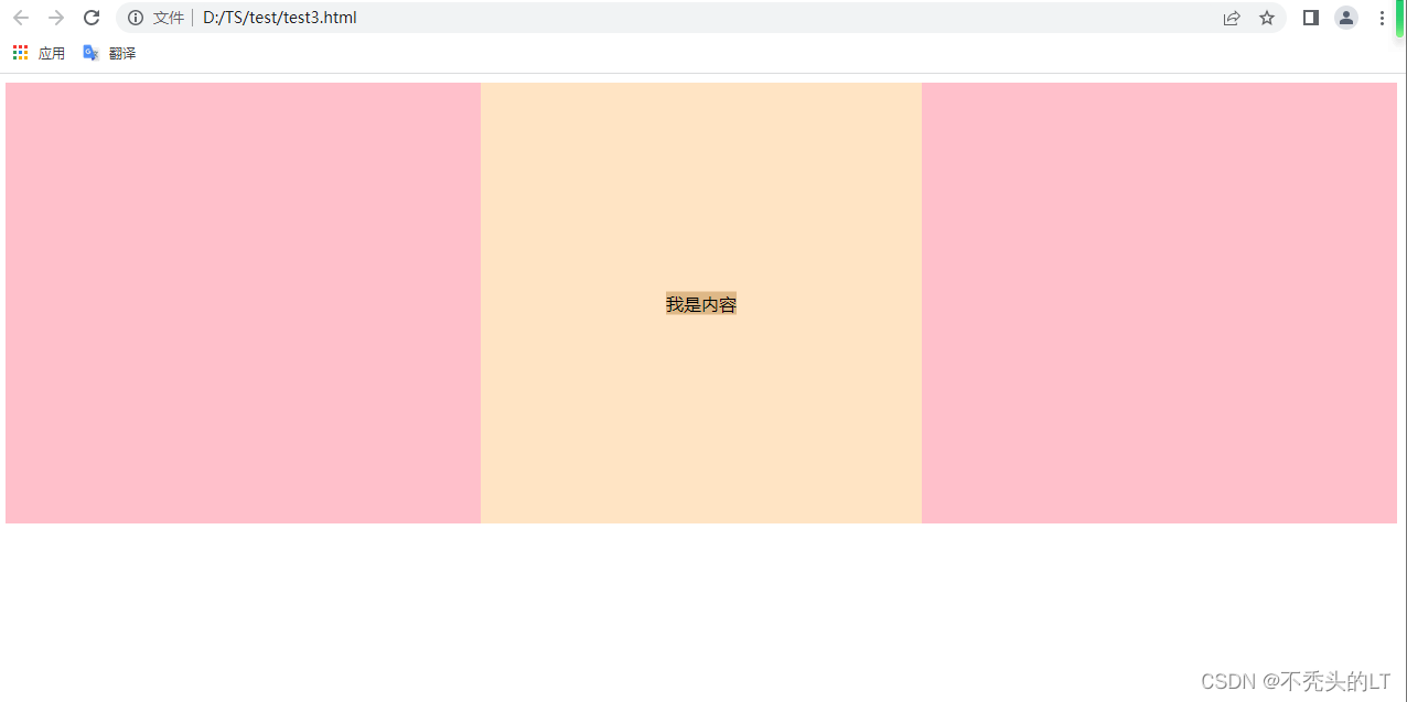
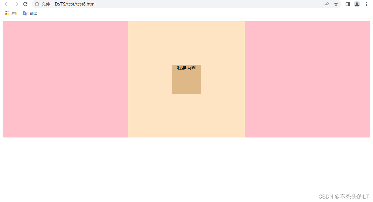
6. 父元素:display: flex;子元素: margin: auto;
<!DOCTYPE html>
<html lang="en"><head><meta charset="UTF-8"><meta http-equiv="X-UA-Compatible" content="IE=edge"><meta name="viewport" content="width=device-width, initial-scale=1.0"><title>Document</title><style>.parent{height: 100%;width: 100%;background-color: pink;}.son{position: relative;height: 400px;width: 400px;background-color: bisque;margin: 0 auto;display: flex;}.child{height: 100px;width: 100px;background-color: burlywood;margin: auto;text-align: center;}</style></head><body><div class="parent"><div class="son"><div class="child">我是内容</div></div></div></body>
</html>
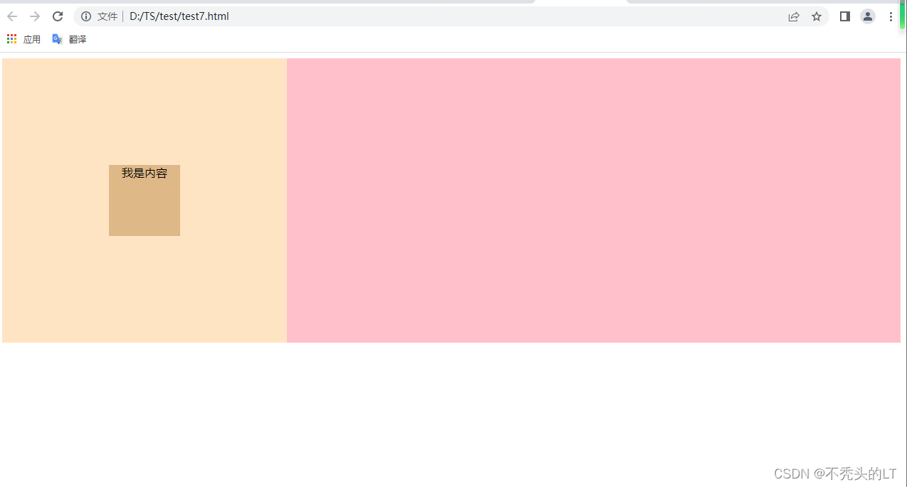
7. 父元素:display: table-cell;vertical-align: middle;子元素:margin: 0 auto;
<!DOCTYPE html>
<html lang="en"><head><meta charset="UTF-8"><meta http-equiv="X-UA-Compatible" content="IE=edge"><meta name="viewport" content="width=device-width, initial-scale=1.0"><title>Document</title><style>.parent{height: 100%;width: 100%;background-color: pink;}.son{position: relative;height: 400px;width: 400px;background-color: bisque;display: table-cell;vertical-align: middle;}.child{height: 100px;width: 100px;background-color: burlywood;margin: 0 auto;text-align: center;}</style></head><body><div class="parent"><div class="son"><div class="child">我是内容</div></div></div></body>
</html>
总结: 元素本身设置定位方式为相对定位,position: relative; 同时设置margin: 0 auto;即可水平居中,最后设置文字水平居中:text-align: center;
position: relative;
margin: 0 auto;
text-align: center;
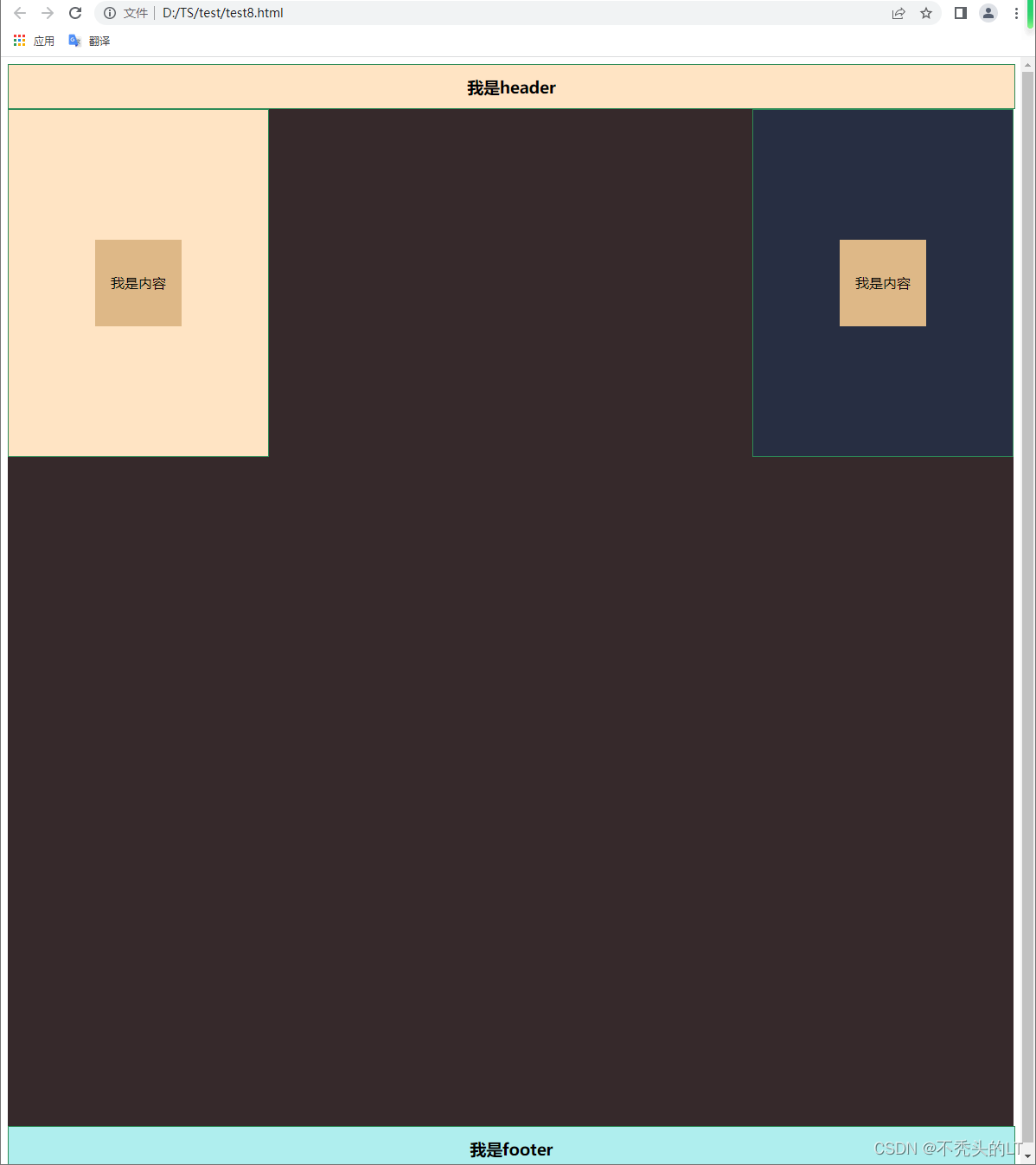
8. flex弹性布局
<!DOCTYPE html>
<html lang="en"><head><meta charset="UTF-8"><meta http-equiv="X-UA-Compatible" content="IE=edge"><meta name="viewport" content="width=device-width, initial-scale=1.0"><title>Document</title><style>html,body{height:100%;}.container{height: 100%;width: 100%;display: -webkit-flex; /* Safari */display: flex;flex-direction: column;}.header{height: 50px;width: 100%;background-color: bisque;display: flex;justify-content: center;align-items: center;border: 1px solid seagreen;}.main{ width: 100%;flex: 1;background-color: rgb(54, 41, 43);display: flex;justify-content: space-between;}.left{height: 400px;width: 300px;background-color: bisque;display: flex;border: 1px solid seagreen;}.right{height: 400px;width: 300px;background-color: rgba(23, 52, 90, 0.5);display: flex;border: 1px solid seagreen;}.footer{height: 50px;width: 100%;background-color: paleturquoise;display: flex;justify-content: center;align-items: center;border: 1px solid seagreen;}.child{height: 100px;width: 100px;background-color: burlywood; text-align: center;line-height: 100px;margin: auto;}</style></head><body><div class="container"><div class="header"><h3>我是header</h3></div><div class="main"><div class="left"><div class="child">我是内容</div></div><div class="right"><div class="child">我是内容</div></div></div><div class="footer"><h3>我是footer</h3></div></div></body>
</html>