16种css水平垂直居中方法以及应用(文字、图片)
一、垂直居中
1、行内元素
基本思想:单行文本子元素line-height 值为父元素 height 值
.parent {height: 200px;
}.son {line-height: 200px;
}
2、块级元素
2.1行内块级元素
基本思想:元素是行内块级,使用display: inline-block, vertical-align: middle+伪元素处于容器中央
兼容性:支持IE7
.parent::after, .son{display:inline-block;vertical-align:middle;
}
.parent::after{content:'';height:100%;
}
2.2table布局
兼容性:支持IE6/IE7,IE8无效
.parent {display: table;
}
.son {display: table-cell;vertical-align: middle;
}
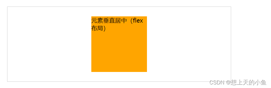
2.3flex弹性布局
2009版写法
兼容性:不支持IE
.parent {display: box;box-orien: vertical;box-pack: center;
}
2012版写法
兼容性:IE8/IE9不支持
.parent{display:flex;justify-content:center;
}
.son{align-self:center;
}
2.4绝对定位+transform:translate(-50%,-50%)
.parent{position:relative;
}
.son{position: absolute;top:50%;left:50%;transform:translate(-50%,-50%);
}
二、水平居中
1、行内元素
基本思想:父元素设置text-align: center即可实现行内元素水平居中
.parent {text-align: center;
}
2、块级元素
2.1一般居中
基本思想:该元素设置margin:0 auto
.son {margin: 0 auto;
}
2.2子元素含float
基本思想:子元素包含 float:left 属性, 让父元素宽度设置为fit-content,并且配合margin,fit-content是css3的新属性值
.parent{width:fit-content;margin:0 auto;
}.son {float: left;
}
2.3 flex弹性布局
2009版本写法
.parent{display:box;box-orient:horiaontal;box-pack:center;
}
2012版写法
.parent{display:flex;justify-content:center;
}
2.4绝对定位
- transform
.son{position:absolute;left:50%;transform:translate(-50%,0);
}
- 负值margin-left
.son{position:absolute;with:固定宽度left:50%;margin-left:-0.5*固定宽度;
}
- left:0;right:0;margin:0 auto
.son{position:absolute;width:固定宽度;left:0;right:0;margin:0 auto;
}
三、具体应用–文字居中
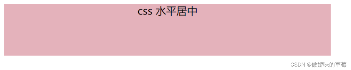
3.1css如何设置文字水平居中
基本思想:css使用text-align规定水平对齐方式,影响一个元素的文本行相互的对齐方式。center值设置文本居中
注意:text-align应用与容器,针对容器里面的文字以及容器里面的display:inline/inline-block,若是display:block无影响
text-align具备向下传递的特点,设置一个div,div里面的也会居中
<!DOCTYPE html>
<html><head><meta charset="UTF-8"><title></title><style>.box {width: 500px;height: 80px;background: rgb(228, 178, 187);text-align: center;}</style>
</head><body><div class="box">css 水平居中了--文本文字</div>
</body></html>
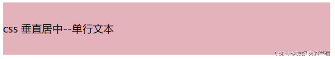
3.2css如何设置文字垂直居中
- 单行文本:基本思想是行高(line-height)和所在区域高度(height)设置一致
<!DOCTYPE html>
<html><head><meta charset="UTF-8"><title></title><style>.box {width: 500px;height: 80px;background: rgb(228, 178, 187);line-height: 80px;}</style>
</head><body><div class="box">css 垂直居中--单行文本</div>
</body></html>
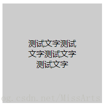
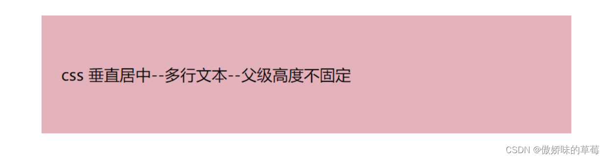
- 多行文本
(1)当父级元素高度不固定
当父级元素不固定,会随着内容变化,高度只能通过文本的高度来撑开,所以需要使用内填充padding来使多行文本居中。只需要设置padding-top的值与padding-bottom的值相等
<!DOCTYPE html>
<html><head><meta charset="UTF-8"><title></title><style>.box {width: 500px;margin: 50px auto;background: rgb(228, 178, 187);padding-top: 50px;padding-bottom: 50px;padding-right: 20px;padding-left: 20px;}</style>
</head><body><div class="box">css 垂直居中--多行文本--父级高度不固定</div>
</body></html>
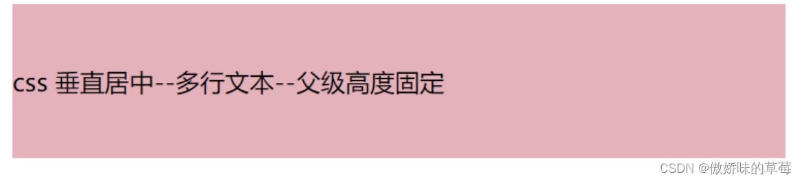
(2)当父级元素高度固定
vertical-align:middle +display:table-cell
<!DOCTYPE html>
<html><head><meta charset="UTF-8"><title></title><style>.box {width: 500px;height: 100px;background: rgb(228, 178, 187);vertical-align: middle;display: table-cell;}</style>
</head><body><div class="box">css 垂直居中--多行文本--父级高度固定</div>
</body></html>
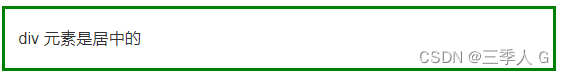
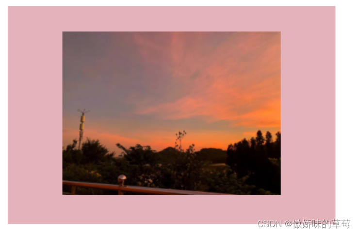
四、具体引用–图片居中
4.1display:table
基本思想:最外层div display: table+img父元素display: table-cell、vertical-align: middle
<!DOCTYPE html>
<html><head><meta charset="UTF-8"><title></title><style>.box {width: 300px;height: 200px;background: rgb(228, 178, 187);display: table;}#imgbox {display: table-cell;vertical-align: middle;}#imgbox img {width: 200px;}</style>
</head><body><div class="box"><div id="imgbox"><img src="1.jpg" alt="图片1"></div></div>
</body></html>
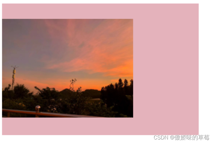
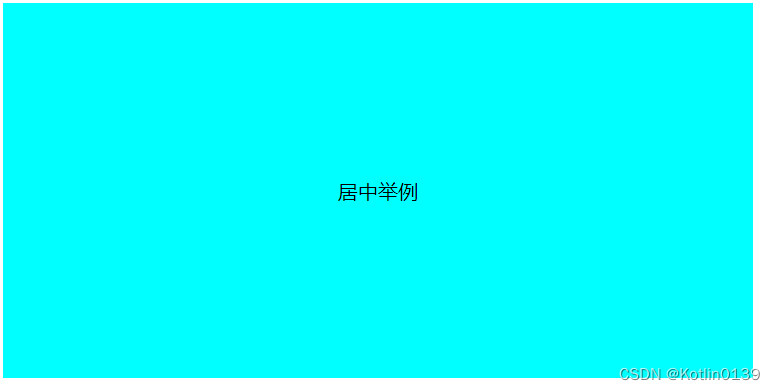
思考:如何在图片垂直居中基础上+水平居中
基本思想:最外层div text-align: center(具有向下传递的特点)
<!DOCTYPE html>
<html><head><meta charset="UTF-8"><title></title><style>.box {width: 300px;height: 200px;background: rgb(228, 178, 187);display: table;text-align: center;/*增加的一行代码*/}#imgbox {display: table-cell;vertical-align: middle;}#imgbox img {width: 200px;}</style>
</head><body><div class="box"><div id="imgbox"><img src="1.jpg" alt="图片1"></div></div>
</body></html>
4.2flex实现
基本思想:display: flex;align-items: center
兼容性:不是最好的选择,IE8/IE9不支持
<!DOCTYPE html>
<html><head><meta charset="UTF-8"><title></title><style>.imgbox {width: 300px;height: 200px;background: rgb(228, 178, 187);display: flex;align-items: center;}.imgbox img {width: 150px;height: 100px;align-items: center;}</style>
</head><body><div class="imgbox"><img src="1.jpg" alt="图片1"></div>
</body></html>

4.3绝对定位
基本思想:img父元素相对定位position: relative+子元素绝对定位position: absolute,img的top设置为50%,负值margin-top(这个是想实现垂直居中元素高度的一半),不确定高度用transform:translateY(-50%)
兼容性:推荐写法,兼容性好
<!DOCTYPE html>
<html><head><meta charset="UTF-8"><title></title><style>.imgbox {width: 300px;height: 200px;background: rgb(228, 178, 187);position: relative;margin: 0 auto;}.imgbox img {width: 150px;position: absolute;top: 50%;transform: translateY(-50%);}</style>
</head><body><div class="imgbox"><img src="1.jpg" alt="图片1"></div>
</body></html>