OrgChart页面模仿编程简单记录
导航栏
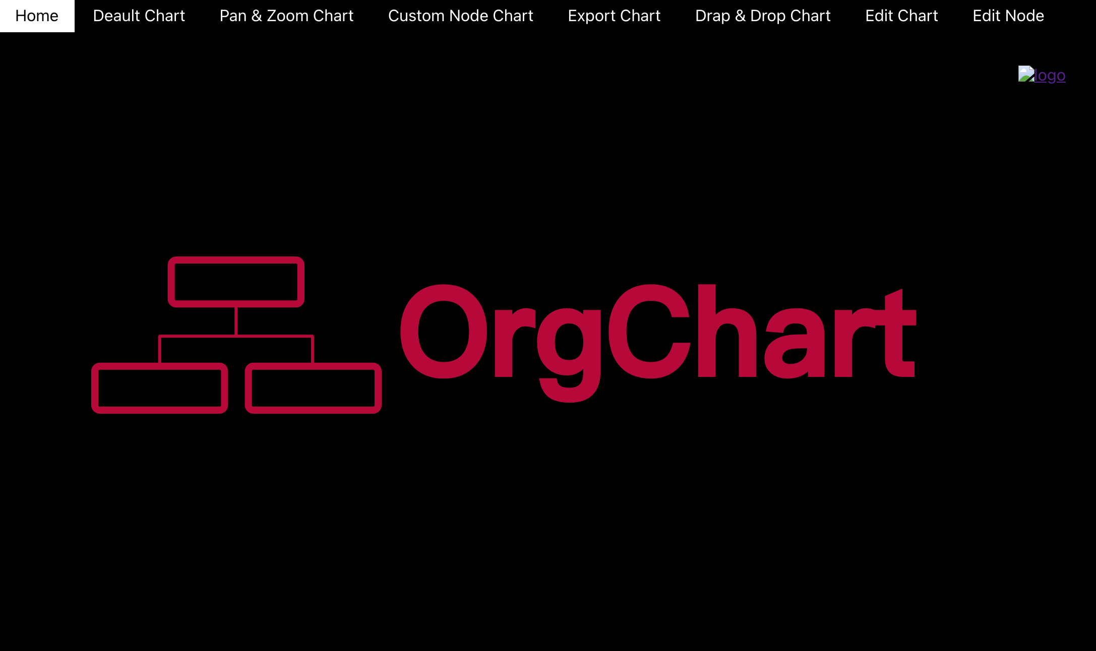
整体来看,导航栏设计的还是比较简洁,顶部有8个导航模块,每个模块点击后会跳转到相应模块页面。可以使用在App.js页面中使用<Router> <Navlink>来实现。
<Router>  <nav>  <Navlink>Home</Navlink>  </nav>
</Router>
样式首先是被选择后改变背景颜色,<Navlink> 中有activeclassName 可以改变被选择后的样式。在css中将背景颜色改为白色即可。
<NavLink to="/" exact activeClassName="selected"> Home </NavLink>
当鼠标经过时也会进行背景颜色的改变。可以在样式文件中在<nav> 标签中添加hover 来改变背景颜色。
nav a:hover {
background-color: #fff;
color: #000;
}
home页面
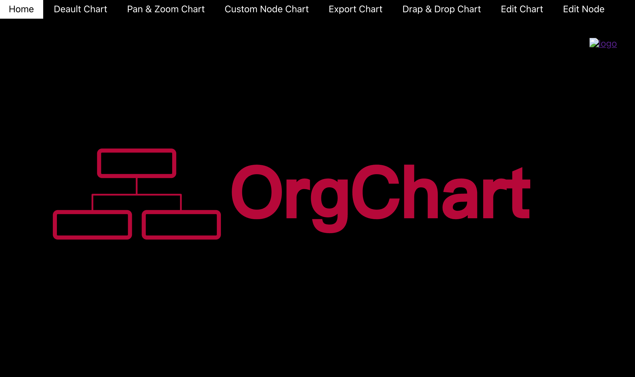
主页面为svg格式,为可缩放的矢量图形。通过以下代码实现。
<svg width="860" height="240" xmlns="http://www.w3.org/2000/svg"><g><textstroke="#b80036"transform="matrix(1.2821781635284424,0,0,1.313725471496582,-94.81186294555664,-18.196077346801758) "fill="#b80036"strokeWidth="3"strokeDasharray="null"strokeLinejoin="null"strokeLinecap="null"x="524.741312"y="134.910448"id="svg_4"fontSize="92"fontFamily="Sans-serif"textAnchor="middle"fontWeight="bold">OrgChart</text><g id="svg_5" stroke="null"><rectid="svg_1"height="43.609757"width="128.702291"y="45"x="95.791349"strokeLinecap="null"strokeLinejoin="null"strokeDasharray="null"strokeWidth="7"fill="none"rx="5"ry="5"stroke="#b80036"/><rectheight="43.609757"width="128.702291"y="150.390247"x="172.297711"strokeLinecap="null"strokeLinejoin="null"strokeDasharray="null"strokeWidth="7"fill="none"id="svg_2"rx="5"ry="5"stroke="#b80036"/><rectheight="43.609757"width="128.702291"y="150.390247"x="20"strokeLinecap="null"strokeLinejoin="null"strokeDasharray="null"strokeWidth="7"fill="none"id="svg_3"rx="5"ry="5"stroke="#b80036"/><linefill="none"strokeWidth="3"strokeDasharray="null"strokeLinejoin="null"strokeLinecap="null"x1="83.636139"y1="120.590246"x2="236.648851"y2="120.590246"id="svg_8"stroke="#b80036"/><linefill="none"strokeWidth="3"strokeDasharray="null"stroklinejoin="null"strokeLinecap="null"x1="84.351146"y1="119.86342"x2="84.351146"y2="148.209759"id="svg_10"stroke="#b80036"/><linefill="none"strokeWidth="3"strokeDasharray="null"strokeLinejoin="null"strokeLinecap="null"x1="235.933844"y1="119.863418"x2="235.933844"y2="148.209759"id="svg_11"stroke="#b80036"/><linefill="none"strokeWidth="3"strokeDasharray="null"strokeLinejoin="null"strokeLinecap="null"x1="160.142495"y1="90.790247"x2="160.142495"y2="119.863416"id="svg_12"stroke="#b80036"/></g></g></svg>
使用<a> 对<svg>进行包裹并添加href可点击svg进行跳转。
当完成矢量图的设置后,再对CSS文件进行简单的设置就可以实现主页面效果。
Default-Chart
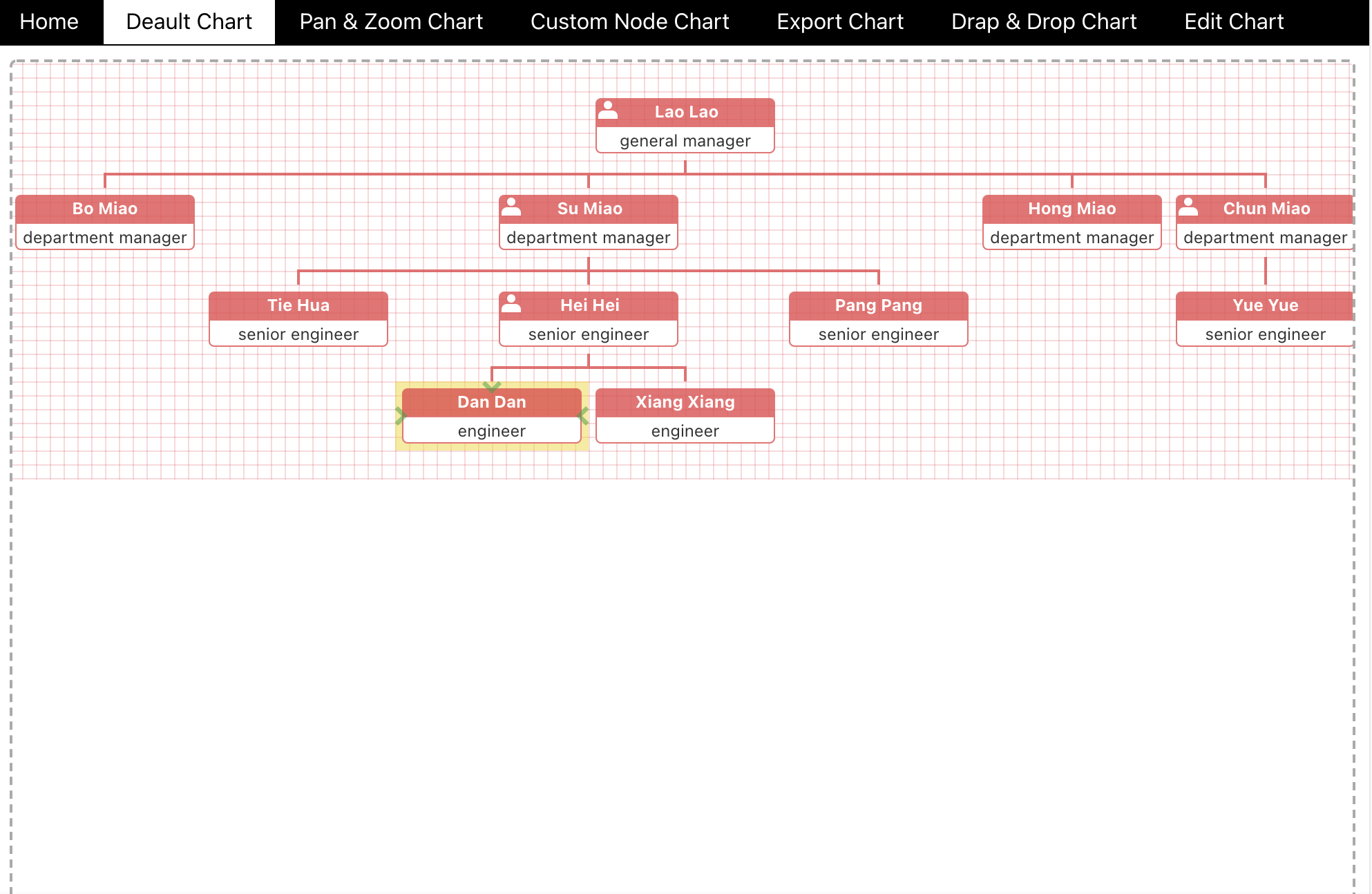
通过安装@dabeng/react-orgchart的组件,可以在Default-Charts页面添加模版,需要设置id name title,当单个元素有子元素时,可进行添加children来进行添加子元素,children的添加类型为对象,同样包括id name title。同样,子元素可以进行嵌套使用。
Pan&Zoom Chart
[外链图片转存失败,源站可能有防盗链机制,建议将图片保存下来直接上传(img-0aoo0J9B-1626254039456)(https://oscimg.oschina.net/oscnet/up-f4fcb25600222e732d25c73e12dc8c3b283.png)]
与Default-Chart没有太大的区别,在引入@dabeng/react-orgchart 的OrganizationChart组件后,自身就已经携带有pan zoom等属性,但默认为false,将其值更改为true后,便可以实现缩放效果。
<OrganizationChart datasource={ds} pan={true} zoom={true} />
Custom Node Chart
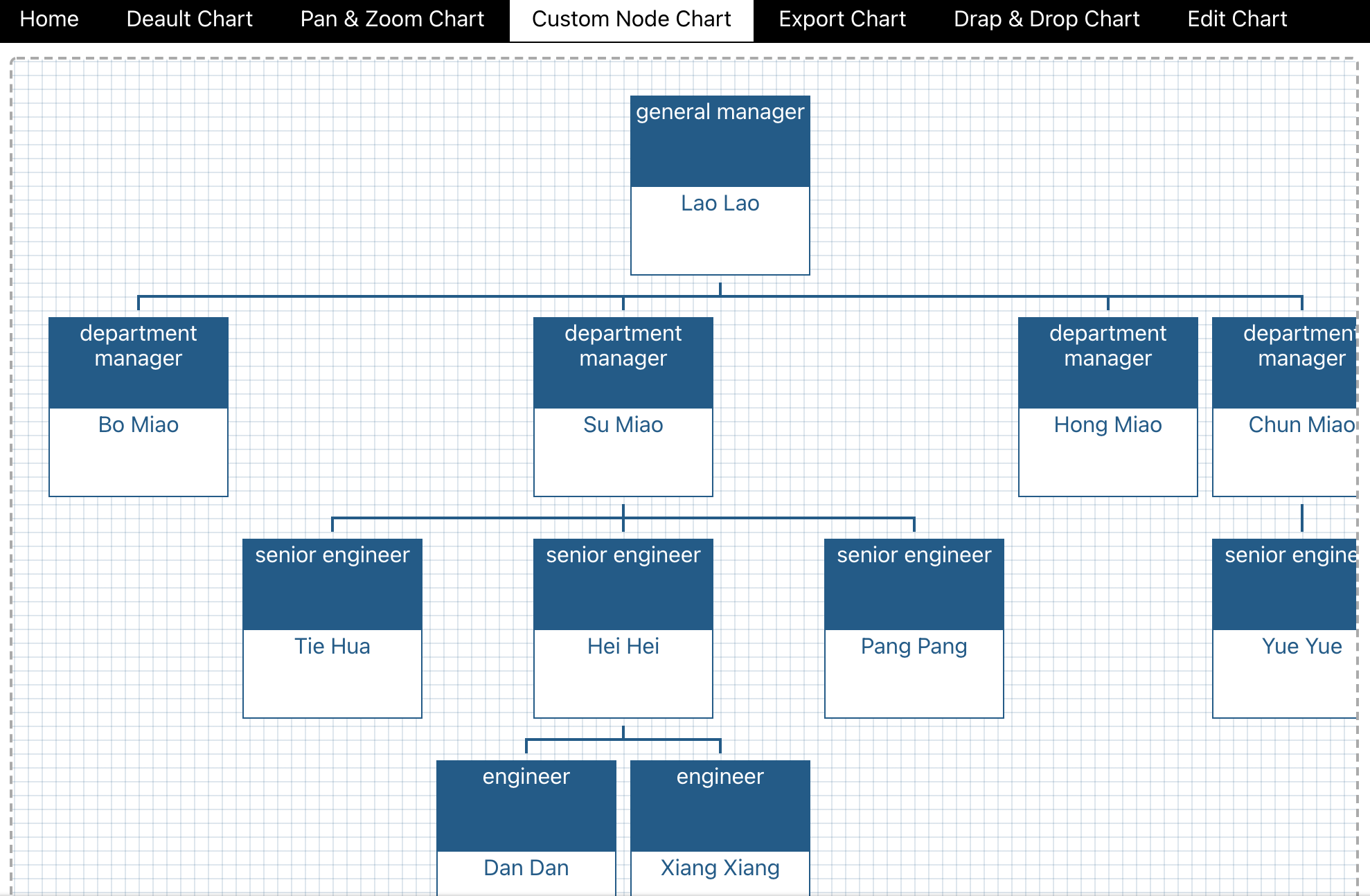
自定义节点图表通过OrganizationChart组件引入后,可以对其进行自定义设置,更改背景颜色,增加点击事件等。通过其内置chartClass属性可以进行样式的修改,可更换背景图片、颜色以及字体等。通过NodeTemplate对其进行事件的添加。可将已经完成的组件进行直接添加。
<OrganizationChartdatasource={ds}chartClass="myChart"NodeTemplate={MyNode}
/>
Export Chart
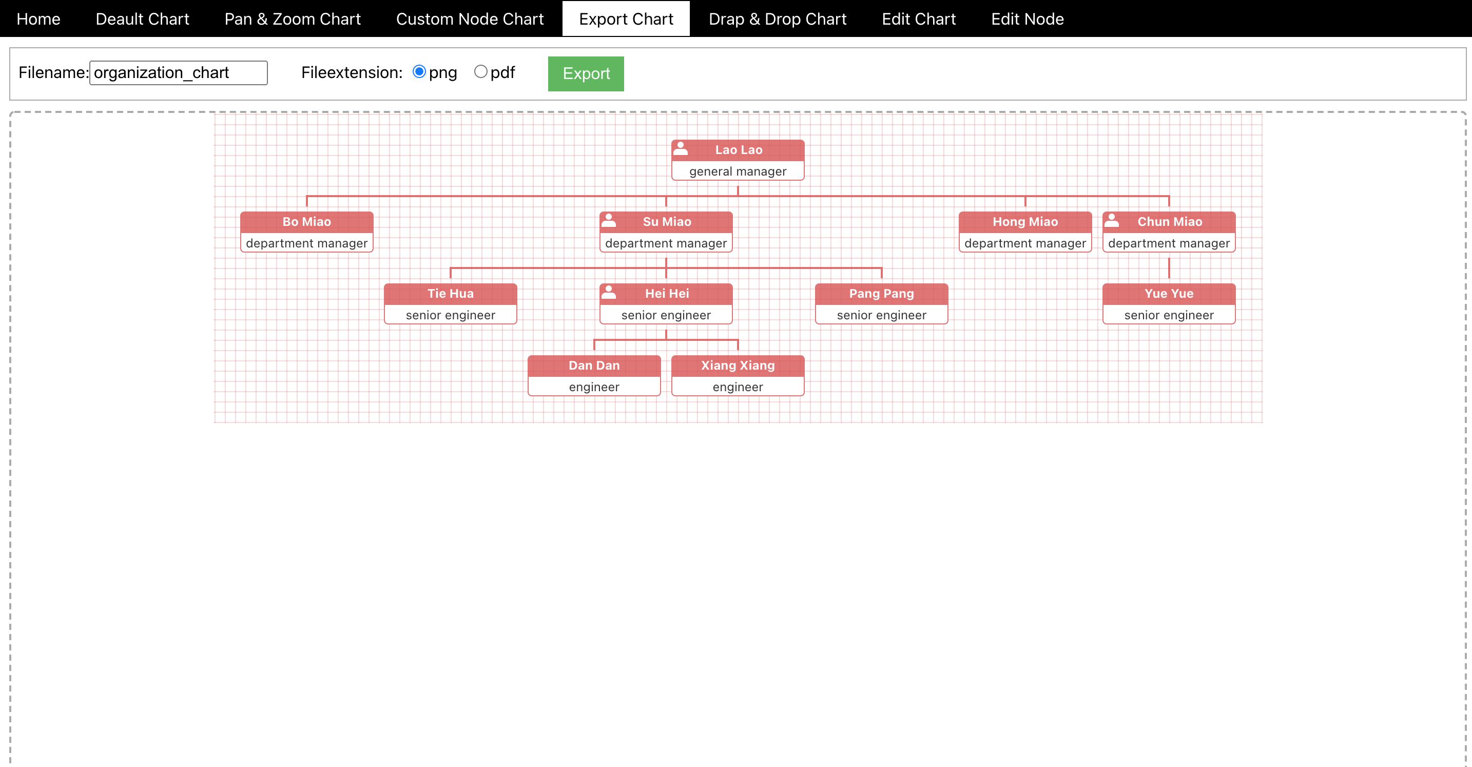
与其他页面不同的是,顶部添加了导出栏。通过对导出栏的选项更改,可以选择导出的名称及类型。通过给filename一个值再给其重新赋值可以显示默认值,同样的选择框中也是一样。再通过设置export按钮的点击事件来完成其导出功能。将filename以及选择框中的值赋给orgchart.current.exportTo()中,即可完成导出是名称及类型的选择。
const exportTo = () => {
orgchart.current.exportTo(filename, fileextension);
};
Drag&Drop Chart
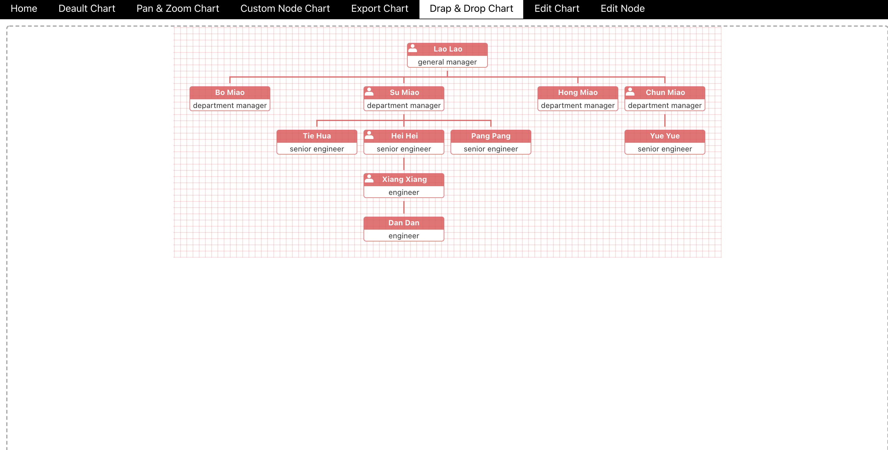
其效果为可对图表元素进行拖拽并添加到其他图表元素内,需要将组件中OrganizationChart中的draggable属性值设置为true即可。
<OrganizationChart datasource={ds} draggable={true} />
Edit Chart
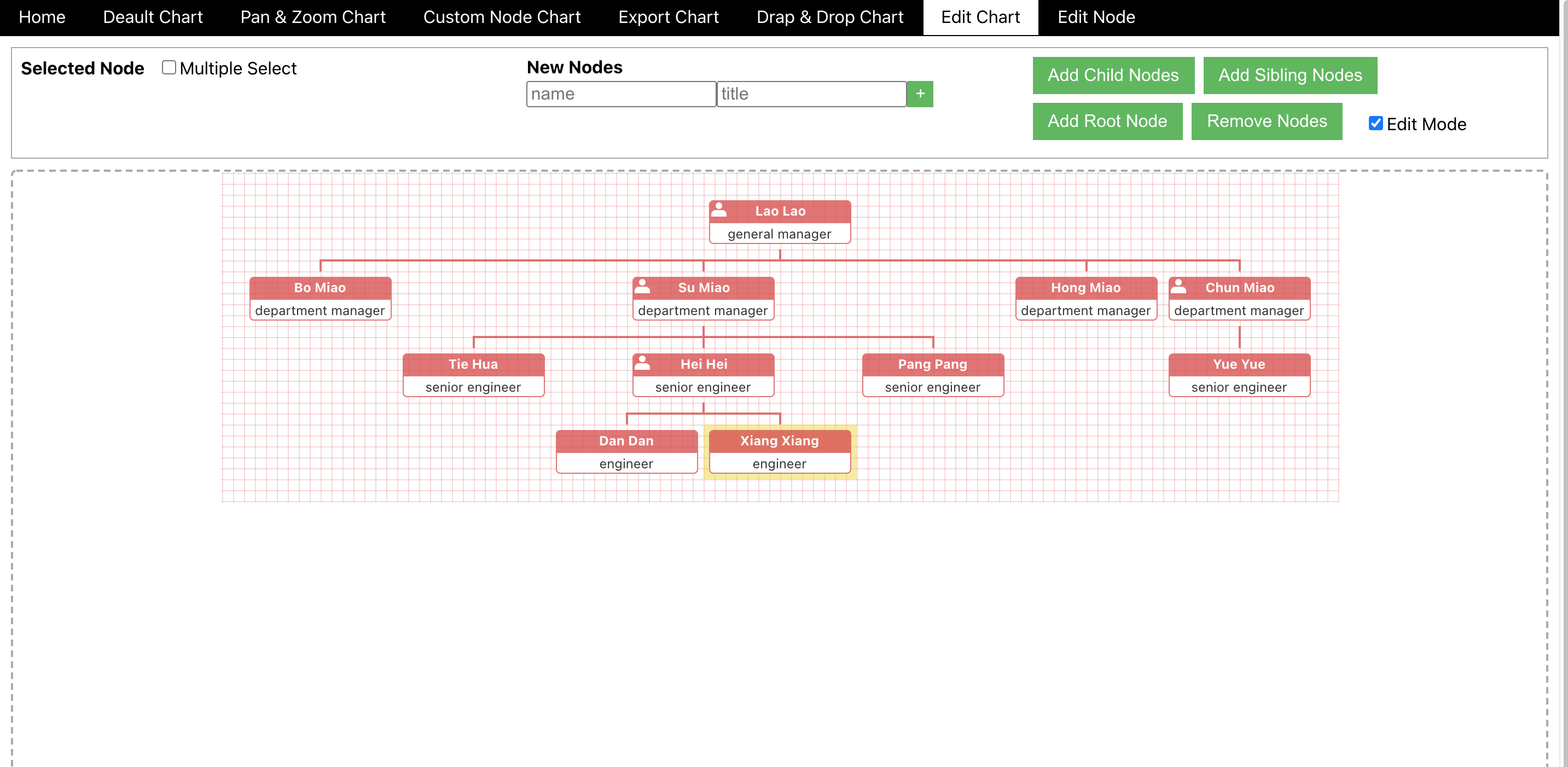
与其他部分不同的是顶部的编辑框,可以在默认模版的基础上实现添加、删除、改变图表元素的功能。通过对默认图表元素中值的操作来实现其功能。总体思路为获取输入的值,再点击相应按钮来实现按钮的相应功能。第一个,已经选择的以及多选框,通过读取点击的图表元素获取其值,然后进行遍历展示在SelectedNode中,这一过程通过组件OrganizationChart中的属性onClickNode获取,通过onClickChart清除已经选择的。接下来是多选框,设置类型为checkbox将其值赋予OrganizaitionChart中的multipleSelect属性来设置其是否为多选。然后是名称及标题输入框,两个input框默认值为name以及title,通过获取输入的name以及title的值,再通过JSONDigger组件中的属性与按钮的点击事件相对应,如增加图表元素子元素在JSONDigger中的属性为JSONDigger.addChildre等,对已经选择的图表元素进行操作。最后为编辑模式,即是否禁用按钮,对此input框设置类型为checkbox,默认值为true,将其相反值赋予各个按钮中disable属性的值来判断是否禁用,而编辑模式在OrganizationChart组件中有相应的collapsible属性值来判断是否为编辑模式。
<OrganizationChartref={orgchart}datasource={ds}collapsible={!isEditMode}multipleSelect={isMultipleSelect}onClickNode={readSelectedNode}onClickChart={clearSelectedNode}/>
Edit Node
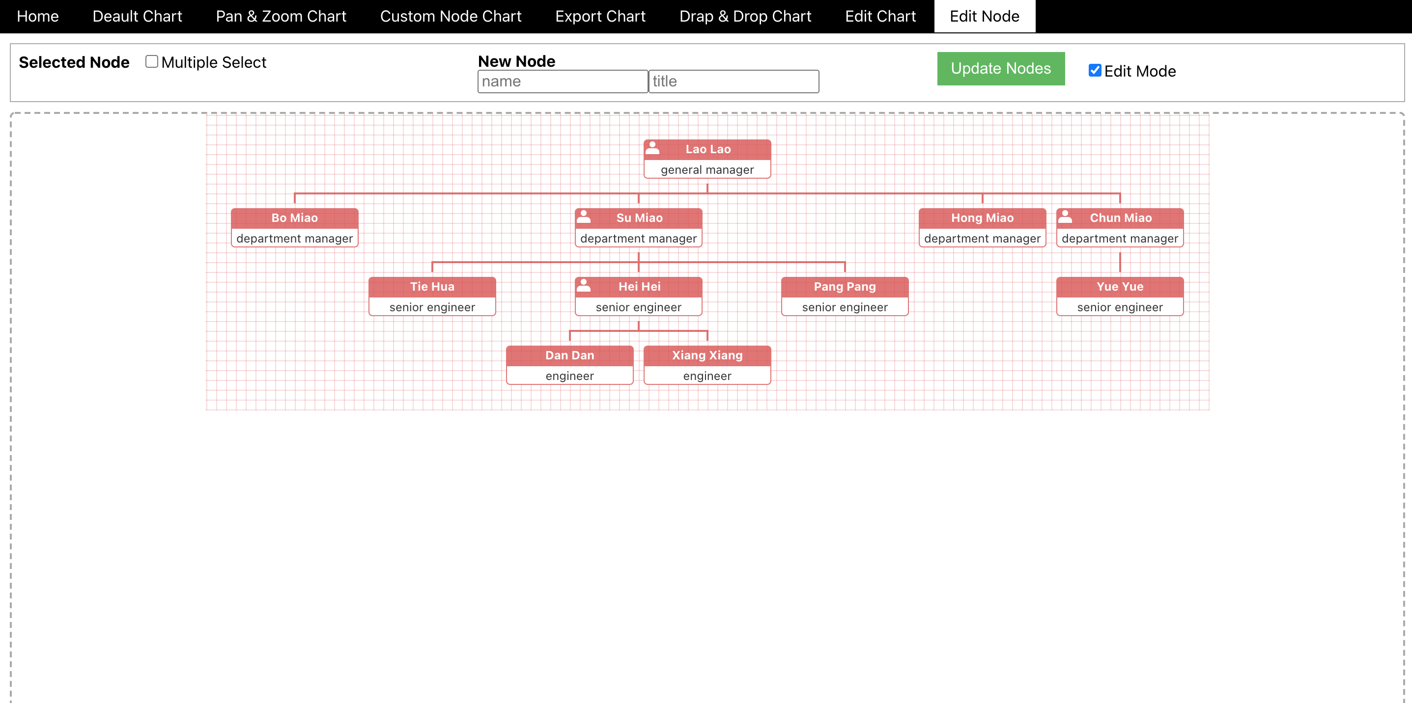
与Edit Chart基本一致,不过是对单个图表元素的更改,最大的不同为顶部编辑栏只有Update Node按钮来对已经选择的图表元素进行操作。不过思路是一样的,通过获取输入框中的值,利用JSONDigger组件将获取的值赋予所选择的图表元素,其余的编辑模式以及是否多选都与Edit Chart中相似。
const updateNodes = async () => {
await dsDigger.updateNodes([...selectedNodes].map(node => node.id), {id: uuidv4(),name: newNodeName,title: newNodeTitle
});
setDS({ ...dsDigger.ds });};


![Python&OpenCV自动人脸打马赛克&调色系统[源码&UI操作界面&部署教程]](https://img-blog.csdnimg.cn/img_convert/998e08f64c706d6f78d7fdef3b837218.png)