1. :before 和 :after 的主要作用是在元素内容前后加上指定内容,示例:
<!DOCTYPE html>
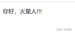
<html lang="en"><head><meta charset="UTF-8"><meta http-equiv="X-UA-Compatible" content="IE=edge"><meta name="viewport" content="width=device-width, initial-scale=1.0"><title>Document</title><style>p::before {content: "你好,";}p::after {content: "!!!"}</style>
</head><body><p>火星人</p>
</body></html>效果如图:
以上代码是:before和:after的基本用法,但是这两种伪类还有很多更方便的用法。
2. :after清除浮动
元素设置浮动以后,其父元素以及父元素的兄弟元素的布局都会受到影响,如父元素的背景边框(如宽度,高度,背景颜色)不能正常显示,父元素的兄弟元素位置布局错误等,
为了避免这种浮动带来的影响必须要清除浮动,:after就是其中的一种方法。
<!DOCTYPE html>
<html lang="en"><head><meta charset="UTF-8"><meta http-equiv="X-UA-Compatible" content="IE=edge"><meta name="viewport" content="width=device-width, initial-scale=1.0"><title>服饰展</title><style>* {margin: 0;padding: 0;box-sizing: border-box;/* 盒子宽度和高度包括了padding 和 border */}.gallery {width: 910px;margin: 15px auto;padding: 5px;background: rgb(76, 116, 190);}.gallery>div {position: relative;float: left;padding: 5px;}.gallery>div>img {width: 290px;transition: .1s;transform: translateZ(0);}.gallery>div:hover {z-index: 1;}.gallery>div:hover>img {transform: scale(1.6, 1.6);/* X轴Y轴被拉长 */transition: .3s transform;border: 1px solid rgba(236, 236, 236, 1.00);}/* 元素设置浮动以后,其父元素以及父元素的兄弟元素的布局都会受到影响,如父元素的背景边框不能正常显示,父元素的兄弟元素位置布局错误等 */.cf:after {display: block;content: "";clear: both;/* line-height: 0; */}h1:first-child {text-align: center;font-style: italic;color: antiquewhite;font-size: 35px;}body {background-image: url(imgs/雪景.jpg);background-repeat: repeat-x;}</style>
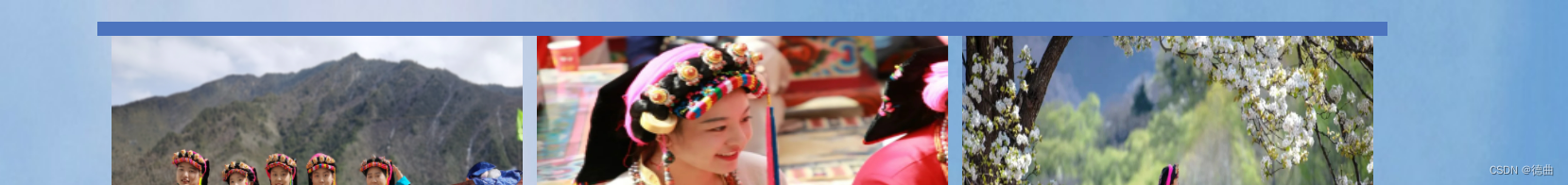
</head><body><div class="gallery cf"><div><img src="imgs/服饰1.jpg" height="242"></div><div><img src="imgs/服饰3.jpg" height="242"></div><div><img src="imgs/服饰4.jpg" height="244"></div><div><img src="imgs/服饰5.jpg" height="244"></div><div><img src="imgs/服饰6.jpg" height="244"></div><div><img src="imgs/服饰7.jpg" height="244"></div></div>
</body></html>此时显现的界面为

若没有这段代码来清除浮动,则界面如下
背景高度会影响。
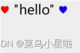
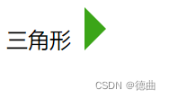
3. :before和:after 用来写小三角形
在日常的工作中会经常遇到小三角形这样的小图标,可以用添加图片的方式实现,但是更方便的是用:after :before伪类来实现。
<!DOCTYPE html>
<html lang="en"><head><meta charset="UTF-8"><meta http-equiv="X-UA-Compatible" content="IE=edge"><meta name="viewport" content="width=device-width, initial-scale=1.0"><title>Document</title><style>.demo:after {content: '';display: inline-block;width: 0;height: 0;border: 16px solid transparent;border-left: 16px solid #3ba518;position: relative;top: 2px;left: 10px;}</style>
</head><body><div class="demo">三角形</div>
</body></html>
效果如图所示:
4. 用:after和:before 写一个对话框
<!DOCTYPE html>
<html lang="en"><head><meta charset="UTF-8"><meta http-equiv="X-UA-Compatible" content="IE=edge"><meta name="viewport" content="width=device-width, initial-scale=1.0"><title>Document</title><style>.left,.right {min-height: 40px;position: relative;display: table;text-align: center;border-radius: 7px;background-color: #17d035;}.right {/*使左右的对话框分开*/top: 40px;left: 60px;}.left>p,.right>p {/*使内容居中*/display: table-cell;vertical-align: middle;padding: 0 10px;}.left:before,.right:after {/*用伪类写出小三角形*/content: '';display: block;width: 0;height: 0;border: 8px solid transparent;position: absolute;top: 11px;}/*分别给左右两边的小三角形定位*/.left:before {border-right: 8px solid #17d035;left: -16px;}.right:after {border-left: 8px solid #17d035;right: -16px;}</style>
</head><body><div class="left"><p>花花的粉丝名是啥</p></div><div class="right"><p>是火星人啊</p></div></body></html>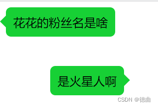
上面的对话框是模仿微信的样式写的,用:before和:after写很方便哦 。
这是我借鉴这篇博客的 详情请看这里