一、介绍
css3为了区分伪类和伪元素,伪元素采用双冒号写法。(:before和:after是在CSS2中提出来的,CSS3中的写法是::before和::after)
常见伪类——:hover,:link,:active,:target,:not(),:focus。
常见伪元素——::first-letter,::first-line,::before,::after,::selection。
::before和::after下特有的content,用于在css渲染中向元素逻辑上的头部或尾部添加内容。
这些添加不会出现在DOM中,不会改变文档内容,不可复制,仅仅是在css渲染层加入。
所以不要用:before或:after展示有实际意义的内容,尽量使用它们显示修饰性内容,例如图标。
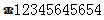
举例:网站有些联系电话,希望在它们前加一个icon☎,就可以使用:before伪元素,如下:
<!DOCTYPE html>
<meta charset="utf-8" />
<style type="text/css">.phoneNumber::before {content:'\260E';font-size: 15px;
}
</style>
<p class="phoneNumber">12345645654</p>
Note:
1、这些特殊字符的html,js和css的写法是不同的,如下
⇠ 箭头类
| 符号 | UNICODE | 符号 | UNICODE | ||||
|---|---|---|---|---|---|---|---|
| HTML | JS | CSS | HTML | JS | CSS | ||
| ⇠ | ⇠ | \u21E0 | \21E0 | ⇢ | ⇢ | \u21E2 | \21E2 |
| ⇡ | ⇡ | \u21E1 | \21E1 | ⇣ | ⇣ | \u21E3 | \21E3 |
| ↞ | ↞ | \u219E | \219E | ↠ | ↠ | \u21A0 | \21A0 |
| ↟ | ↟ | \u219F | \219F | ↡ | ↡ | \u21A1 | \21A1 |
| ← | ← | \u2190 | \2190 | → | → | \u2192 | \2192 |
| ↑ | ↑ | \u2191 | \2191 | ↓ | ↓ | \u2193 | \2193 |
| ↔ | ↔ | \u2194 | \2194 | ↕ | ↕ | \u2195 | \2195 |
| ⇄ | ⇄ | \u21C4 | \21C4 | ⇅ | ⇅ | \u21C5 | \21C5 |
| ↢ | ↢ | \u21A2 | \21A2 | ↣ | ↣ | \u21A3 | \21A3 |
| ⇞ | ⇞ | \u21DE | \21DE | ⇟ | ⇟ | \u21DF | \21DF |
| ↫ | ↫ | \u21AB | \21AB | ↬ | ↬ | \u21AC | \21AC |
| ⇜ | ⇜ | \u21DC | \21DC | ⇝ | ⇝ | \u21DD | \21DD |
| ↚ | ↚ | \u219A | \219A | ↛ | ↛ | \u219B | \219B |
| ↮ | ↮ | \u21AE | \21AE | ↭ | ↭ | \u21AD | \21AD |
| ⇦ | ⇦ | \u21E6 | \21E6 | ⇨ | ⇨ | \u21E8 | \21E8 |
| ⇧ | ⇧ | \u21E7 | \21E7 | ⇩ | ⇩ | \u21E9 | \21E9 |
| ▲ | ▲ | \u25B2 | \25B2 | ► | ► | \u25BA | \25BA |
| ▼ | ▼ | \u25BC | \25BC | ◄ | ◄ | \u25C4 | \25C4 |
| ➔ | ➔ | \u2794 | \2794 | ➙ | ➙ | \u2799 | \2799 |
| ➨ | ➨ | \u27A8 | \27A8 | ➲ | ➲ | \u27B2 | \27B2 |
| ➜ | ➜ | \u279C | \279C | ➞ | ➞ | \u279E | \279E |
| ➟ | ➟ | \u279F | \279F | ➠ | ➠ | \u27A0 | \27A0 |
| ➤ | ➤ | \u27A4 | \27A4 | ➥ | ➥ | \u27A5 | \27A5 |
| ➦ | ➦ | \u27A6 | \27A6 | ➧ | ➧ | \u27A7 | \27A7 |
| ➵ | ➵ | \u27B5 | \27B5 | ➸ | ➸ | \u27B8 | \27B8 |
| ➼ | ➼ | \u27BC | \27BC | ➽ | ➽ | \u27BD | \27BD |
| ➺ | ➺ | \u27BA | \27BA | ➳ | ➳ | \u27B3 | \27B3 |
| ↷ | ↷ | \u21B7 | \21B7 | ↶ | ↶ | \u21B6 | \21B6 |
| ↻ | ↻ | \u21BB | \21BB | ↺ | ↺ | \u21BA | \21BA |
| ↵ | ↵ | \u21B5 | \21B5 | ↯ | ↯ | \u21AF | \21AF |
| ➾ | ➾ | \u27BE | \27BE | ||||
❤ 基本形状类
| 符号 | UNICODE | 符号 | UNICODE | ||||
|---|---|---|---|---|---|---|---|
| HTML | JS | CSS | HTML | JS | CSS | ||
| ❤ | ❤ | \u2764 | \2764 | ✈ | ✈ | \u2708 | \2708 |
| ★ | ★ | \u2605 | \2605 | ✦ | ✦ | \u2726 | \2726 |
| ☀ | ☀ | \u2600 | \2600 | ◆ | ◆ | \u25C6 | \25C6 |
| ◈ | ◈ | \u25C8 | \25C8 | ▣ | ▣ | \u25A3 | \25A3 |
| ☻ | ☻ | \u263B | \263B | ☺ | ☺ | \u263A | \263A |
| ☹ | ☹ | \u2639 | \2639 | ✉ | ✉ | \u2709 | \2709 |
| ☎ | ☎ | \u260E | \260E | ☏ | ☏ | \u260F | \260F |
| ✆ | ✆ | \u2706 | \2706 | � | � | \uFFFD | \FFFD |
| ☁ | ☁ | \u2601 | \2601 | ☂ | ☂ | \u2602 | \2602 |
| ❄ | ❄ | \u2744 | \2744 | ☃ | ☃ | \u2603 | \2603 |
| ❈ | ❈ | \u2748 | \2748 | ✿ | ✿ | \u273F | \273F |
| ❀ | ❀ | \u2740 | \2740 | ❁ | ❁ | \u2741 | \2741 |
| ☘ | ☘ | \u2618 | \2618 | ❦ | ❦ | \u2766 | \2766 |
| ☕ | ☕ | \u9749 | \9749 | ❂ | ❂ | \u2742 | \2742 |
| ☥ | ☥ | \u2625 | \2625 | ☮ | ☮ | \u262E | \262E |
| ☯ | ☯ | \u262F | \262F | ☪ | ☪ | \u262A | \262A |
| ☤ | ☤ | \u2624 | \2624 | ✄ | ✄ | \u2704 | \2704 |
| ✂ | ✂ | \u2702 | \2702 | ☸ | ☸ | \u2638 | \2638 |
| ⚓ | ⚓ | \u2693 | \2693 | ☣ | ☣ | \u2623 | \2623 |
| ⚠ | ⚠ | \u26A0 | \26A0 | ⚡ | ⚡ | \u26A1 | \26A1 |
| ☢ | ☢ | \u2622 | \2622 | ♻ | ♻ | \u267B | \267B |
| ♿ | ♿ | \u267F | \267F | ☠ | ☠ | \u2620 | \2620 |
¥ 货币类
| 符号 | UNICODE | 符号 | UNICODE | ||||
|---|---|---|---|---|---|---|---|
| HTML | JS | CSS | HTML | JS | CSS | ||
| $ | $ | \u0024 | \0024 | ¢ | ¢ | \u00A2 | \00A2 |
| £ | £ | \u00A3 | \00A3 | ¤ | ¤ | \u00A4 | \00A4 |
| € | € | \u20AC | \20AC | ¥ | ¥ | \u00A5 | \00A5 |
| ₱ | ₱ | \u20B1 | \20B1 | ₹ | ₹ | \u20B9 | \20B9 |
½ 数学类
| 符号 | UNICODE | 符号 | UNICODE | ||||
|---|---|---|---|---|---|---|---|
| HTML | JS | CSS | HTML | JS | CSS | ||
| ½ | ½ | \u00BD | \00BD | ¼ | ¼ | \u00BC | \00BC |
| ¾ | ¾ | \u00BE | \00BE | ⅓ | ⅓ | \u2153 | \2153 |
| ⅔ | ⅔ | \u2154 | \2154 | ⅛ | ⅛ | \u215B | \215B |
| ⅜ | ⅜ | \u215C | \215C | ⅝ | ⅝ | \u215D | \215D |
| ‰ | ‰ | \u2030 | \2030 | % | % | \u0025 | \0025 |
| < | < | \u003C | \003C | > | > | \u003E | \003E |
♫ 音乐符号类
| 符号 | UNICODE | 符号 | UNICODE | ||||
|---|---|---|---|---|---|---|---|
| HTML | JS | CSS | HTML | JS | CSS | ||
| ♩ | ♩ | \u2669 | \2669 | ♪ | ♪ | \u266A | \266A |
| ♫ | ♫ | \u266B | \266B | ♬ | ♬ | \u266C | \266C |
| ♭ | ♭ | \u266D | \266D | ♯ | ♯ | \u266F | \266F |
✖ 对错号
| 符号 | UNICODE | 符号 | UNICODE | ||||
|---|---|---|---|---|---|---|---|
| HTML | JS | CSS | HTML | JS | CSS | ||
|   | \u00A0 | \00A0 | ☐ | ☐ | \u2610 | \2610 | |
| ☑ | ☑ | \u2611 | \2611 | ☒ | ☒ | \u2612 | \2612 |
| ✓ | ✓ | \u2713 | \2713 | ✔ | ✔ | \u2714 | \2714 |
| ✕ | ✕ | \u10005 | \10005 | ✖ | ✖ | \u2716 | \2716 |
| ✗ | ✗ | \u2717 | \2717 | ✘ | ✘ | \u2718 | \2718 |
★ 全都是星星
| 符号 | UNICODE | 符号 | UNICODE | ||||
|---|---|---|---|---|---|---|---|
| HTML | JS | CSS | HTML | JS | CSS | ||
| ★ | ★ | \u2605 | \2605 | ✭ | ✭ | \u272D | \272D |
| ✮ | ✮ | \u272E | \272E | ☆ | ☆ | \u2606 | \2606 |
| ✪ | ✪ | \u272A | \272A | ✡ | ✡ | \u2721 | \2721 |
| ✯ | ✯ | \u272F | \272F | ✵ | ✵ | \u2735 | \2735 |
| ✶ | ✶ | \u2736 | \2736 | ✸ | ✸ | \u2738 | \2738 |
| ✹ | ✹ | \u2739 | \2739 | ✺ | ✺ | \u273A | \273A |
| ✱ | ✱ | \u2731 | \2731 | ✲ | ✲ | \u2732 | \2732 |
| ✴ | ✴ | \u2734 | \2734 | ✳ | ✳ | \u2733 | \2733 |
| ✻ | ✻ | \u273B | \273B | ✽ | ✽ | \u273D | \273D |
| ❋ | ❋ | \u274B | \274B | ❆ | ❆ | \u2746 | \2746 |
| ❄ | ❄ | \u2744 | \2744 | ❅ | ❅ | \u2745 | \2745 |
♒ 星座类
| 符号 | UNICODE | 符号 | UNICODE | ||||
|---|---|---|---|---|---|---|---|
| HTML | JS | CSS | HTML | JS | CSS | ||
| ♈ | ♈ | \u2648 | \2648 | ♉ | ♉ | \u2649 | \2649 |
| ♊ | ♊ | \u264A | \264A | ♋ | ♋ | \u264B | \264B |
| ♌ | ♌ | \u264C | \264C | ♍ | ♍ | \u264D | \264D |
| ♎ | ♎ | \u264E | \264E | ♏ | ♏ | \u264F | \264F |
| ♐ | ♐ | \u2650 | \2650 | ♑ | ♑ | \u2651 | \2651 |
| ♒ | ♒ | \u2652 | \2652 | ♓ | ♓ | \u2653 | \2653 |
♚ 国际象棋类
| 符号 | UNICODE | 符号 | UNICODE | ||||
|---|---|---|---|---|---|---|---|
| HTML | JS | CSS | HTML | JS | CSS | ||
| ♚ | ♚ | \u265A | \265A | ♛ | ♛ | \u265B | \265B |
| ♜ | ♜ | \u265C | \265C | ♝ | ♝ | \u265D | \265D |
| ♞ | ♞ | \u265E | \265E | ♟ | ♟ | \u265F | \265F |
| ♔ | ♔ | \u2654 | \2654 | ♕ | ♕ | \u2655 | \2655 |
| ♖ | ♖ | \u2656 | \2656 | ♗ | ♗ | \u2657 | \2657 |
| ♘ | ♘ | \u2658 | \2658 | ♙ | ♙ | \u2659 | \2659 |
♣ 扑克牌类
| 符号 | UNICODE | 符号 | UNICODE | ||||
|---|---|---|---|---|---|---|---|
| HTML | JS | CSS | HTML | JS | CSS | ||
| ♠ | ♠ | \u2660 | \2660 | ♣ | ♣ | \u2663 | \2663 |
| ♥ | ♥ | \u2665 | \2665 | ♦ | ♦ | \u2666 | \2666 |
| ♤ | ♤ | \u2664 | \2664 | ♧ | ♧ | \u2667 | \2667 |
| ♡ | ♡ | \u2661 | \2661 | ♢ | ♢ | \u2662 | \2662 |
Ω 希腊字母
| 符号 | UNICODE | 符号 | UNICODE | ||||
|---|---|---|---|---|---|---|---|
| HTML | JS | CSS | HTML | JS | CSS | ||
| Α | Α | \u0391 | \0391 | Β | Β | \u0392 | \0392 |
| Γ | Γ | \u0393 | \0393 | Δ | Δ | \u0394 | \0394 |
| Ε | Ε | \u0395 | \0395 | Ζ | Ζ | \u0396 | \0396 |
| Η | Η | \u0397 | \0397 | Θ | Θ | \u0398 | \0398 |
| Ι | Ι | \u0399 | \0399 | Κ | Κ | \u039A | \039A |
| Λ | Λ | \u039B | \039B | Μ | Μ | \u039C | \039C |
| Ν | Ν | \u039D | \039D | Ξ | Ξ | \u039E | \039E |
| Ο | Ο | \u039F | \039F | Π | Π | \u03A0 | \03A0 |
| Ρ | Ρ | \u03A1 | \03A1 | Σ | Σ | \u03A3 | \03A3 |
| Τ | Τ | \u03A4 | \03A4 | Υ | Υ | \u03A5 | \03A5 |
| Φ | Φ | \u03A6 | \03A6 | Χ | Χ | \u03A7 | \03A7 |
| Ψ | Ψ | \u03A8 | \03A8 | Ω | Ω | \u03A9 | \03A9 |
☩ 十字
| 符号 | UNICODE | 符号 | UNICODE | ||||
|---|---|---|---|---|---|---|---|
| HTML | JS | CSS | HTML | JS | CSS | ||
| ☨ | ☨ | \u2628 | \2628 | ☩ | ☩ | \u2629 | \2629 |
| ✝ | ✝ | \u271D | \271D | ✞ | ✞ | \u271E | \271E |
| ✟ | ✟ | \u271F | \271F | ✠ | ✠ | \u2720 | \2720 |
| ✚ | ✚ | \u271A | \271A | † | † | \u2020 | \2020 |
| ✢ | ✢ | \u2722 | \2722 | ✤ | ✤ | \u2724 | \2724 |
| ✣ | ✣ | \u2723 | \2723 | ✥ | ✥ | \u2725 | \2725 |
© 法律符号
| 符号 | UNICODE | 符号 | UNICODE | ||||
|---|---|---|---|---|---|---|---|
| HTML | JS | CSS | HTML | JS | CSS | ||
| ® | ® | \u00AE | \00AE | © | © | \u00A9 | \00A9 |
| ℗ | ℗ | \u2117 | \2117 | ™ | ™ | \u0099 | \0099 |
| ℠ | ℠ | \u2120 | \2120 | ||||
@ 标点和符号
| 符号 | UNICODE | 符号 | UNICODE | ||||
|---|---|---|---|---|---|---|---|
| HTML | JS | CSS | HTML | JS | CSS | ||
| « | « | \u00AB | \00AB | » | » | \u00BB | \00BB |
| ‹ | ‹ | \u008B | \008B | › | › | \u009B | \009B |
| “ | “ | \u201C | \201C | ” | ” | \u201D | \201D |
| ‘ | ‘ | \u2018 | \2018 | ’ | ’ | \u2019 | \2019 |
| • | • | \u2022 | \2022 | ◦ | ◦ | \u25E6 | \25E6 |
| ¡ | ¡ | \u00A1 | \00A1 | ¿ | ¿ | \u00BF | \00BF |
| ℅ | ℅ | \u2105 | \2105 | № | № | \u2116 | \2116 |
| & | & | \u0026 | \0026 | @ | @ | \u0040 | \0040 |
| ℞ | ℞ | \u211E | \211E | ℃ | ℃ | \u2103 | \2103 |
| ℉ | ℉ | \u2109 | \2109 | ° | ° | \u00B0 | \00B0 |
| | | | | \u007C | \007C | ¦ | ¦ | \u00A6 | \00A6 |
| – | – | \u2013 | \2013 | — | — | \u2014 | \2014 |
| … | … | \u2026 | \2026 | ¶ | ¶ | \u00B6 | \00B6 |
| ∼ | ∼ | \u223C | \223C | ≠ | ≠ | \u2260 | |
2、创建的伪元素默认是在所依附的元素之上的,我们可以使用z-index:-1;把它放到下面
去
3、input、img、iframe等元素都不能包含其他元素,所以不能通过伪元素插入内容。
二、content属性
::before和::after必须配合content属性来使用,content用来定义插入的内容,content必须有值,至少是空。默认情况下,伪类元素的display是默认值inline,可以通过设置display:block来改变其显示。
content可取以下值:
1、string
2、attr——调用当前元素的属性
eg:
<style type="text/css">
a::after{content: "(" attr(href) ")";
}
</style>
<a href="http://www.cnblogs.com/starof">starof</a>
运行结果:
3、URL/URI——引用媒体文件
eg:content:url("https://www.baidu.com/img/baidu_jgylogo3.gif");
4、counter()——不使用列表元素实现序号功能
eg:
<!DOCTYPE html>
<html lang="en">
<head><meta charset="UTF-8"><title>Document</title><style>body{counter-reset: section;}h1{counter-reset: subsection;}h1:before{counter-increment:section;content:counter(section) "、";}h2:before{counter-increment:subsection;content: counter(section) "." counter(subsection) "、";}</style>
</head>
<body><h1>HTML tutorials</h1><h2>HTML Tutorial</h2><h2>XHTML Tutorial</h2><h2>CSS Tutorial</h2><h1>Scripting tutorials</h1><h2>JavaScript</h2><h2>VBScript</h2><h1>XML tutorials</h1><h2>XML</h2><h2>XSL</h2>
</body>
</html>
运行结果:

三、使用
1、清除浮动
清除浮动方法有多种,现在最常用的就是下面这种方法,仅需要以下样式即可在元素尾部自动清除浮动
.cf::before,
.cf::after{content:"";display:table;
}
.cf::after{clear:both;
}
.cf{*zoom:1;
}
2、模拟float:center的效果
float没有center这个取值,但是可以通过伪类来模拟实现。
这个效果实现很有意思,左右通过::before float各自留出一半图片的位置,再把图片绝对定位上去。
<!DOCTYPE html>
<html>
<head><meta charset='UTF-8'><title>Float Both</title><style>* {margin: 0;padding: 0;}body {font: 14px/1.8 Georgia, serif;}#page-wrap { width: 60%; margin: 40px auto; position: relative; }#logo { width:250px; height:250px; position: absolute; top: 0; left: 50%; margin-left: -125px; }#l, #r { width: 49%; }#l { float: left; }#r { float: right; }#l:before, #r:before { content: ""; width: 125px; height: 250px; }#l:before { float: right; }#r:before { float: left; }</style>
</head>
<body><div id="page-wrap"><img src="1.jpg" id="logo"><div id="l"><p>Pellentesque habitant morbi tristique senectus et netus et malesuada fames ac turpis egestas. Vestibulum tortor quam, feugiat vitae, ultricies eget, tempor sit amet, ante. Donec eu libero sit amet quam egestas semper. Aenean ultricies mi vitae est. Mauris placerat eleifend leo. Quisque sit amet est et sapien ullamcorper pharetra. Vestibulum erat wisi, condimentum sed, commodo vitae, ornare sit amet, wisi. Aenean fermentum, elit eget tincidunt condimentum, eros ipsum rutrum orci, sagittis tempus lacus enim ac dui. Donec non enim in turpis pulvinar facilisis. Ut felis. Praesent dapibus, neque id cursus faucibus, tortor neque egestas augue, eu vulputate magna eros eu erat. Aliquam erat volutpat. Nam dui mi, tincidunt quis, accumsan porttitor, facilisis luctus, metus</p></div><div id="r"><p>Pellentesque habitant morbi tristique senectus et netus et malesuada fames ac turpis egestas. Vestibulum tortor quam, feugiat vitae, ultricies eget, tempor sit amet, ante. Donec eu libero sit amet quam egestas semper. Aenean ultricies mi vitae est. Mauris placerat eleifend leo. Quisque sit amet est et sapien ullamcorper pharetra. Vestibulum erat wisi, condimentum sed, commodo vitae, ornare sit amet, wisi. Aenean fermentum, elit eget tincidunt condimentum, eros ipsum rutrum orci, sagittis tempus lacus enim ac dui. Donec non enim in turpis pulvinar facilisis. Ut felis. Praesent dapibus, neque id cursus faucibus, tortor neque egestas augue, eu vulputate magna eros eu erat. Aliquam erat volutpat. Nam dui mi, tincidunt quis, accumsan porttitor, facilisis luctus, metus</p></div></div>
</body>
</html>
运行结果如下:

3、做出各种图形效果
举例:一个六角星
<style>#star-six {width: 0;height: 0;border-left: 50px solid transparent;border-right: 50px solid transparent;border-bottom: 100px solid red;position: relative;}#star-six::after {width: 0;height: 0;border-left: 50px solid transparent;border-right: 50px solid transparent;border-top: 100px solid red;position: absolute;content: "";top: 30px;left: -50px;}
</style>
<body><div id="star-six"></div>
</body>
运行结果:

4、不使用图片创建小图标
举例:比如一个电话
很巧妙的应用一个div左border加圆角当机身,::before和::after配合圆角当听筒。

<style type="text/css">#phone{width:50px;height:50px;border-left:6px solid #EEB422;border-radius:20%;transform:rotate(-30deg);-webkit-transform:rotate(-30deg);margin:20px;margin-right:0px;position:relative;display: inline-block;top: -5px;}#phone:before{width:15px;height:15px;background:#EEB422;border-radius: 20%;content: "";position: absolute;left:-2px;top: 1px;}#phone:after{width:15px;height:15px;background:#EEB422;border-radius: 20%;content: "";position: absolute;left:-3px;top: 34px;}
</style>
<div id="wraper"><div id="phone"></div>
</div>
更多图标:
<!doctype html>
<html>
<head><title>伪类标签使用</title>
</head>
<style type="text/css">#wraper{padding:10px;width:380px;height:380px;border:3px solid #ccc;margin:auto;}#power{width: 30px;height: 30px;margin:20px;border: 6px solid #EEB422;border-radius: 50%;position: relative;display: inline-block;}#power:before{width:7px;height:22px;background:#EEB422;position: absolute;left:8px;top:-13px;content: "";border: 3px solid #fff;}#play{width: 30px;height: 30px;margin:20px;border: 6px solid #EEB422;border-radius: 50%;position:relative;display: inline-block;background: #EEB422;}#play:before{border:11px solid transparent;border-left:17px solid #fff;content: "";position: absolute;left:9px;top: 3px;}#pause{width: 30px;height: 30px;margin:20px;border: 6px solid #EEB422;border-radius: 50%;position:relative;display: inline-block;background: #EEB422;}#pause:before{height:20px;width:5px;border:0px solid transparent;border-left:8px solid #fff;border-right:8px solid #fff;content: "";position: absolute;left:4px;top: 5px;}#stop{width: 30px;height: 30px;margin:20px;border: 6px solid #EEB422;border-radius: 50%;position:relative;display: inline-block;background: #EEB422;}#stop:before{height:17px;width:17px;background:#fff;content: "";position: absolute;left:6px;top: 6px;}#comment{width: 50px;height: 25px;margin:20px;border: 6px solid #EEB422;border-radius: 20%;position:relative;display: inline-block;background: #EEB422;}#comment:before{border:10px solid transparent;border-top:10px solid #EEB422;content: "";position: absolute;left:28px;top: 28px;}#comment:after{content: "....";position: absolute;color: #fff;font-size: 26px;top: -10px;left: 2px;}#like{width: 50px;height: 30px;margin:20px;border-radius: 55%;transform:rotate(55deg);-webkit-transform:rotate(55deg);position:relative;display: inline-block;background: #EEB422;}#like:before{width:50px;height:30px;border-radius: 55%;transform:rotate(-110deg);-webkit-transform:rotate(-110deg);background:#EEB422;content: "";position: absolute;left:8px;top: -12px;}#search{width: 20px;height: 20px;border:4px solid #EEB422;border-radius:50%;margin:20px;position:relative;display: inline-block;top: -5px;left: -5px;}#search:before{width:20px;height:5px;background:#EEB422;transform:rotate(45deg);-webkit-transform:rotate(45deg);content: "";position: absolute;left:15px;top: 22px;}#home{width: 30px;height: 30px;background:#EEB422;margin:20px;position:relative;display: inline-block;top: 5px;}#home:before{width:6px;height:12px;background:#fff;content: "";position: absolute;left:12px;top: 20px;}#home:after{border:25px solid transparent;border-bottom:20px solid #EEB422;content: "";position: absolute;top: -38px;left:-10px;}#photo{width:40px;height:30px;background:#EEB422;margin:20px;position:relative;display: inline-block;top: 5px;}#photo:before{width:13px;height:13px;border:4px solid #fff;border-radius:50%;background:#EEB422;content: "";position: absolute;left:10px;top: 5px;}#photo:after{width:15px;height:10px;background:#EEB422;content: "";position: absolute;top: -7px;left:13px;}#photo{width:40px;height:30px;background:#EEB422;margin:20px;position:relative;display: inline-block;top: 5px;}#email{width:50px;height:35px;background:#EEB422;margin:20px;position:relative;display: inline-block;top: 5px;}#email:before{border:25px solid transparent;border-top:20px solid #fff;content: "";position: absolute;left:0px;top: 2px;}#email:after{border:25px solid transparent;border-top:20px solid #EEB422;content: "";position: absolute;top:0px;}#file{width:30px;height:45px;border:4px solid #EEB422;margin:20px;position:relative;display: inline-block;top: 5px;}#file:before{border:10px solid #fff;border-right:10px solid #EEB422;border-bottom:10px solid #EEB422;content: "";position: absolute;left:-4px;top: -4px;}#file:after{width:20px;height:5px;border-top:3px solid #EEB422;border-bottom:3px solid #EEB422;content: "";position: absolute;left: 5px;top: 25px;}#history{width:35px;height:35px;border:4px solid #EEB422;border-radius: 50%;margin:20px;position:relative;display: inline-block;top: 5px;}#history:before{width:14px;height:14px;border-bottom:4px solid #EEB422;border-left:4px solid #EEB422;content: "";position: absolute;left:14px;top: 3px;}#video{width:50px;height:35px;background:#EEB422;border-radius: 20%;margin:20px;position:relative;display: inline-block;top: -5px;}#video:before{width:6px;height:6px;border:11px solid transparent;border-right:11px solid #EEB422;content: "";position: absolute;left:35px;top: 4px;}#video:after{width:10px;height:10px;border:6px solid transparent;border-top:6px solid #EEB422;border-left:6px solid #EEB422;transform:rotate(45deg);-webkit-transform:rotate(45deg);content: "";position: absolute;left:13px;top: 35px;}#tags{width:50px;height:25px;background:#EEB422;border-radius: 35% 0% 0% 35%;transform:rotate(45deg);-webkit-transform:rotate(45deg);margin:20px;margin-left:35px;position:relative;display: inline-block;top: -5px;}#tags:before{width:10px;height:10px;border-radius:50%;background:#fff;content: "";position: absolute;left:7px;top: 7px;}#phone{width:50px;height:50px;border-left:6px solid #EEB422;border-radius:20%;transform:rotate(-30deg);-webkit-transform:rotate(-30deg);margin:20px;margin-right:0px;position:relative;display: inline-block;top: -5px;}#phone:before{width:15px;height:15px;background:#EEB422;border-radius: 20%;content: "";position: absolute;left:-2px;top: 1px;}#phone:after{width:15px;height:15px;background:#EEB422;border-radius: 20%;content: "";position: absolute;left:-3px;top: 34px;}#profile{width: 40px;height:15px;background:#EEB422;border-radius: 45% 45% 0 0;margin:20px;position:relative;display: inline-block;top: 0px;}#profile:before{width: 20px;height:22px;background:#EEB422;border-radius:40%;content: "";position: absolute;left: 10px;top: -22px;}
</style>
<body><div id="wraper"><div id="power"></div><div id="play"></div><div id="pause"></div><div id="stop"></div><div id="comment"></div><div id="like"></div><div id="search"></div><div id="home"></div><div id="photo"></div><div id="email"></div><div id="file"></div><div id="history"></div><div id="video"></div><div id="tags"></div><div id="phone"></div><div id="profile"></div></div>
</body>
</html>
5、显示打印网页的URL
<!DOCTYPE html>
<html lang="en">
<head><meta charset="UTF-8"><title>Document</title>
</head>
<style>
@media print {a[href]:after {content: " (" attr(href) ") ";}
}
</style>
<body>
<a href="http://www.baidu.com">百度</a>
</body>
</html>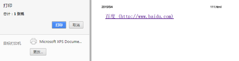
6、给blockquote添加引号
经常用到给blockquote 引用段添加巨大的引号作为背景,可以用 ::before 来代替 background 。好处是即可以给背景留下空间,还可以直接使用文字而非图片:
<meta charset="utf-8"/>
<style type="text/css">blockquote::before {content: open-quote;color: #ddd;z-index: -1;font-size:80px;
}
</style>
<blockquote>引用一个段落,双引号用::before伪元素实现</blockquote>
7、超链接特效
举例:配合 CSS定位实现一个鼠标移上去,超链接出现方括号的效果
<meta charset="utf-8" />
<style type="text/css">
body{background-color: #425a6c;
}a {position: relative;display: inline-block;outline: none;color: #fff;text-decoration: none;font-size: 32px;padding: 5px 20px;
}
a:hover::before, a:hover::after { position: absolute; }
a:hover::before { content: "\5B"; left: -10px; }
a:hover::after { content: "\5D"; right:  -10px; }
</style>
<a>鼠标移上去出现方括号</a>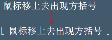
更多创意链接特效可参考: Creative Link Effects 。
8、::before和::after实现多背景图片
举例:一个标签应用5张背景图
<meta charset="utf-8" />
<style type="text/css">
#silverback {position: relative;z-index: 1;min-width: 200px;min-height: 200px;padding: 120px 200px 50px;background: #d3ff99 url(img/vines-back.png) -10% 0 repeat-x;
}
#silverback:before, #silverback:after {position: absolute;z-index: -1;top: 0;left: 0;right: 0;bottom: 0;padding-top: 100px;
}
#silverback:before {content: url(img/gorilla-1.png);padding-left: 3%;text-align: left;background: transparent url(img/vines-mid.png) 300% 0 repeat-x;
}
#silverback:after {content: url(img/gorilla-2.png);padding-right: 3%;text-align: right;background: transparent url(img/vines-front.png) 70% 0 repeat-x;
}
</style>
<div id="silverback">一个标签应用了5张背景图片</div>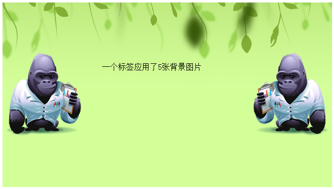
原效果来自:Multiple Backgrounds and Borders with CSS 2.1
这个效果看的真的是脑洞大开,虽然多背景图用css3的background-image很容易就能实现。但是这篇文章是10年写的,已经过去5年了,想想也正是他们这样的尝试和努力才加速了css3标准的制定,让今天的开发更easy。今天的我们又能为5年后的开发人员做些什么贡献呢?